

eCourses are designed to be worked on in multiple sessions. Click on the numbers below to go directly to any class.


INTRODUCTION
About This Course
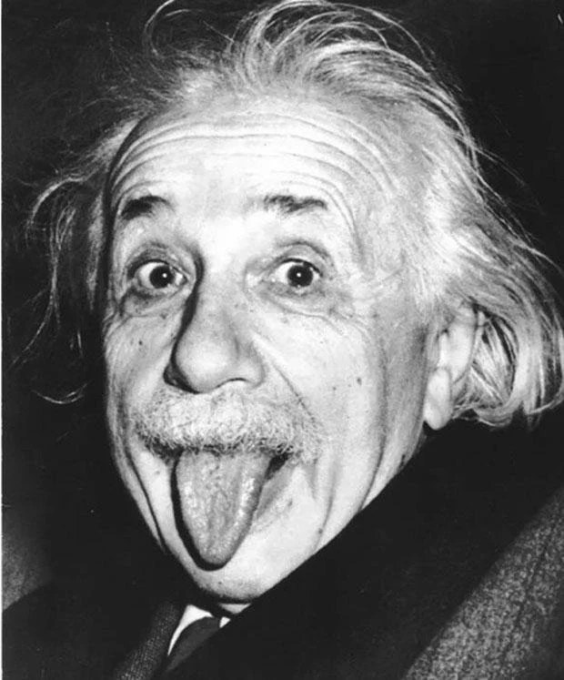
ALBERT EINSTEIN (of course) and also how you may feel about color sometimes!
One! Of course I had to do PART TWO after having so much fun in my first online color course!
In this Session we will delve a bit more deeply into some color theory and approaches. And, as always I will endeavor to make the information as fun and approachable as possible with entertaining Projects and links to interesting information. As I worked on this class, it became apparent that the over-arching “Theme” became what I call “The Theory of Relativity” (yes me, and old Einstein!). Basically, all color is relative. I attempt to make the explanations as simple and straightforward as possible, but there is no getting around the fact that color can be just plain contradictory and therefore confusing at times. By the end of the class you should understand many of the reasons why this is true.
In case you are new to my e-Courses, each Project can be created with many different approaches. I encourage you to adapt any Project to your own creative interest according to your skill level and subject matter focus. I provide links to my Pinterest boards in each class with examples of paintings using the concepts described. These will also provide inspiration for new ways of approaching your own work. And Orange “Dots”= “Projects” so look for dots like the ones below and you will find your "homework."
…………………..
Learning to see color as well as mixing what you see can take time and practice. Be patient with yourself. And paint lots. That is by far the best way to learn. It takes time for color to become “intuitive.” Time for the lessons you learn here to absorb and travel from your brain down to your hands. Time to see color combinations and the beauty of neutrals and the contrast of "brights."
So let‘s start having some fun! Join me down that road of color and let‘s get started!
Important Color Terms

HUE: Basically a color family: Red, Blue, Yellow, Green, Violet, and Orange. Every color is part of one of these color families. Thus, every color has a “hue.”
VALUE: Degree of lightness or darkness of a color. The color (hue) is not important in this definition, just how light or dark it is. (Think of a black and white photo of your painting).
LOCAL COLOR: The true color of an object, as opposed to the way it may appear in certain lighting conditions, at a distance, or in contrast with other colors.
TINT: A color to which white has been added.
SHADE: A color to which black has been added.
CHROMA: The brightness or INTENSITY of a color. Cadmium Red Light (for instance) straight from the tube is an example of high-chroma color.
PRIMARY COLORS: Red, Blue, Yellow
SECONDARY COLORS: Orange, Green, Purple
TERTIARY COLORS: Yellow-Orange, Yellow-Green, Blue-Green, Blue-Violet, Red-Violet, Red-Orange
COMPLEMENTARY COLORS: Colors opposite each other on the color wheel.
ANALOGOUS COLORS: Colors next to each other on the color wheel. Another way to darken or lighten a color is to add an analogous color.
TRIAD: Three Colors that are evenly spaced around the color wheel. Examples: Red, Yellow, Blue or Blue-Green, Yellow-Orange, Red-Violet.
“TO GREY DOWN A COLOR”: This phrase means to “neutralize” a color or make it less intense. The most common way is to add the color's complement creating a more neutral or “greyed“ version of the original color. There are many additional ways to grey down a color such as adding black or white.
REFLECTED COLOR: Color from one object next to, or near another object that is reflected on the object‘s surface altering the ”local color.”
Subject Matter
Please feel free to select any subject matter for any project. I encourage both abstract and realist painters to work with subject matter that excites them. Here are two sites that have copyright free images if you need some resources.
Pixabay and Sktchy (Sktchy is only for your smart phone.)
All of these Projects can be created more than once and in different combinations. The more you experiment, the more you will learn!


CLASS ONE
Color and Light: A Little History
Hang on to your hats for we are off and running...There is A TON OF INFORMATION in this first class. I could have divided it into two, but I feel that all of the information is related, and it is all important to your understanding of color in the long run. Trust me as I guide you on this road. It is a bit more curvy than OWN YOUR COLORS PART ONE, but the effort is well worth the journey. And we’re OFF....
THE “INVENTION” OF MODERN COLOR THEORY
Color is exciting and emotional, fantastical and, well, COLORFUL...right? It sounds like such an exciting topic and, yet, I will tell you that much reading of color theory will put you to sleep faster than a herd of sheep! To understand some of the basics of color, however we need to know where the “theories” came from, and I promise to make it as painless as possible. We need just a little history and science here to get that color wheel rolling down the road, and I would be remiss if I did not include this in your Part Two eCourse. Remember this: A Theory is just something that hasn’t been proven. A “system of ideas intended to explain something.” Artists and scientists have been trying to get it right for years and it continues to evolve. So let's see where modern color theory began...
Please Note: Each video in this course has its own unique password.
VIDEO PASSWORD: Pink
NOTE: This video has no sound until the end, just so you know. Also, you may want to pause it as you go to read at your own pace. The links that I mention in the video are:

Information on Mineral and Modern Colors

Pink Floyd “Wink”
PAINT, LIGHT, TEMPERATURE AND THE THEORY OF RELATIVITY
Now that we have a fundamental understanding of the way paint colors work and light “colors” work, let’s start looking at COLOR TEMPERATURE in more depth. I find that this is one of the most confusing elements of color theory to many students. I get asked so many questions about color temperature. Should the shadow be cool or warm? Should we mix warm colors with warm colors and cool colors with cool colors? Are skin tones warm or cool? When do I use a cool? A warm?
First let’s take a look at how Paint, Light and Color Temperature Relate.
Paint/Pigment Color “Temperature” and Light Color Temperature are actually two very different concepts.
Let’s start with Light Temperature:
“The temperature of a light source is a definite property that it bears.”
The color temperature of light can actually be measured scientifically by the “visible segment (or segments) of the electromagnetic spectrum” it radiates. (Those colors that were coming through the prism.) So if a light source is “hot” or “warm” it is emitting very few of the colors in the blue end of the spectrum, and if it is “cool,” very few colors from the red end of the spectrum. The important point here is that this light is measurable, even though the color of the light may change throughout the day.
Don’t let your eyes glaze over yet. I promise this all relates and will increase your understanding of color in the long run.
Paint/Pigment Color Temperature:
Pigments may lean towards red (warm) or blue (cool) and thus we identify them as warm or cool. These are words made up by artists and paint companies to describe certain colors. However, in a painting (and in how we see) ALL COLOR IS RELATIVE, and the color temperature of a pigment is always RELATIVE TO THE OTHER COLORS AROUND IT. Therefore the color temperature of a pigment is not necessarily consistent from painting to painting and even within a painting.
In other words a Yellow-Green may be considered a very warm color technically, however, when placed next to warm yellows, the Yellow-Green may become the cooler pigment.
Whew! No wonder color is so confusing!
Let’s look at some studies that I did below.
PROJECT “CROSS”
Warm Cross — Cool Cross
One of the many traditional composition “designs” is called a “Cross.” It is loosely based on the shape of the cross, and can be made into a landscape or an abstract or a figure or any number of subjects. In the four paintings below I play with this compositional configuration as abstracts. My intention was to select one color that looked cool in one painting and warm in another. In the two on the left I chose Yellow-Green, and on the right I chose a “Cool Red” (Quinacridone Red). Your first Project is to do the same. Choose a color that you make look cool in one painting and warm in another by how it looks relative to the colors around it. Feel free play with the “Cross Composition” or use any subject matter of your choosing. You may also want to watch the video below first to see me move some colors around, comparing them on different paintings.
RELATIVE COLOR TEMPERATURE EXAMPLES


Don‘t be surprised if this is harder than it looks. Playing with color temperature this way is tricky for me as well (mine are not perfect). Have fun with it and see what you can come up with! We are all learning here! These four paintings are only 6" x 6" each. You can have a lot of fun with color on a small support. You will learn the most if you try a bunch of these.
Paintings using Cross Composition
Throughout the classes I provide PINTEREST BOARDS for a specific relevant topic. Click on the logo to see the examples gathered.
Looking At Color Temperature And Relativity
Watch this video where I move colors around in different paintings illustrating how one color can look quite different when surrounded by different colors. In this video I particularly focus on Color Temperature. (And I apparently need a new microphone as I sound like I have a lisp and a cold!) You may want to go full screen with this video in order to get a good look at the colors.
VIDEO PASSWORD: Violet
Here are a few more examples of color temperature relativity in paintings by Paul Klee. If you look closely you can see that some of the reds appear warm in one painting and cool in another, and a few of the blues and greens do as well.


Color Temperature and Shadows
There is one fairly consistent “Rule” about Color and Light, however. Yay!
Cool Light creates Warm Shadows and Warm Light creates Cool Shadows.
If you can identify the color of your light source, you can identify the color of your shadows and also learn to harmonize your paintings more easily. This applies too if you are working intuitively and making up your colors. If you have found that sometimes something feels “off,” learning this concept may help you to identify why, especially if your colors feel “unnatural” or like “something is out of place.”
Obviously this concept becomes extremely important in landscape, still life, and any true realist work. I believe it's better to know the “rules” so that you can know when you are breaking them or at least how to manipulate them!
EXAMPLE: Same cup shot under two different light sources, one WARM and one COOL.
In this example, you can see very clearly the different color temperatures of the cast shadows on the table. You can also see the temperature of the light within the cup to some degree. Where the light illuminates the interior, the Left Cup looks cooler on the inside (cool light source) and the Right Cup looks warmer on the inside (warm light source). AND if you look at the cup on the right you can actually see TWO SHADOWS on the table. The “blue” one is from the incandescent light and the warmer one coming forward is actually from the north light window. Here you can compare the two shadow temperatures side by side!


PROJECT “SHADOWS”
Concentrating on Shadows and Light Temperature
In these videos I demonstrate two different still life paintings with different temperature light sources creating different shadow temperatures. I was not looking at any resource photo or image for these paintings, but I made them up using the concepts we've been looking at here. I did this purposely so that you can feel free to invent the subject matter for this Project as well. Flowers can easily be ‘invented’. we don‘t have to know if they are a specific ‘daisy’ or ‘rose’. Watch these videos and then go have some fun with paint!
VIDEO #1: Warm Light — Cool Shadows
VIDEO PASSWORD: Warm
Time = 27 minutes
(Doggie barking towards the end was out playing in the park. Woof!)
VIDEO #2: Cool Light—Warm Shadows
PASSWORD: Cool
Time = 21 minutes
NOTE: The photos of these two paintings above came out rather “hot” in the reds. I can‘t seem to get them to show much cooler here. The reds on the right are a bit lighter and cooler than they appear here...a bit more pink with white (thus the cooler light).


WEBSITE
Paint colors on my palette in both of these demos are from left to right: Black, Ultramarine Blue, Phthalo Turquoise*, Emerald Green*, Permanent Green Light*, Titanium White, Lemon Yellow, Cad. Yellow Medium, Orange, Cad. Red, Quinacridone Red, Ultramarine Violet*
*Gamblin colors
Warm Light — Cool Shadows
Throughout the classes I provide PINTEREST BOARDS for a specific relevant topic. Click on the logo to see the examples gathered.
Cool Light — Warm Shadows
Throughout the classes I provide PINTEREST BOARDS for a specific relevant topic. Click on the logo to see the examples gathered.
BONUS “SHADOWS” PROJECT

MELINDA COOTSONA
Grab a white piece of paper and find different light sources in your house. Create a shadow over the paper and see if you can tell if the shadow is warm or cool. This works great if you have an incandescent light and a fluorescent light as incandescent light is warm, and fluorescent cool. The more you study these light effects in real life the more you will learn to see them in your paintings.
Set up a simple still life under one of these light sources and look for the color temperatures that are created. This can be as simple as a coffee cup and its shadow (like my photos above). You do not need to use complicated imagery, and we are not looking at drawing here, just the study of color and light.
Look for color temperature outdoors as well, even at your next café - lunch, look at the white tablecloth and see what color the shadows are. You will become a color and light expert once you start looking! And, of course you can try this Project outside as well in warm or cool daylight.
And, yes, I know that the shadows in the painting on the left are not completely consistent. For the most part, the light on this box was warm, and the shadows cool. Cool blue shadows appear in the box but there is a dash of warm red in the cool shadow of the tablecloth. That is called “Artistic License” or “Manipulation of the Rules” at the whim of the Artist! HA! The warm yellows within the box are actually reflected light, however. Look for these subtle color changes when you observe your surroundings.
Some examples of warm and cool light and shadow conditions in paintings.


The Most Important Concept of All:
This First Class is the most “technical” of this PART TWO Session. It is also by far the longest! I realize that there is A LOT of information in this one class. The concepts are not always intuitive and also the actual visual experiences that you may have when observing these "rules" can be contradictory. This individual experience of color is EXACTLY why it can be very confusing to so many people. I know that many of you will have questions if one shadow is warm here or cool there and I will not always be able to answer. Color is relative and how we see it changes as well. For instance are the shadows in Veronika’s painting above warm or cool? I am certain that I could prove the answer either way.
Don’t pull your hair out by focusing too hard on if a color should be warm or cool. Instead, just have these concepts in the back of your brain and over time you will begin to watch them play out in different situations. I really don't want to be teaching that there is a “right” and “wrong” way to be painting shadows or any other subjects. These concepts are just here to help you in the grand scheme of things. Ideas to think about when possibly something is going wrong in your painting, or when you want to create a certain effect.
The most important concept to always remember is to HAVE FUN while you create!


CLASS TWO
The “Deception” Of Color And A Little Detour On Our “Road”
“In visual perception a color is almost never seen as it really is—as it physically is. This fact makes color the most relative medium in art. In order to use color effectively it is necessary to recognize that color deceives continually.”
We really can’t get a thorough understanding of color without talking about Joseph Albers and his legacy. His concepts are fundamental to all contemporary artists, and they will also help to explain why we get so DARNED CONFUSED about color! Not only is color temperature relative, color itself is relative to other colors around it. Below are three of Albers’ classic examples of how color is “relative to its surroundings.” His book The Interaction of Color contains his theories on studying and teaching color. More on that in a minute…
RELATIVE COLOR EXAMPLES
1. GREEN and PURPLE EXAMPLES
In the green example the small rectangle on the left appears lighter and paler. The rectangle on the right, darker and a bit more “green.” But they are the SAME COLOR.
In the purple example the left small purple rectangle appears significantly darker than the right small rectangle, however they are the SAME COLOR.
2. TAN SQUARES EXAMPLE
Look at the two small squares and guess what? They are the SAME COLOR! The top one appears much brighter and more ”orange”, while the bottom one appears darker and more neutral. Their appearance changes because of the colors that surround them.
Literally the color of the square changes in front of our eyes proving that all color is relative to that which surrounds it.


The “bottom line” here is that color can be very deceptive. How we see it depends on very many factors. We have seen that light can affect color and now we see that surrounding colors affect color. The trick is to learn how to use this all to our advantage.
Albers spent a big portion of his life studying these color interactions and teaching his students to see them as well. His book, "The Interaction of Color" was reproduced around the world in different languages with many examples of plates like the ones above. It is actually very easy to read and quite understandable. YOU are actually at the right place and time in this color universe, however, as there is now an iPad App that Albers would have flipped over. The Interaction of Color is now available as an App (created by the Albers foundation) that YOU can play with and discover these color interactions on your own. I HIGHLY RECOMMEND that you purchase this App to learn more about color relationships. Plus it is just darned FUN! I believe this is only available for the iPad and not a tablet or phone yet, but we can hope that they will develop these platforms in the future.

Interaction of Color APP (Trial)
This app is available only on the App Store for iPad.

Interaction of Color BOOK
by Josef Albers
50th Anniversary Edition
If you are fascinated by this concept feel free to create these studies on your own in paint. I am not giving this as a Project as it is too tedious for many students, but if you would like to create your own “Albers” Projects, please GO FO IT!!
Josef Albers Projects
Throughout the classes I provide PINTEREST BOARDS for a specific relevant topic. Click on the logo to see the examples gathered.

SUMMARY
Armed with the knowledge of the Relativity of Color you can now begin to understand just why color can be so confusing. Not only is COLOR ALWAYS RELATIVE to the colors that surround it, and its light source, I believe that many of us actually see colors differently (Albers believed this too). With this knowledge, you can now give yourself some creative patience and respect for “learning to see.” And the next time you get confused about color you will have a better understanding of WHY.

Color Proportion In Paintings
Now that I have your head spinning with the Relativity and “Deception” of Color, it's time to take a break from Relativity. Let’s take a small detour on our road and look at a simpler concept that can be applied to any painting subject matter. This is the concept of color proportion. Watch this short slide presentation to learn about “A Gallon, A Quart and a Pint,” or “Mostly, Some, and a Bit.”
Please Note: Each video in this course has its own unique password.
VIDEO PASSWORD: Mostly
VIDEO LENGTH: 13 minutes
PROJECT “PROPORTION”
Watch Me Demo The Color Proportion Concept
Create a painting using the concept of “Mostly, Some and a Bit”.
Please Note: Each video in this course has its own unique password.
VIDEO PASSWORD: Orange
VIDEO LENGTH: 36 minutes

Clothesline, M. Cootsona
Here I demonstrate an abstract painting using “Mostly, Some, and a Bit.” I clearly use more than just three colors intentionally. I started by figuring out my “Mostly” as warms and oranges. I wanted MOST of my painting to be very warm “Orangey,” but not just Orange. As I proceeded I then added greens and blues that became my “Some” and a ”Bit.” I didn't have this clearly planned out in the beginning, but I had a general direction. Mostly warms and then smaller amounts of cools.
WEBSITE
Paint colors on my palette are from left to right: Mars Black, Ultramarine Blue, Viridian, Green Gold, Titanium White, Lemon Yellow, Indian Yellow, Cadmium Orange, Cadmium Red Light, Yellow Ochre, Cold Wax Medium.


CLASS THREE
Neutrals And “Mud”—The Painter’s Gold
MUD - THE “GOOD” KIND
Painters have always been thrifty people when it comes to their paint. No one likes to see good paint go to waste. Oil painters learned early on that scraping the palette at the end of the day and combining this left over paint can create beautiful neutral colors. We call this left-over paint "mud" and it is also known as Painter's Gold. These are often rich neutrals that you would not have predicted or thought up on your own. You can also "control" your muds by scraping up all the left-over cools, for instance, into a separate pile than your warms. Or combine other left-overs to create the muds of your choosing. Since these muds are created from all of the colors in your current painting, they will harmonize beautifully with it. They often go right back into what ever painting I am currently working on.
S.C. YUAN - A MASTER OF “MUD”
One of my favorite painters is S.C. Yuan who truly turned mud into gold. He favored using his muds in all of his work to create gorgeous calm passages that then made intense colors sing. Look through this gallery of his work to see the beauty of “mud.” Notice how these neutral “dull” colors enhance the “brights’ in the paintings and make them appear even brighter. The blue in the Blue Vase painting for instance glows next to the neutrals. Look also for neutrals that you would never have thought of! Click on any image to see larger.


MUD: THE “BAD” KIND
Often times painters say, “My painting is muddy.” Or “My colors are getting muddy.” Or, “I can't work on this any longer because I'm just creating mud.” This typically happens with oil painters, but it can happen with acrylic work too. Generally speaking it is not the “mud” color that is necessarily the problem. There are usually three reasons why paintings look “muddy.”
1. The most common reason is that the VALUES in the painting are off. Very often the painting is stuck in mid-values with no contrast of darks and lights. Usually it is mostly the lights that are missing. This condition creates a “muddy, grey day” feel as there is no feeling of light in the painting.
2. The second reasons is there is not enough color intensity (chroma) in the painting. This condition usually happens because of over-mixing colors, HOWEVER, it is more likely that the real culprit is #1...the lack of values. There are MANY lovely paintings that are completed solely with neutral colors. Color intensity is usually not the true problem, only part of the problem.
3. The third reason that a painting can feel muddy is a bit less obvious. If the edges are too soft and undefined in too many areas, this can create a muddy feel. Typically this goes hand in hand with the value problem noted above. I love soft edges in general but in some cases they are simply lost because of less drawing experience and timidity of the artist. We all go through that at some point as we learn. It is just good to note that the color may not be the sole culprit, but, also, the edges and the drawing.
MUD AND ACRYLICS
Since acrylic paint dries so quickly artists don’t typically end up with mud at the end of the day or even while they are painting. I believe that the lack of neutral colors in some (not all) acrylic paintings is actually what makes them appear less rich than oil paintings. It can be easy to “over-saturate” an acrylic painting, although there are many people who like high chroma paintings and there is certainly nothing wrong with that approach! But if you have been wanting a richer more balanced acrylic painting you might try mixing some “muds” on purpose to experiment with in your work. At the very least, you may want to mix a few complements together to get some neutrals to include in your work.
DEMONSTRATION
Fixing A “Muddy” Painting
Watch here as I take a “muddy” painting and turn it into a painting with light and color.
Please Note: Each video in this course has its own unique password.
VIDEO PASSWORD: Muddy
Back on the Relativity Road for a couple of miles…
NEUTRALS AND RELATIVITY
“A thimble full of red is redder than a bucketful.”
The old Masters, Rembrandt, Da Vinci, Delacroix and even Vermeer did not have the bright colors on their palettes that we have access to today. Yet they were still able to make gold shine and candles glow with their very limited palettes. Most of the colors that they had to work with were neutrals to begin with! They were all masters of the “Theory of Relativity.” With exceedingly good skill these artists controlled the Values and Chroma (see the definitions above) in their extremely limited palettes to make the most of the colors available. They knew that placing different colors next to each other could give the illusion of brightness, shine, and light, or conversely of shadow and dusk. Let’s take a look at these Masters of Color and Illusion. Click on any image to see larger.
OLD MASTERS RELATIVITY EXAMPLES


1. Rembrandt Van Rijn “Man With the Golden Helmet”
To the right we see an amazing Rembrandt. You absolutely BELIEVE the light shining on that helmet just like it would be in a photograph, yet it is all created with paint. Dull and bright “yellows” (not really very bright at all compared to our modern paints) along with dark and light values masterfully placed next to each other create the illusion of not only a Gold helmet, but a light source on that helmet.
2. Leonardo Da Vinci “Portrait of a Musician”
Again we have not only the sense of light on this musician's face and collar, but the glow of the paper that he is holding. The light appears to bounce off the canvas right back at us, just as if the light of the candle was truly hitting that paper and shining into our eyes. (Remember this was candle light he is representing, no electricity!) All done with a handful of actually quite dull colors (relatively) placed next to lighter, “brighter” colors. And believe me, there was no Indian Yellow in site!
3. Eugene Delacroix “Liberty Guiding the People”
The light on the shirt of the fallen! Need I say more?
4. Jan Vermeer “Young Woman with a Pearl Necklace”
Sheesh, Vermeer could make paint glow like no other. Again, this yellow may look bright but it was not as intense as many of the colors that we now have available. Vermeer just made it look brighter relative to the colors he placed next to it, and surrounded it with, in the rest of the painting. And that ribbon…(I didn’t even mention the pearls)
5. Gerhard Richter “Two Candles”
If you have ever seen one of Richter‘s Candle paintings in person it is nothing short of astonishing. Yes this is a painting. And, yes it looks this luminescent in real life, not just on the computer. And it is 110 cm x 140 cm which is fairly large. It is hard to believe that it is not a photograph even in person. But it is paint and a perfect example of the “Theory of Relativity” hard at work.
I had to include this to show what can be done with very few colors, muted colors, and the contrasting light “brighter” flame colors. It truly is amazing what paint can do.
The “bottom line” here is that color can be very deceptive. How we see it depends on very many factors. We have seen that light can affect color and now we see that surrounding colors affect color. The trick is to learn how to use this all to our advantage.
Albers spent a big portion of his life studying these color interactions and teaching his students to see them as well. His book, "The Interaction of Color" was reproduced around the world in different languages with many examples of plates like the ones above. It is actually very easy to read and quite understandable. YOU are actually at the right place and time in this color universe, however, as there is now an iPad App that Albers would have flipped over. The Interaction of Color is now available as an App (created by the Albers foundation) that YOU can play with and discover these color interactions on your own. I HIGHLY RECOMMEND that you purchase this App to learn more about color relationships. Plus it is just darned FUN! I believe this is only available for the iPad and not a tablet or phone yet, but we can hope that they will develop these platforms in the future.
More Old Masters Paintings
Throughout the classes I provide PINTEREST BOARDS for a specific relevant topic. Click on the logo to see the examples gathered.
“OK, I know that most of you don’t expect to “paint like the masters” and that you would just like to have fun with color and learn how to control it more in your work. But it’s important (and enlightening) to see how far color, and in this case very little color, can be “pushed” by the experts! Let’s use this contrast of neutrals and color now in some more “contemporary” subject matter.”
PROJECT “THIMBLE”
Using A “Thimble Full Of Red”
Please Note: Each video in this course has its own unique password.
VIDEO PASSWORD: Thimble
VIDEO LENGTH: 41 minutes

Cafe Latte, M. Cootsona
In this demo I use neutral colors and a some of my muds to create a painting. Doing this emphasizes the intense red that I use on the figure's dress. The neutral colors make the dress appear even more vibrant, and in contrast, the bright red turns the neutral colors into beautiful "supporting actors."
**Remember, the Cadmium Red is in many of my mud colors here which helps to harmonize this painting.**
For your next Project use several of your left over muds to create neutralized paintings. If you don't have any muds, mix some up. Make one of the colors in your mud the "thimbleful" color in your painting.
NOTE: The “Thimbleful of Red” does not need to actually be red—it can be any vibrant (chromatic) color.
WEBSITE
Paint colors on my palette are from left to right: Black, Van Dyke Brown, Ultramarine Blue, Emerald Green, Titanium White, Titanium Buff, Yellow Ochre, Cad. Red, Burnt Sienna, Two Mud Piles.
“Thimble Full Of Red” Examples
Throughout the classes I provide PINTEREST BOARDS for a specific relevant topic. Click on the logo to see the examples gathered.


CLASS FOUR
Limited Palettes And Triads

PIGMENT JARS AT THE SENNELIER STORE (PARIS, FRANCE)
Do you go to the paint store and stand mesmerized in front of the seemingly infinite colors of paint on the shelves? Do you have a stash of pretty paint colors with names like Caucasian Skin, Brilliant Yellow, Radiant Blue, Turquoise Lake? Do you have little piles of these “colors with pretty names” scattered all over your palette? AND, Do the colors in your paintings sometimes “get out of hand” – like too many cooks in the soup?
If any of these ring true (and even if they don't), you may want to practice Limiting Your Palette.
Many people think that more colors will give them more options and help in their color mixing ability, however, typically the opposite is true. More colors tend to confuse the artist and especially an inexperienced one.
That being said, it’s important to have the right colors for the job. We talked about Modern vs Mineral pigments both in my first e-Course as well as the first class above in this course. It is true that you absolutely need certain colors to give you certain effects, but you don't need every color from your favorite Art Store on your palette at the same time.
Let’s look at four very different limited palettes that you might explore in your work. Each of these is based on a Triad (three colors evenly spaced around the color wheel) of Primaries: Red, Blue and Yellow, but we change up what we use for each Primary color.
Cadmium Yellow Light, Ultramarine Blue, Alizarine Crimson (Traditional Triad)
This may be the most common and basic limited palette Triad. Instead of Cadmium Yellow Light, you could also use Cadmium Yellow Medium, or even Yellow Ochre. These three colors plus black and white will give you a HUGE range of color options as you can see in the examples to the right. All of these paintings were done with only these three colors plus black and white. Click on any image to view larger.


Quinacridone Red, Phthalo Blue, Hansa Yellow Light (Modern Triad)
Modern colors have more Chroma and Intensity than their traditional counterparts. Using this modern palette will give you beautiful vibrant colors. They can also be gorgeous in High Key paintings (paintings on the lighter side of the value scale) as the tinting strength of Modern pigments is very high. This means that when you add white, the color still stays relatively strong. This will be a fun one to try if you like vibrant colors, although you can also get beautiful neutrals as you can see from Rock’s painting on the right. You can add Black and White.


Burnt Sienna, Payne’s Grey, Yellow Ochre (Earth Triad)
In this Triad, the Payne’s Grey acts as your blue. You can also substitute black for Payne’s Grey, and use it like a blue. You will be surprised at the beautiful color combinations that you can achieve with just these three colors plus White. This palette is particularly applicable to landscape painters.


Cadmium Red Light, Payne’s Grey, Yellow Ochre (Zorn Palette)
This Triad plus White, was made popular by the artist Anders Zorn who used it to great effect. This palette is particularly good for figurative work with skin tones as you can see by the examples to the right. Again, the Payne’s Grey will act as your ”Blue.”


Brian Smith
The artist Brian Smith created many of the paintings above. Visit his website to see more.
Let’s Talk A Bit About Black…

NOT ALL BLACKS LOOK AND BEHAVE THE SAME…
The use of black paint on our palettes was pretty much dismissed by the Impressionists who preferred to paint without it. In their quest to paint “light” they felt that black dulled their colors which is accurate.
As a student it is important to learn to Neutralize your colors and create your greys with complements before you rely too heavily on black. In general greys created with complements are much richer than greys created with a color plus black.
If you want to create a black from your palette colors, choose the darkest colors on your palette and mix them together. A classic black is made from Viridian mixed with Alizarin Crimson. When you add white to this mixture you will get a rich grey, much richer than white plus Ivory Black, for example.
However, as you can see from the section above, black can be very useful! It is often used as a substitute for blue as most blacks lean towards the cool side.
Not all blacks are created equal so here is a rundown of “what is what” in black:
Ivory Black or Bone Black: Originally made from the charring of bones or Ivory, it is slightly blue-black and is a great all around mixing black.
Mars Black: Is the strongest most opaque black. It is made from iron oxide pigment. You can see that it’s stronger than Ivory here on the left.
Payne’s Grey: Is the coolest black with a strong blue influence. It is made from colored pigments (originally Prussian Blue, Yellow Ochre and Crimson Lake) unlike the first two blacks above that are made from black pigments. It is often even more blue than the brand I have here on the left.
Van Dyke Brown: Actually considered a very warm black, Van Dyke Brown is transparent and can lend a rich warmth to your paintings in dark value areas. Made from “earth compounds.”
Chromatic Black: A newer black made by Gamblin that is made up of Phthalo Emerald and Quinacridone Red, the modern versions of Viridian and Alizarin that I mentioned earlier. Chromatic Black is a modern version of this “Classic Black” in a tube. It actually leans slightly towards purple.
PROJECT “LIMITED PALETTE”
Use A Primary Triad For Your Painting
In this video I demonstrate a self-portrait using the Zorn Palette with ONLY Payne’s Grey, Cadmium Red Light, Gold Ochre and Titanium White. You will see that I get many beautiful colors from this combination. Using these colors is a great exercise in exploring “skin tones” for any race.
For your Project, feel free to select any of the above Primary Triads or create some new ones of your own. As always, PLEASE FEEL FREE TO PICK ANY SUBJECT MATTER for this project.
Please Note: Each video in this course has its own unique password.
VIDEO PASSWORD: Limit
VIDEO LENGTH: 33 minutes


CLASS FIVE
Breaking The Rules!
“Learn the rules like the pros so you can break them like an artist.”
Possibly the one “Rule” that always holds true in Color Theory is:
ALL RULES CAN BE BROKEN! YIPPEEE!

TIME FOR AN EXCITING JOURNEY FULL OF POSSIBILITIES!
You have successfully navigated some tricky twists and turns on this Color Journey and now it’s time to reward all of that hard work with some irreverence!
Let’s Break Some Rules!
First off, let’s look at just a few of the “Rules” that we have learned in this Session and OWN YOUR COLORS: PART ONE:
VALUES:
Darks come forward and Lights recede (Generally holds true in LANDSCAPE work)
Lights come forward and Darks recede (Generally holds true in PORTRAIT work)
INTENSITY:
Brights come forward and Dull (Neutral) colors recede
TEMPERATURE:
Warms come forward and Cools recede
Warm Light creates Cool Shadows and Cool Light creates Warm Shadows
Now that you know “The Law of Relativity” for color – All Color is relative to the colors that surround it – you can really start to break some rules. Below is a gallery of images of “Rule Breaking Paintings.” See if you can start to identify which rules are broken. Then watch my video where I explain some these ”Broken Rules.”
“RULE BREAKING” PAINTING EXAMPLES
Click on any image to view larger.


SEE MORE WORK FROM “RULE-BREAKING” ARTISTS:
DEMONSTRATION
Rule Breaking Paintings
Please Note: Each video in this course has its own unique password.
VIDEO PASSWORD: Picasso
VIDEO LENGTH: 6 minutes
There are lots of reasons why we may want to break the “Rules.” Just plain fun is often the simple reason. Testing ourselves, trying something different, surprising ourselves AND the viewer to name a few more. Breaking a rule can also draw attention to that area. Surprising color or a compositional tension point are usually attention grabbers, and you can use these concepts to specifically manipulate the viewer. Rule breaking often makes a painting more interesting and keeps the viewer engaged with the visual and emotional experience of your work.
PROJECT “RULE BREAKING”
Have fun choosing any of these concepts to “Break the Rules.” Obviously, multiple rules can be broken in one painting too. Create as many paintings as you would like with these ideas. Find paintings that break the rules and copy their concepts. Now that you know the “Rules” you have permission to break them! From me AND Picasso!

CONCLUSION
Please Note: Each video in this course has its own unique password.
VIDEO PASSWORD: Paint!

(Envision me doing another happy dance) You are now well on your way to “Owning” your colors! If you have participated in both OWN YOUR COLORS eCourses, you are now armed with quite a bit of color theory knowledge. It’s now up to you to interpret it and practice playing with color. I hope you enjoyed participating in this class as much as I enjoyed designing it and teaching it. Remember that all of these Projects can be interpreted, combined and re-visited in many different ways!
Now go forth, play with color and create! And, no matter what, KEEP ON PAINTING!

Recommended for all Online Self Study Course Students

A Monthlong Critique Session with Melinda Cootsona
This course is perfect for students who have created work independently and wish to move forward with their study. In this course, Melinda gives specific and individual comments on your work. Receive constructive and meaningful feedback to improve and progress your work, no matter your subject matter or experience.