


INTRODUCTION
About This Course

PAUL KLEE Painting
I am here to get you excited about COLOR. The “Projects” in this course are designed to get you to learn about color theory by doing, by painting. Traditional color classes may have you paint color charts which, although a brilliant way to learn about color, can be tedious and mind-numbing. In this course we will start with the basics of Value, Intensity and Color Temperature and learn about these important properties by exploring their qualities in various “Projects.” Each lesson builds upon the one before as we develop and strengthen our color sense and knowledge. ”Owning Your Colors” means understanding colors and their properties so that you can control them at will.
Each Project can be created with many different approaches. I encourage you to adapt any Project to your own creative interest according to your skill level. I provide links to my Pinterest boards in each class with examples of paintings using the concepts described. These will also provide inspiration for new ways of approaching your work.
Learning to see color as well as mixing what you see can take time and practice. Be patient with yourself. And paint lots. That is by far the best way to learn. Now join me on the path down the road of color and let's have some fun!
Important Color Terms

PRIMARY COLORS: Red, Blue, Yellow
SECONDARY COLORS: Orange, Green, Purple
TERTIARY COLORS: Yellow-Orange, Yellow-Green, Blue-Green, Blue-Violet, Red-Violet, Red-Orange
COMPLEMENTARY COLORS: Colors opposite each other on the color wheel.
ANALOGOUS COLORS: Colors next to each other on the color wheel. Another way to darken or lighten a color is to add an analogous color.
“TO GREY DOWN A COLOR”: This phrase means to “neutralize” a color or make it less intense. The most common way is to add the color's complement creating a more neutral or “greyed“ version of the original color. There are many additional ways to grey down a color such as adding black or white.
HUE: Basically a color family: Red, Blue, Yellow, Green, Violet, and Orange. Every color is part of one of these color families. Thus, every color has a “hue.”
VALUE: Degree of lightness or darkness of a color. The color (hue) is not important in this definition, just how light or dark it is. (Think of a black and white photo of your painting).
LOCAL COLOR: The true color of an object, as opposed to the way it may appear in certain lighting conditions, at a distance, or in contrast with other colors.
TINT: A color to which white has been added.
SHADE: A color to which black has been added.
CHROMA: The brightness or INTENSITY of a color. Cadmium Red Light (for instance) straight from the tube is an example of high-chroma color.
Subject Matter
Please feel free to select any image provided below for any project, and of course, absolutely feel free to use your own subject matter including abstract work. All of these color principles apply to any two dimensional painting created with oils or acrylic. Also, be sure to mix and match the reference photos at will - you do not have to use the same image that I demonstrate for the same Project. All of these Projects can be created more than once and in different combinations. The more you experiment, the more you will learn!
SUBJECT MATTER
〰️
SUBJECT MATTER 〰️
IMAGES FOR YOUR USE
Click on any image it will open for you to view larger or download as a PDF file.


CLASS ONE
Learning To See The Value Of Your Color
VALUE
VALUE is always the most important element of color in two dimensional art. Learning to see and understand value is paramount. Let’s make sure we all understand the term VALUE as it is key to understanding color. Watch this short slide presentation.
Please Note: Each video in this course has its own unique password.
VIDEO PASSWORD: Value


PROJECT 1A
Paint Directly On A Photo To Study Values
VIDEO PASSWORD: Project1A
In this Exercise we have some fun with color! Watch as I paint directly on a black and white photo while matching the values with color. This can be done in oil paint or acrylic. The painting may not last forever, but this is just for fun and learning.
Print out a photo on your ink jet printer in black and white.
Don’t use gloss paper as the paint won’t stick.
Any matte photo paper should work just fine.
Set your printer to print a good quality print so that you get a good range of darks and lights—black to white—in your photo.
I use a “selfie” and self-portraits make a great subject matter for this project, but you can use any subject matter that excites you. Just be sure to pick a photo that has a wide range of values from 1 to 10...and now you know what that means!
NOTE: In this video I say that light colors recede and dark colors come forward. This concept generally holds true for landscapes (we will get more into this idea further on), however in portraits it is typically the case that lights come forward and darker colors recede.
Examples of contemporary painters who use expressive color while matching the values of what they see.
Clicking on the image will take you to their website.


More RAY TURNER Work
Throughout the classes I provide PINTEREST BOARDS for a specific relevant topic. Click on the logo to see the examples gathered.
PROJECT 1B
Learn To See Values In Your Colors By Working With A Black & White Photo As Your Reference
VIDEO PASSWORD: Project1B
In this video I demo a colorful still life painting, however the source image is a black and white photo. The intention is to match the values of the photo with the colors that I use.
Download one or more of the images from the SUBJECT MATTER Gallery* above to work from, or, of course, feel free to choose your own image. Paint the image in expressive colors matching the values of the black and white photo. Feel free to simplify and interpret the paintings in your own way. Any landscape (for instance) will need simplification.
*The slide show with image options is in the Introduction
I am not looking for exact renderings and photo-realism!!!! I can help you with drawing skills, but the intention of this project is to focus on color and value. If you do choose your own B/W photo, it's often more fun if you don't know exactly what the image actually looked like in color.

WEBSITE
NOTE: The colors I use on my palette for this demo are the ones shown in the palette below for CLASS THREE. For Sap Green I only like Winsor Newton. Colors can vary greatly by manufacturer and Winsor’s Sap Green is rich and dark and transparent, while other brands often are not.
Inspirational Paintings With Expressive Color
Throughout the classes I provide PINTEREST BOARDS for a specific relevant topic. Click on the logo to see the examples gathered.


CLASS TWO
Learning Intensity By Working With Complements

Color Wheel In Video
This wheel is readily available in most art stores and online.
INTENSITY
The next stop on our road down the color path is to visit Intensity also known as Saturation or Chroma—it is the relative brightness or dullness of a color. A Cadmium Red Light straight from the tube is a “High Chroma” color with “High Intensity.” The best way to make any color more neutral is to add its complement, the color directly across from it on the color wheel. Don’t worry—I will illustrate that in the next two videos. Learning to create beautiful neutrals with complements is a key to “Owning” your colors.
THE INNER CIRCLE
This short slide show presents a different way to use your color wheel. Color wheels can actually be really helpful in the artist's studio, and I often reference mine.
VIDEO PASSWORD: Circle
PROJECT 2A
Using Complementary Colors To Mix Neutrals
VIDEO PASSWORD: Project2A
I call this project “KALEIDOSCOPE“ as the result looks a bit like what you see through a kaleidoscope. In this demo I mix together red and green to make many neutrals and a harmonious palette. Mixing together complements to create neutrals and greys can be a much better option than just mixing black into your color. In other words, if you want to grey down a red (make it less bright) add green instead of adding black.
Neutral colors created with mixing complements are often much richer. Play around with all of these combinations to see how many colors you can mix! I guarantee you will find surprises. Feel free to use any complementary color combination in your Kaleidoscope: Orange/Blue, Purple/Yellow, Yellow-Green/Red-Violet, etc.
Before you begin this project, you might want to scroll back up to the Introduction and in the ABOUT THIS COURSE section and take a look at Paul Klee’s mesmerizing painting to see how you can turn this exercise into “art.”
WORKING WITH A COMPLEMENTARY PALETTE
The gallery below includes paintings that use the concept of complementary colors. Things to note:
There are MANY DIFFERENT reds and greens (for instance) in Brian’s paintings. You can use Alizarin Crimson, Cadmiums, Quinacridones, just to name a few. Plus the combinations that they make all mixed together. Don't feel stuck with just one tube of paint for each color.
You CAN definitely use additional colors other than the two complements that you choose. The complements are just the predominant colors.
It's often best to choose one color or the other to be predominant. For example mostly reds and then some greens.


PROJECT 2B
Use Your Kaleidoscope Palette To Paint A Painting
Paint a painting using the color palette that you created in your Kaleidoscope. Per the instructions above, it is fine to include some additional colors as well. The intention is to use the Complementary palette as the predominant palette. Use both Intense colors and Neutrals in your painting.
More Paintings Using Complementary Colors
Throughout the classes I provide PINTEREST BOARDS for a specific relevant topic. Click on the logo to see the examples gathered.


CLASS THREE
Color Temperature
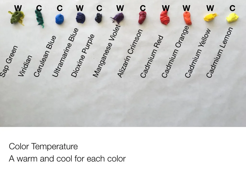

We’ve looked at Values and at Intensity, now we are going to look at COLOR TEMPERATURE. Every color has a temperature, either WARM or COOL. And all colors have a warm and cool version of their hue. Let's look at the palette on the right which shows a warm and a cool of each color except orange. (An orange with more red would technically be warmer than an orange with more yellow).
If I wrapped this palette around into a circle like a color wheel, the yellow-green would go right next to the lemon yellow. This is a great basic palette for any artist beginner to advanced as you can mix almost any color from these combinations, plus white of course. You don’t need black as you can mix your own blacks. Alizarin and Viridian make a beautiful black; you can also add Ultramarine blue into it.
*Interesting Note:
Each of these colors is a HUE (belongs to a color family), however that word can be confusing. When you see the word HUE on a paint tube it has another meaning. Cadmium Yellow Hue (for instance) on a paint tube is actually a substitute for Cadmium Yellow. In other words, it is “Cadmium Yellow Imitation” and is a less expensive product than the original. Often it is perfectly good paint, but the pigment typically is not as strong as, and can have different properties than a true Cadmium. Just something to be aware of.
ALTERNATE PALETTE LAYOUT
For those of you who have a hard time remembering your complementary colors, this bottom palette layout is an alternative. Place your warms on the top and the cools on the bottom, opposite their complements. This photo shows them close together for illustrative purposes, but the cools should be all the way at the bottom of your palette so the mixing area is in between. Of course you could to this side to side as well. Arranging a palette this way helps many people remember their complements.
WEBSITE
NOTE: If you are a paint geek (like me) and really want to know more about color temperature especially for many different colors, a great resource is the Gamblin Paint website. It is geared towards oil painters, but the information will generally hold true for acrylic painters as well. You can see the color temperature of every color that they make.
A BIT ABOUT BLUE
BLUE IS CONFUSING!!! Many many people feel this way. I’ve had lots of people ask me about Blue! As you see in the color temperature palette layout above, Ultramarine Blue is technically warm because it is closer to red, and Cerulean Blue is technically cool because it has no red in it. Red, being the warmest color on the wheel, is the determining factor. The problem is that most people don't seem to see blues that way, including me. I see warm blues as tending more towards yellow than red. Cerulean, Manganese, and Turquoise all appear much warmer to me than Ultramarine or French Ultramarine (which has even more red in it).
Blues in shadow appear to have more red in them to me than blues in the sun which appear to have more yellow. I have wondered if this is ”California Light,” but people around the world have said they see this too. You will hear me talk about Manganese or Cerulean as being warm in some of my demos and this is why. I realize that ”technically” Ultramarine Blue is warmer on the color wheel, but in my paintings I generally choose the Cerulean family for warms. You decide what you see in Blue, but know that you are not alone if you are, or have been, confused.


IT’S ALL RELATIVE
COLOR THEORY “RULES”
WARM colors come FORWARD and COOL colors RECEDE
DARK colors come FORWARD and LIGHT colors RECEDE
BRIGHT colors come FORWARD and DULL colors RECEDE
USUALLY…All rules can be broken!

Hans Hoffman “Fall Euphony” 1959
Warmer colors will appear to be “in front of” cooler colors. This is a general rule of color theory. When you want an object to look like it is behind another object, choose a cooler color, and visa versa. In the painting to the right by Hans Hoffman, he plays with his famous “Push-Pull” use of color where he painted pure abstracts with the intention of manipulating the space with color (temperature, value and intensity) “pushing and pulling” you back and forth in space.
However, all color is relative, which means it all depends on the colors that surround it. Look at the reds in the lower right. they are all technically warm, but some are warmer than the others and those come forward visually. The very dark (number 1 value) black square in the lower left comes way forward, but so does the light yellow one in the middle. He is using intensity in the yellow one to bring it forward. The dark “Forest Green” on the right should come forward because it is dark, but for me it sinks backwards because of the temperature and intensity of the colors around it. The bright yellow square in the upper right appears closer to us than the duller yellow in the left hand corner.
Hoffman is using the concepts of Temperature, Value and Intensity to manipulate space in this painting. He has used the “Rules” I posted above and also manipulated them by the juxtaposition of colors with different temperature, value and intensity (am I sounding like a broken record?). Study it for a few minutes and you will really begin to see the power of these concepts. See what “Pushes” and what ”Pulls” for you.
NOTE: In my OWN YOUR COLORS: PART 2 Class we will have at least one class on breaking the rules!
BONUS PROJECT
Create your own “Push-Pull” painting like Hans Hoffman
Use the Pinterest board images gathered for inspiration.
More HANS HOFFMAN “Push–Pull” Paintings
Throughout the classes I provide PINTEREST BOARDS for a specific relevant topic. Click on the logo to see the examples gathered.
SKETCHBOOK PEEK
When working as a designer for architects we used a simple little figure in our quick sketches of building designs. We called these figures “Tornado People.“ Little heads and tornado-y bodies and long legs. You can even make Tornado Families.
I also want you to note the relationships of hips to shoulders in the sketch on the right. They typically go at opposite angles: if one shoulder is up, the corresponding hip will be down. This simple concept can be used to great affect in simple figures.
In the next video I’m going to paint some simple figures using these concepts. Then you will get the chance to play around with them too, all while learning about color temperature!


PROJECT 3
Focus On Color Temperature To Manipulate Space
VIDEO PASSWORD: Project3
In this video I use simple figures as subject matter to demonstrate how color temperature can be used to describe space in a painting. The warmer colors coming forward and the cooler ones going back. I filmed this video twice as the first time I created very light values in the background which also creates an illusion of space, but I wanted to show that you can do this just with temperature and not necessarily value too. Both paintings are shown below so that you can see the different results.
If you want to see a master at creating beautiful paintings using simple figures and color techniques, look at the work of Robert Burridge. He is a great source of inspiration for this kind of work.
ROBERT BURRIDGE Paintings
Throughout the classes I provide PINTEREST BOARDS for a specific relevant topic. Click on the logo to see the examples gathered.
Website
See more work for inspiration.
As always, PLEASE FEEL FREE TO PICK ANY SUBJECT MATTER for this project. The “Tornado People” are only one fun option.
The colors I used on my palette for this demo going clockwise are:
Permanent Green Light
Ultramarine Blue
Manganese Blue
Titanium White
Lemon Yellow
Cadmium Yellow Dark (Medium in Winsor Newton)
Cadmium Orange
Cadmium Red
Quinacridone Red

Colour Shaper Wide
Colour Shapers are a unique tool made from silicone. The tip will not absorb any material, and so is great for applying, removing, scraping and moving color. Used alone or together with your existing tools, Colour Shapers will give you the opportunity to develop new and exciting effects. Made by Royal Sovereign in England.
NOTE: I don’t talk during every second of this video. I want to let you watch me paint and absorb what I am saying. So when you experience moments of silence that is intentional.
Also, I don’t talk about the “shoulder-hip” relationship in the video, however you can use it to illustrate a figure's position, movement and expression. Try just altering the shoulders slightly in your painting and see what your figures “say.”


Examples of paintings emphasizing Warms and Cools
Throughout the classes I provide PINTEREST BOARDS for a specific relevant topic. Click on the logo to see the examples gathered.


CLASS FOUR
Analogous Colors And The Properties Of White
ANALOGOUS COLORS
As I mentioned in the beginning under color terms, Analogous colors are colors that are next to each other on the color wheel. Typically about 4 colors next to each other. Yellow-Green, Green, Blue-Green and Blue would be an Analogous palette. Restricting your palette in this way can create beautifully harmonious paintings, and as a student of color theory, you can learn a lot by limiting your palette as well. (Hopefully you began to discover this in CLASS TWO with Complements.) We really have to think about the color temperature of each color (as well as our old friends Value and Intensity) when we don’t have that many colors to work with. Here are a few paintings using this concept. You will see other colors not strictly within the analogous palette the artist has chosen, but the predominant colors are analogous.


USING WHITE IS A BIG DEAL
COLOR THEORY RULE
WHITE both DULLS and COOLS a color
Have you ever looked at an oil painting that looks “chalky”? The colors seem dull and not vibrant? Or it looks like a cloudy day when it was supposed to be sunny? Even acrylic painters can have a similar problem with duller more pastel colors instead of bright ones. Less experienced painters often lighten their colors with white to indicate a light source. A better option to keep your colors more intense is to lighten your color with a lighter analogous color, or to simply use the analogous color as the case may be. A blue shirt in the sun, for instance might be Ultramarine Blue in the shade and Manganese blue in the sun. An apple may gradate from Alizarin Crimson to Cadmium Red Medium, then CR Light, then CR Light with Orange...all this before ever adding any white! Of course, you may still need to add white, but consider doing it after you have tried the other options.
Why? BECAUSE WHITE WILL DULL YOUR COLOR AND ALSO COOL IT. So if you are trying to show a warm sunny red sports car, Alizarin with just white in it will not look like warm light is hitting it. Actually it will pretty much look like Pepto Bismo. You are cooling it and neutralizing it (dull) instead of creating warmth and vibrancy. Make the car Aizarin in the shade and Cadmium Red light in the sun and BAM! You have a Ferrari!
To the left is a detail of a painting where I used a range of analogous colors to show the darks and lights of her dress. The result is a vibrant yellow dress. No “chalky” or pastel feeling.
CONCLUSION: Adding white will cool down your color and neutralize your color. Try using analogous, lighter colors first when mixing a lighter version of your local color.

MORE ON WHITE
AERIAL PERSPECTIVE - USING THE DULL AND COOL PROPERTIES OF WHITE TO OUR ADVANTAGE.
You have all heard of perspective drawing...don’t worry I'm not going THERE in this class. (wink) There is another way to create the feeling of perspective especially in landscape paintings and it is called Aerial Perspective which is the technique of making objects in the distance lighter and generally duller and cooler. Our atmosphere has moisture in it, and that typically creates a mist in the air, even if it is a warm day. This “mist” makes mountains and subjects further away from us appear lighter and generally cooler. This is why the rule “Lights go back and Darks come forward” is generally true (although not always) especially in landscape work.
Since white both dulls and cools, it is the perfect pigment to add to your colors to create this effect as seen in the example below.

“Cinnabar Hills” Melinda Cootsona
PROJECT 4
Use Analogous Color For Your Next Painting
VIDEO PASSWORD: Project4
Follow me as I paint a landscape using an Analogous color palette and all of the “Theories” that we have covered so far. Even though the colors are limited to mostly greens and blues I use Value, Intensity, and Color Temperature to create the illusion of depth.
I continue to use a palette knife in combination with the brush in this demo, applying the paint thickly in areas and cutting into the trees and objects to give them shape.
For your project choose four colors next to each other on your color wheel and work predominantly with them to create an Analogous painting. Remember the color ”rules” we are working with. Try using a palette knife if you are interested and it is new to you.
After years of landscape painting I can make up a simple composition like this one. You can copy this painting, or the concept or choose a different photo from this course. And, of course, you can always use your own subject matter!
The colors I used on my palette for this demo (going clockwise) are:
Permanent Green Light
Viridian
Sap Green
Ultramarine Blue
Manganese Blue
Titanium White
Lemon Yellow
Cadmium Yellow Medium
Cadmium Orange
Cadmium Red Light
Quinacridone Red
Analogous Painting Inspiration
Throughout the classes I provide PINTEREST BOARDS for a specific relevant topic. Click on the logo to see the examples gathered.


CLASS FIVE
Working With A High Key Palette
FIRST, LET’S TALK PIGMENT—ALL COLORS ARE NOT CREATED EQUAL
THE BRAND MAKES A DIFFERENCE
Pigment is the powder or substance that is the actual color of your paint. Binder is the substance that holds (binds) the pigment together and adheres it to the substrate (canvas, paper, etc.). Binder is typically linseed oil or safflower oil. The more pigment that is in your paint tube or jar, the stronger the color will be. More expensive paint has more pigment. Cheaper paint has more binder and/or cheaper pigment.
I always instruct my students to buy the BEST QUALITY paint that you can afford. Beginning students actually need THE HIGHEST QUALITY PAINT, not the cheapest. Weak pigment strength can result in muddy paint mixtures and dull “brights” very easily. Often the artist thinks these problems are a result of their poor mixing skills when in actuality it is the pigment strength that is causing the problems.
Another fact to note is that COLORS CAN VARY GREATLY BY MANUFACTURER. A Cadmium Yellow Medium can be a Cadmium Yellow Dark from another brand. On the right I show a Cerulean Blue Hue from Lukas Paint and Gamblin Paint. You can easily see that they are two different colors out of the tube.
The Gamblin paint is a higher quality paint than this particular Lukas quality (Lukas has several qualities to choose from). As I add white to the paint you can see that the tinting strength is lower—when I add white to it the color gets light quickly—which means there is less pigment. As I add white to Gamblin, the color stays relatively strong. This means that I use less of Gamblin’s Cerulean Blue paint in a mixture.

GAMBLIN versus LUKAS Cerulean Blue Hue
Cheaper paint does have its place, however. I use a combination of high quality paint and less expensive paint, but over time I have learned how the various pigments “behave”, and what I can expect of their mixing strength. Generally you will use MORE of the less expensive paint to keep the color strong, and it can be quite a bit more!
This information is important because in order to create “High Chroma” —Intense—color mixtures you need to have a high chroma color, ideally with good pigment strength, to begin with.
MINERAL COLORS AND MODERN COLORS
Mineral colors are made from pigments that come from the ground or metals. They are generally considered traditional colors since they have been around for a long time. Yellow Ochre, Burnt Sienna, the Cadmiums for example.
Modern colors are made from organic pigments “which have a molecular structure based on carbon” (per Gamblin’s website). Obviously that was probably Too Much Information, HOWEVER, what you want to know is that generally the pigment strength and chroma of Modern colors are very high. Which means that when you add white to them they are still relatively strong bright colors. You simply cannot get the same intensity with many of the Mineral colors. (To see exactly which are Mineral and which are Modern I, again, refer you to Gamblin’s website.)
Take the two cool reds Alizarin Crimson (Mineral) and Quinacridone Red (Modern). Add white to Alizarin and you will get a “Pepto Bismo” dull pink. Add white to Quinacridone and you will get a vibrant fuchsia.
The painting on the right illustrates a number of different reds from Cadmium Red in the warm shadows to Quinacridone Red with white added in the areas of the vibrant pink. The flower on the middle left shows the Alizarin with white added on the left side creating a duller pink, and the Quinacridone on the right with the white added to create a more vibrant pink. Some Ultramarine was also added to some of the darkest reds to make them darker and cooler.
I could not have achieved this range of pinks with just Alizarin Crimson. It took a combination of Mineral and Modern colors to get this intensity (Higher Chroma) in this painting.
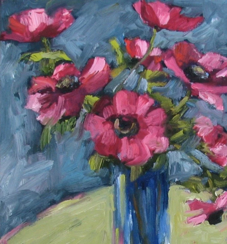
“Cosmos” (detail), Melinda Cootsona
High Chroma (Saturated) Paintings
Throughout the classes I provide PINTEREST BOARDS for a specific relevant topic. Click on the logo to see the examples gathered.

INSIDE SCOOP
If you want to know all about where pigments come from the book “Color” by Victoria Finlay is a great read. Every chapter is about a different color and how it came to be in paint, starting with Ochre and moving through the colors to Violet. A virtual travel through time in color!
HIGH KEY AND LOW KEY PAINTINGS
HIGH KEY refers to a painting that is done in values that range from 10 (white) to about 5. Therefore, it's a painting that is created mostly with light values and very few or no darks. You can remember this by thinking of the “higher numbers” 5-10 on the value scale.
LOW KEY (as you might imagine) refers to a painting that is done in values that range from 1(black) to about 5. Therefore, it’s a painting that is created mostly with dark values and few or no "lights." Conversely you can think of the “lower numbers” on the value scale.
Watch this slide show where I talk about the different types of High Key and Low Key paintings, showing lots of examples. We will mainly be focusing on Low Key paintings for the demo.
VIDEO PASSWORD: High5
PROJECT 5
Paint A High Key Painting
VIDEO PASSWORD: Project5
In this, my last demo of this e-Course, I will paint a small figurative painting in a High Key palette. I concentrate on keeping my values on the light end of the value scale 5-10. This concept is quite different from CLASS ONE, Project #1A and 1B where we matched the values of the black and white paintings. Here we are intentionally changing the values as a different approach. High Key paintings can create a very different mood or feeling from a ”Regular” or ”Full Range” painting. Think about the different moods you might create with this kind of work.
In this video I also show you my process of decision making in creating my work: trying out various shapes and colors to see what works best in the painting, letting the painting guide me. Remember all color is relative in Value, Intensity and in Temperature, so as I paint I am comparing all of these qualities to each other and adjusting each of them accordingly.
For your final project, create a High Key painting. Your colors can be brighter, or more ”pastel” (tinted with white), or neutral, and, of course, a combination of all three.
Inspirational High Key work
Throughout the classes I provide PINTEREST BOARDS for a specific relevant topic. Click on the logo to see the examples gathered.
More of WOLF KAHN’s Work
Throughout the classes I provide PINTEREST BOARDS for a specific relevant topic. Click on the logo to see the examples gathered.
NOTE: The video lasts about 42 minutes so grab a cup of coffee, tea or a glass of wine and watch me paint!
BONUS PROJECT
Paint A Low Key Painting
Inspirational Low Key work
Throughout the classes I provide PINTEREST BOARDS for a specific relevant topic. Click on the logo to see the examples gathered.

CONCLUSION
VIDEO PASSWORD: Finale

(Envision me doing a happy dance)
If you have completed these Projects you are well on your way to “Owning” your colors! Even if you have only completed a few, each one is designed to help further your understanding of color and to help you develop your mixing skills and color knowledge. I hope you enjoyed participating in this class as much as I enjoyed designing it and teaching it. Remember that all of these Projects can be interpreted, combined and re-visited in many different ways! I hope that you will continue to enjoy the Projects and discover new ways of using them.
Now go forth, play with color and create! And, no matter what, KEEP ON PAINTING!
Recommended for all Online Self Study Course Students

A Monthlong Critique Session with Melinda Cootsona
This course is perfect for students who have created work independently and wish to move forward with their study. In this course, Melinda gives specific and individual comments on your work. Receive constructive and meaningful feedback to improve and progress your work, no matter your subject matter or experience.