

“Painting an abstract is kind of like climbing Mt. Everest. Everyone who does it is one part crazy, one part eccentric, and two parts creative. Those creative parts have to do with having a vision and a craving of a creative challenge so difficult that most people shake their heads and will never-ever try ‘the ascent,’ or, more importantly, even try to understand the attempt.”

INTRODUCTION
Five Elements of Design


In this e-ssentials eCourse we are focusing on five elements of Design: Line, Value, Color, Shape, Texture. Depending on who you read there can be anywhere from five to eight elements, including three dimensional design elements, but for our purposes we are starting off with the most basic and fundamental five. These concepts are keys for all visual artists to unlock doors of understanding, inspiration, cohesiveness, creativity, composition, and so much more. They are the foundations of our art-making, much like the alphabet is to a novel.
When working with abstraction it is essential that we understand these elements and the potential that they offer to our work.
Why Abstract?

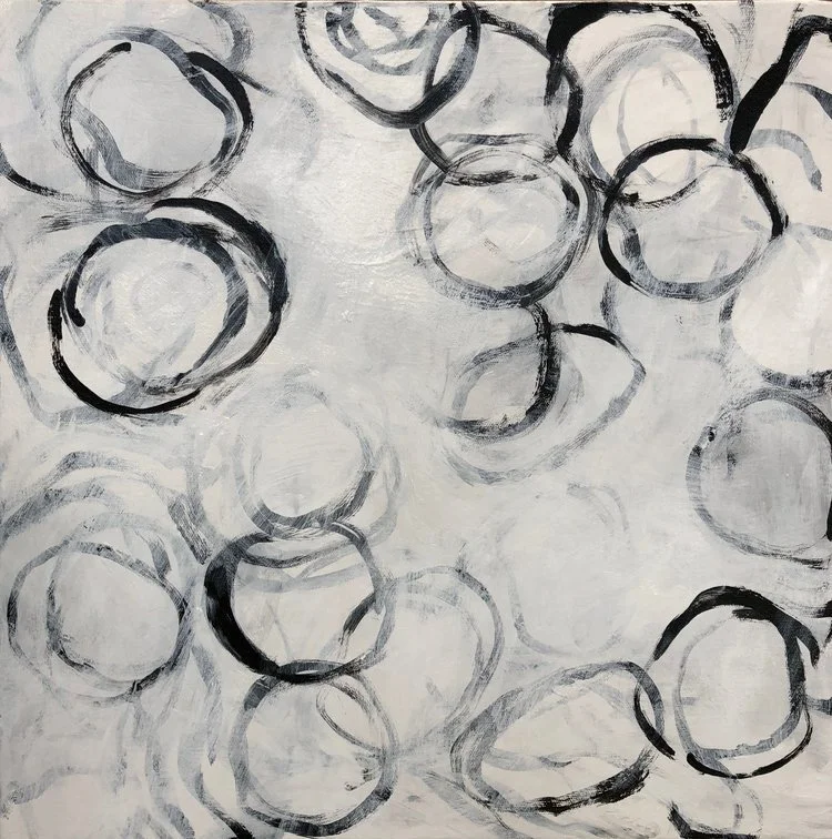
MELINDA COOTSONA, “GENIE”
Many artists agree that creating pure abstraction successfully is the most challenging of all ‘subject matter.’ When painting a still life you can look at your reference and say, “I need an ellipse here” or “the side is a dark value,” or “the table is a rectangle made of Ultramarine blue with a dash of Cerulean.” Even if the still life is imagined, many of those ‘rules’ can apply. When creating an abstract, however, ALL DECISIONS ARE IMAGINED AND DETERMINED BY YOU. There is no reference to guide you in your decision making like there is with a coffee cup, for instance, where you can see if an ellipse is off or the handle is crooked.
With an abstract painting you are constantly making choices: Dark or light? Red or Green? Large or small? Warm or Cool? Hard edge or soft edge? Push back or pull forward? EVERYTHING IS UP TO YOU. THERE IS ALWAYS MORE THAN ONE ANSWER, and on top of that, MOST OF THE CHOICES ARE SUBJECTIVE. And, honestly, it is just plain exhausting…but oh so exhilarating when you get it just right!
So if you are up to the challenge of creating something completely unique, out of your own imagination, while making it balanced and harmonious (or dis-harmonious) with rules that are all made to be broken, then you are in the right place! Welcome!
ABSTRACT ESSENTIALS BASICS
Please feel free to use whatever medium you feel comfortable with. I have tried to create videos with a wide range of mediums from charcoal to oil paint to digital. The concepts presented here apply to all mediums.
All rules can be broken. For every ‘rule’ that I give you in this course, there will be a time when the opposite is true, or when you can manipulate the rule and break it. This flexibility of the process is what makes us both crazy (full of doubt and frustration) and excited at the same time. It is helpful, however, to know these ‘rules’ (shall we call them guidelines?) so that you can control and manipulate your work with intention.
HAVING TECHNICAL OR INTERNET ISSUES?
The videos in this course are now DOWNLOADABLE! If you are watching them via WIFI, however, every now and then the videos may pause or not reload. This can happen because of slow internet speed or because several people may be using your internet at the same time. To run the videos smoothly you will need a fast internet. Periodically it has to do with Vimeo and their technology. If the latter is the case, be just a bit patient. Try refreshing your browser or possibly changing your browser. Wait a few minutes and/or try watching a different video. If it is on Vimeo’s end, this problem typically resolves itself within a short amount of time.
ONLINE ART STORES AROUND THE GLOBE
I list here several options for your painting supplies. Obviously there are many more, and I cannot list one for every country; however I try to list one for almost every continent to get you started!
USA Dick Blick, Jerry's Artarama
UK Jackson's Art , Ken Bromley
AUSTRALIA The Sydney Art Store
NEW ZEALAND Takapuna Art Supplies
EU Boesner , Van Beek Art , Le Géant des Beaux-Arts
CANADA Curry's Art, Aboveground
SOUTH AFRICA Loot
STORE LOCATOR
← Click on the logo to locate stores around the world that carry GAMBLIN products.
Let’s Get Started!
Limitations

MELINDA COOTSONA, “HONEY”
Because of the overwhelming and infinite choices in pure abstraction, many artists use limitations to help guide their work. Limitations can mean many things from a limited palette to limited emotional content, however, in this course we are going to focus on five design elements as our limitations.
LINE
VALUE
COLOR
SHAPE
TEXTURE
Hopefully the results will be two-fold; to help you narrow your choices, and also to help you focus and explore each specific element in order to better understand how it could enhance your personal work.


LINE & MARK
“LINE: The recorded movement of a dot on its journey from one place to another.”

The most basic element of art, a line was used by the earliest man/woman right up to the last word you wrote or doodled. Classically speaking, “Line” is the first fundamental element of design, however for art, and abstraction in particular, I am including “Mark” as well. A line can be BIG AND BOLD or light and airy. Squiggly or smooth, straight or curvilinear. A line has length by definition; it is “a long narrow mark.” How long or narrow is, of course, relative. In art, lines typically relate to each other somehow by intersecting, running parallel or touching. Much can be done with lines as we will see.
All Lines are Marks, but not all Marks are Lines.
“MARK: An impression, deposit or remnant left on a surface as the result of contact by a tool or object.”
Marks are infinite in description from dots to handprints, from smears to drips. In art, however, a mark represents the “hand of the maker” (as Mr. Aimone aptly points out), and therefore it embodies a recording of your process and essentially of YOU! Marks (and lines) can express meaning, emotion, movement, depth and more. Let’s look at a few ways to explore line in the video below.

CLICK to see on GOOGLE
Steven Aimone is the author of an excellent book titled, “Expressive Drawing - A Practical Guide to Freeing the Artist Within.” Unfortunately it is out of print, but if you can find one for a decent price, grab it. Search on Google and there are used copies available. He also teaches interesting workshops.
Exploring Line
Please Note: Each video in this course has its own unique password.
VIDEO PASSWORD: Charcoal
VIDEO LENGTH: 10:31 minutes
PROJECT IDEAS
FED Lines Images


MORE PROJECT IDEAS:
Diagonal Lines: Fill a page with only diagonal lines that move your eye around the page.
Emotional Lines: Fill a page with Lines expressing one emotion such as Love, Anger, Joy, or Sadness.
Musical Lines: Create a drawing of Lines and Marks while listening to your favorite song.
Talking Lines: Make a Mark with your dominant hand and then respond with a Mark from your non-dominant hand. Continue back and forth until you feel the drawing is complete.
Staccato: Fill a page with short lines and marks.
Eyes Closed: Make a drawing with your eyes closed…or at least start one that way.
Erase: Fill a page with soft charcoal and erase all of your lines.
Inspirational images of work with LINE
Throughout the classes I provide PINTEREST BOARDS for a specific relevant topic. Click on the logo to see the examples gathered.
Line and Layering
Please Note: Each video in this course has its own unique password.
VIDEO PASSWORD: Layers
VIDEO LENGTH: 21:04 minutes
Artist Focus
〰️
JERI LEDBETTER
〰️
Artist Focus 〰️ JERI LEDBETTER 〰️
Click on any image to see larger


Jeri Ledbetter uses an assortment of mixed media to create sublime and subtle works that focus mainly on line. Her work is a perfect example of the amazing versatility of line, and how expressive this ‘simple’ element can be. Here is her artist’s statement:
“Living on the Mississippi River, I find nature’s oddities compelling and inspiring. I see man-made structures, a fence, a barge, the cobble stones, all striving for survival with water, wind and vines. And time.
The contrast of, and interplay between, industry and nature are of great interest to me as an artist. When working, I cast about for the accidental, for surprises and often my labor is a scouring from low to high or from the bottom up, I find.
Rather than paint a realistic landscape or figure, for example, I let paint and pencil, instruments cast from natural objects by industry, paint the surface, much like wind and water toil against the works of man, i.e., by slow erosion, accretion and erasure.
I let the involuntary or free hand not be unduly controlled by my plan or scheme, allowing for the blessing of the unexpected line or stroke. In sum, what I do is like digging for clams on the seashore. When it works and I hear the rattle of the shells in my bucket, I smile.”
Jeri Ledbetter talks about her work
INTERPLAY New Paintings by Jeri Ledbetter and Rebecca Crowell

CONCLUSION
LINE
Now you have seen how LINE alone can be a pretty amazing source of inspiration. There are infinite ways to incorporate just this single element into your work! You might even consider spending a week or a month (or longer) on just this one concept. But let’s move on to the next element, VALUE, as it will bring even more clarity into your work.


VALUE
“The degree of lightness or darkness of a color or mark. ”

The color (hue) is not important in Value, just how light or dark it is. (Think of a black and white photo of your drawing or painting). The concept of Value is super important to grasp as it is absolutely essential to understanding color as well as indicating contrast in black and white or monochromatic work. In many classical ateliers, students use only black and white materials, such as charcoal, for years to master value before they continue with color. Of course, we don’t have that kind of time, and are going to have a lot more fun here, but the more you understand and can identify values accurately the easier the use and control of color will become for you. So, before we move to Color, you need to understand Value.
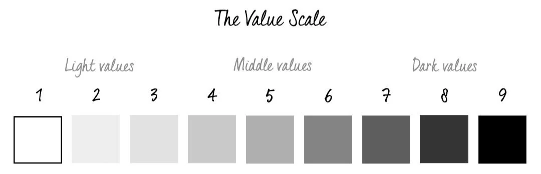
The Value Scale
Generally when we talk about Values we refer to the Value scale which, by convention, goes from 1 to 10. I have found that about half of artists say that 1 is black and 10 is white and the other half reverse this with 1 being white and 10 being black. Whichever you choose, just be sure that you are clear when you are trying to communicate with other artists. Therefore, I am going to refer to 1 as black and 10 as white. I do this mostly because we often refer to ‘High Key’ and ‘Low Key’ paintings. A Low Key painting is one that is mostly in darker values (more towards 1 or lower) and a High Key painting is one made mostly with lighter values (more towards 10 or higher).
General Rule: Dark values come forward and light values recede.
This is one of the many rules that can be broken as you will see in my video below, but generally it holds true, mostly because it is how we perceive space. Objects closer to us will appear darker than the mountains or trees in the distance (usually). This is called ‘atmospheric perspective’ – the atmosphere (moisture in the air) creates a haze that visually lightens objects in the distance. This effect can be seen pretty easily in the simple graphic image above.
The Push And Pull Of Values
Please Note: Each video in this course has its own unique password.
VIDEO PASSWORD: Push
VIDEO LENGTH: 3:34 minutes

PROJECT IDEA: Play with Push and Pull
In whatever medium you prefer use Black and White and mix various grays to create different values. Play around with shapes and see what kind of “Push/Pull” effects you can achieve with this simple concept.
Value As A Concept
Please Note: Each video in this course has its own unique password.
VIDEO PASSWORD: Light
VIDEO LENGTH: 3:03 minutes

PROJECT IDEA: Digital Fun
Use your tablet or other device (phone, computer) to create some art! Import a painting and use a black and white filter in a photo program to change your image. Then start playing with different values and shapes right on top of the painting to see what new art develops! Use the painting as a jumping off point for shapes. No risk involved!
Of course, you can always try this additionally with ‘real paint or drawing materials’ on top of an old unsuccessful painting or drawing as well. Limit your palette and really focus on values.
The Apps Procreate and Artrage work great for this, and, of course, Adobe Photoshop.
Inspirational images of work with VALUES
Throughout the classes I provide PINTEREST BOARDS for a specific relevant topic. Click on the logo to see the examples gathered.
Examples focusing solely on Value are especially difficult to find as most abstract work almost always combines Value with other Elements. In this Pinterest board there will be many instances where images are arguably about Color, Line, Texture, etc., however I tried to include works that had some emphasis on Value as well.
Simply Black and White Paint
Please Note: Each video in this course has its own unique password.
VIDEO PASSWORD: Limit
VIDEO LENGTH: 8:58 minutes

PROJECT IDEA: Simply Black and White…well almost…
Here’s the painting from the video. I truly was simply concentrating on creating a nice range of values starting with that dark black. The yellow accidentally got mixed into my white and, well, this is what we call a happy accident!
Try using simply black and white and create a wide range of values in grays to make your painting. See what you can do with this concept and how far you can run with it.
And also (just a hint) don’t forget good old ‘Line’…all of these elements can be combined!
MORE VALUE PROJECT IDEAS
Create a painting with all High Key values (5-10, light values)
Create a painting with all Low Key values (1-5, dark values)
Create a painting with black and white and one color
Print a photo out on regular printer paper and paint with color directly on top of it and try to match the values of the photo, but with colored paint
Using any medium including digital, brush out one color, then try to match its value with other colors.

CONCLUSION
VALUE
VALUE is a KEY Element in art. Developing a keen eye that sees subtle value differences in both grays and colors will not only improve your own work, but will also help you to understand the intentions of other artists.
Artist Focus
〰️
JEANE MYERS
〰️
Artist Focus 〰️ JEANE MYERS 〰️


See more work on her website:


VALUE & COLOR—A Bridge

Now that you have (hopefully) really been thinking about Value as its very own Element and have spent some time studying its effects, it’s time to look at Value AND Color together before we move specifically to Color. Many students have a difficult time understanding Value as it relates to Color. If you too find this difficult, please know that you are not alone. Learning to see the values of colors is a life long pursuit for many people. I look at color daily and am fairly well trained to see values, but I can still get it wrong. Color can be very deceptive. Before we move to Color specifically we want to look at how these two elements relate.
Where the confusion often starts….
The most difficult colors to work with ‘value-wise’ are bright colors; colors that have high intensity or ‘chroma’. These bright colors are often the culprits in sending artists off into a ‘mid-value only’ range in their work. Students often misinterpret bright colors as light colors (closer to white) when, quite often, they are 6, 7 or 8 on a value chart (1 being black and 10 being white). In the video below I think many of you will be surprised at how dark some of the values are when placed on the white. (You will also perceive color shifts from the stripes on the colors to the stripes on white. I promise you that these stripes are exactly the same grays. These perceived color changes have to do with the relativity of color that I discuss in the Color section below. (I also go into more depth on the relativity of color in my OWN YOUR COLORS: PART TWO eCourse.) Yellows are particularly deceptive as we think of them as a ‘light’ color when often they are not a 10 value, but closer to an 8 or even a 7!
Learning To See Color As A Value
Please Note: Each video in this course has its own unique password.
VIDEO PASSWORD: Yellow
VIDEO LENGTH: 3:20 minutes
In this video, I work on my iPad in Procreate. Here is a list of my steps:
I create three bright colors beginning with Blue, then Yellow followed by Red.
I then try to match their value with a neutral grey with three different stripes.
I then show you these same stripes against white so that you get a sense of their actual value.
It is surprising how different the grays appear on white!! You will not even believe that they are the same grays, but they are!
In two examples I make additional marks on the grays in the white areas to show you that they are actually different gray values since they appear so similar.
I next run the process with each color again through a black and white filter so that you can compare the value of the stripes to the value of the colors with no color distraction, and see how successful (or not) I have been in matching the value. The intent is to not even see the stripe on the color section (which is now grey) or to barely see it. You will see that I am not 100% successful.
Now YOU give it a try!
Limited Palette and Value and Working Small
In this video I work with oil and cold wax on Arches oil paper to create four different small paintings using very limited palettes. The first two have an undercoat of Indian Yellow and I then use only Mars Black, Titanium White and Cadmium Yellow Medium. The green that comes up is simply the yellow mixed with the black. The second set has an undercoat of Indian Yellow and Transparent Red Oxide. I use the same three colors adding Transparent Red Oxide. In this video I am concentrating on Color AND Value. Three of the small paintings have a wider range of values and one has very close more mid-range values. See if you can tell which is which.
Please Note: Each video in this course has its own unique password.
VIDEO PASSWORD: Colors
VIDEO LENGTH: 12:18 minutes
Now let’s move on to the next Element, Color….


COLOR
“The colors live a remarkable life of their own after they have been applied to the canvas.”

Mark Rothko
THE TOP ORANGE IS A HIGH CHROMA (BRIGHT) COLOR. THE BOTTOM RED IS A LOW CHROMA OR LOW INTENSITY (DULLER) COLOR.
There is so much to say about color that I have two eCourses devoted just to exploring it, and I still could do more! Often color is the first thing we respond to in a painting. Color creates a mood and can evoke emotions much the same way music affects us, often on a purely instinctual or ‘gut’ level.
I’m fairly certain that I don’t need to give you a definition of color, however I do want to clarify a few color terms so that we are all ‘talking the same language.’
HUE
Basically a color family: Red, Blue, Yellow, Green, Violet, and Orange. Every color is part of one of these color families. Thus, every color has a "hue."
CHROMA
The brightness or INTENSITY of a color. Cadmium Red Light (for instance) straight from the tube is an example of high-chroma color. In contrast, a grey-blue, for instance, would be a more neutral, “greyed-down,” or “duller” color.
TEMPERATURE
Whether a color is warm or cool. Warmer colors lean towards reds and yellows while cooler colors lean towards blues. For a good reference chart of which colors are warm and which are cool, see the GAMBLIN website link below. This is an oil paint chart, however there are many overlapping colors with water based mediums.
TRANSPARENT AND OPAQUE
Every paint color has a degree of transparency and opacity. These qualities are something to keep in mind when choosing and using color. Most paint tubes and charts will show a rating of Transparent, Semi-Transparent or Opaque.
COMPLEMENTARY COLORS
These are colors that are opposite each other on a color chart. This is important to know for many reasons, but most importantly, when you mix complementary colors you will get a neutral version, or gray of those colors, which will be much richer, generally, then a gray created with black and a color. Examples of complements include: red and green, blue and orange, yellow and purple.
CLICK ON LOGO TO VIEW CHART
Visit the GAMBLIN website for a REFERENCE CHART of which colors are warm and which are cool.
The Push And Pull Of Color
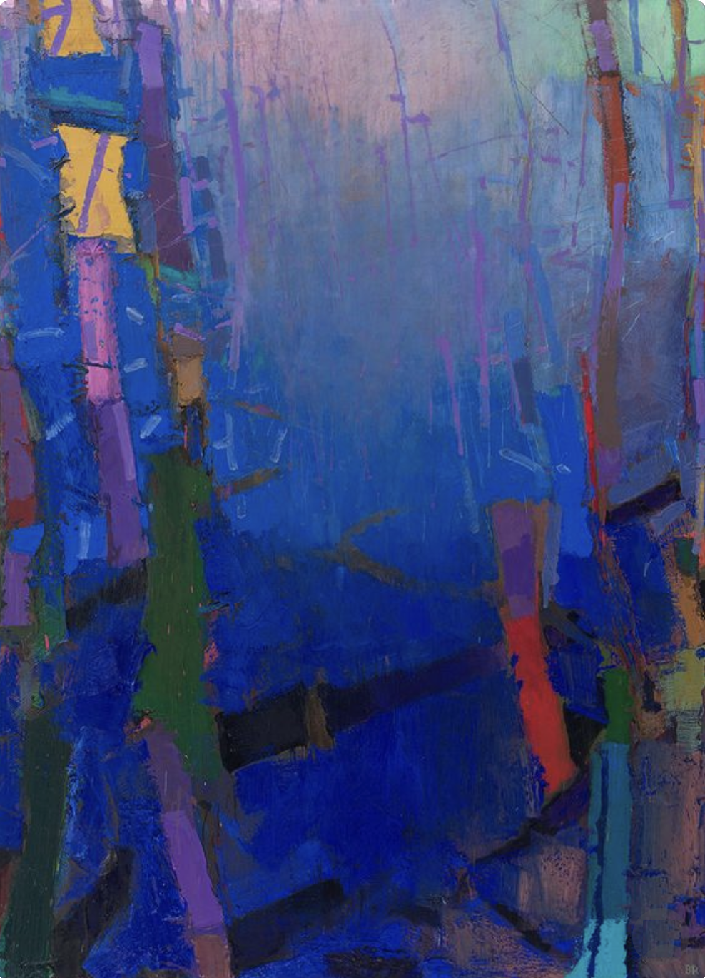
Brian Rutenberg
We looked at the push and pull of value, and now let’s look at it with color. These concepts are important to know so that you can use color with intention. The more you understand color theory, the more you will be able to control the outcome of your paintings. I’m all for intuitive and responsive work, but having a good foundation lets you run with your intuition without thinking about the ‘rules.’ Again, like knowing the alphabet and writing the essay…
Often when working with color artists like to manipulate the illusion of space creating a sense of depth in their work. Rutenberg’s work to the right is a perfect example of this quality. Even though this work has a landscape feel to it, artists working with pure abstraction use this technique as well.
GENERAL COLOR RULES:
Colors That Come FORWARD
WARM ▪ BRIGHT (HIGH CHROMA) ▪ DARK
Colors That RECEDE
COOL ▪ DULL (NEUTRAL OR GRAYED) ▪ LIGHT
I give you these ‘rules’ with the caveat that:
‘All Rules Can be Broken.’ I just want you to KNOW what rules you are breaking.
AND…on that note, one final thought from artist Helen Frankenthaler:
“There are no rules. That is how art is born, how breakthroughs happen. Go against the rules or ignore the rules. That is what invention is about.”
The Relativity Of Color
“When you really understand that each color is changed by a changed environment, you eventually find that you have learned about life as well as about color.”
HANS HOFMANN and JOSEF ALBERS
Hans Hofmann and Josef Albers each spent a lifetime studying color. They were both particularly interested in the relativity of color or, more simply put, how one color can affect another. In the following slide show, I show several images and talk about these two artist’s intentions.

Hans Hofmann
GERMAN-AMERICAN PAINTER AND THEORETICIAN
Born: March 21, 1880 - Weissenberg, Bavaria
Died: February 17, 1966 - New York City, NY
Movements and Styles: Abstract Expressionism

Josef Albers
AMERICAN PAINTER, POET, SCULPTOR, TEACHER, AND THEORETICIAN
Born: March 19 1888 - Bottrop, Germany
Died: March 25 1976 - New Haven, CT, USA
Movements and Styles: Bauhaus, Geometric Abstraction, Op Art
Please Note: Each video in this course has its own unique password.
VIDEO PASSWORD: Hofmann
VIDEO LENGTH: 3:53 minutes
COLOR PROJECT IDEAS:
Focus on creating the illusion of depth in an abstract painting with the use of color.
Create a “push pull” painting aka Hofmann and experiment with the interaction of colors, values and chroma.
Use a palette close in value AND intensity and emphasize complements (see “Good Vibrations”below). The result may be a mid-value painting, but you will be creating it intentionally. Feel free to add some darks and lights!
Try some rule breaking like making light colors come forward and dark colors recede.
Have a ton of fun with this Interaction of Color APP for iOS devices based on Josef Albers’ book.

Interaction of Color APP (Trial)
This app is available only on the App Store for iPad.
Good Vibrations Looking at the Chroma of Color

Try to match the Value AND Intensity of colors as one approach to create harmonious palettes that vibrate.
Why do some colors vibrate when placed next to each other? Well, I can’t tell you the science behind this, but I can tell you how to get these results. Complementary colors (refer to definitions) will often vibrate when placed next to each other. Complementary colors of the SAME VALUE will vibrate even more. Complementary colors with the SAME VALUE AND SAME INTENSITY (refer to definitions) will vibrate even more more!!
As you can see in this example, the orange stripes and blue background are really jumping, however all of the colors are creating a very harmonious palette. This is because they are all very close in both Value and Chroma (Intensity). You can create gorgeous color harmonies by actually keeping a tight/close range of values AND intensities. More ‘alphabet’ for your soup!
Inspirational images of paintings emphasizing COLORS
Throughout the classes I provide PINTEREST BOARDS for a specific relevant topic. Click on the logo to see the examples gathered.
Playing the Blues - Expression by Emphasizing ONE Color
In this Demo I, again, work with a limited palette concentrating this time on the color blue. My intention here is simply to create a painting with predominantly blue. I use several different blues (my palette is listed below), along with some warms to help create more neutral blues and cooler (more violet) blues. I am playing with Color, Value, Line and Shape (coming up next!). I work at varying each element to give the painting contrast and interest throughout. Setting up these kinds of limitations can focus your work and your decision making and often leads to greater creativity.
Please Note: Each video in this course has its own unique password.
VIDEO PASSWORD: Cobalt
VIDEO LENGTH: 20:58 minutes
Palette colors left to right:
VanDyke Brown, Transparent Red Oxide, Gold Ochre, Quinacridone Red, Cadmium Orange Hue, Titanium White, Titanium Buff, Ultramarine Blue, Cerulean Blue, Transparent Turquoise, Gamblin Gel Medium, Cold Wax


Two different examples of “Playing the Blues.” In both instances I was concentrating on varying the values, colors and intensities of the blues while adding in neutrals as well. These paintings are each 16” x 16".” Artists often produce a series of paintings working with the same concept/process. This practice can create surprises and lead to new ways of working and thinking about your work.
Remember Your Neutrals
Neutrals are colors too! Amazing, beautiful paintings can be created with neutrals alone. Remember neutrals help to set off brighter more saturated colors. Sometimes a painting that is created with all saturated (High Chroma) color is like having all dessert for dinner; a bit too concentrated on one set of taste buds. Neutrals can balance and give richness and even more depth to those brighter colors. In addition, neutrals themselves are some of the MOST beautiful colors!
Witness the the neutrals in the beautiful paintings of Rebecca Crowell below. Rebecca’s neutrals make the more saturated colors ‘sing.’ We will look further at Rebecca’s work when we get to the Element Texture.
Artist Focus
〰️
REBECCA CROWELL
〰️
Artist Focus 〰️ REBECCA CROWELL 〰️
Click on any image to view larger


Using Emotion and Surprise with Color
Many artists use these two concepts in their work. In this video we look at Mark Rothko and Barnett Newman both of whom were specifically concentrating on the emotional qualities of color. They wanted viewers to stand close to their large works to experience physical and emotional sensations. The viewers were/are to feel an existential sense of themselves within the universe while ‘enveloped’ in the expansive color of the paintings.
The next two artists we see are Helen Frankenthaler and Gerhard Richter. Both of these artists work very differently, but both are using surprise and unpredictability of color and paint in their process. Frankenthaler works with pours of paint and their unpredictable reactions with each other and the canvas itself, while Richter works with layers of paint which he then squeegees off to reveal the hidden history below.
Please Note: Each video in this course has its own unique password.
VIDEO PASSWORD: Surprise
VIDEO LENGTH: 5:43 minutes
MORE COLOR PROJECT IDEAS
Create a series of paintings based on an emotion, using color to focus your work.
Create a painting with mostly neutrals and just some pops (a pop?) of brighter colors.
Use a very large canvas and a very limited palette to elicit an emotional response with color.
Use oil paint (and cold wax as an option) to create several layers on a panel and scrape back like Richter to uncover the history. Repeat this layering and removing process. You can do this with acrylic too, but work fast
Try pouring paint with acrylics ala Frankenthaler and see what surprises you can get on your canvas or panel. Think of combining this technique with layering as well. (There are lots of how-to videos on acrylic pours on Youtube.
Pick a temperature like 90F or 32.2C and interpret it with a painting of color.
Artist Focus
〰️
BRIAN RUTENBERG
〰️
Artist Focus 〰️ BRIAN RUTENBERG 〰️
Click on any image to view larger


Brian Rutenberg’s work is an explosion of color. Landscape inspired, yet clearly abstract, his paintings pull you into his world of color, space and texture. When seen in person, you will immediately notice the three dimensionality of his thickly applied oil paint, which contributes to the sense of depth that otherwise is created purely with color. One can’t help but be mesmerized by his use of lush, saturated (high chroma) jewel tones along side rich neutrals that harmonize and unite the work. You will also notice a lot of rule breaking going on. Here is a master of Color at ease with ALL of the Elements.

Clear Seeing Place: Studio Visits
From the salt marshes and moss-draped live oaks of the South Carolina Lowcountry to the New York art world, Clear Seeing Place takes the reader behind the studio door to explore the making of a painter in intimate detail.
CLICK ON LOGO to listen to Brian talk about his work

CLICK ON LOGO to see more work on his website

CONCLUSION
COLOR
COLOR is often the first Element that we see or notice in a painting. We frequently respond emotionally to Color before we even perceive the subject matter of a painting. We can use Color to manipulate space as well as emotions, drawing people into our work. Focusing on Color alone can be a lifetime interest as well as a very fun limitation in abstraction!

Melina Cootsona


SHAPE & FORM
“A SHAPE is defined as a two dimensional area that stands out from the space next to or around it due to a defined or implied boundary, or because of differences of value, color, or texture. Shapes are recognizable objects and forms and are usually composed of other elements of design.
In visual design, FORM may be described as any three-dimensional object. Form is defined by light and dark. It can be defined by the presence of shadows on surfaces or faces of an object.”

Melinda Cootsona, “Morning Cup”
Shapes can be geometric or organic, hard-lined or with soft, indefinite edges. Shapes are fundamentally made up of at least one of the other elements (Line, Value, Color, Texture).
We deal with two-dimensional shapes and three-dimensional forms every day in our material world. We get used to thinking of forms as ‘things,’ such as a lamp, or a tree or a human form. Artists who practice drawing from life learn to separate shapes and forms from ‘things.’ We try to delete the connotation of ‘things’ from our minds and reduce each item down to a shape. We work to see complicated imagery like a face or landscape as simple shapes in order to translate three dimensions onto a two dimensional surface.* When truly viewed this way, all paintings become works of abstraction.
*For the purpose of this course we are focusing on two-dimensional design, however artists dealing with Form and three-dimensional work clearly learn to concentrate on shape as well.
Positive and Negative Space
Artists often talk about ‘Positive’ and ‘Negative’ space. Positive space generally refers to the ‘thing’ or object, and Negative space refers to the space around the object. The photos below illustrate this concept. Both Positive and Negative space can essentially be translated as shapes and should be seen by the artist as equal in importance. It’s important to understand this concept as we move to the section below.
All Shapes are Created Equal
“All shapes are created equal” is a mantra that you will hear me say often in workshops. Students tend to focus on the Positive shapes and forget or neglect until the ‘end’ the space around the ‘object.’ When a viewer sees a painting, she may see the object first, however the painting will only stand up to repeated interest if it comes together as a whole. Of course this is dependent on many factors including composition, but learning to see each shape in your work as equally important is vital to creating strong imagery and particularly essential in abstract work. To some degree, it’s like putting together a puzzle where each piece completes the whole.
Shape Shifting Project
In the video below I take two different realist paintings into Procreate and cover the shapes with new colors to create abstract images. A realist painting should essentially hold up as an abstract in terms of shapes. If you paint realist work as well, this is a fun exercise to help you really focus on shape. You can do this digitally in a program like Procreate or Photoshop, or you can take a photo of your work, print it out in black and white and paint directly on the paper for a fun exercise.


Please Note: Each video in this course has its own unique password.
VIDEO PASSWORD: Shapes
VIDEO LENGTH: 2:03 minutes
SHAPE MASTERS
Click on any image to visit their website


Dancing with Abstraction
“(Shapes) are unique elements in a unique situation. They are organisms with volition and a passion for self assertion. They move with internal freedom, and without need to conform with what is probable in the familiar world.”
What is Rothko saying here?
In essence I think he is reminding us of two important concepts. If you have painted much at all you will have had the experience of imagining a painting will turn out one way and, as you work, it takes an entirely different direction. It feels as if the painting has a mind of its own…”(an organism) with volition and a passion for self assertion.” As abstract artists we specifically need to recognize and respond to these shapes and to the painting.
Rothko also reminds us to look at the shapes we create in terms of what is necessary for the painting and not as “what need(s) to conform with what is probable in the familiar world.” Shapes not things.
“Like dancing with a partner, the painting and the artist must interact with sensitivity and some degree of passion.”

Mark Rothko
Artist Focus
〰️
KAREN DARLING
〰️
Artist Focus 〰️ KAREN DARLING 〰️
Click on any image to see larger. Visit her website to see more.


Focus on a Single Shape
The works above are by the artist Karen Darling. At one point in her career she was learning to use cold wax medium and decided to concentrate solely on circles and crosses as imagery. These are a few works from her circle series. Using one or two shapes as a limitation is a great way to explore abstraction and push your creativity as you can see from her results above. (And don’t forget artists like Albers and Rothko!)
Paintings focusing on SHAPES
Throughout the classes I provide PINTEREST BOARDS for a specific relevant topic. Click on the logo to see the examples gathered.
Image as a Starting Point
In this video I take a photo of a landscape and use it as a starting point for shapes. I am really only looking at shapes, not colors or even values so much, although values sometimes become shapes. You will see that the photo was really only a ‘jumping off point.’ Coincidentally I read this quotation the day after I filmed this video in an essay by Ruth E Fine speaking of Richard Diebenkorn.
“He often started from forms discovered in the visible world, transforming them as abstraction…and while one may guess as to a composition’s origins, it is the transformation that matters, the starting point becoming increasingly inconsequential to understanding subsequent moves. One does have to start from something, but that something may become invisible.”
Please Note: Each video in this course has its own unique password.
VIDEO PASSWORD: Pink
VIDEO LENGTH: 22:00 minutes
Palette colors from left to right: Gold Ochre, Quinachridone Red, Cadmium Red Light, Cadmium Orange, Cadmium Yellow, Cadmium Lemon, Titanium white, Permanent Green Light, Ultramarine Blue, Transparent Red Oxide, Mars Black, Gel Medium, Cold Wax Medium. Oil Bar = R & F Black
MORE PROJECT SHAPE IDEAS
Work with predominantly hard-edged shapes.
Work with predominantly soft-edged, ethereal shapes.
Create a series focusing on one shape ‘ala’ Karen Darling.
Focus on all organic shapes and curved lines.
Create a piece full of shapes and connect them with lines.
Work with repetition. Repeat two or more shapes covering your surface. Vary the sizes and interpretations of the shapes.

Richard Diebenkorn:
The Catalogue Raisonné
A four-volume definitive resource on the career and unique works of the postwar American artist Richard Diebenkorn (1922–1993)

Artist Focus
〰️
SANDY OSTRAU
〰️
Artist Focus 〰️ SANDY OSTRAU 〰️
Click on any image to view larger. Visit her website to see more work.


Sandy Ostrau’s work is driven by shape and color, however, shape is dominant. Like Rutenberg, her inspiration is the landscape, but her paintings are abstracted visions of our world. Ostrau looks for the essence of a place and reduces ‘things’ to an abstraction of shape and color that you can walk into. Here is her artist statement:
“I take scenes of everyday life— people, places and activities— and reduce them to their fundamental elements. I strip away the superfluous detail and minutiae of the moment in order to present each scenario in its essence. At a certain point, specific content is not that important or even relevant, but rather what appears to be going on, creating situations that can be observed or contemplated in more universal ways.”

CONCLUSION
SHAPE
SHAPES are infinite in variety; soft, hard, geometric, organic, on and on. Learning to see all of the Shapes on your canvas as equal in importance is key to understanding your composition and seeing the painting as a whole. Certain Shapes may be central to your composition or be focal points, but paying attention to them all equally as the artist/creator will help you in both realist and abstract work.

Melinda Cootsona, “When I Was Young”


TEXTURE & PATTERN
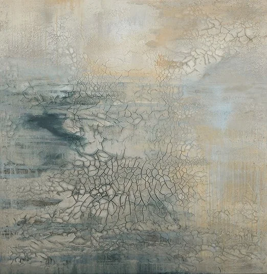
Danae Mattes, “Interior III”
Click on the image to see more of her work
Texture is the way a surface feels or is perceived to feel. Tactile texture is the actual three-dimensional feel of a surface. Visual texture is the illusion of peaks and valleys on the surface.
Pattern is typically made up of repeated shapes so it crosses Elements, but sometimes Pattern can read as textural. I include it here with Texture as artists often use Pattern as a textural Element even though the meaning of each is quite different.
Texture can be a compelling contrast to the other four Elements as seen in the painting on the right by Danae Mattes. When used next to flat areas or shapes, Texture provides depth and interest often pulling people literally closer to the work. How often have you seen a painting that you must peer at closely to see the brushwork or other textural marks on the surface?
Sixteen Artists – Sixteen Approaches: A Slide Show of Texture and Pattern
Please Note: Each video in this course has its own unique password.
VIDEO PASSWORD: Sixteen
VIDEO LENGTH: 9:41 minutes
ARTISTS INCLUDED (in order of appearance):
Click on any artist name to see more of their work
[1] Brian Rutenberg [2] Joan Brown [3] Joshua Meyer [4] Jerry McLaughlin [5] Danae Mattes [6] Tracey Adams [7] Irene Zweig [8] Michael Buscemi [9] Matt Gonzalez [10] Jenifer Kent [11] Sam Messenger [12] Amber Brookman [13] Kim Frohsin [14] Mark Fox [15] Agnes Martin [16] Cordula Kagelmann
Some Ideas On Materials
As we’ve seen in the examples above, texture is often (but not always) created with more than just paint alone. Texture can involve three dimensions which is generally achieved by adding something to the paint. Below I list a few mediums for oil and acrylic that you might like to experiment with. Acrylic painters do have more options in terms of store bought mediums.
OIL PAINT


Oil painters do not have as many options in this category as acrylic painters. If you are willing to experiment with non-traditional materials, such as Danae Mattes does with clay, or McLaughlin with ash, sand, and dirt, the world is your oyster!
Note: Many artists use acrylic textured mediums, such as those on the right, as their base layer for oil paints. Be sure to let this layer dry before applying oils. I do not work this way so I cannot attest to the permanence of this method. I would just caution you that your painting may not be archival (hold up) over time. However, it also could be just fine.
ACRYLIC PAINT
Golden alone has a plethora of mediums for your exploration! Here are just a few with links to descriptions:


PRICKLY AND SMOOTH!
Emotive Qualities of Texture
TEXTURE involves more than just our visual sense. Texture is tactile. Not only do we literally feel (touch) surfaces, but texture can additionally imply emotional feelings or responses. Think of how the following words make you feel:
Sharp · Pebbly · Smooth · Soft · Crackly · Silky · Rough · Spiky
We can use Texture in our artwork to imply, portray or emphasize a multitude of emotional qualities. Try creating texture with an emotional intent…
Paint as Texture
In this video I paint an abstracted landscape from my imagination based on the California hills that surround me. I obviously exaggerate colors and shapes. I am working with thick oil paint adding cold wax medium only some of the time. I have painted 100’s of landscapes like this without cold wax with the same result. The wax helps me with the demo, drying time and does give added stiffness to the paint.
Please Note: Each video in this course has its own unique password.
VIDEO PASSWORD: Texture
VIDEO LENGTH: 19:32 minutes
Palette Colors Clockwise: Quinacridone Red, Cadmium Red Light, Cadmium Orange, Gold Ochre (added), Cadmium Yellow Medium, Cadmium Yellow Lemon, Titanium White, Yellow-Green (Georgian), Green Gold, Ultramarine Blue, Van Dyke Brown, Cold Wax Medium.
TEXTURE in Abstraction
Throughout the classes I provide PINTEREST BOARDS for a specific relevant topic. Click on the logo to see the examples gathered.
More Texture Ideas in both Acrylic and Oil
Please Note: Each video in this course has its own unique password.
VIDEO PASSWORD: Texture
VIDEO LENGTH: 23:28 minutes
Materials Used:
ACRYLIC DEMO
Medium: Golden Crackle Paste
Dry Pigment: Gamblin Ultramarine Blue
Paint: Transparent Red Oxide, Cadmium Red Light, Cobalt Blue, Yellow Ochre, Titanium White
OIL DEMO
Medium: Cold Wax, Marble Powder
Dry Pigment: Gamblin Titanium White
Paint: Ultramarine Blue, Van Dyke Brown
Pan Pastels: Red, Yellow
Squeegee and Brayer by Squeegee Press
Click on any image below to visit the website for purchase


MORE TEXTURE PROJECT IDEAS
Experiment with a new medium and see what it brings to your work.
Use acrylic gel medium or an archival glue to collage paper or other materials onto your support (paper or panel supports are best) to create texture. Hint: these papers can also include pattern). If working with oil paint be sure to cover the paper layer with clear gesso before continuing with oil paint.
Use unusual mark making instruments to imprint texture into your work. Some ideas are whisk brooms, kitchen tools, burlap, bubble wrap, string, corrugated cardboard.
Use only (or mostly) a palette knife to paint and intentionally use the thick paint as texture. Try to create different textures throughout the painting, smooth and flat vs rough and textural.
Think about finishes as textural. Glossy vs flat. Use mediums to create more than one finish in your work.
MORE TEXTURE EXAMPLES
〰️
MORE TEXTURE EXAMPLES 〰️
Click on any image below to see artists’ websites for more inspiration


There are infinite ways to create Texture and Pattern. The artists above use a variety of materials. Dalton uses image transfer, Cutlip uses collage, and I used oil and cold wax on board scraping back into the wax to reveal layers beneath.
Using Stencils As Pattern
I have often used stencils for a textural pattern in my work. They can create interest and surprises. They can also simply give me something to react to on the canvas. I’ve used numbers and letters and all kinds of shapes. I have also made my own stencils.
In this video I create a painting digitally using ‘stencil’ patterns within Procreate. It is very much the same way that I work with oils, by trial and error. At the end of the video I show several of my own finished paintings that include stencil work.
Please Note: Each video in this course has its own unique password.
VIDEO PASSWORD: Stencil
VIDEO LENGTH: 2:46 minutes

A great resource for STENCILS

Melinda Cootsona, “She Demanded Red”
Pattern Project Ideas
I used several stencils in this painting “She Demanded Red”.
Choose a Pattern and repeat it throughout the painting. Choose an emotion to go with it. Then create a second painting using the same Pattern, but focus on, and try to represent a contrasting emotion. See how the two works differ. (Think of Amber Brookman, Tracey Adams or Agnes Martin.)
Use stencils to create patterns. Let them repeat and work in layers so that they become buried into the work. Some may be completely covered while others appear more ‘on top.’
Use corrugated cardboard or another textured surface as a ‘stamp’ to apply patterns in your work.
Use Emulsion transfer to lift patterns and transfer them to your work. Watch the YouTube below:
Artist Focus
〰️
REBECCA CROWELL
〰️
Artist Focus 〰️ REBECCA CROWELL 〰️
Click on any image to view larger
Rebecca Crowell works with oil and cold wax building up layers and layers of texture. She travels extensively and works to evoke a sense of place in her paintings, taking inspiration from nature, its colors, shapes, forms and…texture! The work appears patinated as though created centuries ago and gracefully aged over time. The cold wax provides a level of transparency that is hard to capture in photographs but creates a depth to the work that partially reveals the history beneath.

See more work

Listen to Rebecca talk about her work
This content is now only available to members of Savvy Painter (unfortunately).
Audio interview on SavvyPainter.com

CONCLUSION
TEXTURE & PATTERN
Texture and Pattern are often used to add interest and an added level of depth (literally and figuratively) to artwork, however some artists explore texture in and of itself as subject matter. People can perceive emotional qualities in Texture very much the same way they do with color, often immediate and instinctive.
Honestly, I found Texture a joy to research for this course. I discovered many new artists and began to see textural work in an entirely new way. In my work, texture has always been important whether working with purely thick paint (similar to my demo), working with shiny vs flat finishes, or working with imprinting texture into cold wax. However, texture has never been primary to my art, but rather a ‘supporting actor,’ so examining it as a direct approach was new for me.
I hope that this glimpse into the vast world of Texture opens your eyes to new possibilities in your work as well.
Please Note: Each video in this course has its own unique password.
VIDEO PASSWORD: Paint
VIDEO LENGTH: 0:53 minutes

Melina Cootsona

You have now learned about the Five Fundamental Elements of Design!
These elements are used throughout all art from painting to architecture, interior design, graphic design, sculpture and everything in between. They will certainly be useful with any subject matter you choose, but as you work more with abstraction they become increasingly important to understanding balance and composition (or design). These Elements can also help to focus your abstract work as you learn to use them to guide your choices. I hope that you continue to explore them as your work evolves and thrives!
Until we meet again….KEEP ON PAINTING!

Recommended for all Online Self Study Course Students

A Monthlong Critique Session with Melinda Cootsona
This course is perfect for students who have created work independently and wish to move forward with their study. In this course, Melinda gives specific and individual comments on your work. Receive constructive and meaningful feedback to improve and progress your work, no matter your subject matter or experience.