


VALUE
“The degree of lightness or darkness of a color or mark. ”

The color (hue) is not important in Value, just how light or dark it is. (Think of a black and white photo of your drawing or painting). The concept of Value is super important to grasp as it is absolutely essential to understanding color as well as indicating contrast in black and white or monochromatic work. In many classical ateliers, students use only black and white materials, such as charcoal, for years to master value before they continue with color. Of course, we don’t have that kind of time, and are going to have a lot more fun here, but the more you understand and can identify values accurately the easier the use and control of color will become for you. So, before we move to Color, you need to understand Value.
The Value Scale
Generally when we talk about Values we refer to the Value scale which, by convention, goes from 1 to 10. I have found that about half of artists say that 1 is black and 10 is white and the other half reverse this with 1 being white and 10 being black. Whichever you choose, just be sure that you are clear when you are trying to communicate with other artists. Therefore, I am going to refer to 1 as black and 10 as white. I do this mostly because we often refer to ‘High Key’ and ‘Low Key’ paintings. A Low Key painting is one that is mostly in darker values (more towards 1 or lower) and a High Key painting is one made mostly with lighter values (more towards 10 or higher).
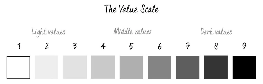
General Rule: Dark values come forward and light values recede.
This is one of the many rules that can be broken as you will see in my video below, but generally it holds true, mostly because it is how we perceive space. Objects closer to us will appear darker than the mountains or trees in the distance (usually). This is called ‘atmospheric perspective’ – the atmosphere (moisture in the air) creates a haze that visually lightens objects in the distance. This effect can be seen pretty easily in the simple graphic image above.
The Push And Pull Of Values
Please Note: Each video in this course has its own unique password.
VIDEO PASSWORD: Push
VIDEO LENGTH: 3:34 minutes

PROJECT IDEA: Play with Push and Pull
In whatever medium you prefer use Black and White and mix various grays to create different values. Play around with shapes and see what kind of “Push/Pull” effects you can achieve with this simple concept.
Value As A Concept
Please Note: Each video in this course has its own unique password.
VIDEO PASSWORD: Light
VIDEO LENGTH: 3:03 minutes

PROJECT IDEA: Digital Fun
Use your tablet or other device (phone, computer) to create some art! Import a painting and use a black and white filter in a photo program to change your image. Then start playing with different values and shapes right on top of the painting to see what new art develops! Use the painting as a jumping off point for shapes. No risk involved!
Of course, you can always try this additionally with ‘real paint or drawing materials’ on top of an old unsuccessful painting or drawing as well. Limit your palette and really focus on values.
The Apps Procreate and Artrage work great for this, and, of course, Adobe Photoshop.
Inspirational images of work with VALUES
Throughout the classes I provide PINTEREST BOARDS for a specific relevant topic. Click on the logo to see the examples gathered.
Examples focusing solely on Value are especially difficult to find as most abstract work almost always combines Value with other Elements. In this Pinterest board there will be many instances where images are arguably about Color, Line, Texture, etc., however I tried to include works that had some emphasis on Value as well.
Simply Black and White Paint
Please Note: Each video in this course has its own unique password.
VIDEO PASSWORD: Limit
VIDEO LENGTH: 8:58 minutes

PROJECT IDEA: Simply Black and White…well almost…
Here’s the painting from the video. I truly was simply concentrating on creating a nice range of values starting with that dark black. The yellow accidentally got mixed into my white and, well, this is what we call a happy accident!
Try using simply black and white and create a wide range of values in grays to make your painting. See what you can do with this concept and how far you can run with it.
And also (just a hint) don’t forget good old ‘Line’…all of these elements can be combined!
MORE VALUE PROJECT IDEAS
Create a painting with all High Key values (5-10, light values)
Create a painting with all Low Key values (1-5, dark values)
Create a painting with black and white and one color
Print a photo out on regular printer paper and paint with color directly on top of it and try to match the values of the photo, but with colored paint
Using any medium including digital, brush out one color, then try to match its value with other colors.

CONCLUSION
VALUE
VALUE is a KEY Element in art. Developing a keen eye that sees subtle value differences in both grays and colors will not only improve your own work, but will also help you to understand the intentions of other artists.
Artist Focus
〰️
JEANE MYERS
〰️
Artist Focus 〰️ JEANE MYERS 〰️


See more work on her website:


VALUE & COLOR—A Bridge

Now that you have (hopefully) really been thinking about Value as its very own Element and have spent some time studying its effects, it’s time to look at Value AND Color together before we move specifically to Color. Many students have a difficult time understanding Value as it relates to Color. If you too find this difficult, please know that you are not alone. Learning to see the values of colors is a life long pursuit for many people. I look at color daily and am fairly well trained to see values, but I can still get it wrong. Color can be very deceptive. Before we move to Color specifically we want to look at how these two elements relate.
Where the confusion often starts….
The most difficult colors to work with ‘value-wise’ are bright colors; colors that have high intensity or ‘chroma’. These bright colors are often the culprits in sending artists off into a ‘mid-value only’ range in their work. Students often misinterpret bright colors as light colors (closer to white) when, quite often, they are 6, 7 or 8 on a value chart (1 being black and 10 being white). In the video below I think many of you will be surprised at how dark some of the values are when placed on the white. (You will also perceive color shifts from the stripes on the colors to the stripes on white. I promise you that these stripes are exactly the same grays. These perceived color changes have to do with the relativity of color that I discuss in the Color section below. (I also go into more depth on the relativity of color in my OWN YOUR COLORS: PART TWO eCourse.) Yellows are particularly deceptive as we think of them as a ‘light’ color when often they are not a 10 value, but closer to an 8 or even a 7!
Learning To See Color As A Value
Please Note: Each video in this course has its own unique password.
VIDEO PASSWORD: Yellow
VIDEO LENGTH: 3:20 minutes
In this video, I work on my iPad in Procreate. Here is a list of my steps:
I create three bright colors beginning with Blue, then Yellow followed by Red.
I then try to match their value with a neutral grey with three different stripes.
I then show you these same stripes against white so that you get a sense of their actual value.
It is surprising how different the grays appear on white!! You will not even believe that they are the same grays, but they are!
In two examples I make additional marks on the grays in the white areas to show you that they are actually different gray values since they appear so similar.
I next run the process with each color again through a black and white filter so that you can compare the value of the stripes to the value of the colors with no color distraction, and see how successful (or not) I have been in matching the value. The intent is to not even see the stripe on the color section (which is now grey) or to barely see it. You will see that I am not 100% successful.
Now YOU give it a try!
Limited Palette and Value and Working Small
In this video I work with oil and cold wax on Arches oil paper to create four different small paintings using very limited palettes. The first two have an undercoat of Indian Yellow and I then use only Mars Black, Titanium White and Cadmium Yellow Medium. The green that comes up is simply the yellow mixed with the black. The second set has an undercoat of Indian Yellow and Transparent Red Oxide. I use the same three colors adding Transparent Red Oxide. In this video I am concentrating on Color AND Value. Three of the small paintings have a wider range of values and one has very close more mid-range values. See if you can tell which is which.
Please Note: Each video in this course has its own unique password.
VIDEO PASSWORD: Colors
VIDEO LENGTH: 12:18 minutes