
colorwise

INTRODUCTION
ColorWise: Mastering Harmonious Color
Welcome! Bienvenue! Willkommen!
Quick Review of Color Terms
I use these terms throughout this course and want to make certain that you understand them.
-
Basically a color family such as Red, Blue, Yellow, Green, Violet, and Orange. We can break these down further into Yellow-Green, Red-Orange, etc. Every color belongs to a color family, thus, every color has a “hue.”
-
The brightness or INTENSITY of a color. We also sometimes use the word SATURATED. Cadmium Red Light (for instance) straight from the tube is an example of high-chroma, saturated color. A low chroma color is generally a more NEUTRAL color such as a grey or earth tone color.
-
Degree of lightness or darkness of a color. The color (hue) is not important in this definition, only how light or dark the color is relative to white and black. (Think of a black and white photo of your painting).
-
The true color of an object, as opposed to the way it may appear in certain lighting conditions, at a distance, or in contrast with other colors.
-
When two (or more) objects are near each other, the color of each may be reflected on the other. Imagine an orange next to a white pitcher. The side of the pitcher may take on (reflect) some of the orange color.
-
Every color is either WARM or COOL. This can be confusing to new painters in particular because color can be in a warm hue family but be cool relative to another color in their family. For example, Quinachridone Red is in the family of Red (warm) but it is a cool color relative to Cadmium Red Light.
See color temperature charts on GAMBLIN website below.
-
Colors opposite each other on the color wheel.
-
Three to four colors next to each other on the color wheel. Another way to darken or lighten a color is to add an analogous color.
In case you want to review it, below is a direct link to the materials list for this course.

PAINT COLOR TEMPERATURE CHARTS
To find the color temperature of most paint colors click on the button below.
NOTE: Color temperature holds true for acrylic and oil paint.
The Color Wheel
Having a color wheel in your studio can actually be super helpful. Watch this short video to see a trick that I do with this very popular and readily available version of the color wheel. This trick makes using and referencing the wheel so much easier!
Lesson one
FOCUSING YOUR COLOR CHOICES
Create Limitations in Your Color Choices and Open Your World to New Possibilities
MONOCHROMATIC and COMPLEMENTARY Color Palettes
MONOCHROMATIC PALETTE: uses one HUE and its combinations such as adding white (a tint) or black (a shade) or other colors to neutralize the original hue.
COMPLEMENTARY PALETTE: focuses on colors that are directly opposite each other on the color wheel.
I’m sure that many of you are familiar with these two color palettes, and they may seem very basic, but do you know just how versatile they can be? Working with these very limited palettes can not only strengthen your color knowledge but also produce some rich, rewarding paintings. Let’s look at some artists who create unique, dramatic and rich paintings using these limited palettes.
▸ PASSWORD: COLOR
▸ VIDEO LENGTH: 13:51 minutes
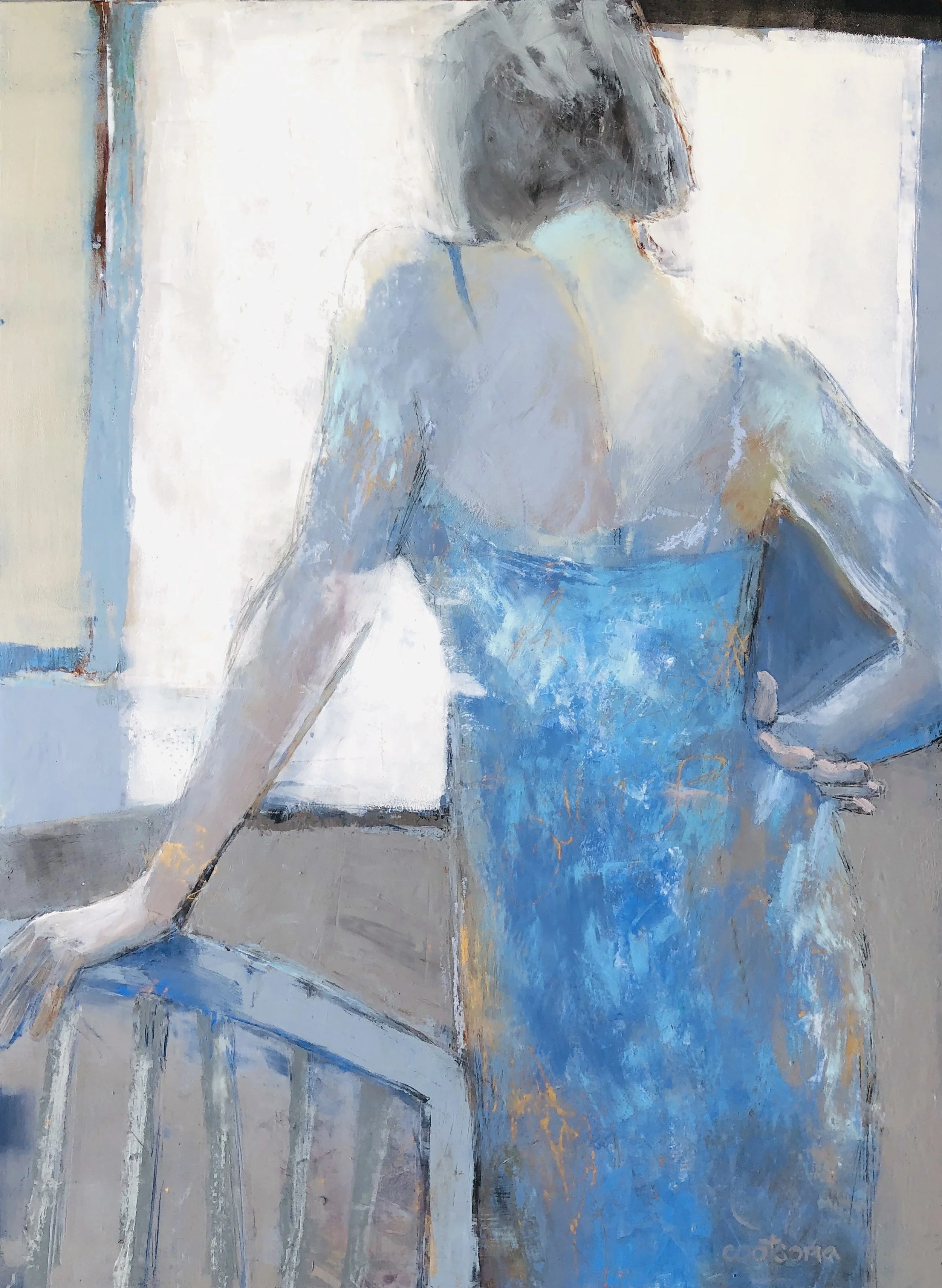
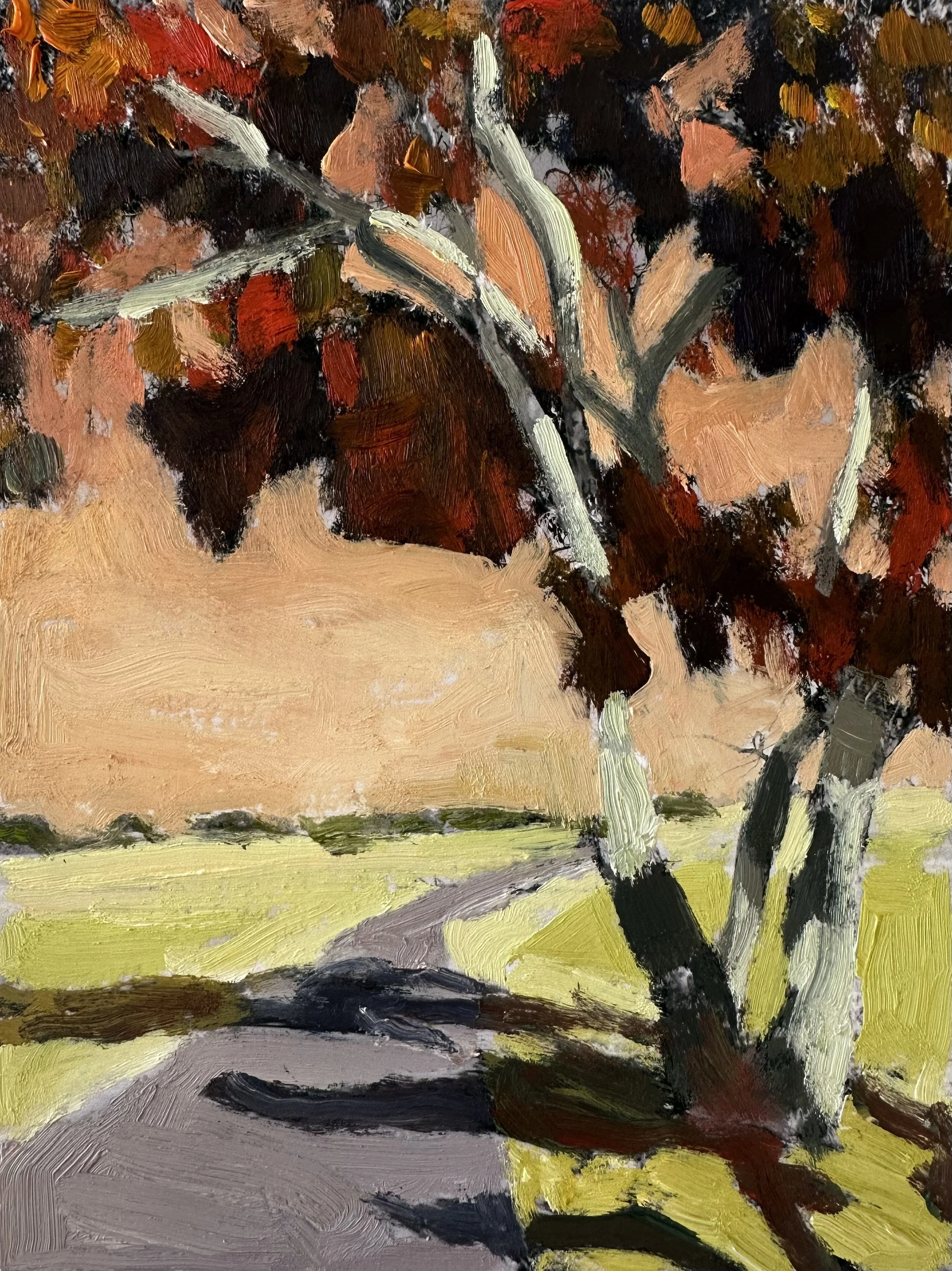
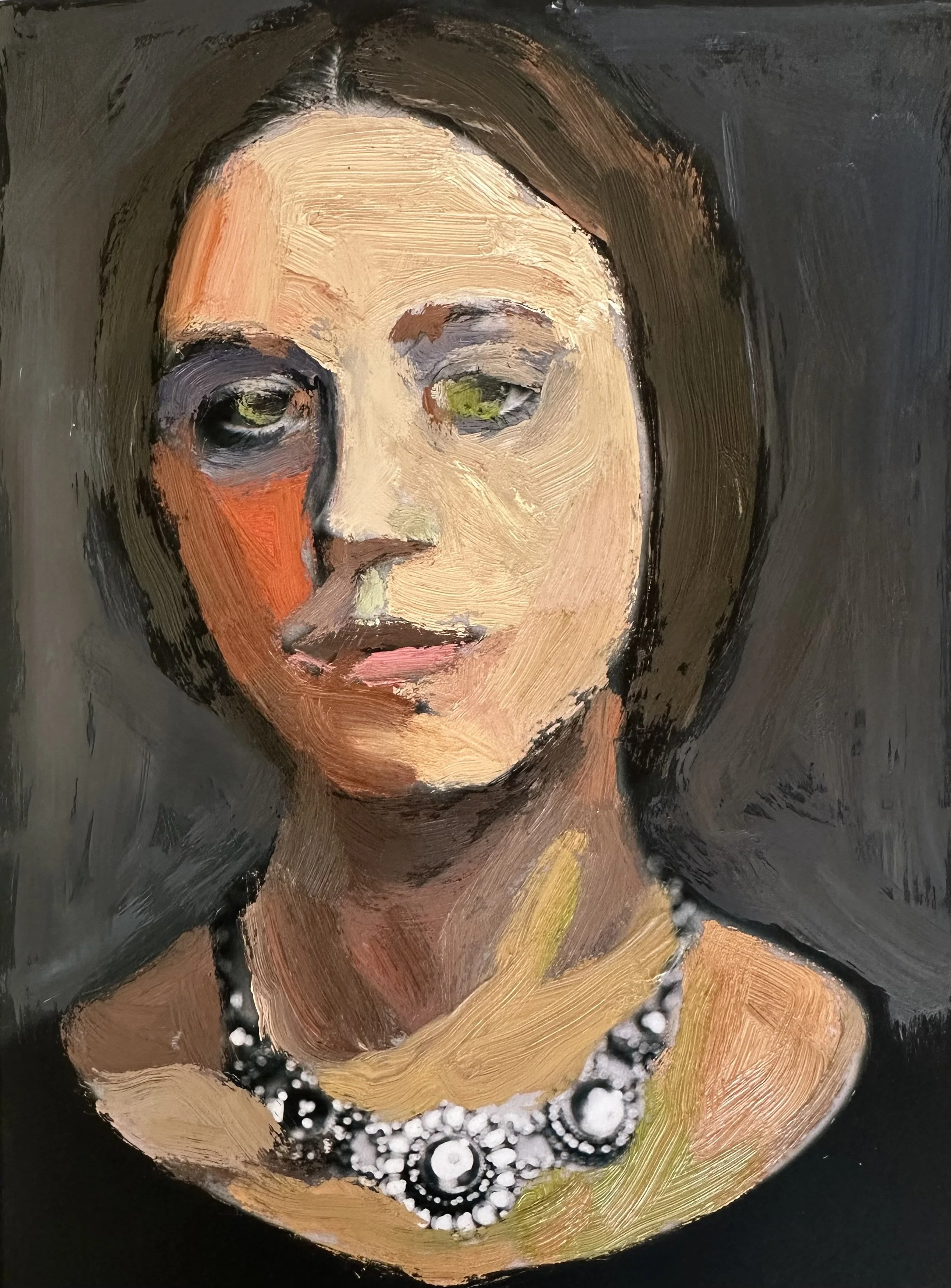
MONOCHROMATIC Palette Gallery
Click on any image to view larger.


COMPLEMENTARY Palette Gallery
Click on any image to view larger.


Important Color Concepts to Remember
All of these concepts can have a big impact in the overall feeling and mood of your limited palette painting.
✶ VALUE
Look at the very dark reds of the Mark Daily Monochromatic in contrast to the Patrick Lee pale reds and how VWLU can significantly change the feel of the painting.
✶ CHROMA
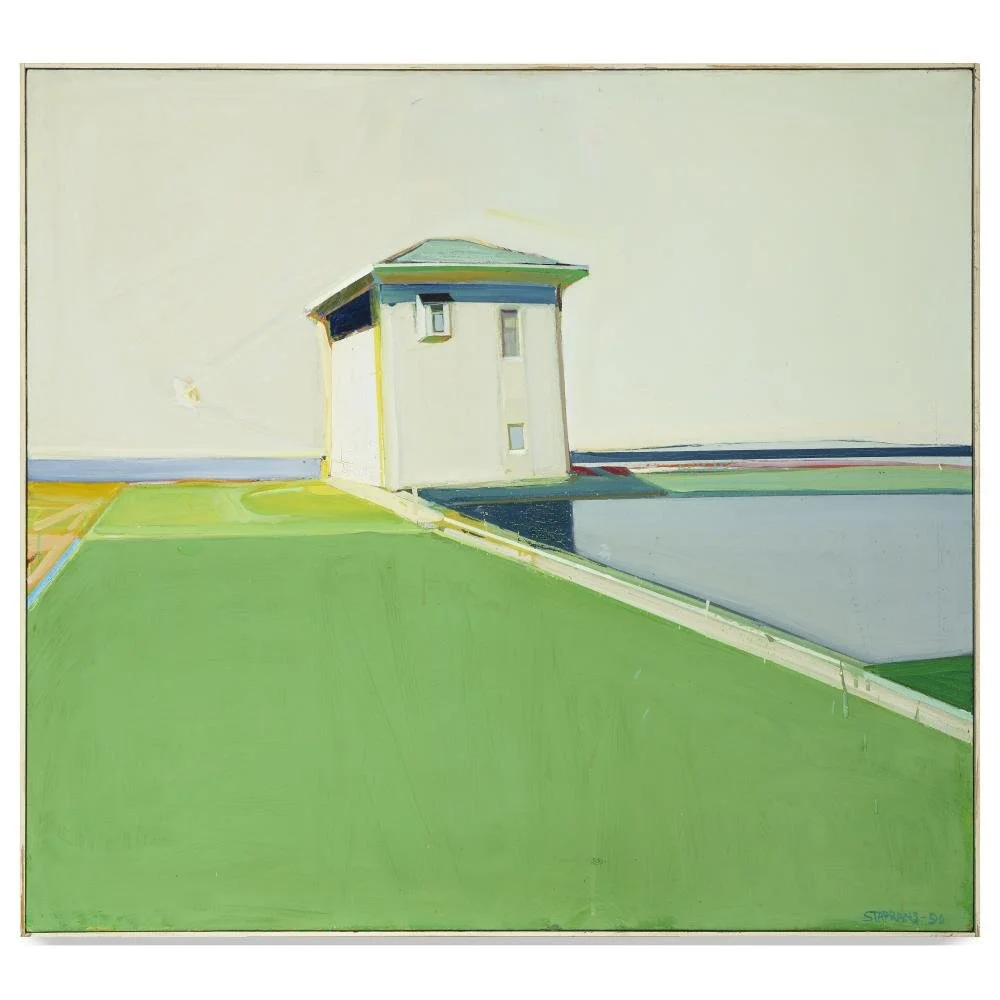
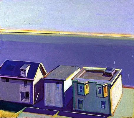
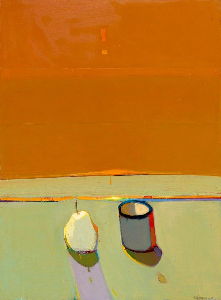
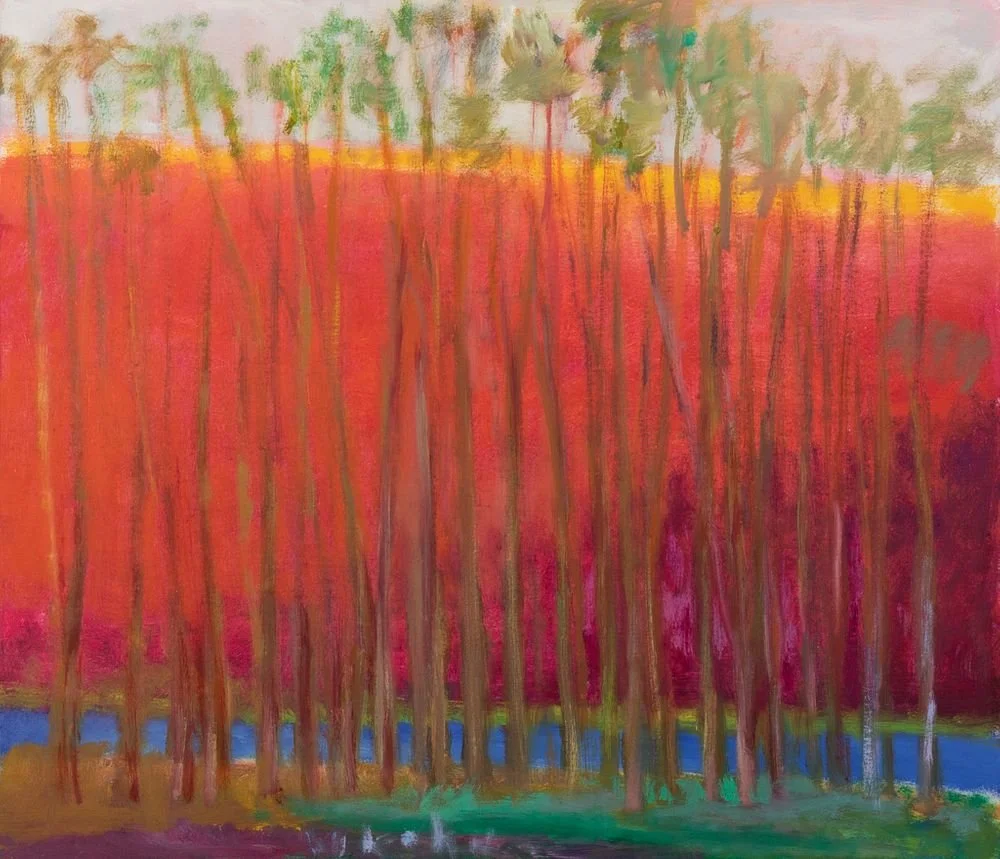
Look at the high chroma (intense/saturated) colors of the Raimond Staprans red and green in comparison to the muted reds and greens of the Wolf Kahn forest in the Complementary Gallery. The chroma creates a completely different mood in each.
✶ COLOR PROPORTIONS MATTER
A complementary painting in yellows and violets, for example, will have a very different feel when predominantly yellow then it will when predominantly violet. See Raymonds Staprans and Patrick Lee in the Complementary Gallery
✶ NEUTRALS MATTER
Neutrals can be included in these two palettes (as in most), and their values and proportions can also shift the feel of the work.
Project One: ONE SUBJECT, ONE PALETTE, TWO PAINTINGS
Watch me create two very different moods with the same image by changing the chroma (color intensity) in each painting.
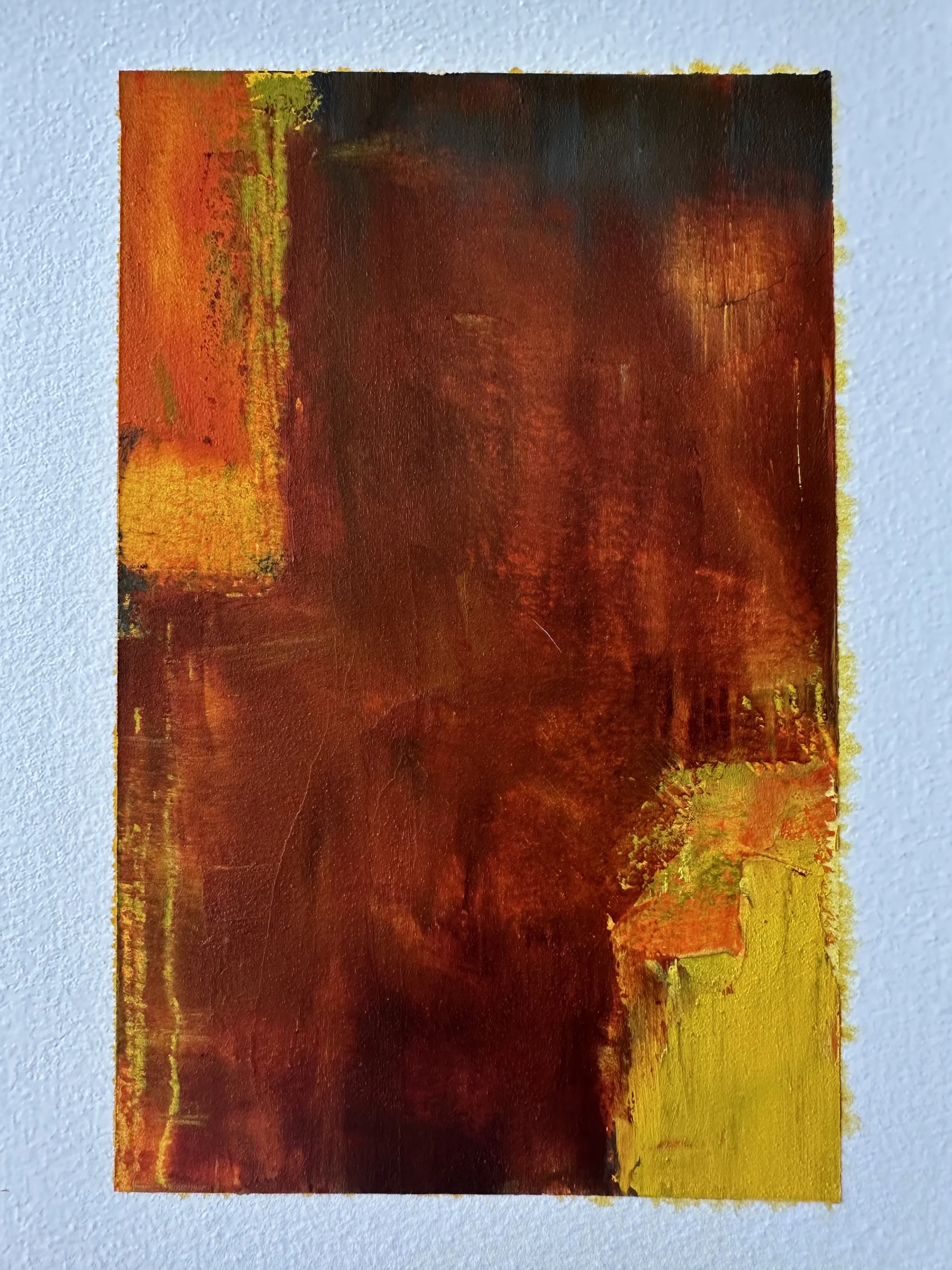
Red/Green Complementary Palette:
HIGH Chroma · SATURATED Color
▸ PASSWORD: CHROMA1
▸ VIDEO LENGTH: 18:37 minutes
High Chroma Complementary Palette Red/Green
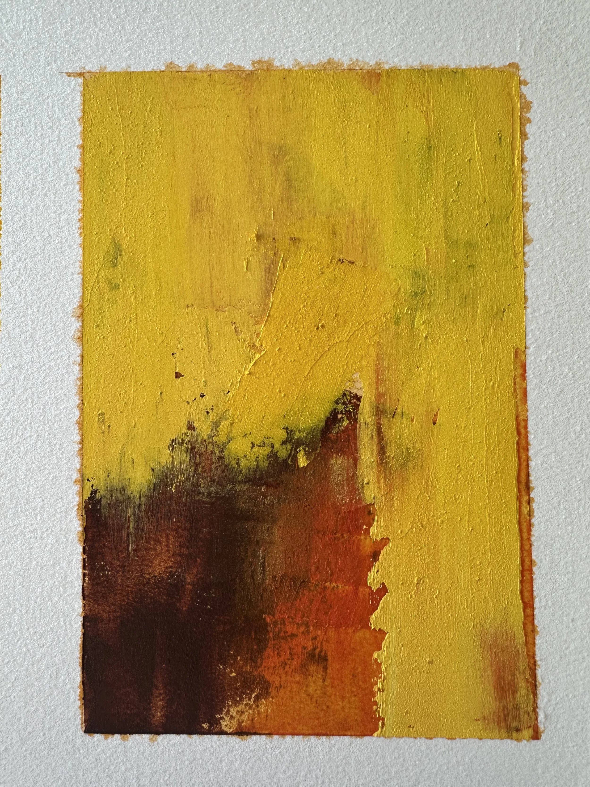
Red/Green Complementary Palette:
LOW Chroma · DE-SATURATED Color
▸ PASSWORD: CHROMA2
▸ VIDEO LENGTH: 15:25 minutes
Low Chroma Complementary Palette Red/Green
Red/Green COMPLEMENTARY Palette
-
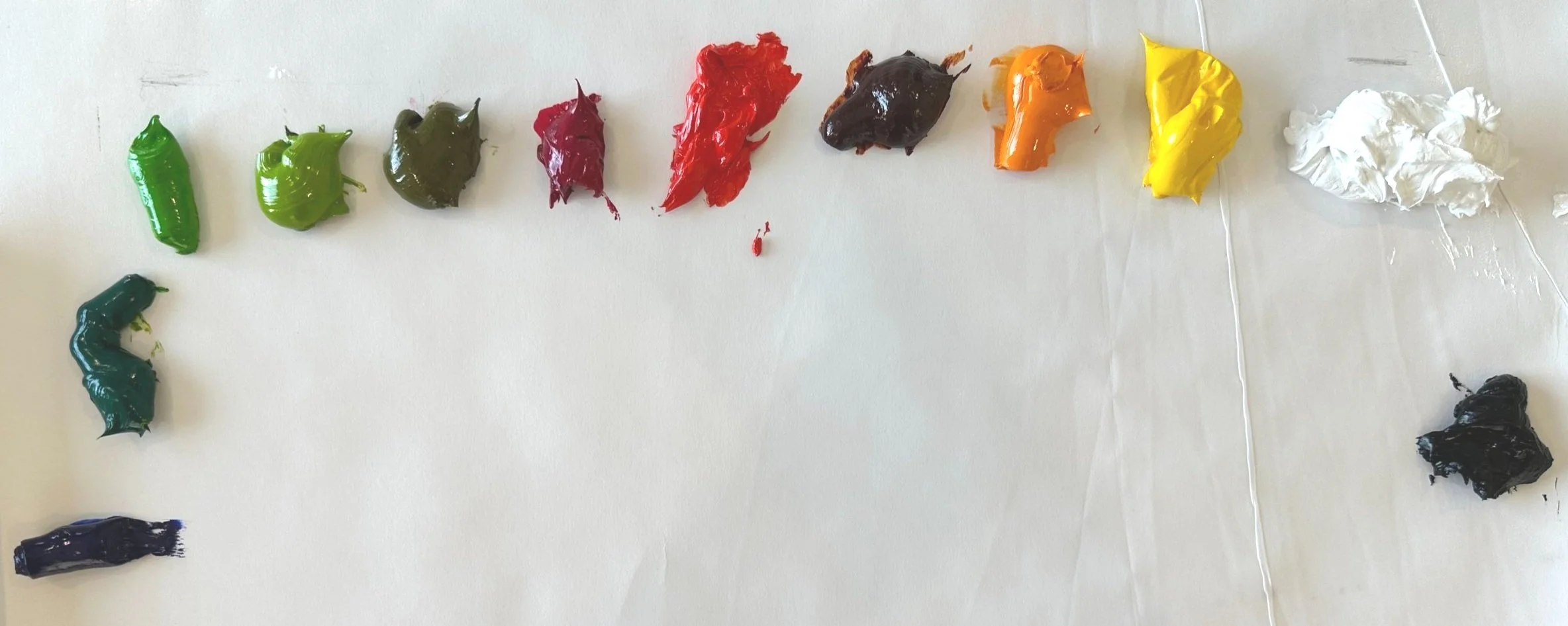
Colors listed below (left to right)
Ultramarine Blue
Viridian Green
Permanent Green Light
Yellow Green
Olive Green
Quinacridone Red
Cadmium Red Light
Transparent Red Oxide
Yellow Orange
Cadmium Yellow Medium
Titanium White
Carbon BlackI later added:
Gamblin’s Portland Warm Grey
Gold Ochre
Gamblin’s Gel MediumThe panels had an initial acrylic layer of:
Burnt Sienna
Quinacridone Magenta
Your Turn:
Before beginning this project, read the section below on MINERAL vs. MODERN colors/pigments. After filming this demo I realized that having a firm understanding of the difference between the two will help with this project.
✶ Using either a Monochromatic or Complementary Palette, create two paintings of the same (or similar) subject matter using the same palette. I used a Red/Green complementary palette, however feel free to use any monochromatic or complementary palette of your choice. I have listed the colors I used for your reference but they are certainly not required.
✶ One painting will have more chromatic and “brighter” colors. You may still use neutrals here but color will be more dominantly high chroma.
✶ The second painting is to be more muted with low chroma colors. A more muted palette implies more neutral colors. Note that adding white (in acrylics and oils) will generally dull your colors as well (except with some modern pigments such as Pthalo and Quinacridone which retain their high chroma).
MINERAL VS MODERN PIGMENTS: What’s the story?
MINERAL COLORS
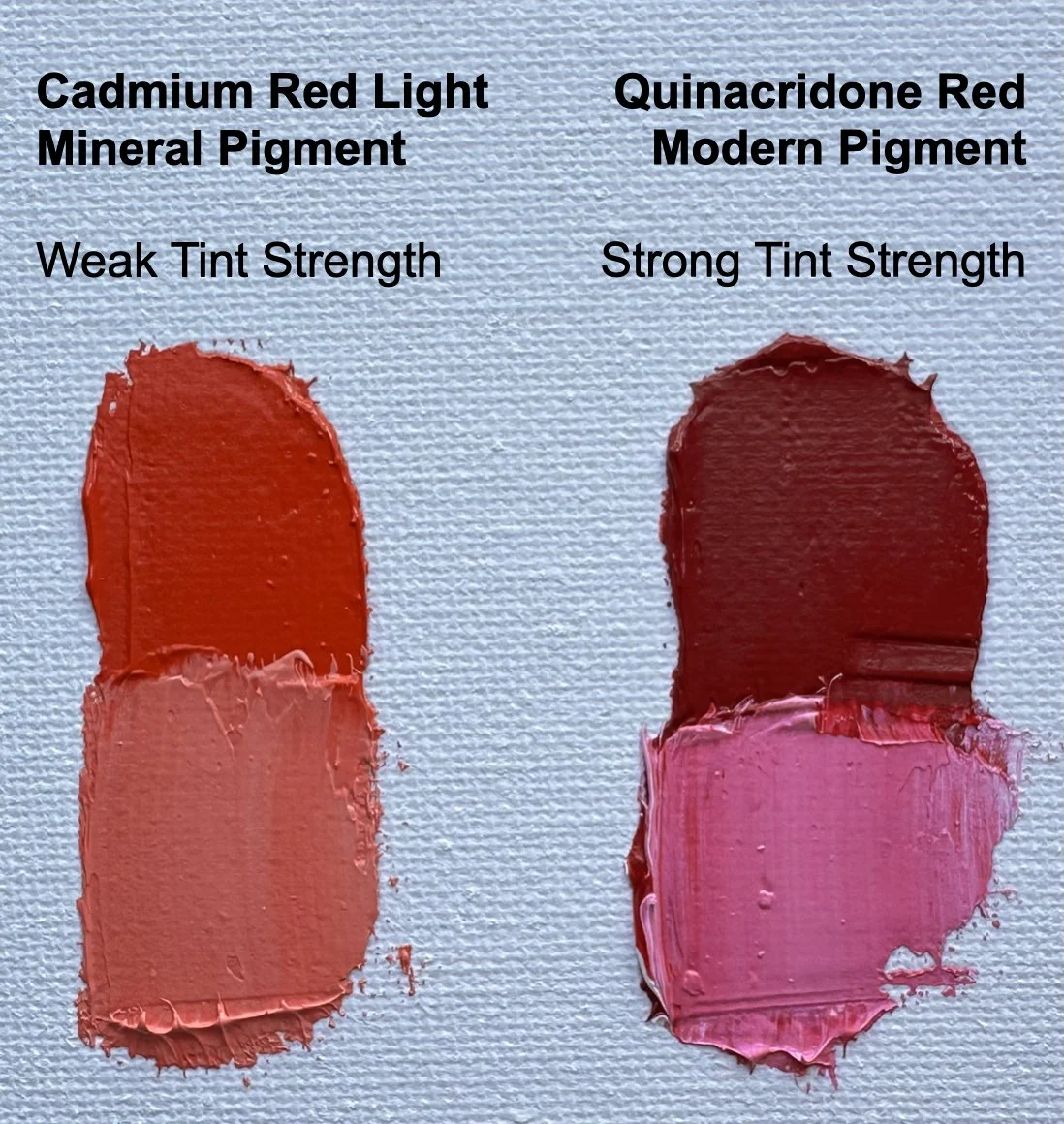
Made from pigments of earth and metals. The first first of these earth pigments go back to cave drawings. These earth pigments include colors such as Yellow Ochre, Raw Umber, and Venetian Red. Metal pigments were developed during the Industrial Revolution and gave the Impressionists a new palette to work with. Metal pigments include colors like the Cadmiums, Cobalts and Ultramarine Blue.
MODERN COLORS
Developed at the end of the 1800’s with the creation of organic chemistry and pharmaceutical dyes. Modern pigments are made in laboratories and are known for their transparency and very strong tinting strength. They tend to have long odd names like Quinacridone and Phthalocyanine.
Note on ACRYLIC PAINTS
Developed in the 1940s with it becoming available to artists in the 1950’s. These same concepts of tinting strength hold true for acrylic paint as well. Acrylic paints also have far more pre-mixed colors available.
✶✶ IMPORTANT TAKE AWAY ✶✶
Modern Colors have a high tinting strength. This means that when you add white to them (creating a tint) the color stays relatively saturated and bright, or High Chroma. Alternatively, Mineral Colors have a lower tinting strength and when white is added the color dulls and becomes significantly less saturated, or Low Chroma.

GAMBLIN COLOR CHARTS
This PDF shows the different colors of paints from different eras
✶ Classic = MINERAL Colors
✶ Impressionist = MINERAL Colors
✶ 20th Century = MODERN Colors
Click on the button below to view/download this useful color chart.
Want to learn more about the history of paint colors?
Gamblin is the industry expert and shares some great information on their website.
Artist Focus
〰️
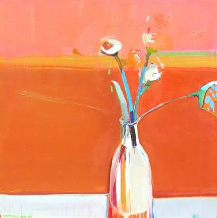
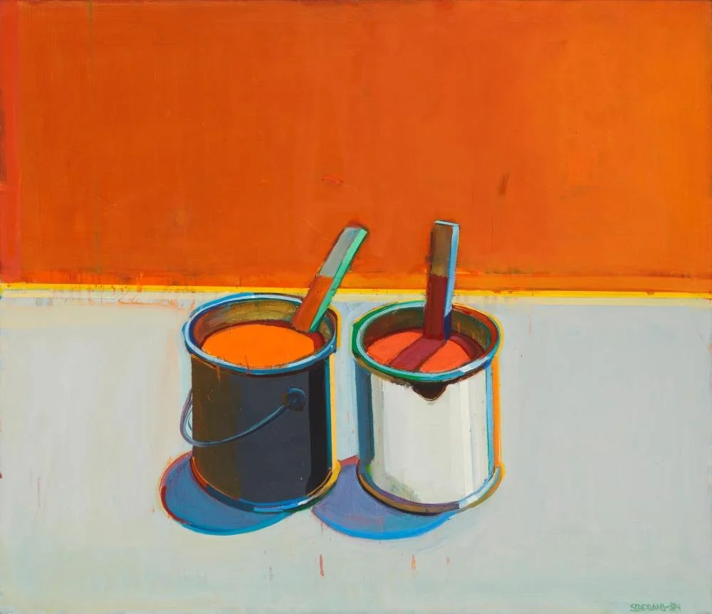
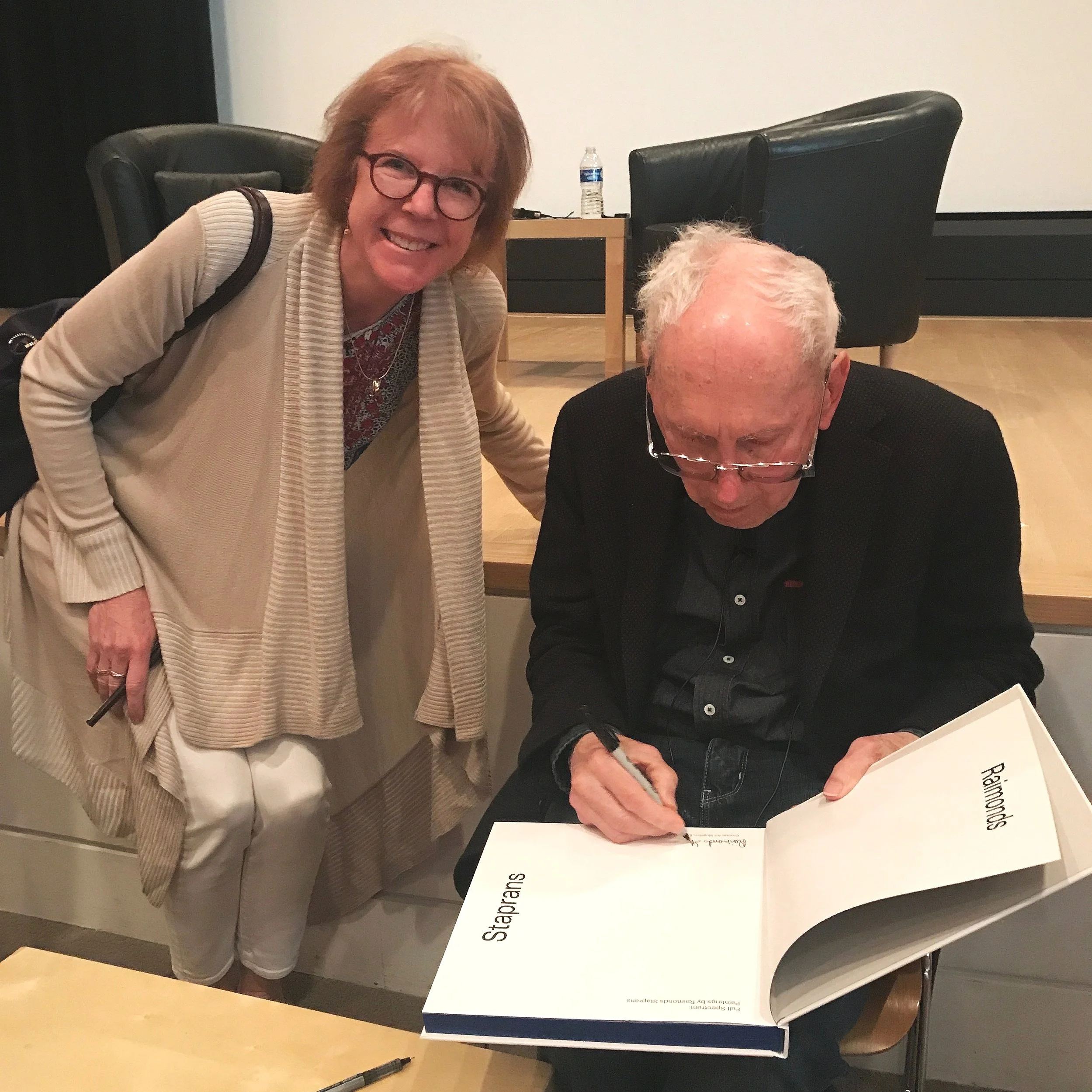
RAIMONDS STAPRANS
〰️
Artist Focus 〰️ RAIMONDS STAPRANS 〰️
You’ve seen several of his paintings on this page, Staprans was an amazing master colorist whose color work was brilliant and the results are stunning. His colors look quite saturated at first glance, but if you study his paintings you will see the subtle manipulations of chroma from more muted colors to the high intensity colors. We can learn much from looking at his work. He did have quite an involved process which you can glimpse in this short video where he discusses his creation of blues. There are several more videos on YouTube if you are interested in more of his thoughts. (Fun side note: I was at the talk at the Crocker Museum (on YouTube) where I got him to autograph his book!).
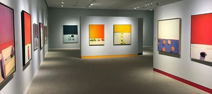
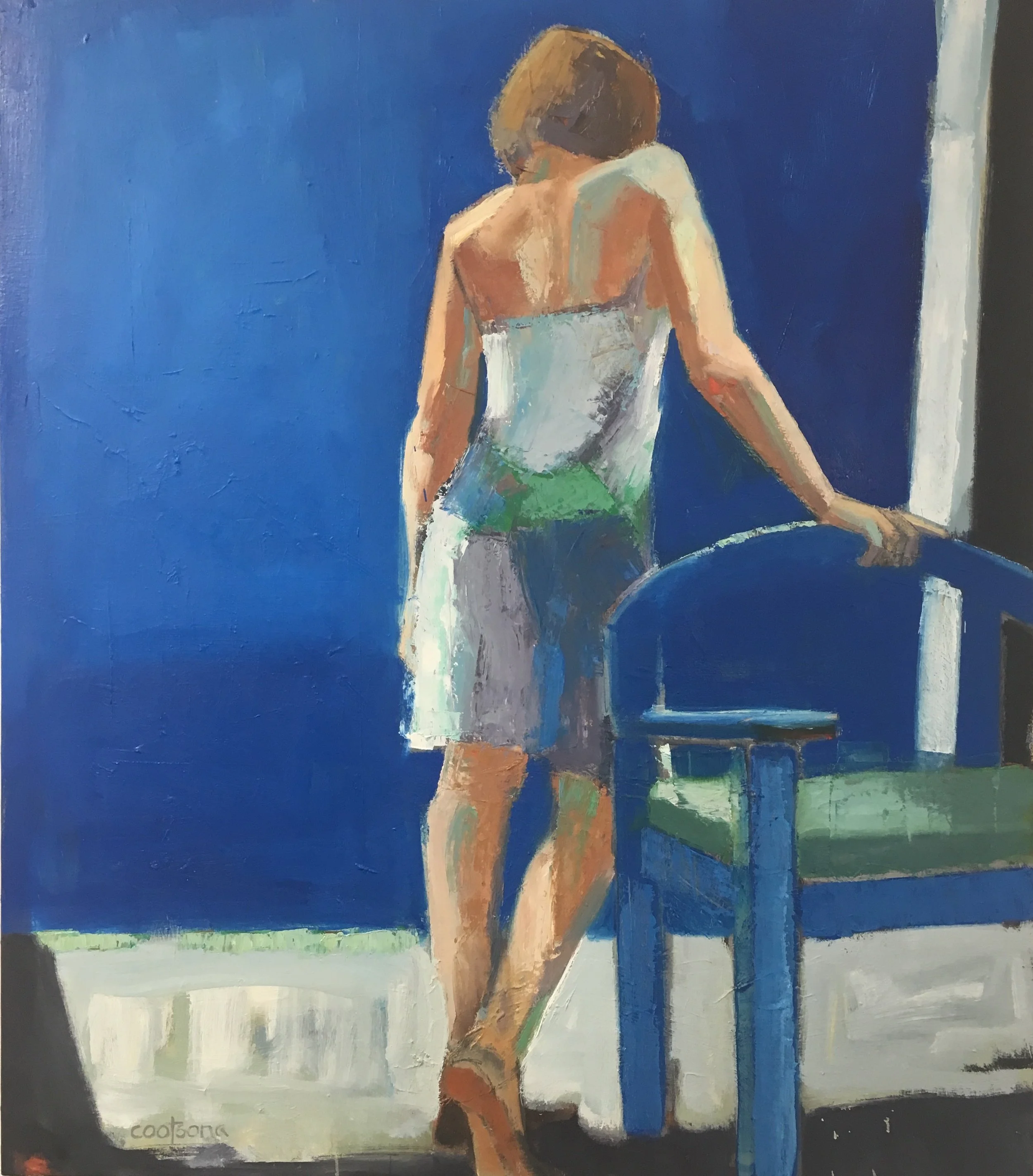
Raimonds Staprans Museum Show
Click on any image to see larger.


It’s always exciting to meet one of your creative “heroes” and see their work on display.
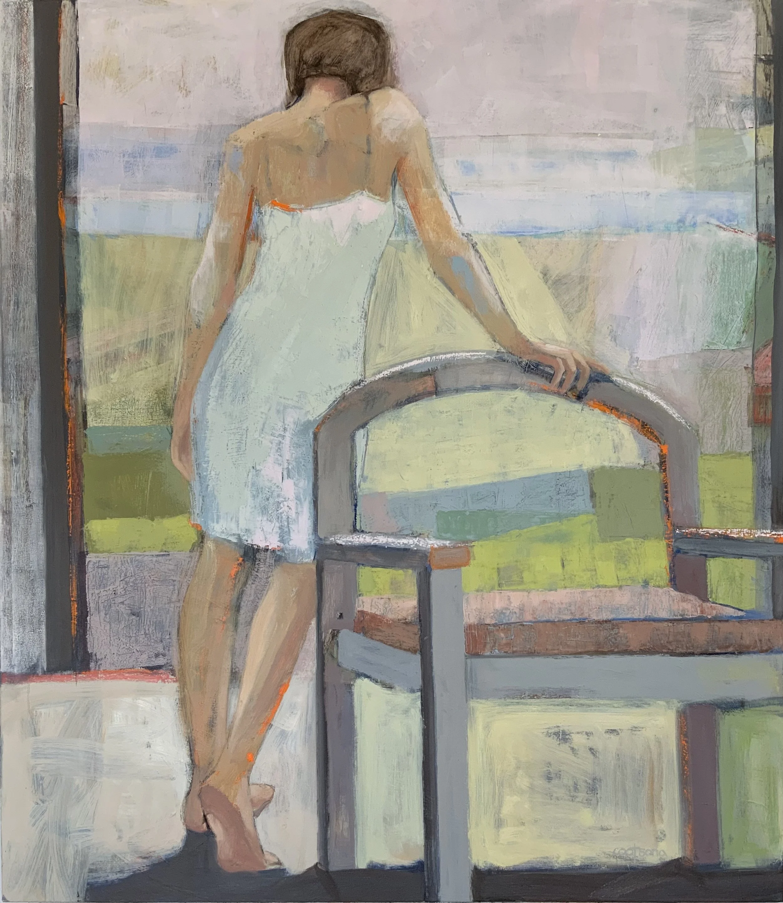
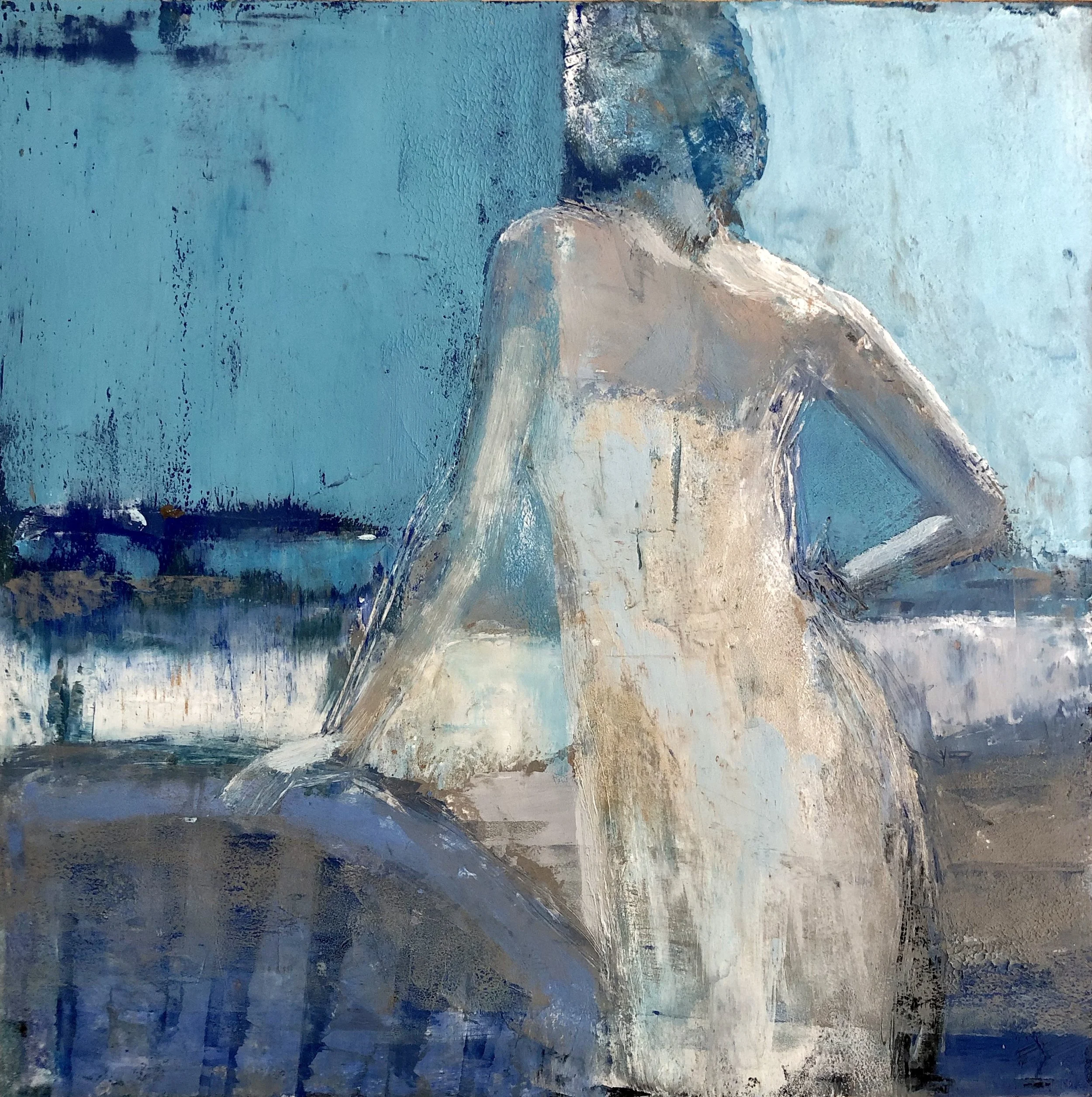
Working in a Series
A series should have visual continuity. The work should “hang together” but not be so repetitive as to be boring.
Click on any image to view larger.
-
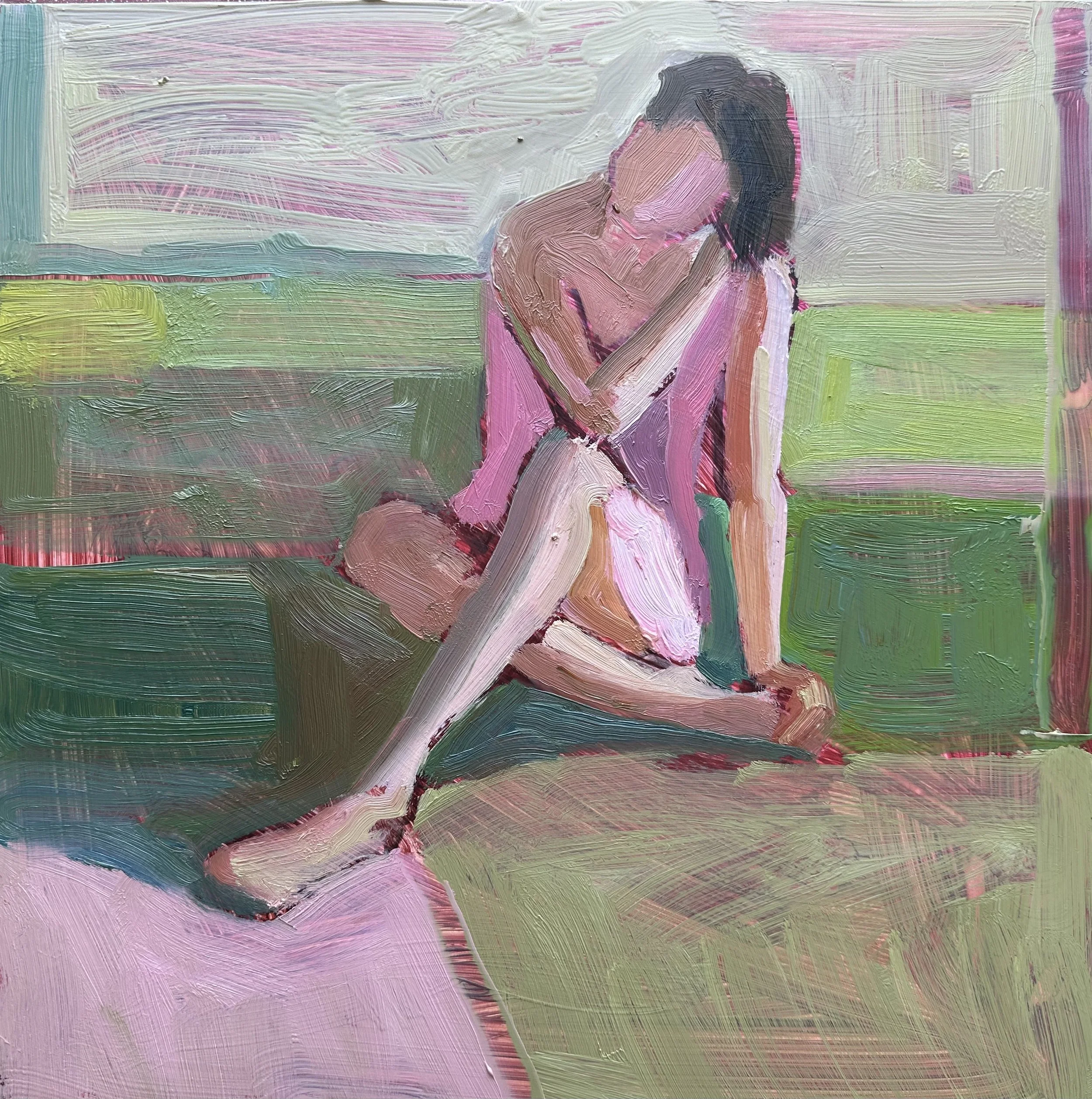
I highly recommend that you focus on working in a series, and this course is the perfect time to do it! There are different approaches to working in a series. When I find a gesture or pose that I particularly like in my figurative work, I will re-use it many times in different paintings as you can see in the examples here. This allows me to explore different environments for the figure and then create different moods and emotions while repeating a figure that becomes more familiar with each painting.
-
The important part about a series is that you focus on a concept and explore it for a period of time. Creating a series gives you an intention in your work and also a nice limitation as it narrows down “what you will paint” or your subject matter. It will force you to explore different expressions of your concept, and typically leads to growth in your work.
-
Choose a specific visual theme to explore. This can be very specific or more broad in scope. A few examples would be:
✶ A landscape that you regularly see, such as “Mountains and Sky” or a lake in different seasons or light. It also can be more focused like a singular tree. Monet’s haystacks are an example of this idea.
✶ An item that intrigues you such as a chair in different light or even a series of chairs. A favorite room, flower or flowers, plant or still life.
✶ Think about intimacy of the subject. Remember you can zoom in and zoom out. The closer the subject the more intimate the painting.Choose one or two of the Five Elements of Design to explore.
✶ Explore color with a singular subject matter
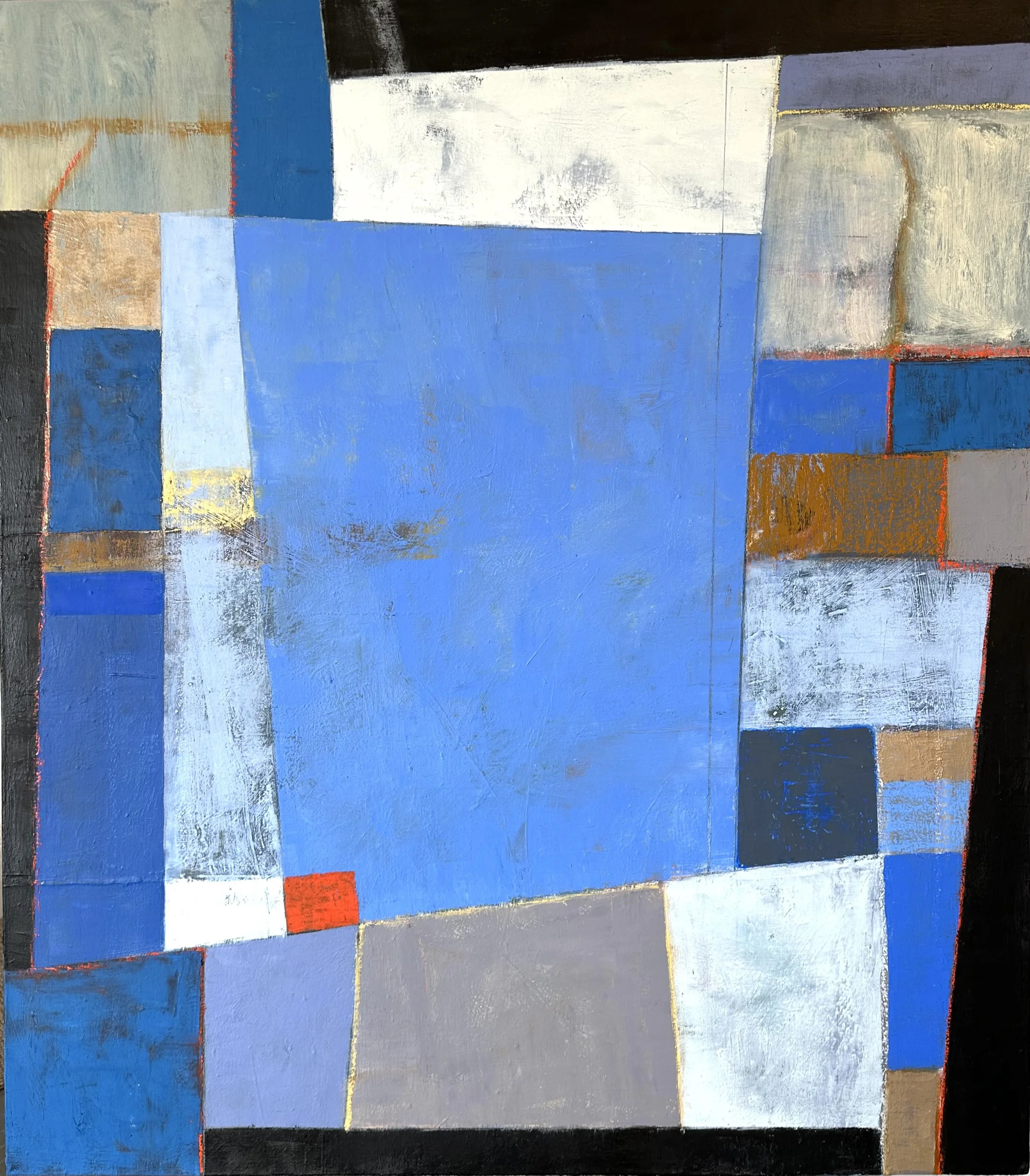
✶ A series on texture or pattern for example. These may relate to your medium. Texture with oil and cold wax make a great subject to explore. Pattern and collage with acrylics are a natural combination.Choose a more conceptual topic to explore. This can be a bit hard to define and I recommend it be as specific as possible. Vague concepts are challenging and don’t often work well, such as painting “love” or another emotion. Try to narrow your topic down and to give yourself a framework. Below is an example of a series of mine called Keystone. I am essentially working with geometric shapes and color as puzzle pieces that must fit together in an interesting composition.
-
Additionally, a series is a great way to study color! Staying with one theme, subject matter or topic and exploring different palettes is a perfect way to learn how color affects an image!
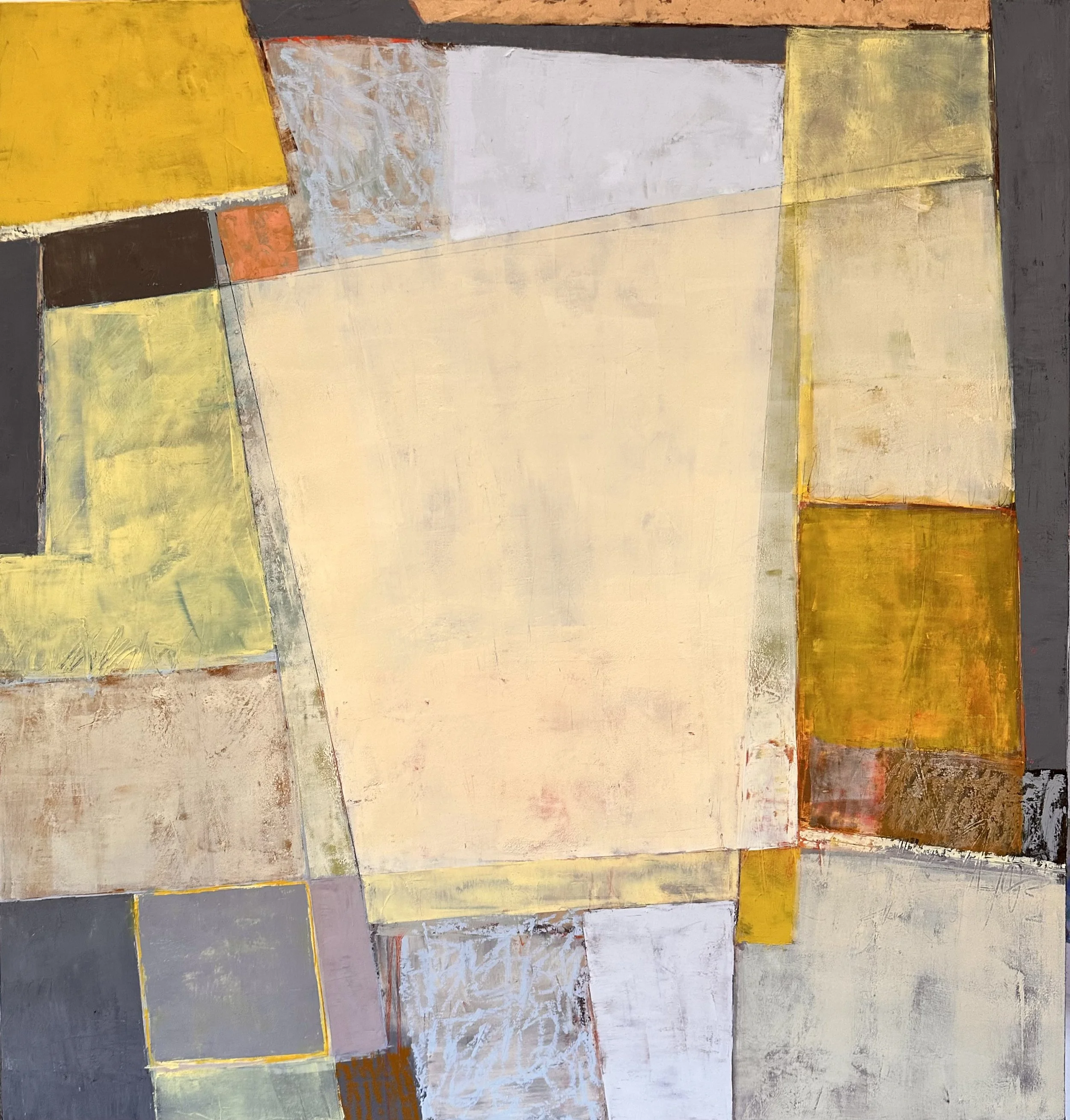
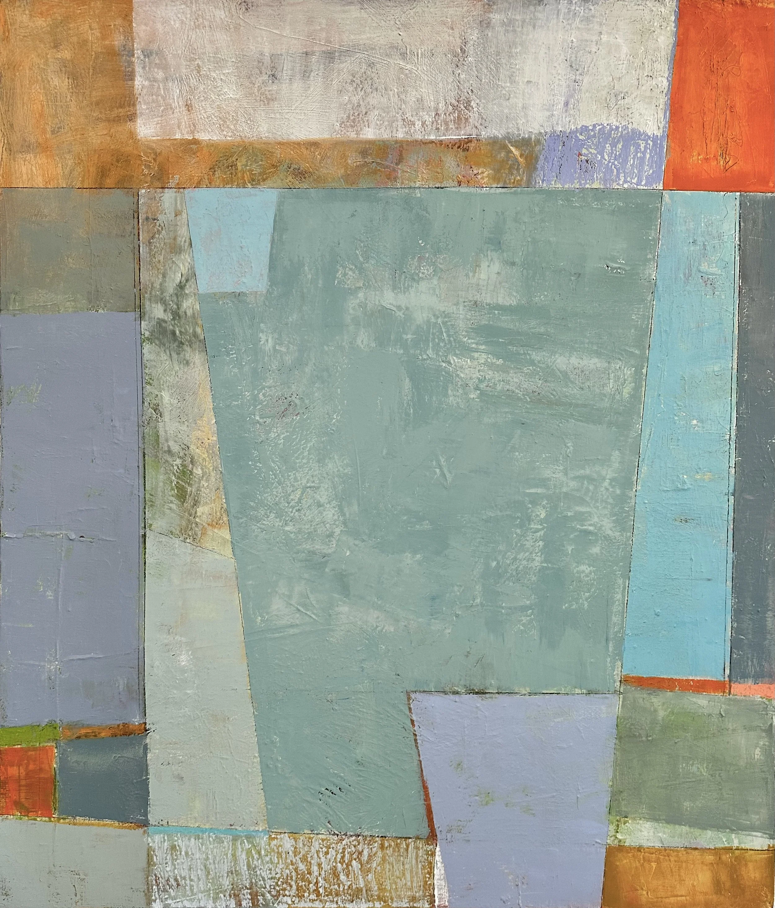
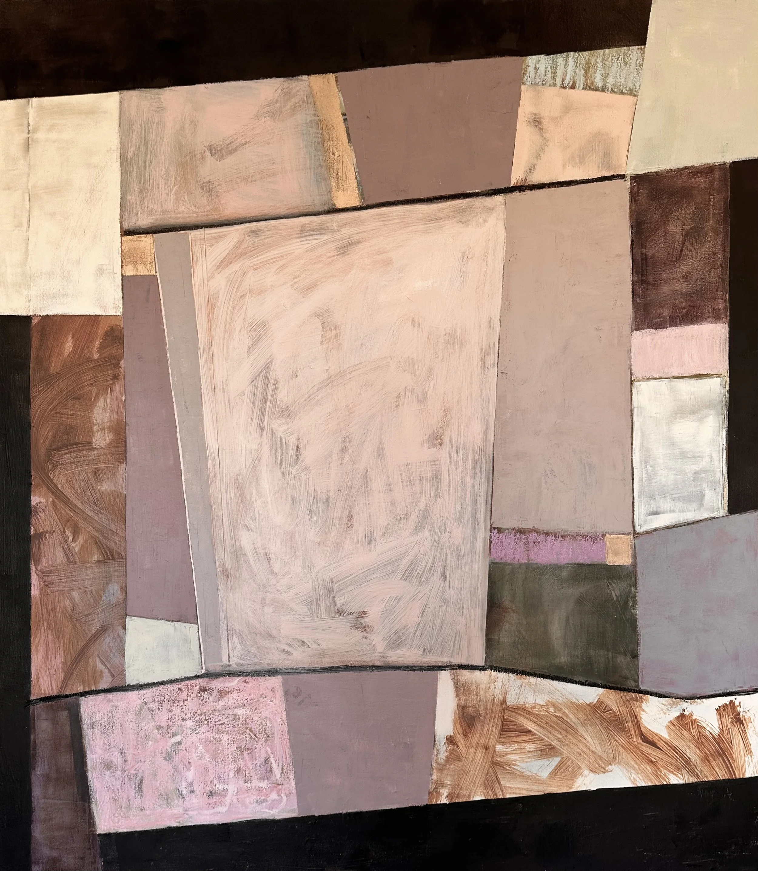
Keystone Series
“These paintings speak to my roots in architecture and puzzle solving. Each painting is built with layers of color, texture and an exploration of shapes. Like removing the ‘keystone’ in an arch, one color or shape change can affect the whole painting. The fun is in finding just the right balance of each element.”
Click on any image to view larger.
Project Two: WHO IS THE STAR?
Looking at Color Proportions
Experiment with which color gets the spotlight, and open the door to powerful new ways to tell your story.
In this fun project we play around with color proportion in some freeing abstract paintings. This is one to get your creativity flowing and really play with color before we move on to the next section. These two short videos illustrate how using the exact same palette but changing the color proportion can change the feel of your painting. Doing this as an abstract can keep you in a playful mode, but feel free to do it with realist subject matter if you prefer.
demo1: Blue/Red Orange Complementary Palette
▸ PASSWORD:STAR1
▸ VIDEO LENGTH: 13:28 minutes
Blue/Red Orange COMPLEMENTARY Palette
-
Colors listed below (left to right)
Ultramarine Blue
Cerulean Blue Hue
Provence Blue
Cadmium Red Light
Cadmium Orange
Cadmium Yellow
Titanium White
Transparent Red Oxide (for the initial wash)
Pthalo Turquoise (for the initial wash)
demo 2: Analogous Palette of Yellow to Red Using Neutrals
▸ PASSWORD:STAR2
▸ VIDEO LENGTH: 11:53 minutes
Analogous Palette of Yellow to Red Using Neutrals

-
Colors listed below (left to right)
Burnt Sienna
Transparent Red Oxide
Transparent Orange
Cadmium Orange
Cadmium Yellow
Titanium White
Van Dyke Brown (a warm black)

lesson two
COLOR and VALUE
Understanding the relationship of Color and Value is KEY to understanding Color and Harmony.
Let’s review the definition of VALUE and some important related terms. We will see in this section why VALUE is such an important player in Color Harmony.
VALUE is the degree of lightness or darkness of a color. The color (hue) is not important in this definition, only how light or dark the color is relative to white and black. (Think of a black and white photo of your painting).
A MID-VALUE PAINTING is a painting created with colors in the mid-range of the value scale which would be approximately 4 - 7 as seen here on the “value finder.”
A HIGH KEY PAINTING is a painting created with mostly light values (towards number 10/white) which would be approximately 7-10.
A LOW KEY PAINTING is a painting created with mostly dark values (towards number 1/black) which would be approximately 1-4.
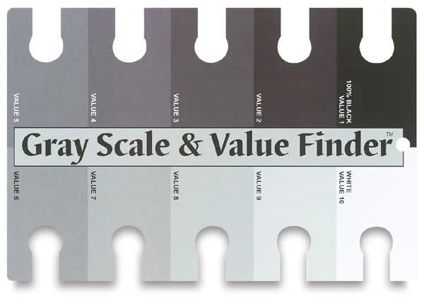
The value scale shown here can be a helpful tool to help you learn the value of your colors. NOTE: Sometimes you will see this scale reversed with 1 as White and 10 as Black. Be sure to notice which method is being used.
Project Three: SPARK IT!
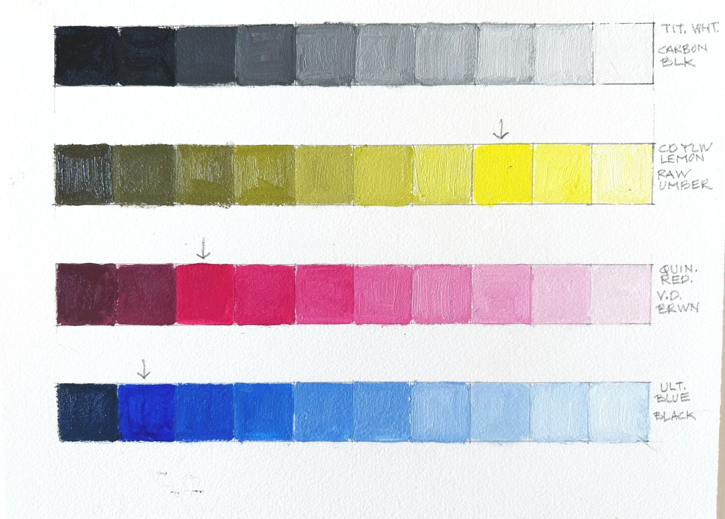
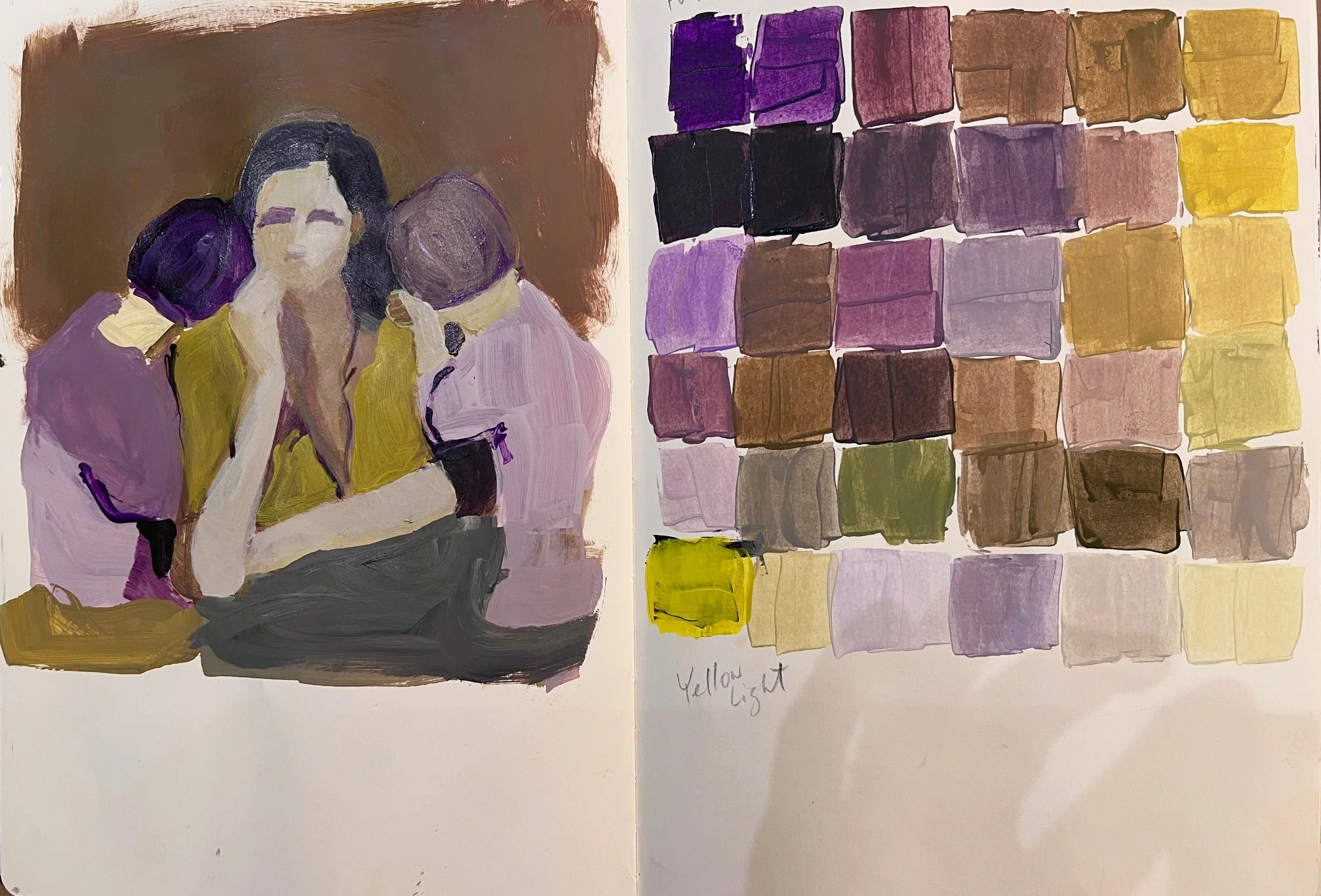
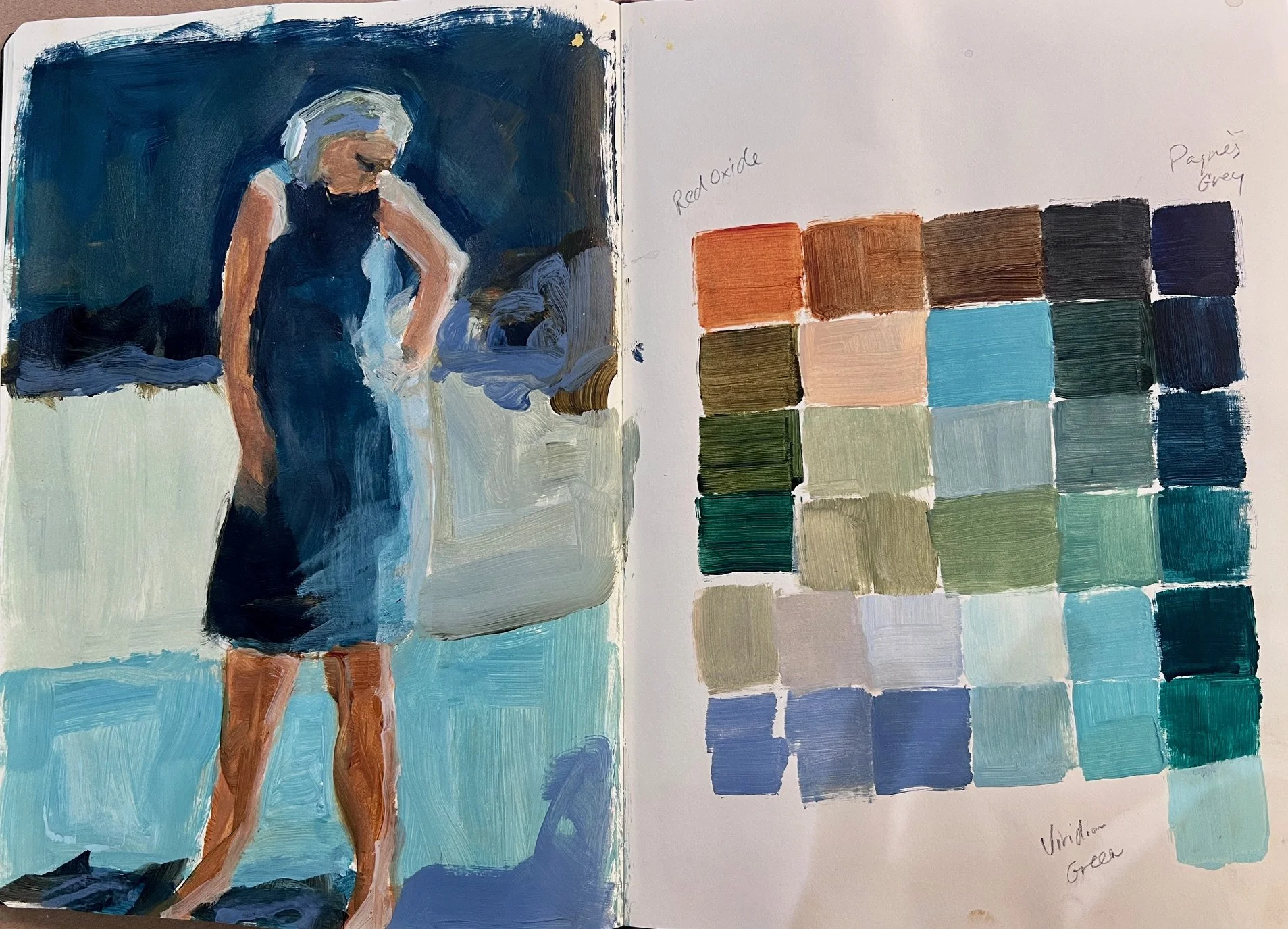
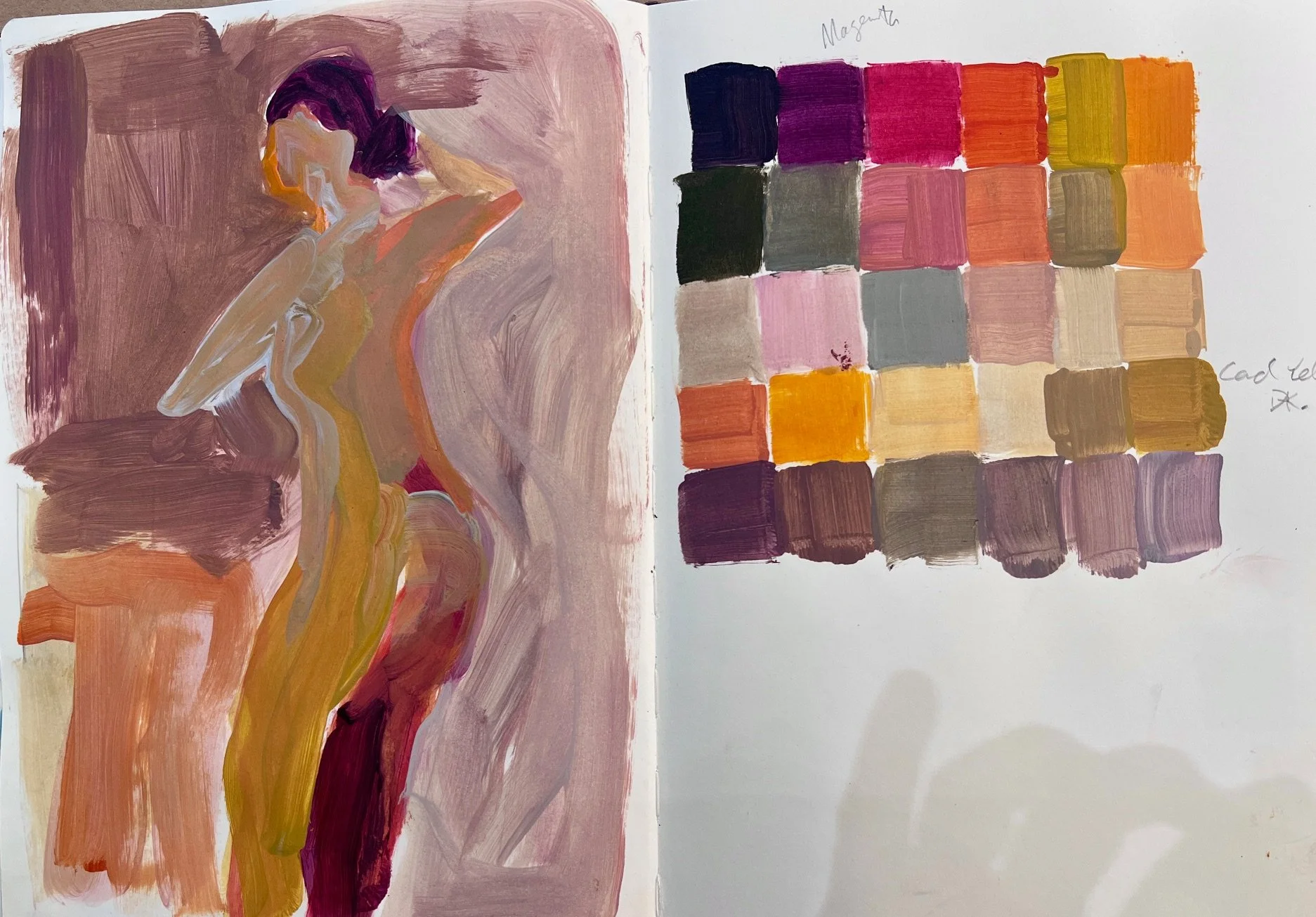
Creating Color Charts to Learn Values
Painting color charts to learn to see your values is an “invaluable” exercise (pun intended). Even making just a few of these will help refine your color skills. Like practicing scales on the piano, color charts can be a “valuable” discipline.
There are several different ways to make color charts. The charts in this video focus on seeing each color’s corresponding value and also on potentially finding some new color combinations.
▸ PASSWORD: Chart
▸ VIDEO LENGTH: 10:05 minutes
Your Turn:
I encourage you to use several color combinations that you don’t typically mix together when creating your chart.
-
Colors listed below (top to bottom)
Carbon Black ▪ Titanium WhiteRaw Umber ▪ Cadmium Yellow Medium ▪ Titanium White
Van Dyke Brown ▪ Quinacridone Red ▪ Titanium White
Carbon Black ▪ Ultramarine Blue ▪ Titanium White
Alternative Color Charts
For those of you who struggle with “Staying Within the Lines” and find charts way too tedious, here is an alternative. Select two or three colors plus white and black and explore the palette in a sketchbook or whatever format works for you. Here are some examples from Julia Foug who created these color studies in her sketchbook. She both learned how the colors mix and now has a reference to look back on for color inspiration in future paintings!
Be sure to write down what colors you use!
HOW WE GOT TO NOW
〰️
HOW WE GOT TO NOW 〰️
A Little History of Expressive Color in Paintings
This is a short and VERY simplified history in pictures of how we went from the neutrals of Carravagio and Rembrandt to contemporary expressive color in Western Art.
▸ PASSWORD: HISTORY
▸ VIDEO LENGTH: 22:00 minutes
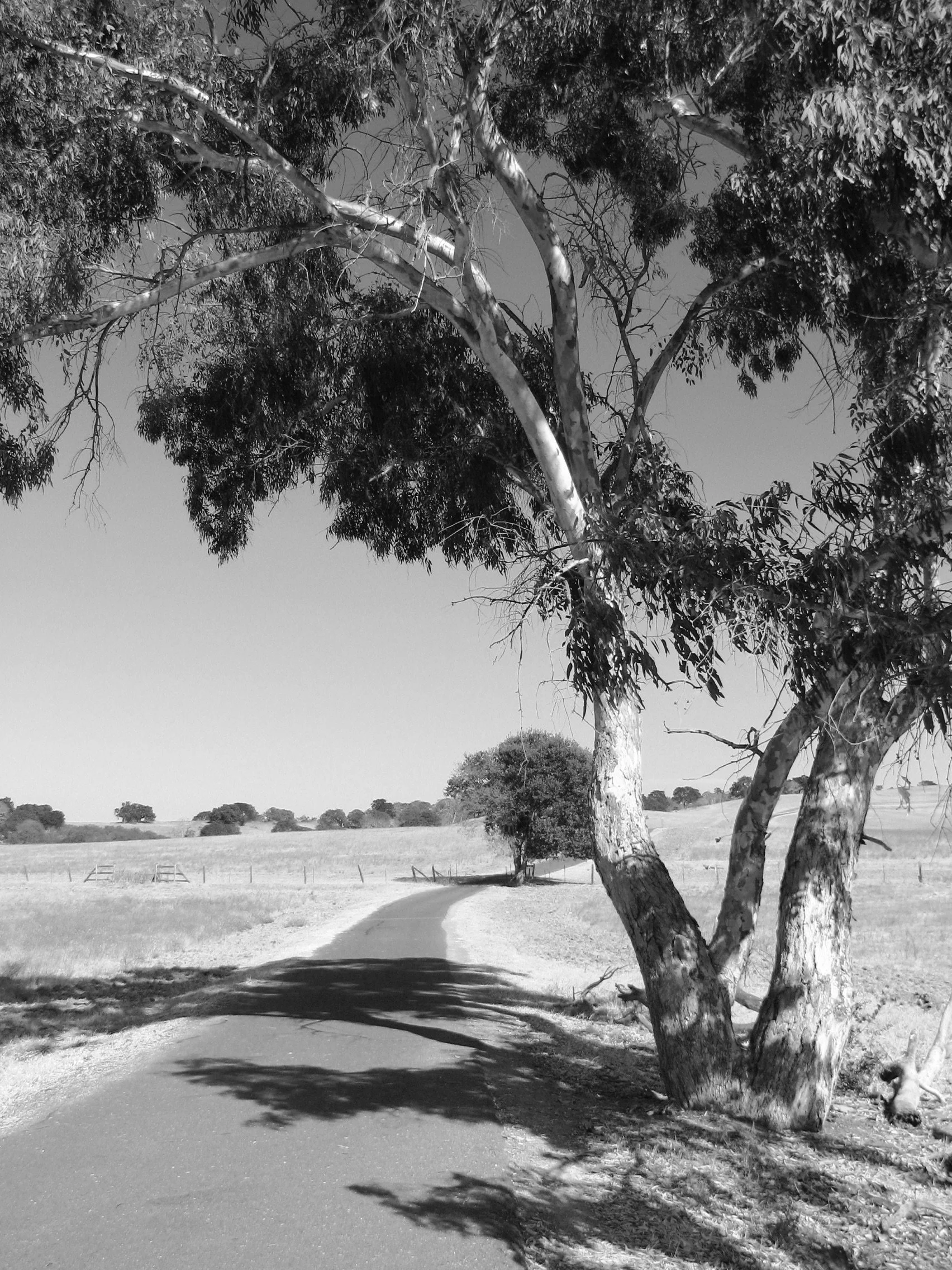
Project Four: THE ART OF SEEING VALUE
Learning to see the value of your colors is extremely important in understanding color and harmony. These are two fun stress-free projects that will help you learn this important skill.
PART 1
▸ PASSWORD: TREE
▸ VIDEO LENGTH: 10:34 minutes
PART 2
▸ PASSWORD: FACE
▸ VIDEO LENGTH: 9:04 minutes
Your Turn:
Use my black and white photos below or choose your own.
Choose a photo with a wide range of values.
It can help to spray the photo with fixative so that the ink will not bleed into your paint color.
Try to match the value of each grey with your paint colors.
You may want to print out a second photo for reference.
Try using expressive colors!! Let your brushwork be loose.
NOTE: If you have previously done a similar project in Own Your Colors 1, then sketch and paint this on a canvas (or other substrate) instead of directly on top of a photograph.

Reimagine How We Use VALUE
Using Limited Values to Create Color Harmony
Now that we have a firm understanding of Value and Color and their relationship, let’s look at different approaches to how we can use Value in our work to create color harmony.
▸ PASSWORD: VALUE1
▸ VIDEO LENGTH: 13:00 minutes
DEMO
〰️
DEMO 〰️
“Stealing” an Artist’s Palette
In this next demo I refer to a Wolf Kahn painting for color inspiration. Kahn is our featured artist in this section and he had a brilliant color sense. Scroll a bit further down to see his Artist Focus. I have several Wolf Kahn books which are well earmarked with notes on his color choices.
I highly recommend “stealing” the palette of a painting which inspires you. There is much to learn from working with another artist’s successful palette. You will learn how to mix those colors and often how they harmonize. You will learn how to pay attention to those crucial concepts of Chroma, Value, and Proportion.
You will also find that your painting will, most likely, come out with at least some different colors than the original source. Mine certainly did. This is a good thing. You will learn to see if those colors work within your painting or if they do not, and you will improve your color-choice decisions.
By working with another artist’s palette, you will begin to understand the original artist’s color journey as well.


Project Five: “STEAL” A PALETTE
A HIGH KEY Painting Inspired by Wolf Kahn
This video is broken into two parts for ease of downloading and watching.
PART 1
▸ PASSWORD: STEAL1
▸ VIDEO LENGTH: 20:12 minutes
PART 2
▸ PASSWORD: STEAL2
▸ VIDEO LENGTH: 14:20 minutes
Your Turn:
Choose a HIGH KEY Wolf Kahn painting or a different artist’s work whose high key color palette inspires you. Use my barn photo or create a painting with your own subject matter, using the colors/palette of your inspirational painting. (Remember HIGH KEY = values on the lighter end of the value scale).
Pay attention to any neutral colors in the work and how these neutrals may support the more saturated colors.
Pay attention to color proportions. Are you using similar proportions or are you changing them? How does this affect the painting?
Are your values close together? It is perfectly OK to have a few dark values within a HIGH KEY painting.
Your palette colors will most likely not match exactly, and that is perfectly OK.
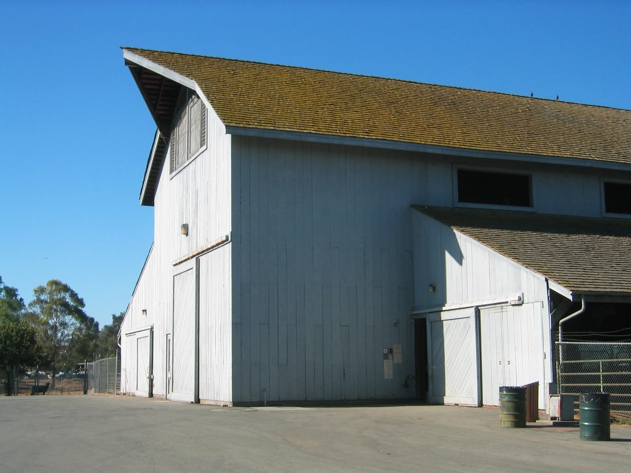
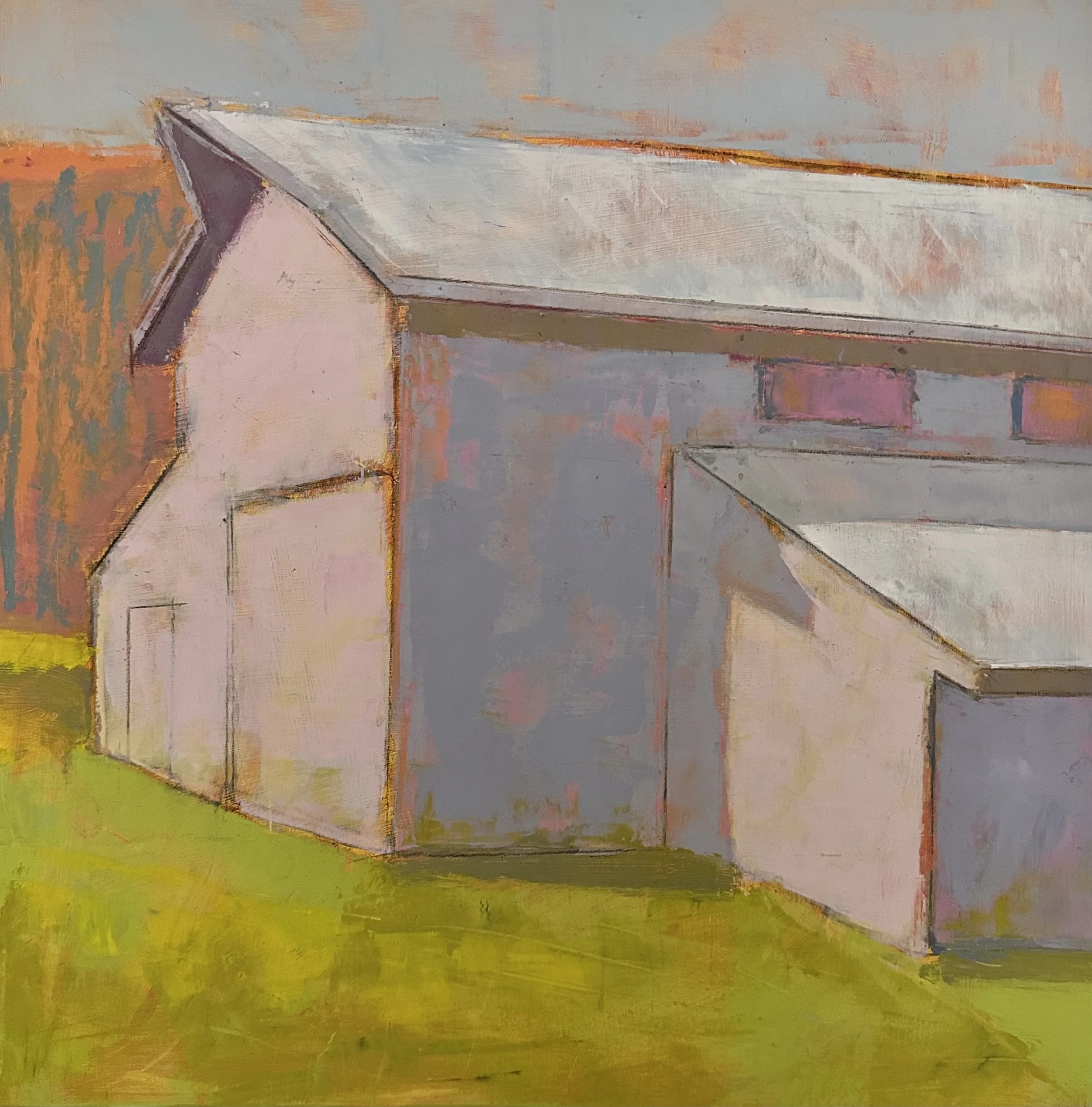
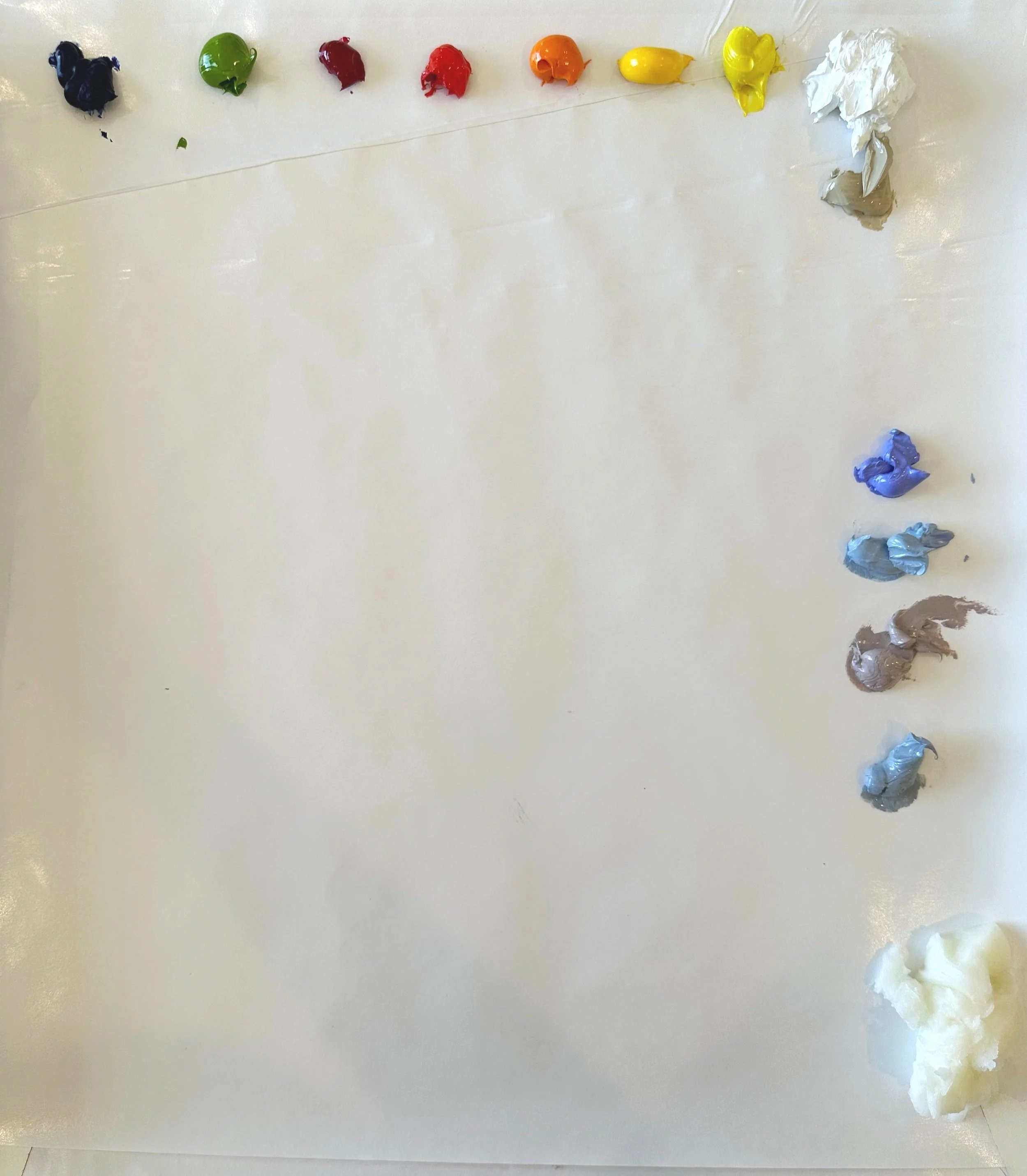
“Pink Barn” Demo Palette Colors
-
Colors listed below (left to right)
Ultramarine Blue
Yellow Green
Quinacridone Red
Cadmium Red Light
Cadmium Orange
Cadmium Yellow Medium
Cadmium Yellow Light
Titanium WhiteBuff Titanium
Provence Blue
Blue Grey
Portland Warm Grey
Portland Cool GreyCold Wax Medium
Artist Focus
〰️
WOLF KAHN
〰️
Artist Focus 〰️ WOLF KAHN 〰️

Wolf Kahn was a brilliant, well loved colorist and landscape painter. This video shows several of his pastel paintings with a reading of Kahn’s own words describing his thoughts on art and his work. If you are interested in watching him actually speak go to YouTube where there are several videos, however, they are all rather poorly produced. I have included the link to one that I found the most interesting and amusing below.
“Colors should never be allowed to merge too easily into their surroundings. If a color drowns in the totality, it loses its energy: it might not have been used at all. Like a good guest at a dinner party, a color should participate in the occasion but must not be allowed to take over the conversation to the point where other guests, who also wish to participate, are squelched, and cannot be heard.”
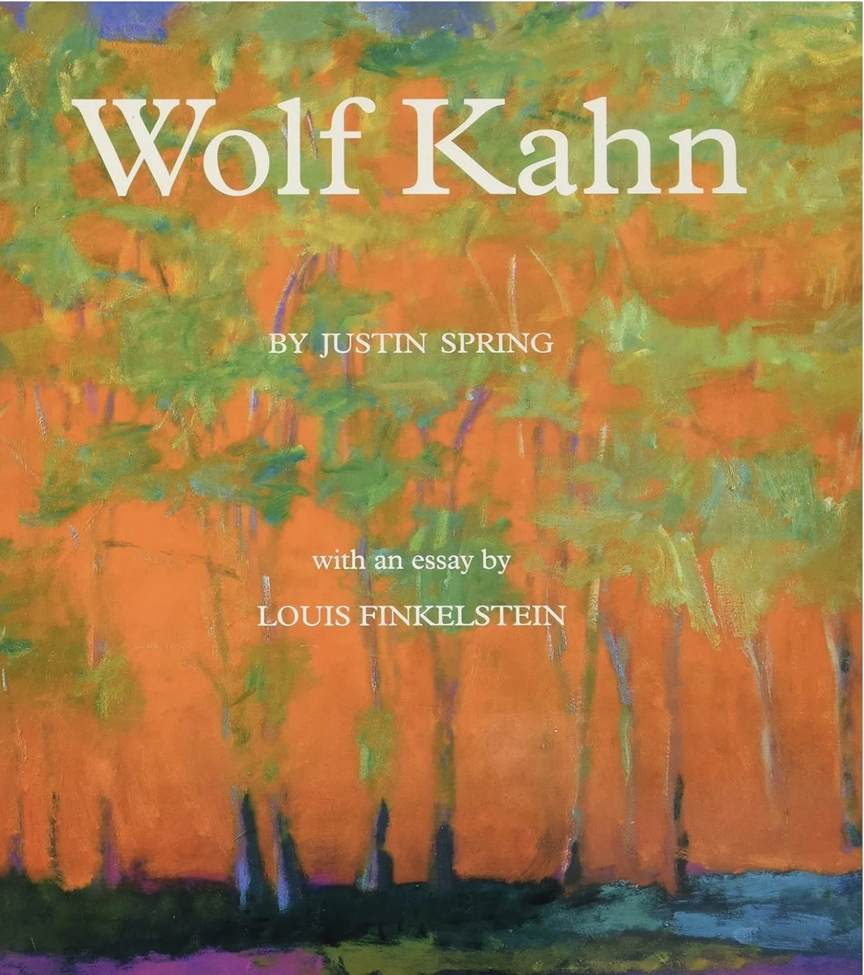
A great book for your library with dozens of beautiful images for your reference.
Click on image to see full painting


What is a Notan and how can it help me?
The word Notan is derived from the Japanese word Nong, which means strong, thick, or concentrated, and the word Dan, which means weak. A Notan painting has only two, three or four values. Notan paintings and studies can create a balanced and harmonious work using this simple concept of contrast and opposites.
NOTAN FACES
Using the concept of a Notan is a great way to abstract faces. Learning to see the important planes of faces by reducing values can truly help you to simplify your work. The painting in the following demo is made up of four values which give you a good likeness, yet little detail.
NOTAN FIGURES
Notans are used in all kinds of subject matter from pure abstract to landscape and figurative. Limiting your values can create some very dramatic effects. Reduicng the value in your figures will help you to see the important shapes and forms.
NOTAN BACKGROUNDS
Creating a Notan from a photo can immediately abstract the “background” areas surrounding your figure. Using this tool can give you a jump start on ideas for your ‘backgrounds.”
COOL TOOL
〰️
COOL TOOL 〰️

NOTANIZER APPLICATION
Fortunately for us there is this super cool APP, available in both Apple and Android versions, called Notanizer. You can upload any photo into the App and it will reduce it to how ever many values you choose. Personally, I like the selection of 4 Values.

There are many examples if you do some searching to see what you can do—or of course, just get the app and experiment on your own!


Project Six: PAINTING A NOTAN
In this fun project I used an image from “UnSplash",” a royalty free website. It looks like Liv Tyler to me! I uploaded the black and white photo into the Notanizer App and selected 4 values. I used Ultramarine Blue, a touch of black and Titanium White to create four blue values and then painted the image.
▸ PASSWORD: NOTAN
▸ VIDEO LENGTH: 19:40 minutes
Your Turn:
Create a Notan of three to four values. Faces are fun because this project helps you to learn the shapes of the face. If you prefer a different subject matter, that is ok too!
Start with a monochromatic version of one color plus white, and black to get your “black value.”.
For a more advanced version select several colors but continue to match the values of the Notan.
Have fun!

