INTRODUCTION
About This Course
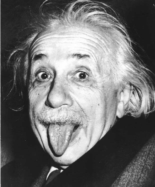
ALBERT EINSTEIN (of course) and also how you may feel about color sometimes!
One! Of course I had to do PART TWO after having so much fun in my first online color course!
In this Session we will delve a bit more deeply into some color theory and approaches. And, as always I will endeavor to make the information as fun and approachable as possible with entertaining Projects and links to interesting information. As I worked on this class, it became apparent that the over-arching “Theme” became what I call “The Theory of Relativity” (yes me, and old Einstein!). Basically, all color is relative. I attempt to make the explanations as simple and straightforward as possible, but there is no getting around the fact that color can be just plain contradictory and therefore confusing at times. By the end of the class you should understand many of the reasons why this is true.
In case you are new to my e-Courses, each Project can be created with many different approaches. I encourage you to adapt any Project to your own creative interest according to your skill level and subject matter focus. I provide links to my Pinterest boards in each class with examples of paintings using the concepts described. These will also provide inspiration for new ways of approaching your own work. And Orange “Dots”= “Projects” so look for dots like the ones below and you will find your "homework."
…………………..
Learning to see color as well as mixing what you see can take time and practice. Be patient with yourself. And paint lots. That is by far the best way to learn. It takes time for color to become “intuitive.” Time for the lessons you learn here to absorb and travel from your brain down to your hands. Time to see color combinations and the beauty of neutrals and the contrast of "brights."
So let‘s start having some fun! Join me down that road of color and let‘s get started!
Important Color Terms
HUE: Basically a color family: Red, Blue, Yellow, Green, Violet, and Orange. Every color is part of one of these color families. Thus, every color has a “hue.”
VALUE: Degree of lightness or darkness of a color. The color (hue) is not important in this definition, just how light or dark it is. (Think of a black and white photo of your painting).
LOCAL COLOR: The true color of an object, as opposed to the way it may appear in certain lighting conditions, at a distance, or in contrast with other colors.
TINT: A color to which white has been added.
SHADE: A color to which black has been added.
CHROMA: The brightness or INTENSITY of a color. Cadmium Red Light (for instance) straight from the tube is an example of high-chroma color.
PRIMARY COLORS: Red, Blue, Yellow
SECONDARY COLORS: Orange, Green, Purple
TERTIARY COLORS: Yellow-Orange, Yellow-Green, Blue-Green, Blue-Violet, Red-Violet, Red-Orange
COMPLEMENTARY COLORS: Colors opposite each other on the color wheel.
ANALOGOUS COLORS: Colors next to each other on the color wheel. Another way to darken or lighten a color is to add an analogous color.
TRIAD: Three Colors that are evenly spaced around the color wheel. Examples: Red, Yellow, Blue or Blue-Green, Yellow-Orange, Red-Violet.
“TO GREY DOWN A COLOR”: This phrase means to “neutralize” a color or make it less intense. The most common way is to add the color's complement creating a more neutral or “greyed“ version of the original color. There are many additional ways to grey down a color such as adding black or white.
REFLECTED COLOR: Color from one object next to, or near another object that is reflected on the object‘s surface altering the ”local color.”
Subject Matter
Please feel free to select any subject matter for any project. I encourage both abstract and realist painters to work with subject matter that excites them. Here are two sites that have copyright free images if you need some resources.
Pixabay and Sktchy (Sktchy is only for your smart phone.)
All of these Projects can be created more than once and in different combinations. The more you experiment, the more you will learn!


