


CLASS FIVE
Working With A High Key Palette
FIRST, LET’S TALK PIGMENT—ALL COLORS ARE NOT CREATED EQUAL
THE BRAND MAKES A DIFFERENCE
Pigment is the powder or substance that is the actual color of your paint. Binder is the substance that holds (binds) the pigment together and adheres it to the substrate (canvas, paper, etc.). Binder is typically linseed oil or safflower oil. The more pigment that is in your paint tube or jar, the stronger the color will be. More expensive paint has more pigment. Cheaper paint has more binder and/or cheaper pigment.
I always instruct my students to buy the BEST QUALITY paint that you can afford. Beginning students actually need THE HIGHEST QUALITY PAINT, not the cheapest. Weak pigment strength can result in muddy paint mixtures and dull “brights” very easily. Often the artist thinks these problems are a result of their poor mixing skills when in actuality it is the pigment strength that is causing the problems.
Another fact to note is that COLORS CAN VARY GREATLY BY MANUFACTURER. A Cadmium Yellow Medium can be a Cadmium Yellow Dark from another brand. On the right I show a Cerulean Blue Hue from Lukas Paint and Gamblin Paint. You can easily see that they are two different colors out of the tube.
The Gamblin paint is a higher quality paint than this particular Lukas quality (Lukas has several qualities to choose from). As I add white to the paint you can see that the tinting strength is lower—when I add white to it the color gets light quickly—which means there is less pigment. As I add white to Gamblin, the color stays relatively strong. This means that I use less of Gamblin’s Cerulean Blue paint in a mixture.

GAMBLIN versus LUKAS Cerulean Blue Hue
Cheaper paint does have its place, however. I use a combination of high quality paint and less expensive paint, but over time I have learned how the various pigments “behave”, and what I can expect of their mixing strength. Generally you will use MORE of the less expensive paint to keep the color strong, and it can be quite a bit more!
This information is important because in order to create “High Chroma” —Intense—color mixtures you need to have a high chroma color, ideally with good pigment strength, to begin with.
MINERAL COLORS AND MODERN COLORS
Mineral colors are made from pigments that come from the ground or metals. They are generally considered traditional colors since they have been around for a long time. Yellow Ochre, Burnt Sienna, the Cadmiums for example.
Modern colors are made from organic pigments “which have a molecular structure based on carbon” (per Gamblin’s website). Obviously that was probably Too Much Information, HOWEVER, what you want to know is that generally the pigment strength and chroma of Modern colors are very high. Which means that when you add white to them they are still relatively strong bright colors. You simply cannot get the same intensity with many of the Mineral colors. (To see exactly which are Mineral and which are Modern I, again, refer you to Gamblin’s website.)
Take the two cool reds Alizarin Crimson (Mineral) and Quinacridone Red (Modern). Add white to Alizarin and you will get a “Pepto Bismo” dull pink. Add white to Quinacridone and you will get a vibrant fuchsia.
The painting on the right illustrates a number of different reds from Cadmium Red in the warm shadows to Quinacridone Red with white added in the areas of the vibrant pink. The flower on the middle left shows the Alizarin with white added on the left side creating a duller pink, and the Quinacridone on the right with the white added to create a more vibrant pink. Some Ultramarine was also added to some of the darkest reds to make them darker and cooler.
I could not have achieved this range of pinks with just Alizarin Crimson. It took a combination of Mineral and Modern colors to get this intensity (Higher Chroma) in this painting.
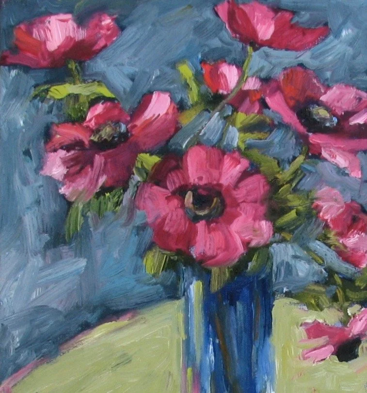
“Cosmos” (detail), Melinda Cootsona
High Chroma (Saturated) Paintings
Throughout the classes I provide PINTEREST BOARDS for a specific relevant topic. Click on the logo to see the examples gathered.

INSIDE SCOOP
If you want to know all about where pigments come from the book “Color” by Victoria Finlay is a great read. Every chapter is about a different color and how it came to be in paint, starting with Ochre and moving through the colors to Violet. A virtual travel through time in color!
HIGH KEY AND LOW KEY PAINTINGS
HIGH KEY refers to a painting that is done in values that range from 10 (white) to about 5. Therefore, it's a painting that is created mostly with light values and very few or no darks. You can remember this by thinking of the “higher numbers” 5-10 on the value scale.
LOW KEY (as you might imagine) refers to a painting that is done in values that range from 1(black) to about 5. Therefore, it’s a painting that is created mostly with dark values and few or no "lights." Conversely you can think of the “lower numbers” on the value scale.
Watch this slide show where I talk about the different types of High Key and Low Key paintings, showing lots of examples. We will mainly be focusing on Low Key paintings for the demo.
VIDEO PASSWORD: High5
PROJECT 5
Paint A High Key Painting
VIDEO PASSWORD: Project5
In this, my last demo of this e-Course, I will paint a small figurative painting in a High Key palette. I concentrate on keeping my values on the light end of the value scale 5-10. This concept is quite different from CLASS ONE, Project #1A and 1B where we matched the values of the black and white paintings. Here we are intentionally changing the values as a different approach. High Key paintings can create a very different mood or feeling from a ”Regular” or ”Full Range” painting. Think about the different moods you might create with this kind of work.
In this video I also show you my process of decision making in creating my work: trying out various shapes and colors to see what works best in the painting, letting the painting guide me. Remember all color is relative in Value, Intensity and in Temperature, so as I paint I am comparing all of these qualities to each other and adjusting each of them accordingly.
For your final project, create a High Key painting. Your colors can be brighter, or more ”pastel” (tinted with white), or neutral, and, of course, a combination of all three.
Inspirational High Key work
Throughout the classes I provide PINTEREST BOARDS for a specific relevant topic. Click on the logo to see the examples gathered.
More of WOLF KAHN’s Work
Throughout the classes I provide PINTEREST BOARDS for a specific relevant topic. Click on the logo to see the examples gathered.
NOTE: The video lasts about 42 minutes so grab a cup of coffee, tea or a glass of wine and watch me paint!
BONUS PROJECT
Paint A Low Key Painting
Inspirational Low Key work
Throughout the classes I provide PINTEREST BOARDS for a specific relevant topic. Click on the logo to see the examples gathered.