


CLASS THREE
Color Temperature
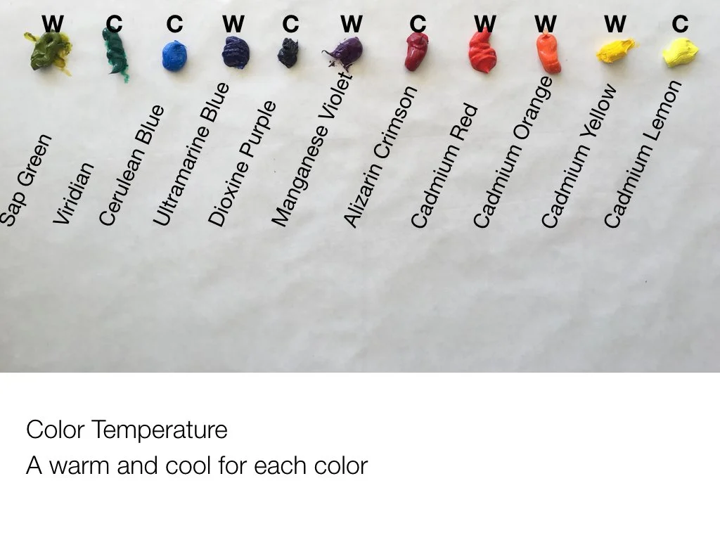

We’ve looked at Values and at Intensity, now we are going to look at COLOR TEMPERATURE. Every color has a temperature, either WARM or COOL. And all colors have a warm and cool version of their hue. Let's look at the palette on the right which shows a warm and a cool of each color except orange. (An orange with more red would technically be warmer than an orange with more yellow).
If I wrapped this palette around into a circle like a color wheel, the yellow-green would go right next to the lemon yellow. This is a great basic palette for any artist beginner to advanced as you can mix almost any color from these combinations, plus white of course. You don’t need black as you can mix your own blacks. Alizarin and Viridian make a beautiful black; you can also add Ultramarine blue into it.
*Interesting Note:
Each of these colors is a HUE (belongs to a color family), however that word can be confusing. When you see the word HUE on a paint tube it has another meaning. Cadmium Yellow Hue (for instance) on a paint tube is actually a substitute for Cadmium Yellow. In other words, it is “Cadmium Yellow Imitation” and is a less expensive product than the original. Often it is perfectly good paint, but the pigment typically is not as strong as, and can have different properties than a true Cadmium. Just something to be aware of.
ALTERNATE PALETTE LAYOUT
For those of you who have a hard time remembering your complementary colors, this bottom palette layout is an alternative. Place your warms on the top and the cools on the bottom, opposite their complements. This photo shows them close together for illustrative purposes, but the cools should be all the way at the bottom of your palette so the mixing area is in between. Of course you could to this side to side as well. Arranging a palette this way helps many people remember their complements.
WEBSITE
NOTE: If you are a paint geek (like me) and really want to know more about color temperature especially for many different colors, a great resource is the Gamblin Paint website. It is geared towards oil painters, but the information will generally hold true for acrylic painters as well. You can see the color temperature of every color that they make.
A BIT ABOUT BLUE
BLUE IS CONFUSING!!! Many many people feel this way. I’ve had lots of people ask me about Blue! As you see in the color temperature palette layout above, Ultramarine Blue is technically warm because it is closer to red, and Cerulean Blue is technically cool because it has no red in it. Red, being the warmest color on the wheel, is the determining factor. The problem is that most people don't seem to see blues that way, including me. I see warm blues as tending more towards yellow than red. Cerulean, Manganese, and Turquoise all appear much warmer to me than Ultramarine or French Ultramarine (which has even more red in it).
Blues in shadow appear to have more red in them to me than blues in the sun which appear to have more yellow. I have wondered if this is ”California Light,” but people around the world have said they see this too. You will hear me talk about Manganese or Cerulean as being warm in some of my demos and this is why. I realize that ”technically” Ultramarine Blue is warmer on the color wheel, but in my paintings I generally choose the Cerulean family for warms. You decide what you see in Blue, but know that you are not alone if you are, or have been, confused.


IT’S ALL RELATIVE
COLOR THEORY “RULES”
WARM colors come FORWARD and COOL colors RECEDE
DARK colors come FORWARD and LIGHT colors RECEDE
BRIGHT colors come FORWARD and DULL colors RECEDE
USUALLY…All rules can be broken!

Hans Hoffman “Fall Euphony” 1959
Warmer colors will appear to be “in front of” cooler colors. This is a general rule of color theory. When you want an object to look like it is behind another object, choose a cooler color, and visa versa. In the painting to the right by Hans Hoffman, he plays with his famous “Push-Pull” use of color where he painted pure abstracts with the intention of manipulating the space with color (temperature, value and intensity) “pushing and pulling” you back and forth in space.
However, all color is relative, which means it all depends on the colors that surround it. Look at the reds in the lower right. they are all technically warm, but some are warmer than the others and those come forward visually. The very dark (number 1 value) black square in the lower left comes way forward, but so does the light yellow one in the middle. He is using intensity in the yellow one to bring it forward. The dark “Forest Green” on the right should come forward because it is dark, but for me it sinks backwards because of the temperature and intensity of the colors around it. The bright yellow square in the upper right appears closer to us than the duller yellow in the left hand corner.
Hoffman is using the concepts of Temperature, Value and Intensity to manipulate space in this painting. He has used the “Rules” I posted above and also manipulated them by the juxtaposition of colors with different temperature, value and intensity (am I sounding like a broken record?). Study it for a few minutes and you will really begin to see the power of these concepts. See what “Pushes” and what ”Pulls” for you.
NOTE: In my OWN YOUR COLORS: PART 2 Class we will have at least one class on breaking the rules!
BONUS PROJECT
Create your own “Push-Pull” painting like Hans Hoffman
Use the Pinterest board images gathered for inspiration.
More HANS HOFFMAN “Push–Pull” Paintings
Throughout the classes I provide PINTEREST BOARDS for a specific relevant topic. Click on the logo to see the examples gathered.
SKETCHBOOK PEEK
When working as a designer for architects we used a simple little figure in our quick sketches of building designs. We called these figures “Tornado People.“ Little heads and tornado-y bodies and long legs. You can even make Tornado Families.
I also want you to note the relationships of hips to shoulders in the sketch on the right. They typically go at opposite angles: if one shoulder is up, the corresponding hip will be down. This simple concept can be used to great affect in simple figures.
In the next video I’m going to paint some simple figures using these concepts. Then you will get the chance to play around with them too, all while learning about color temperature!


PROJECT 3
Focus On Color Temperature To Manipulate Space
VIDEO PASSWORD: Project3
In this video I use simple figures as subject matter to demonstrate how color temperature can be used to describe space in a painting. The warmer colors coming forward and the cooler ones going back. I filmed this video twice as the first time I created very light values in the background which also creates an illusion of space, but I wanted to show that you can do this just with temperature and not necessarily value too. Both paintings are shown below so that you can see the different results.
If you want to see a master at creating beautiful paintings using simple figures and color techniques, look at the work of Robert Burridge. He is a great source of inspiration for this kind of work.
ROBERT BURRIDGE Paintings
Throughout the classes I provide PINTEREST BOARDS for a specific relevant topic. Click on the logo to see the examples gathered.
Website
See more work for inspiration.
As always, PLEASE FEEL FREE TO PICK ANY SUBJECT MATTER for this project. The “Tornado People” are only one fun option.
The colors I used on my palette for this demo going clockwise are:
Permanent Green Light
Ultramarine Blue
Manganese Blue
Titanium White
Lemon Yellow
Cadmium Yellow Dark (Medium in Winsor Newton)
Cadmium Orange
Cadmium Red
Quinacridone Red

Colour Shaper Wide
Colour Shapers are a unique tool made from silicone. The tip will not absorb any material, and so is great for applying, removing, scraping and moving color. Used alone or together with your existing tools, Colour Shapers will give you the opportunity to develop new and exciting effects. Made by Royal Sovereign in England.
NOTE: I don’t talk during every second of this video. I want to let you watch me paint and absorb what I am saying. So when you experience moments of silence that is intentional.
Also, I don’t talk about the “shoulder-hip” relationship in the video, however you can use it to illustrate a figure's position, movement and expression. Try just altering the shoulders slightly in your painting and see what your figures “say.”


Examples of paintings emphasizing Warms and Cools
Throughout the classes I provide PINTEREST BOARDS for a specific relevant topic. Click on the logo to see the examples gathered.