LESSON ONE
HOW COLOR CHANGED THE WORLD
The Beginnings of a New Way of Painting
“With color one obtains an energy that seems to stem from witchcraft.”
Video Password: Summer
Video Length: 14:18 minutes

Collioure ▪ France
Where Matisse and Derain Changed the Art World Forever
Henri Matisse and André Derain painted together in the South of France in 1905 in the small and colorful town of Collioure. The resulting paintings radically changed the way artists use color. The photo here gives us some idea of the brilliant and inspiring “feast for the eyes” they must have experienced.
The video below, created by the Metropolitan Museum of Art, beautifully describes the relationship between Derain and Matisse. It’s hard to imagine the impact that these works had at the time because we are so used to seeing color used this way now, but try to imagine if this was the first time you had seen objects painted with expressive, bright, saturated colors instead of realistic and naturalistic colors.
Notice also, the vibrancy of the paintings in this video. Books and online sources do not truly capture the brilliance of the paint colors.

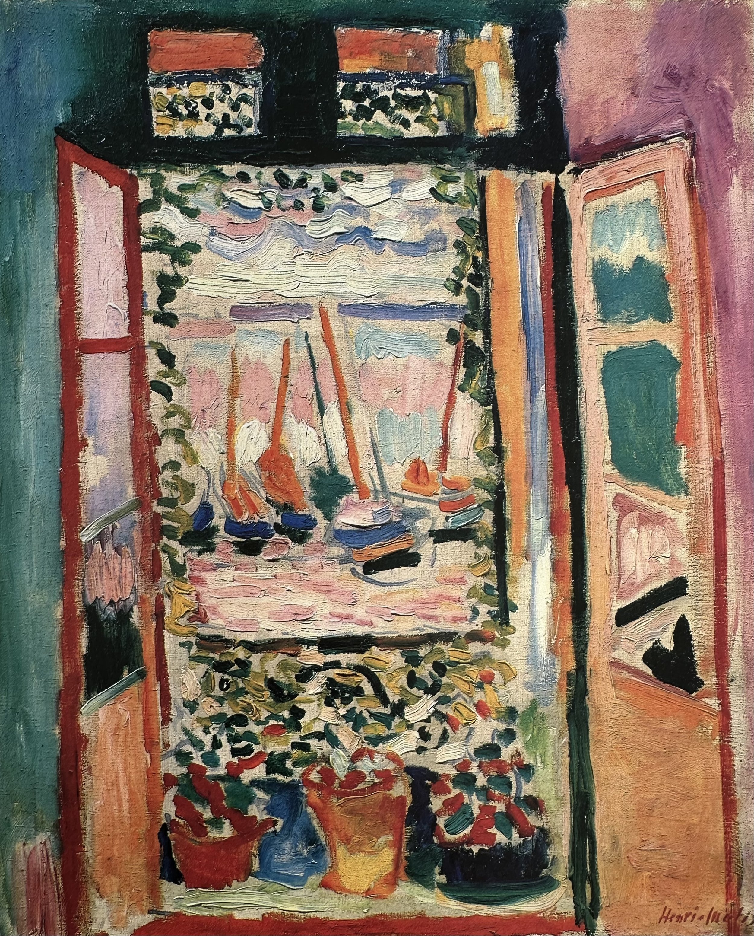
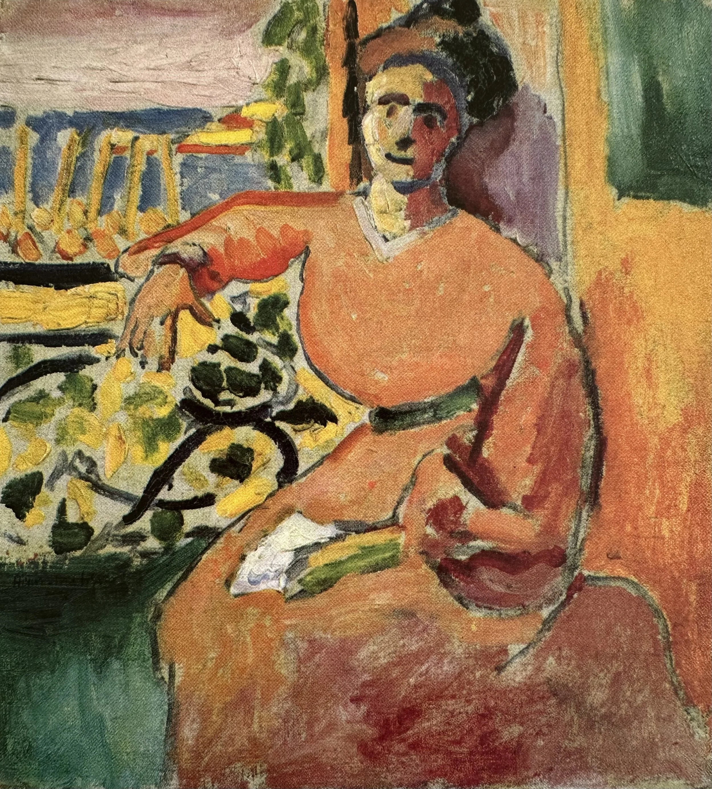
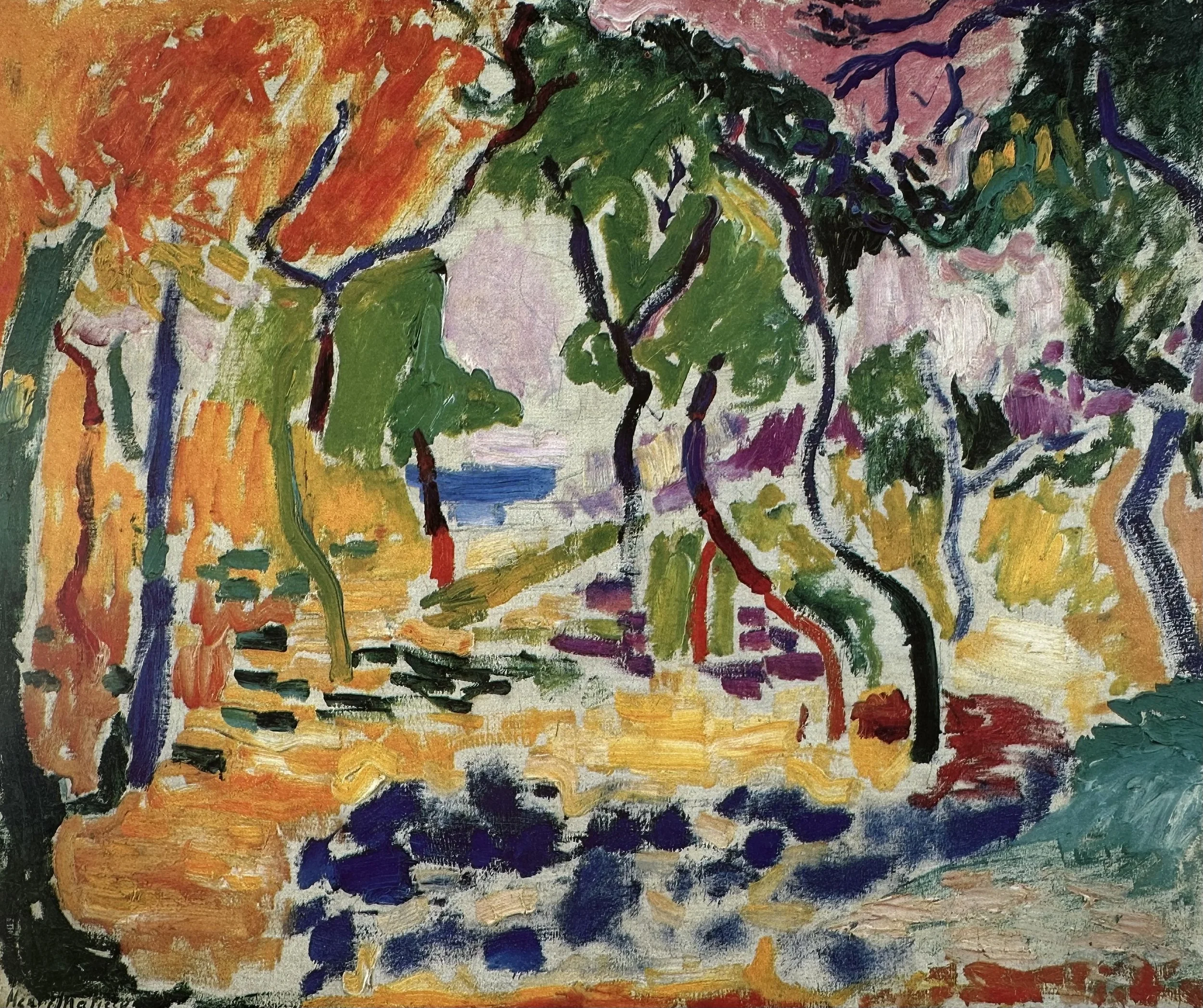
GALLERY
▫
GALLERY ▫
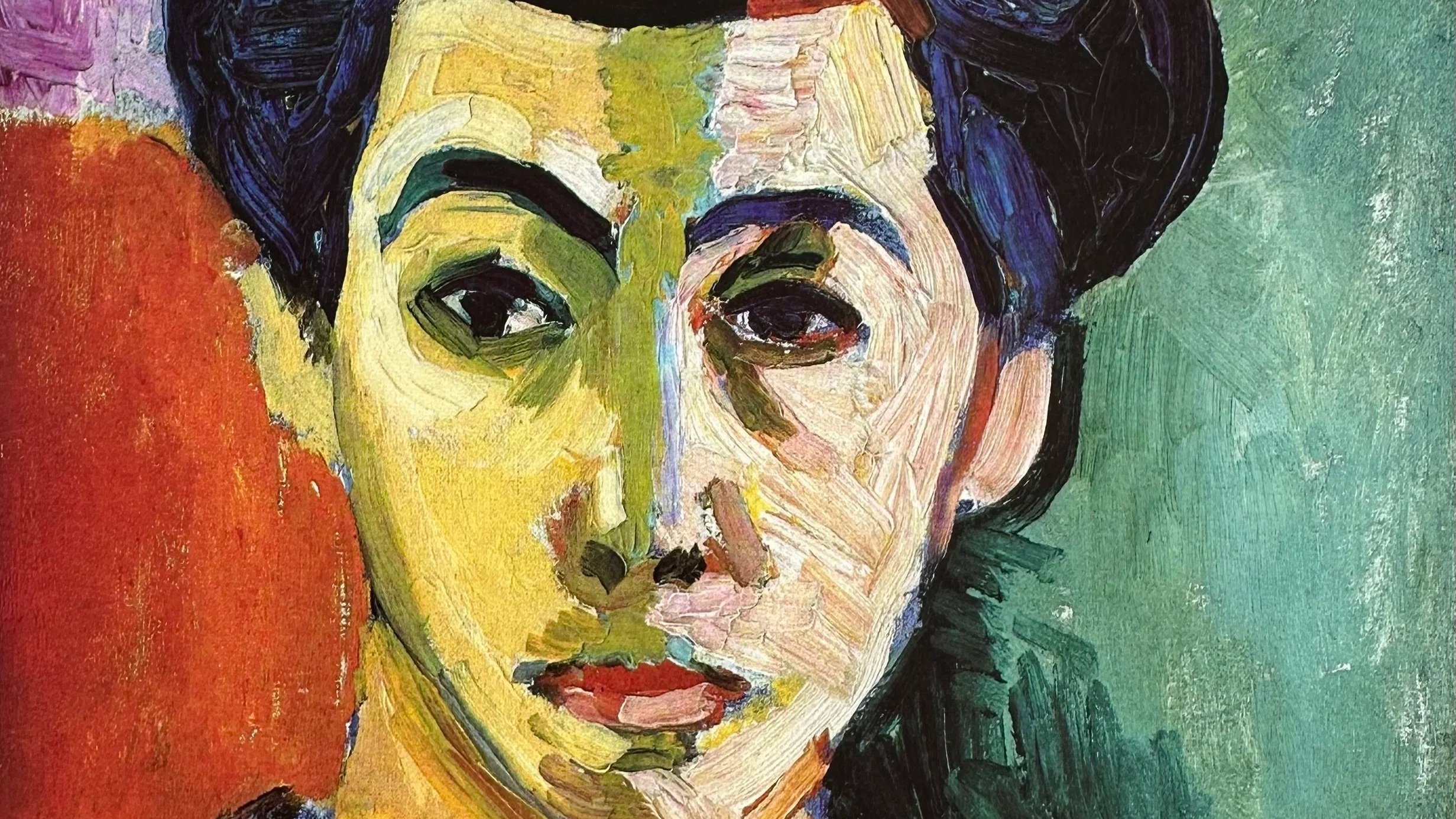
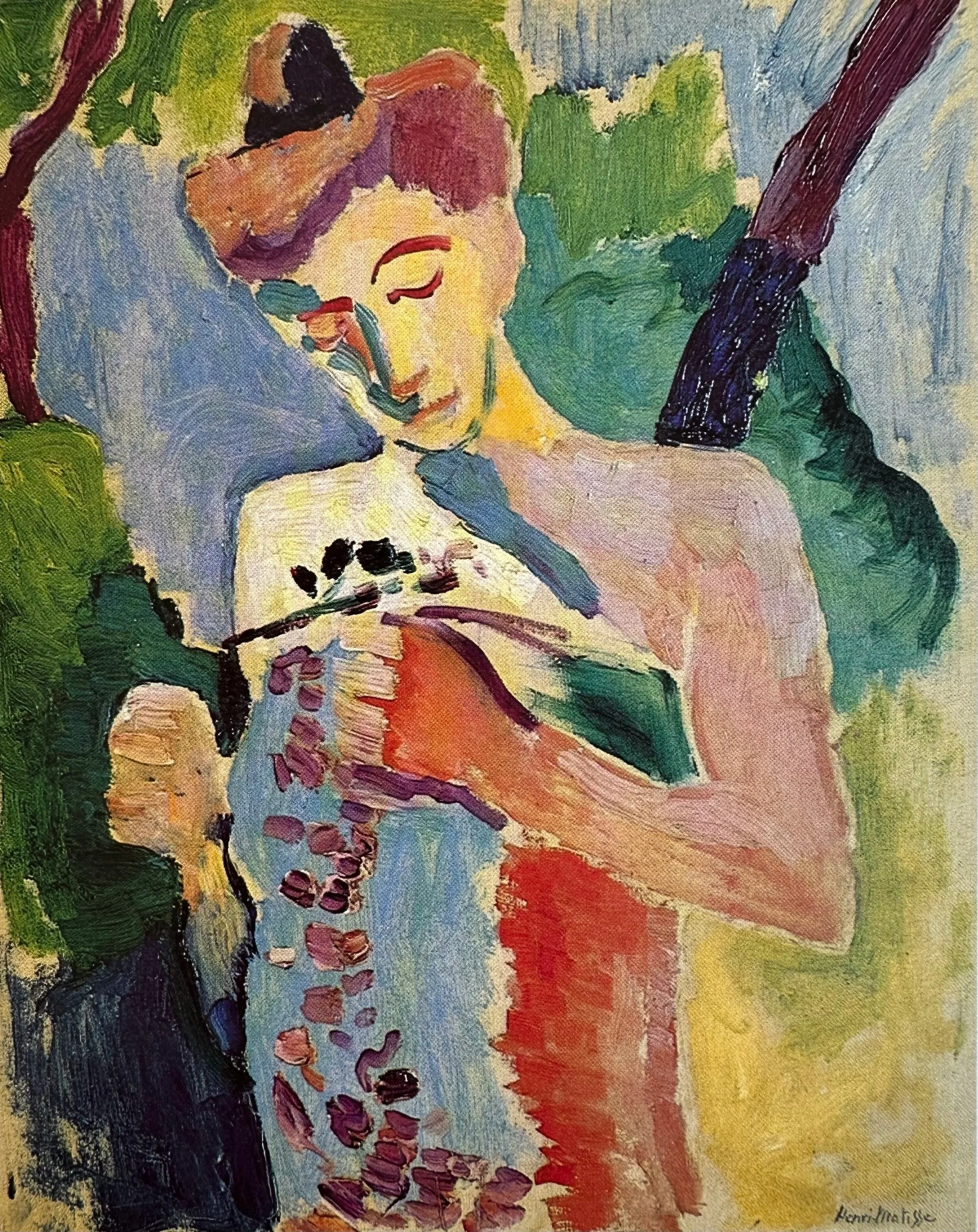
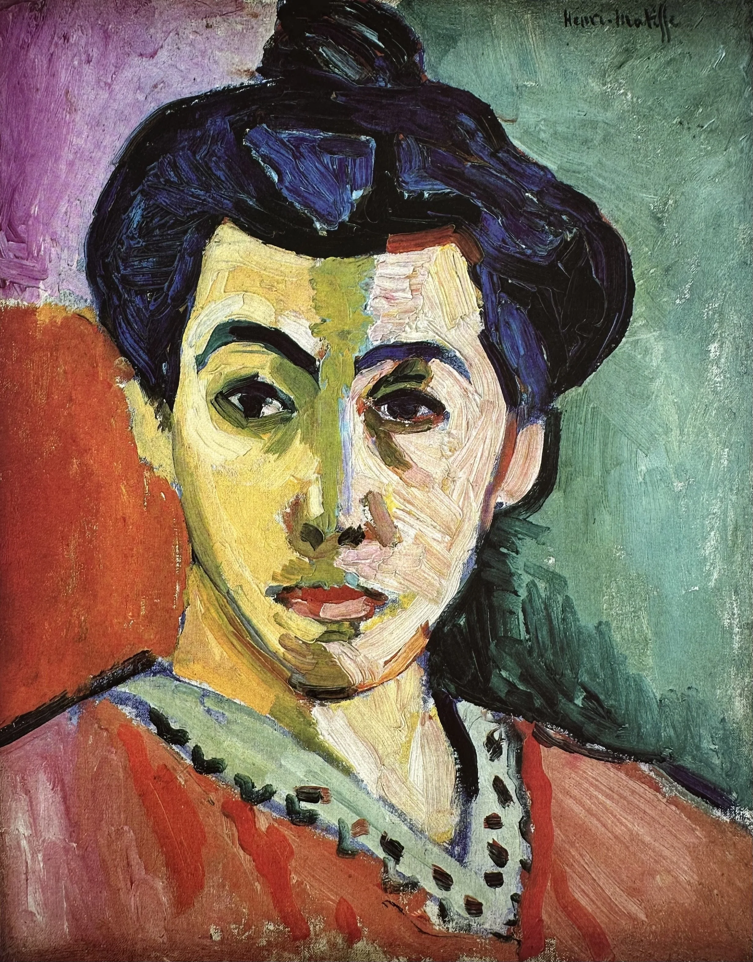
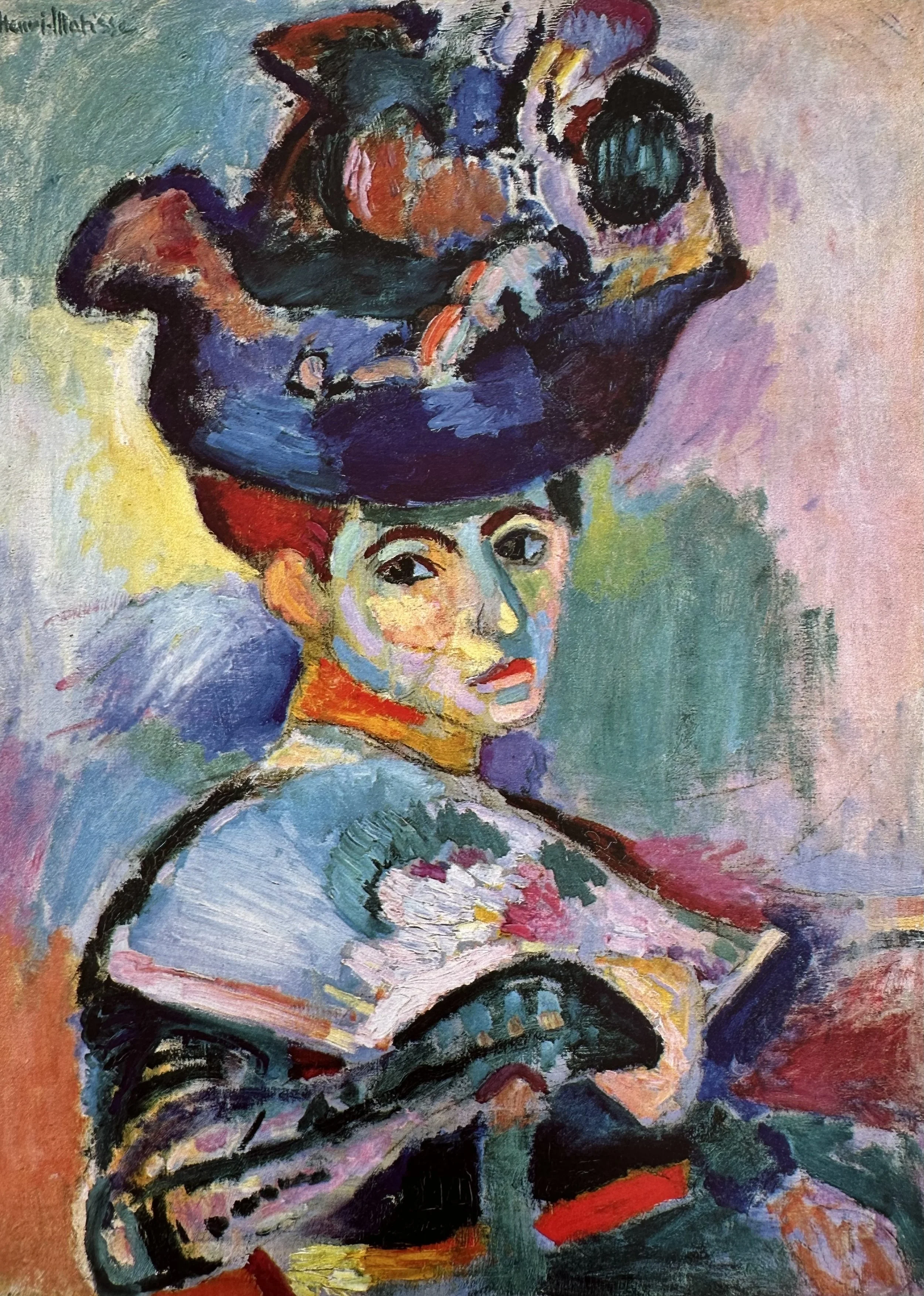
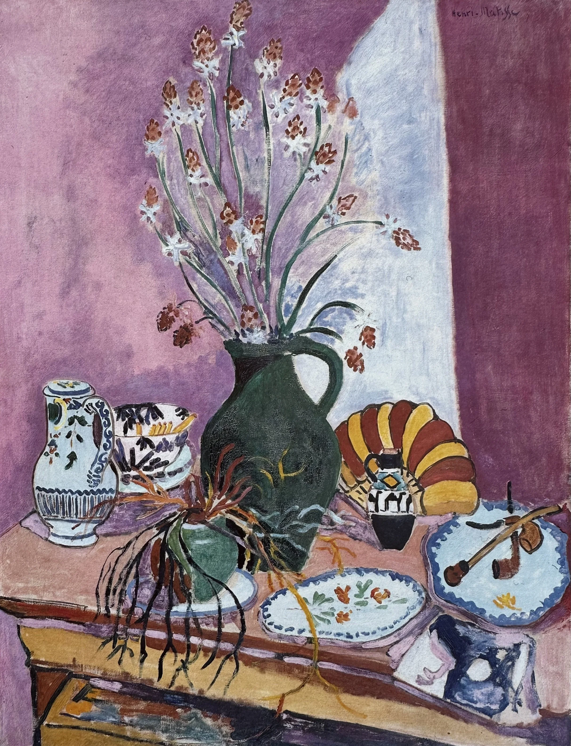
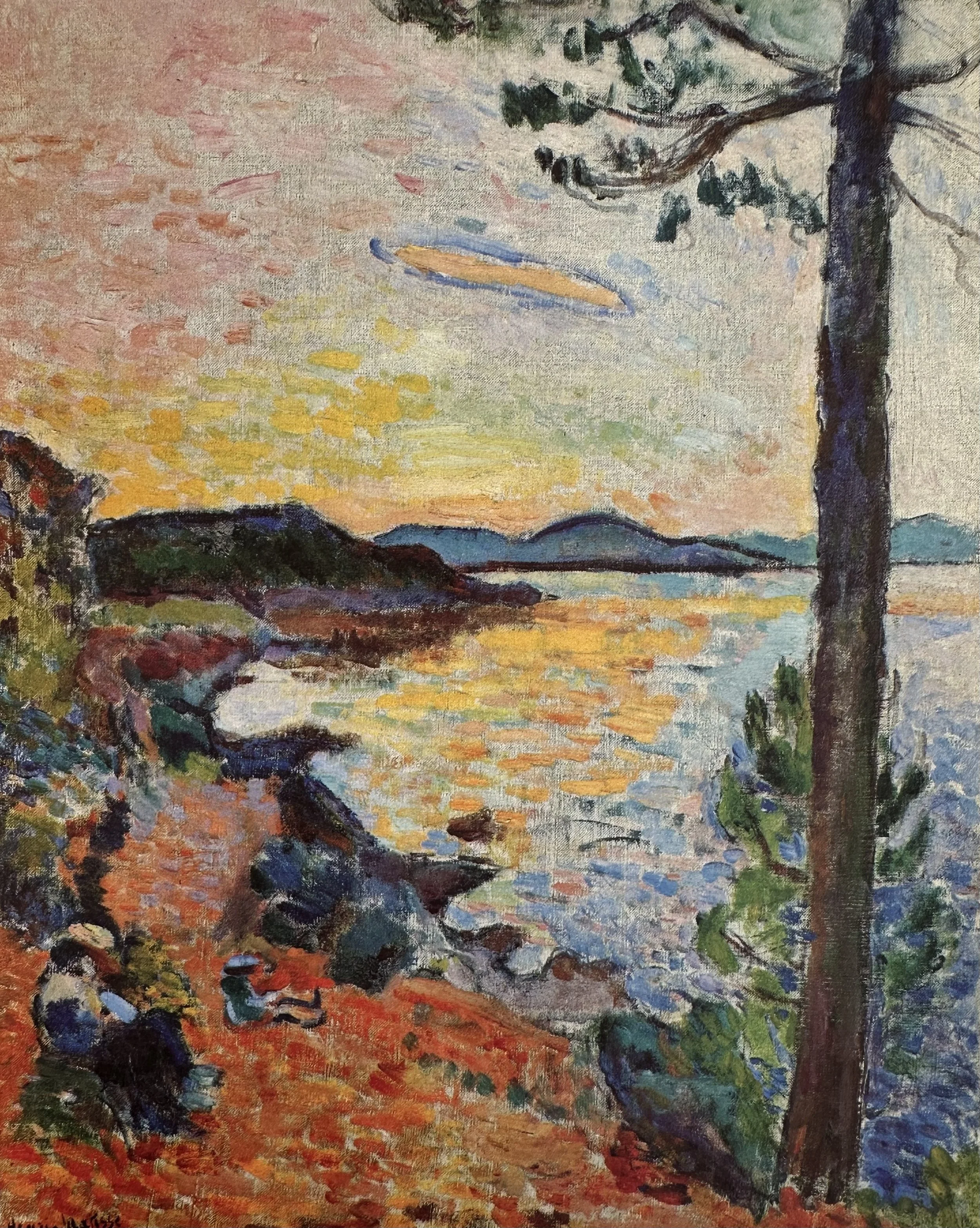
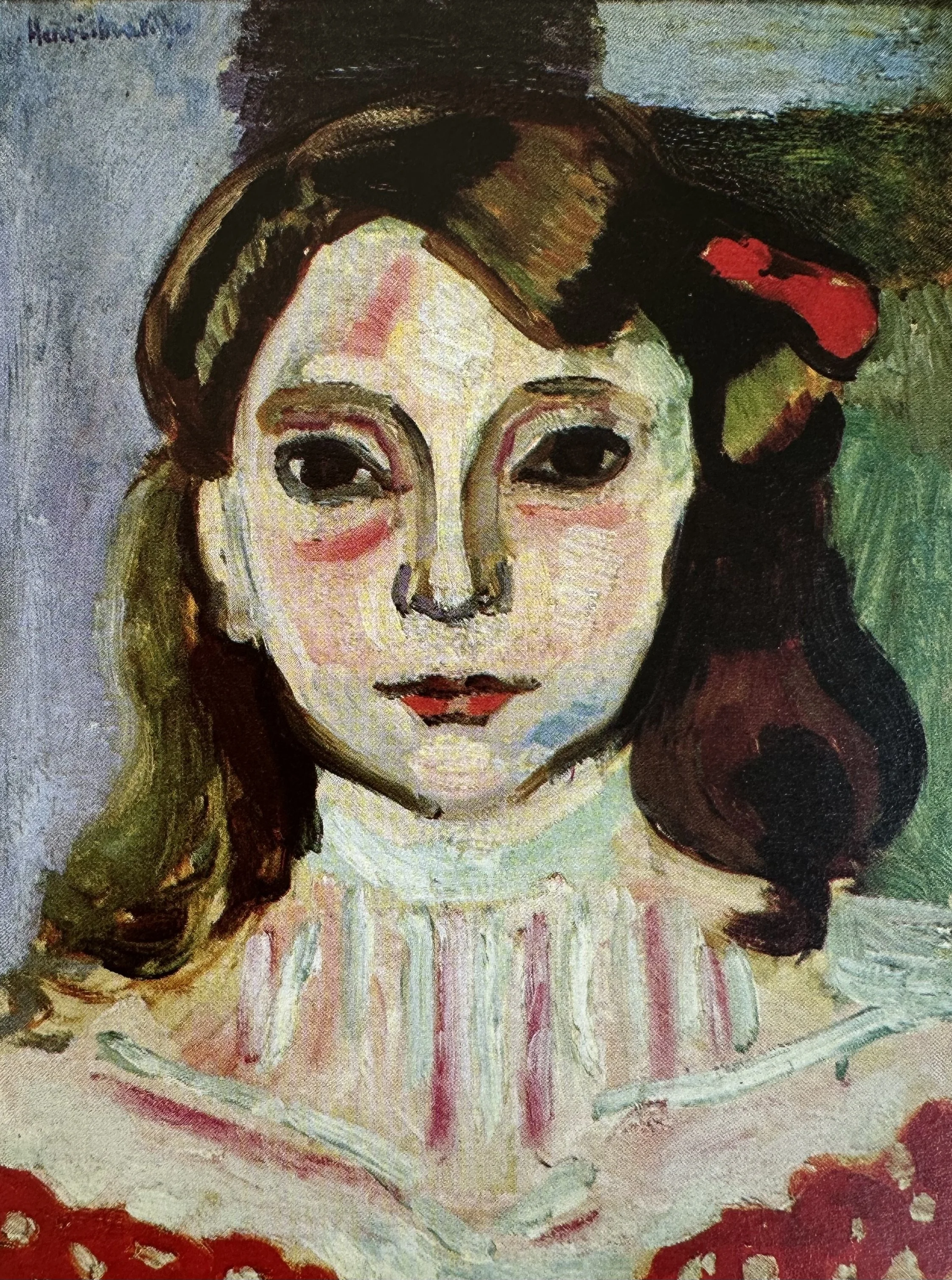
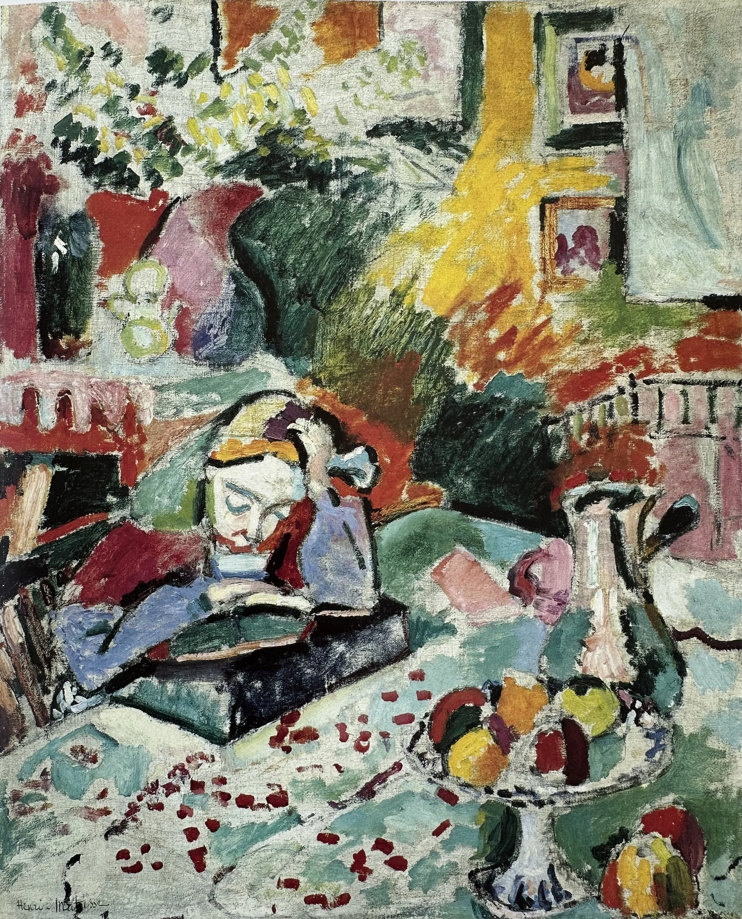
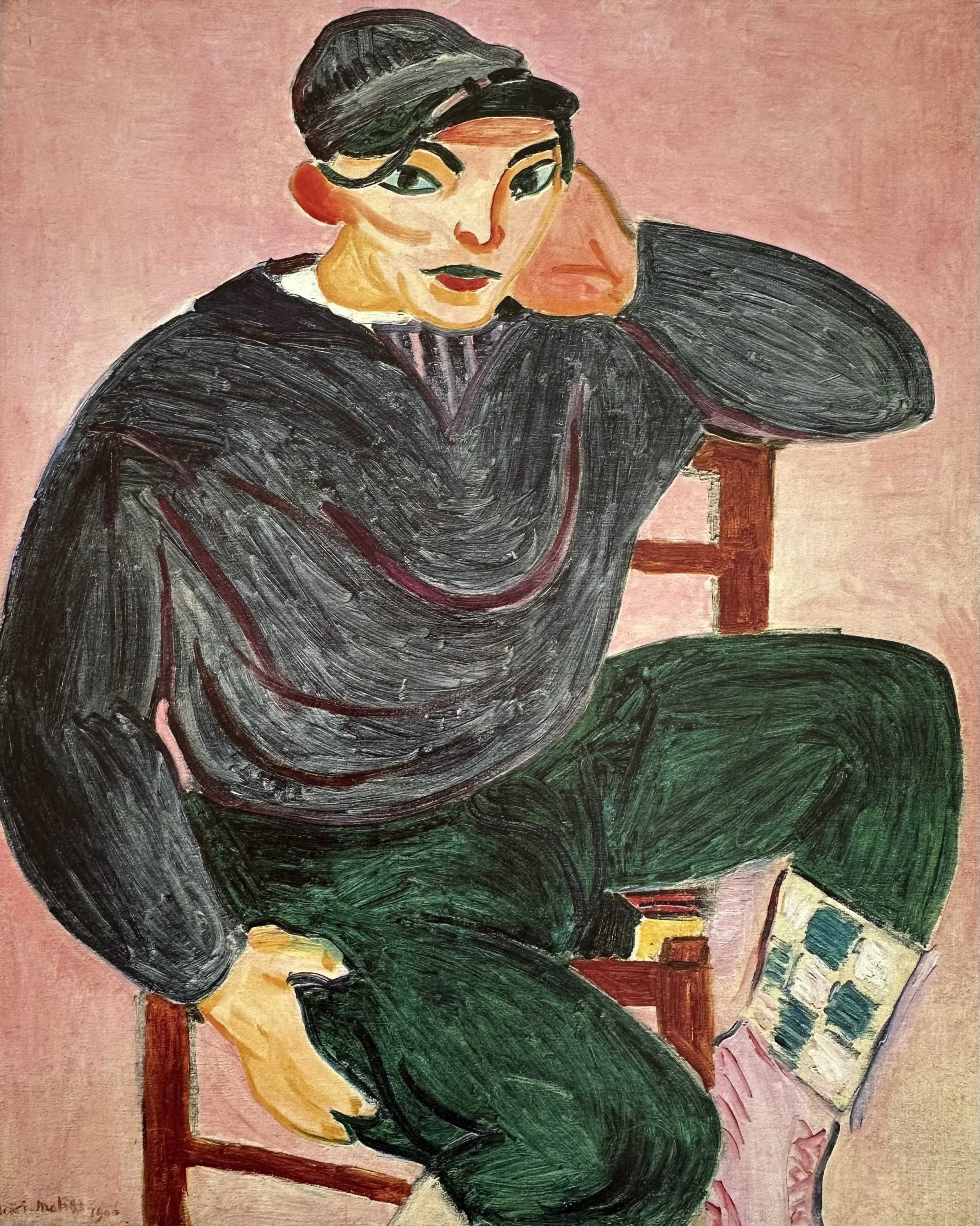
Matisse’s Fauvist Paintings
(1904–1907)
⇣ Click on any image to view larger ⇣
Master of Color
Before we can paint like Matisse, we need to understand his extraordinary command of color. Not necessarily rules to follow but principles he knew so deeply that he could break them with authority. First let’s review basic color terminology to make sure that we are all speaking the same color language before we further our color study.
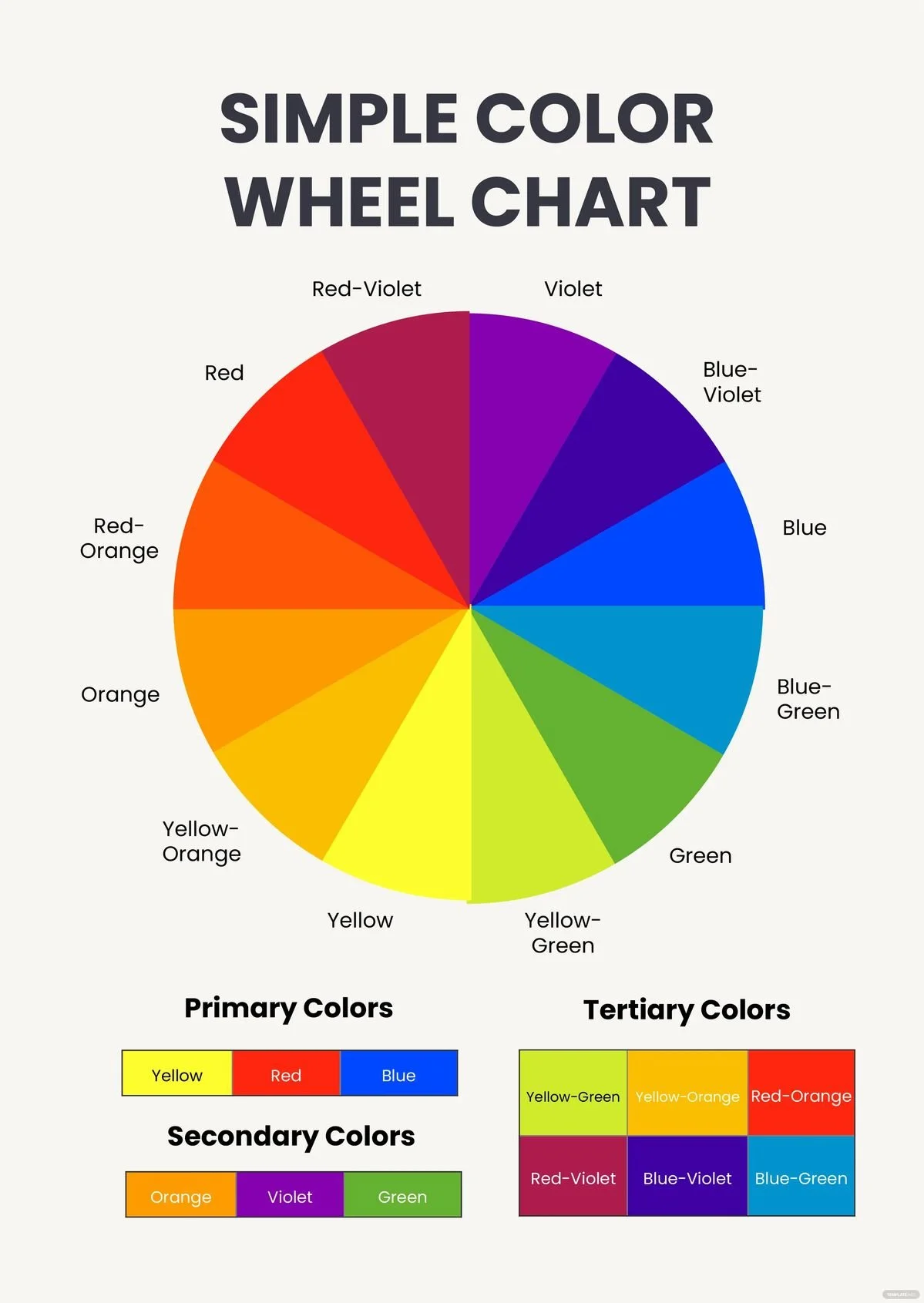
COLOR LANGUAGE
-
A color family such as Red, Blue, Yellow, Green, Violet, and Orange. We can break these down further into Yellow-Green, Red-Orange, etc. Every color belongs to a color family, thus, every color has a “hue.”
-
The brightness or INTENSITY of a color. We also sometimes use the word SATURATED. Cadmium Red Light (for instance) straight from the tube is an example of high-chroma, saturated color. A low chroma color is generally a more NEUTRAL color such as a grey or earth tone color.
-
Degree of lightness or darkness of a color. The color (hue) is not important in this definition, only how light or dark the color is relative to white and black. (Think of a black and white photo of your painting).
-
The true color of an object, as opposed to the way it may appear in certain lighting conditions, at a distance, or in contrast with other colors.
-
When two (or more) objects are near each other, the color of each may be reflected on the other. Imagine an orange next to a white pitcher. The side of the pitcher may take on (reflect) some of the orange color.
-
Every color is either WARM or COOL. This can be confusing to new painters in particular because color can be in a warm hue family but be cool relative to another color in their family. For example, Quinachridone Red is in the family of Red (warm) but it is a cool color relative to Cadmium Red Light.
-
Colors opposite each other on the color wheel.
-
Three to four colors next to each other on the color wheel. Another way to darken or lighten a color is to add an analogous color.
COLOR WHEELS

What Matisse Knew About Color
MATISSE’S SINGING PALETTE
The “singing palette” is a term used to describe the quality that results when colors in a painting seem to vibrate, resonate, or literally sing against each other rather than sitting inertly on the canvas.
Matisse described color less like a painter and more like a musician — talking about notes, chords, and harmony. The singing palette is essentially the visual equivalent of a chord: individual colors that, in combination, produce something greater than any of them alone.
The core idea comes from how certain color combinations create an optical and emotional intensity that no single color could produce alone. It's less about which specific colors you use, and more about the relationships between them.
What creates it:
Matisse understood that complementary colors (those opposite each other on the color wheel) placed side by side at full saturation, intensify each other dramatically. Each color makes the other appear more vivid than it would look in isolation. A red placed next to a green doesn't just sit there, it vibrates.
But a singing palette isn't simply “use complementaries.” Matisse added crucial nuance:
Value is KEY. Firstly, Matisse’s “wild” Fauvist colors would often match the value of the original local color of the subject. Secondly, complementary colors of the same value vibrate more than colors of different values.
Proportion matters. A small note of orange against a large field of blue creates more electricity than equal amounts of each. He controlled the ratio carefully.
Temperature contrast adds to it. Warm colors (reds, oranges, yellows) placed against cool colors (blues, violets, cool greens) create a spatial tension. The warm colors appear to advance, and the cool to recede. This illusion adds to the vibrancy.
Saturation must be managed. If every color is at full intensity all at once, the result is noise, not music. Matisse would include a quieter, more neutral passages for contrast and to give the eye a place of rest.
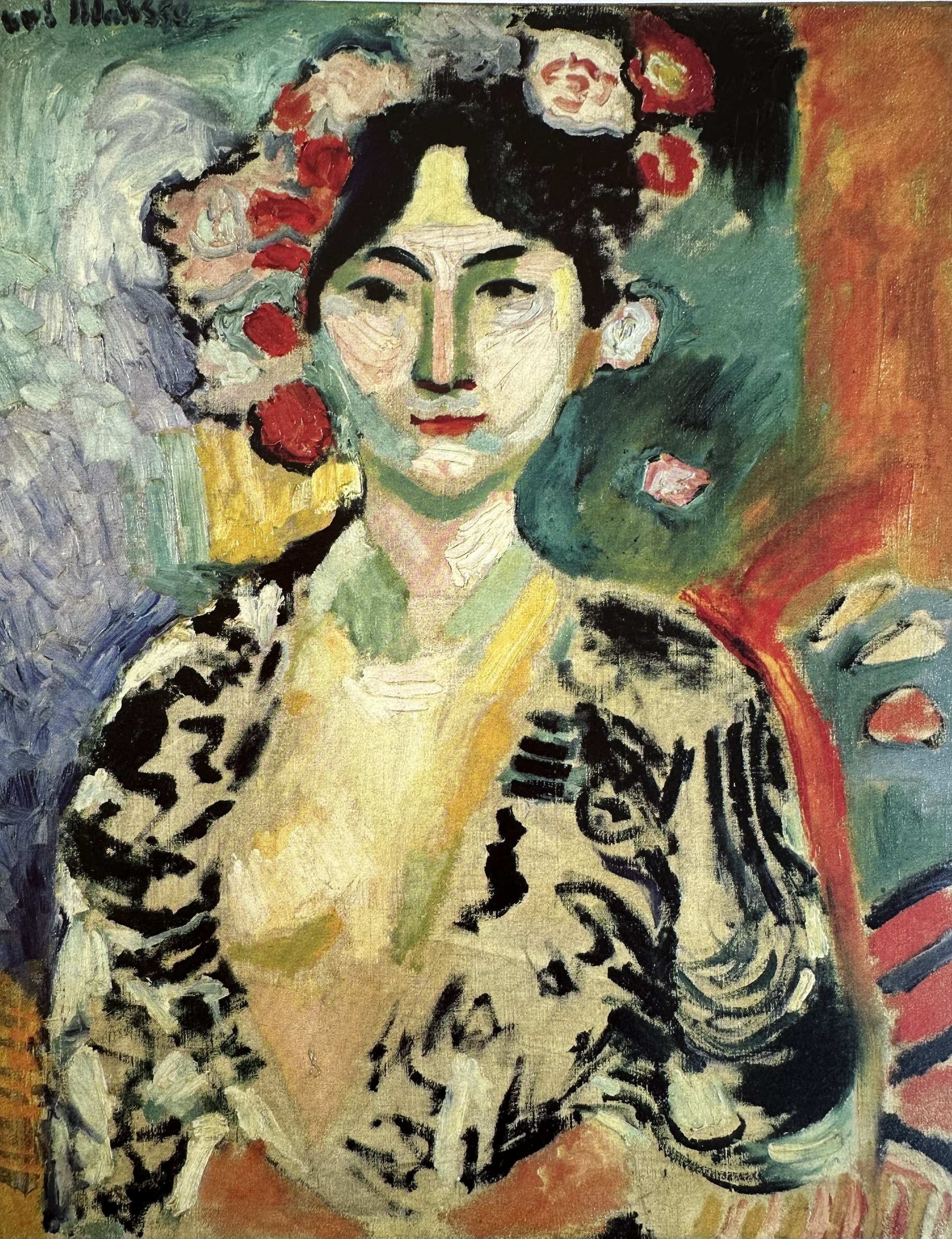
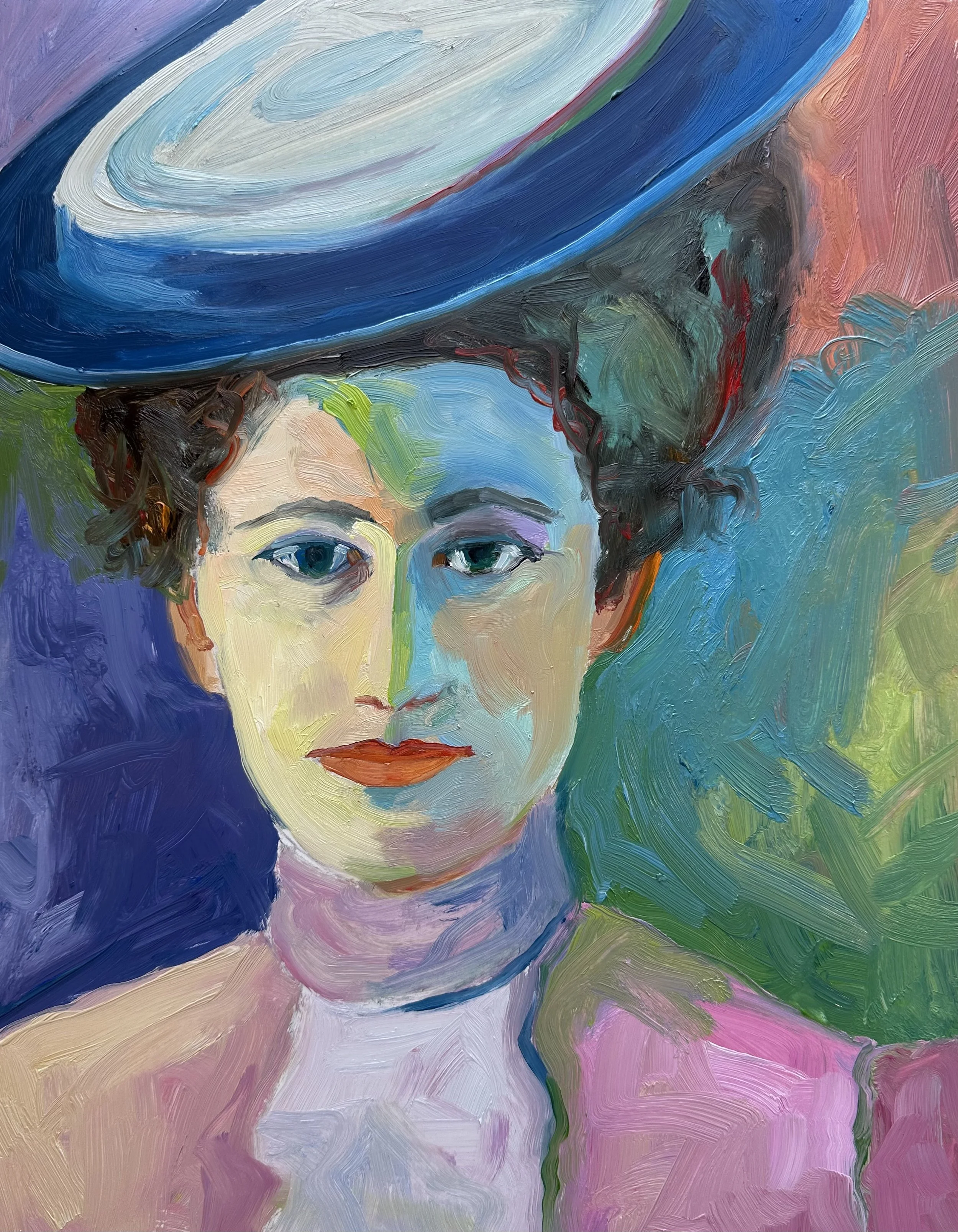
See if you can spot these concepts of a “SINGING PALETTE” in this painting, “The Woman with the Hat.”

Beyond The SINGING PALETTE
▫
Beyond The SINGING PALETTE ▫
ESSAY: “Notes of a Painter” by Henri Matisse
Matisse eventually moved past the use of the Post-Impressionist “pointalist” ideas. He, instead, focused on using color to express emotion as you can see from the quotations below. Very aware that one color will always affect another he would often re-work canvases dozens of times to get the color relationships and proportions to his liking. Here are some of his thoughts about color from an essay he wrote in 1908, “Notes of a Painter.”
“The chief function of color should be to serve expression as well as possible. I put down my tones without a preconceived plan.”
“My choice of colors does not rest on any scientific theory; it is based on observation, on sensitivity, on felt experiences… I simply try to put down colors which render my sensation.”
“In reality, I think that the very theory of complementary colors is not absolute.”
“If upon a white canvas I set down some sensations of blue, of green, of red, each new stroke diminishes the importance of the preceding ones…It is necessary that the various marks I use be balanced so that they do not destroy each other…A new combination of colors will succeed the first and render the totality of my representation. I am forced to transpose until finally my picture may seem completely changed when, after successive modifications, the red has succeeded the green as the dominant color.”
“Notes of a Painter” by Henri Matisse
CLICK ON THE PDF ICON TO READ / DOWNLOAD THE FULL ESSAY
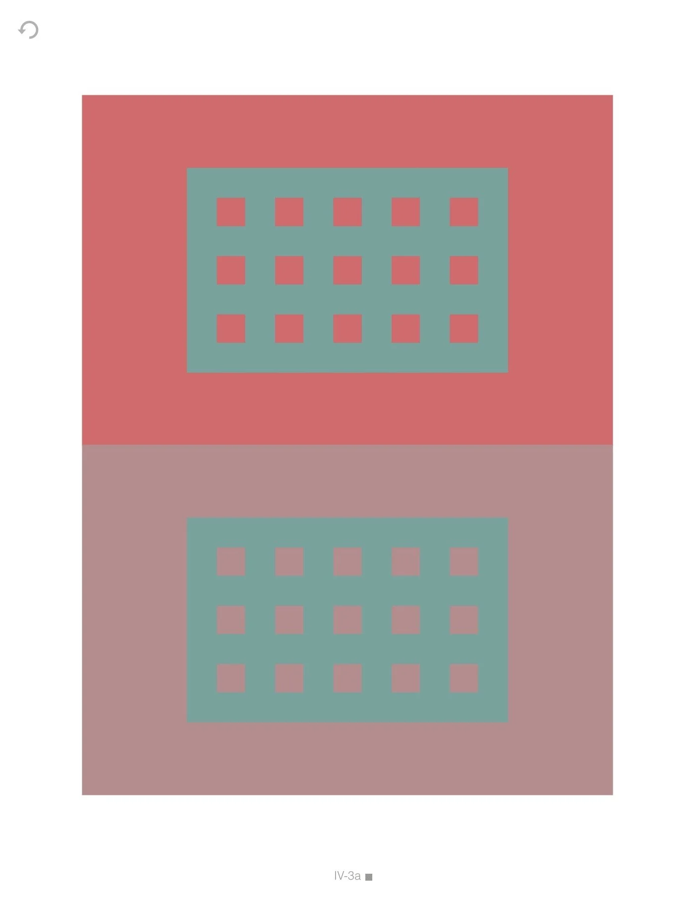
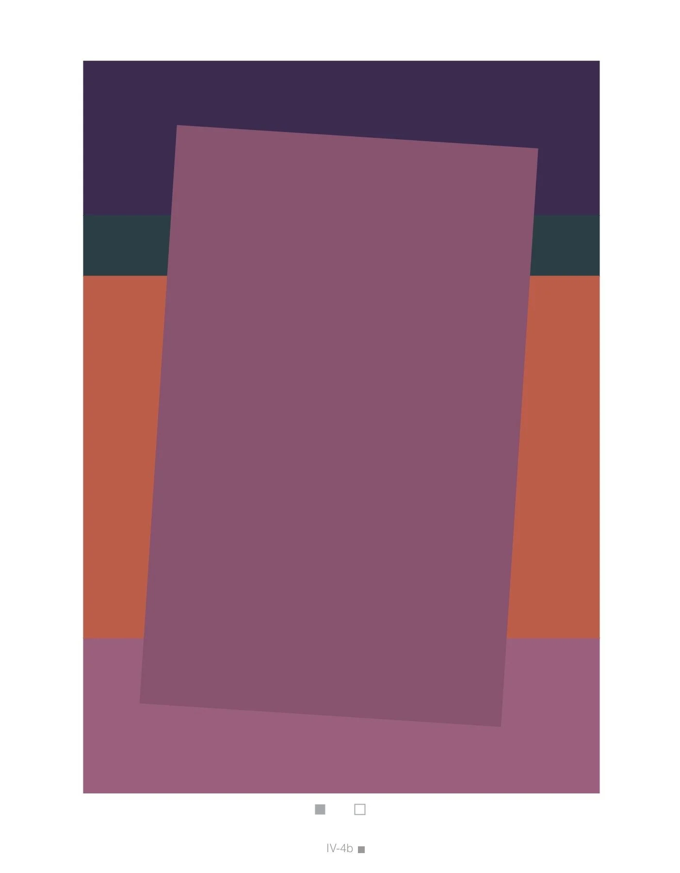
All color is relative. No color exists in isolation.
Every color is defined by its neighbors.
If you find color confusing, you are not alone. Watch this video to understand some reasons why and learn more about Color Relativity.
Video Password: Color
Video Length: 10:34 minutes

Project
Playing with Color Relativity
Play like a child and study color relativity at the same time!
Video Password: Play
Video Length: 5:10 minutes
NOTE: Feel free to select your own compositions or those of another artist for this project as well.


Project
Paint like a Fauve!
Let’s have some fun with color!
Video Password: Fauve
Video Length: 29:29 minutes
-
Be loose! There is no need to copy the photo exactly.
Be expressive with your color choices.
Consider using complementary colors to create that “singing palette.”
Be mindful of values. Think about approximating the values of your reference even though the color may be entirely different.
Be playful.
This project can also be done using a landscape as a reference.
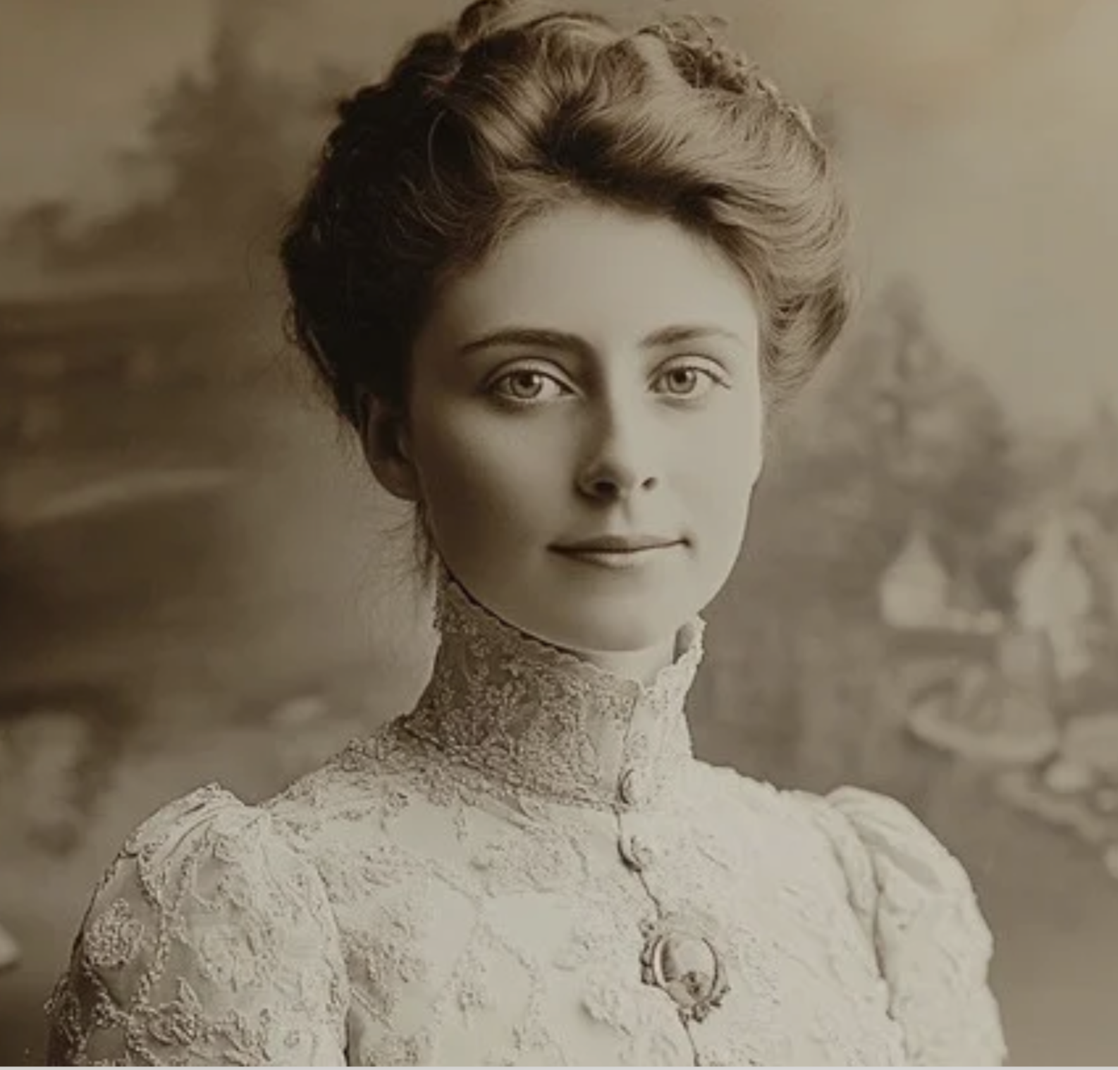
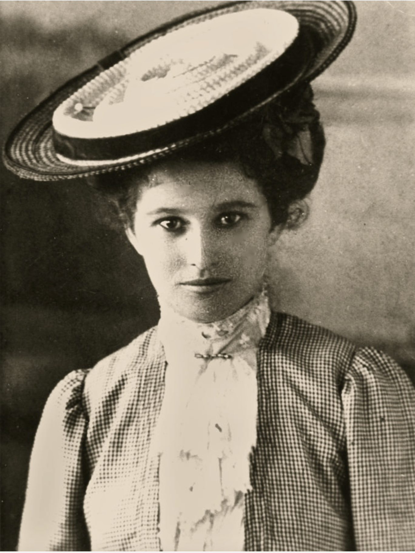
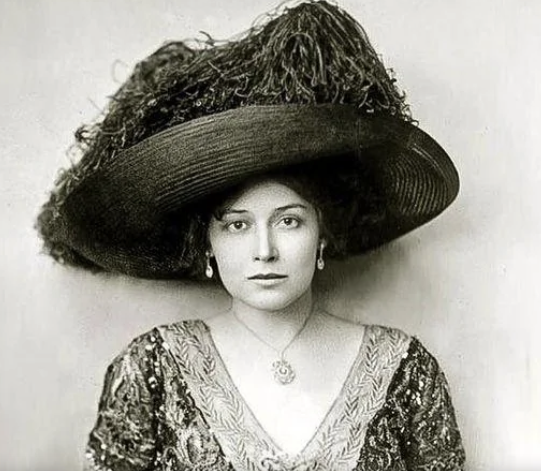
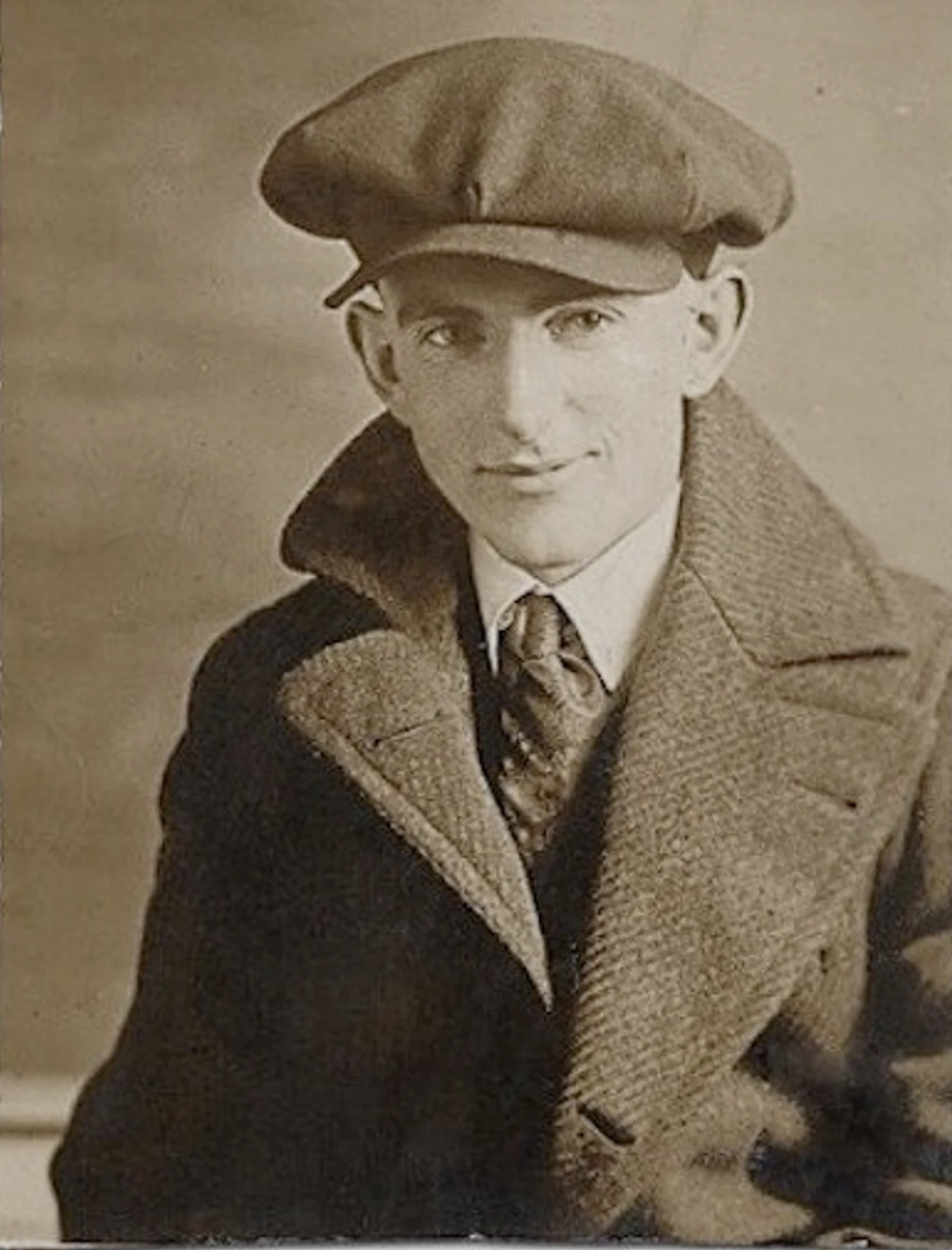
If you like the vintage look of the era of Matisse, simply search for “vintage photos of women",” or “vintage photos of women in hats.” etc. for more images. Below are examples of what you can find. Of course, feel free to use any of your own images that you might prefer.
REFERENCE PHOTO GALLERY
▫
REFERENCE PHOTO GALLERY ▫
⇣ Click on any image to view larger ⇣