
INTRODUCTION
“What I dream of is an art of balance, of purity and serenity devoid of troubling or depressing subject matter…a soothing, calming influence on the mind, something like a good armchair which provides relaxation from physical fatigue.”
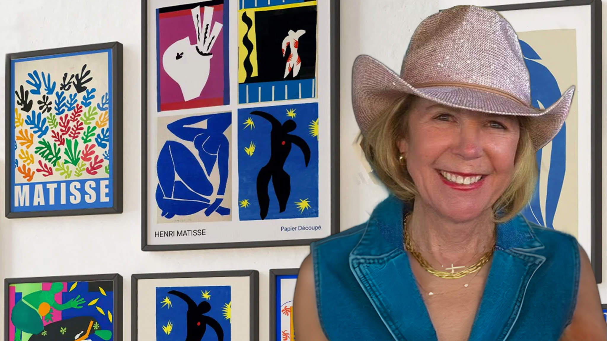
Who was Henri Matisse?
Henri-Émile-Benoît Matisse (1869–1954) is celebrated alongside Picasso as one of the defining figures of modern art. He believed that art should be like “a good armchair,” a place of rest and joy.
In this course we will explore the life and revolutionary vision of one of the 20th century’s greatest artists. We will examine his bold approach to color, his emphasis of line and form, his fascination with windows and interiors, his love of the figure, and his ongoing push towards “balance, purity and serenity.”
No prior art experience is required, only curiosity, a willingness to play, and the desire to see the world a little differently. Each module blends art history, critical looking, and hands-on studio practice so that you leave not just with skills, but with a genuinely deeper understanding of why Matisse still matters.
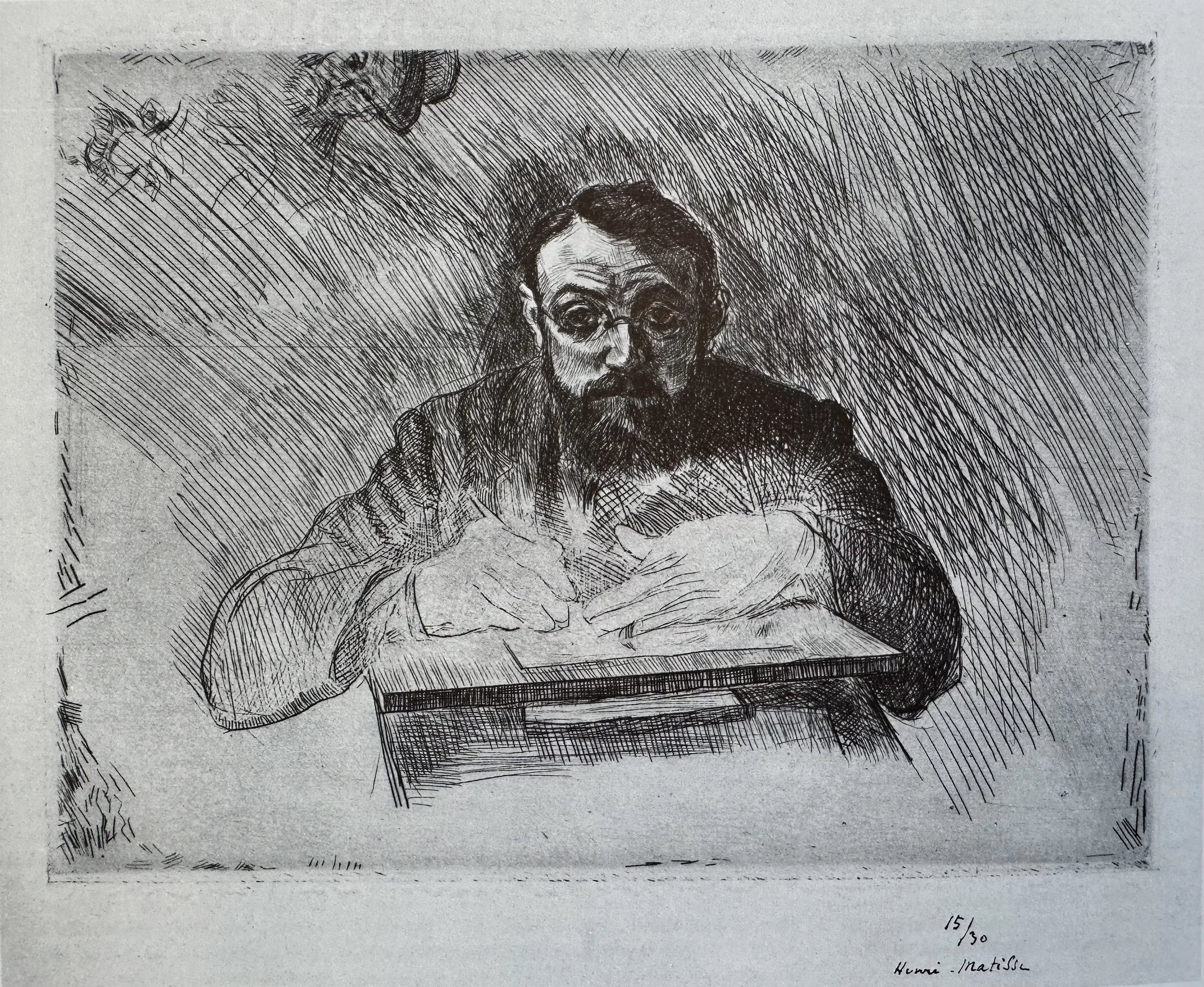
Henri Matisse Etching (1900 - 1903)

Matisse’s Early Years 1869-1908
Video Password: Early
Video Length: 9:43 minutes
1869
Born in Le Cateau-Cambrésis, northern France, son of a grain merchant.
1889
Given a paint box while recovering from illness—begins painting obsessively and decides to dedicate his life to art.
1895–1900
Studies under Symbolist paint Gustave Moreaus at the École des Beaux-Arts, Paris, Forms lasting friendships with Albert Marquet and and other future Fauves.
1904–1905
Works alongside Paul Signac; experiments with Neo-Impressionist Pointillism before breaking free. Summer in Collioure with André Derain is electrifying.
1905
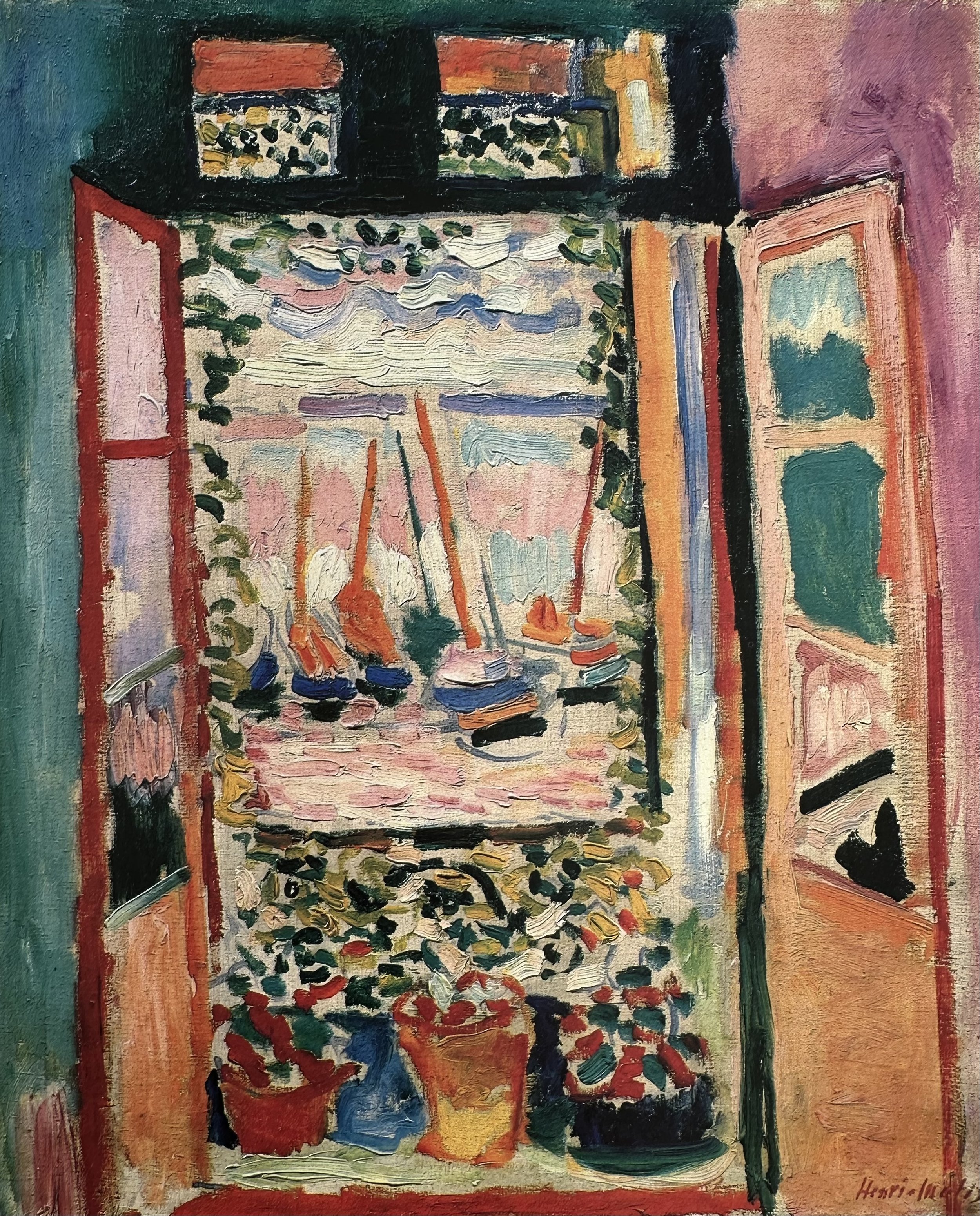
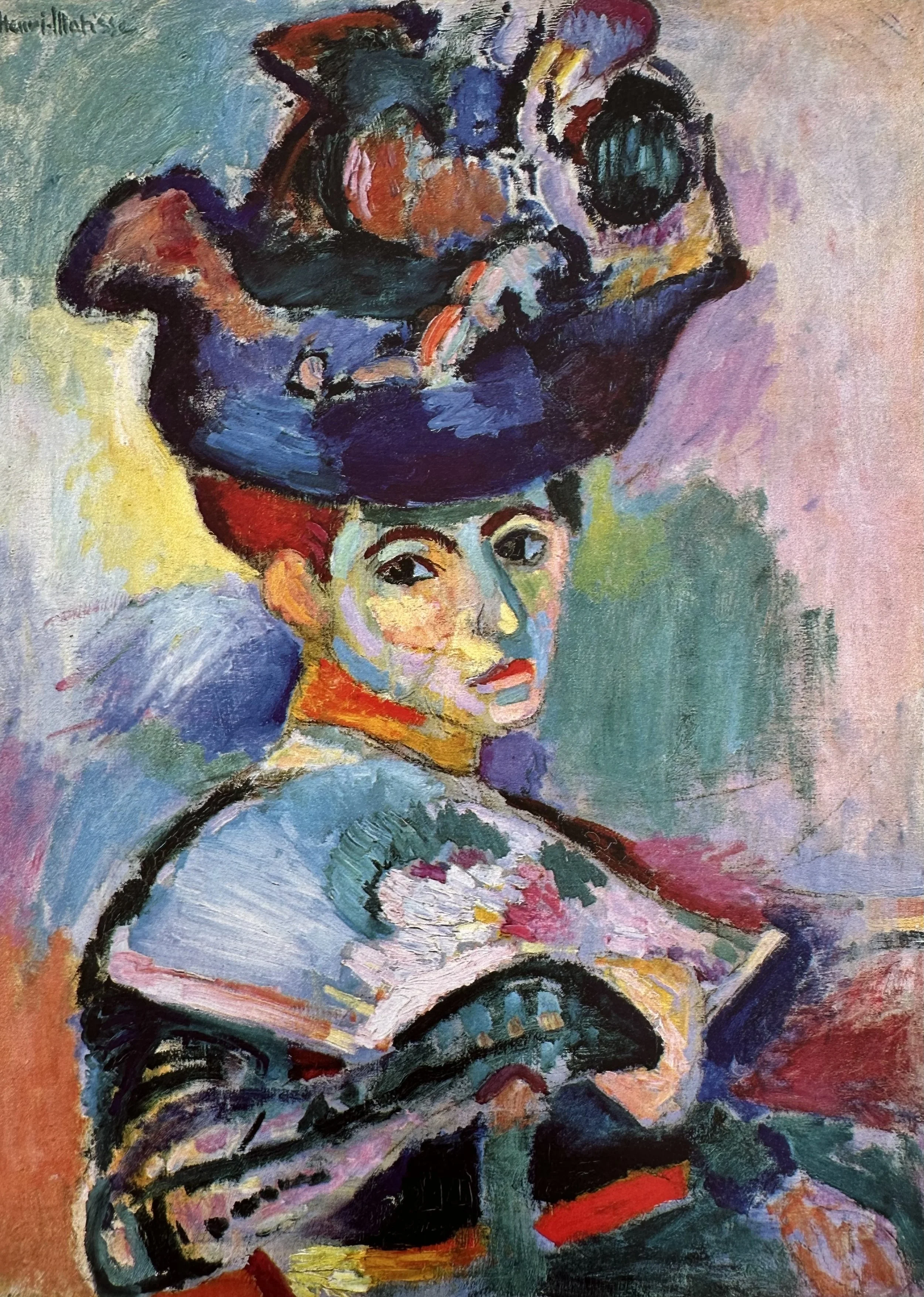
Fauvism explodes onto the scene. The Salon d’Automne exhibition shocks Paris. Critics call Matisse and his circle les fauves — “the wild beasts” — for their savage, non-naturalistic colour. Woman with a Hat scandalises and fascinates in equal measure.
1906–1913
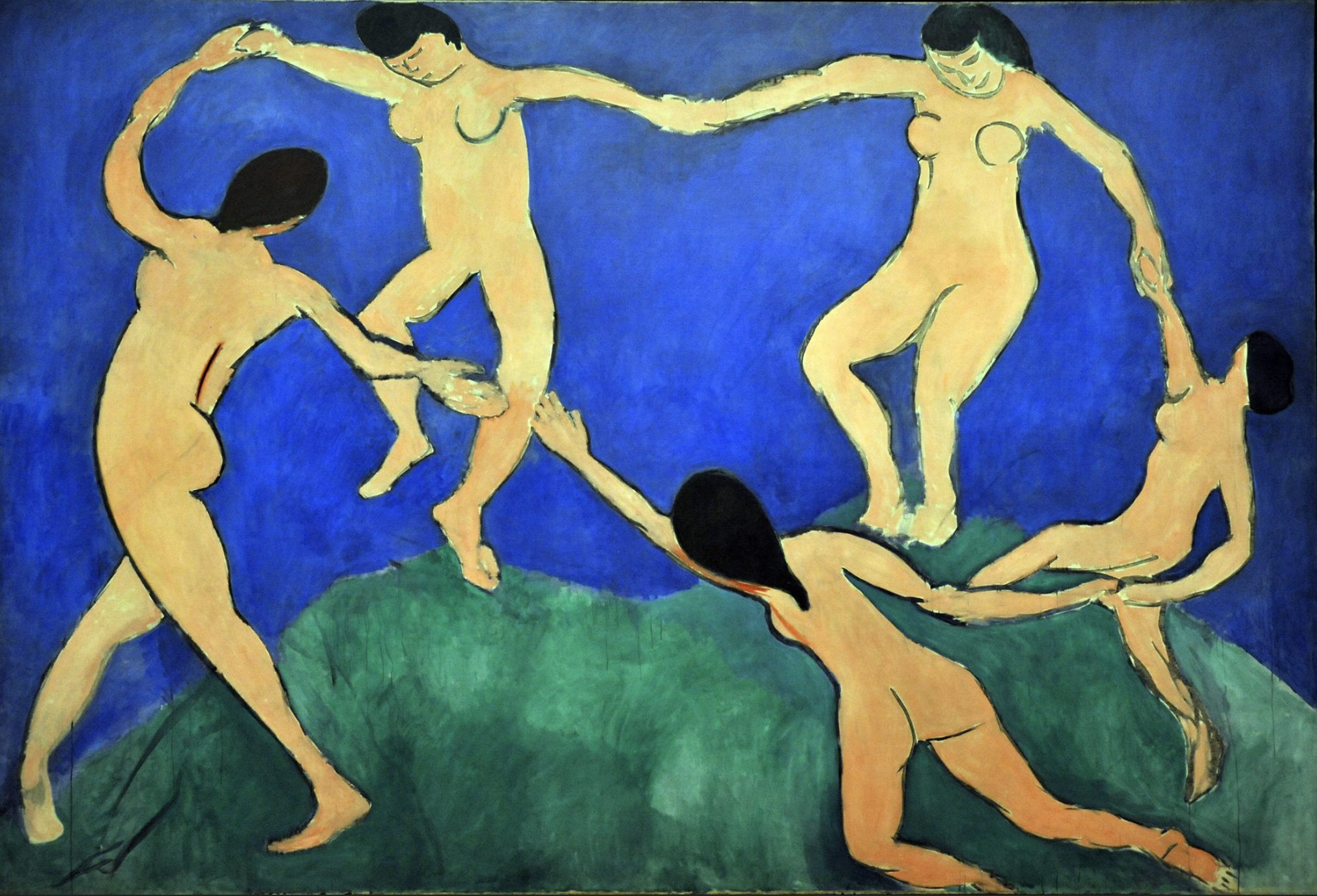
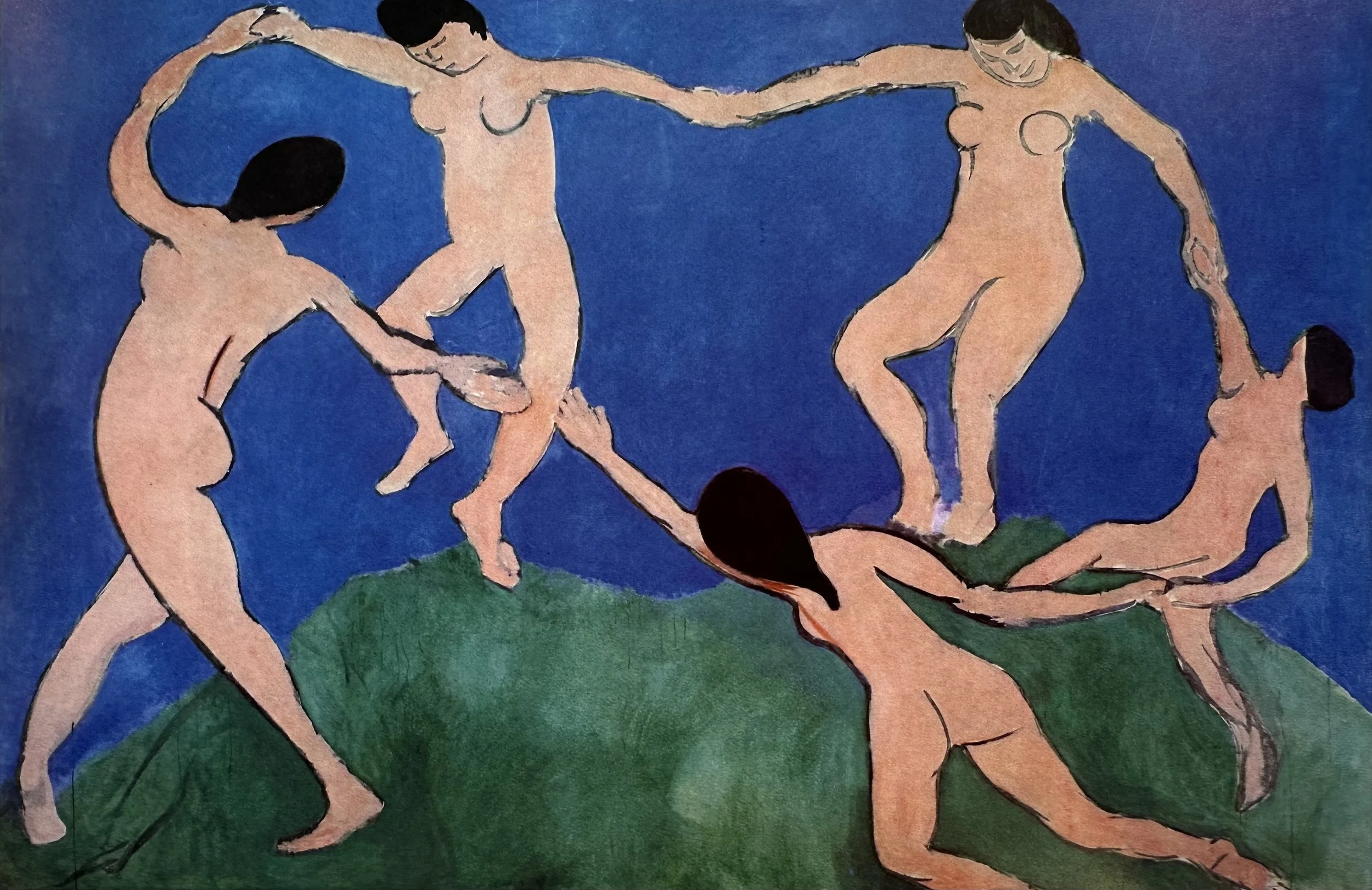
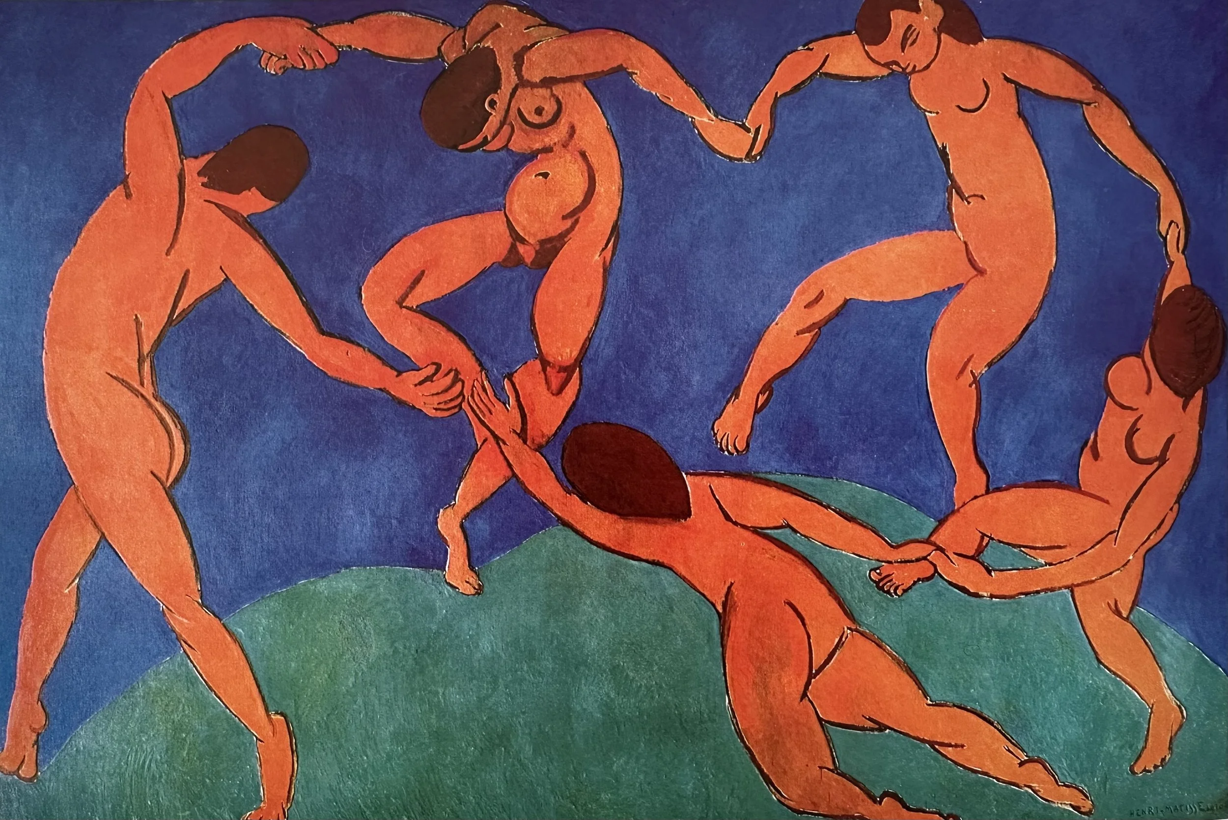
Travels to Morocco and Algeria; Islamic geometric art and vivid North African light permanently transform his sense of pattern, decoration, and colour harmony. Paints the great series The Dance and Music for Russian collector Sergei Shchukin.
▪ END OF INTRODUCTION ▪
LESSON ONE
HOW COLOR CHANGED THE WORLD
The Beginnings of a New Way of Painting
“With color one obtains an energy that seems to stem from witchcraft.”
Video Password: Summer
Video Length: 14:18 minutes

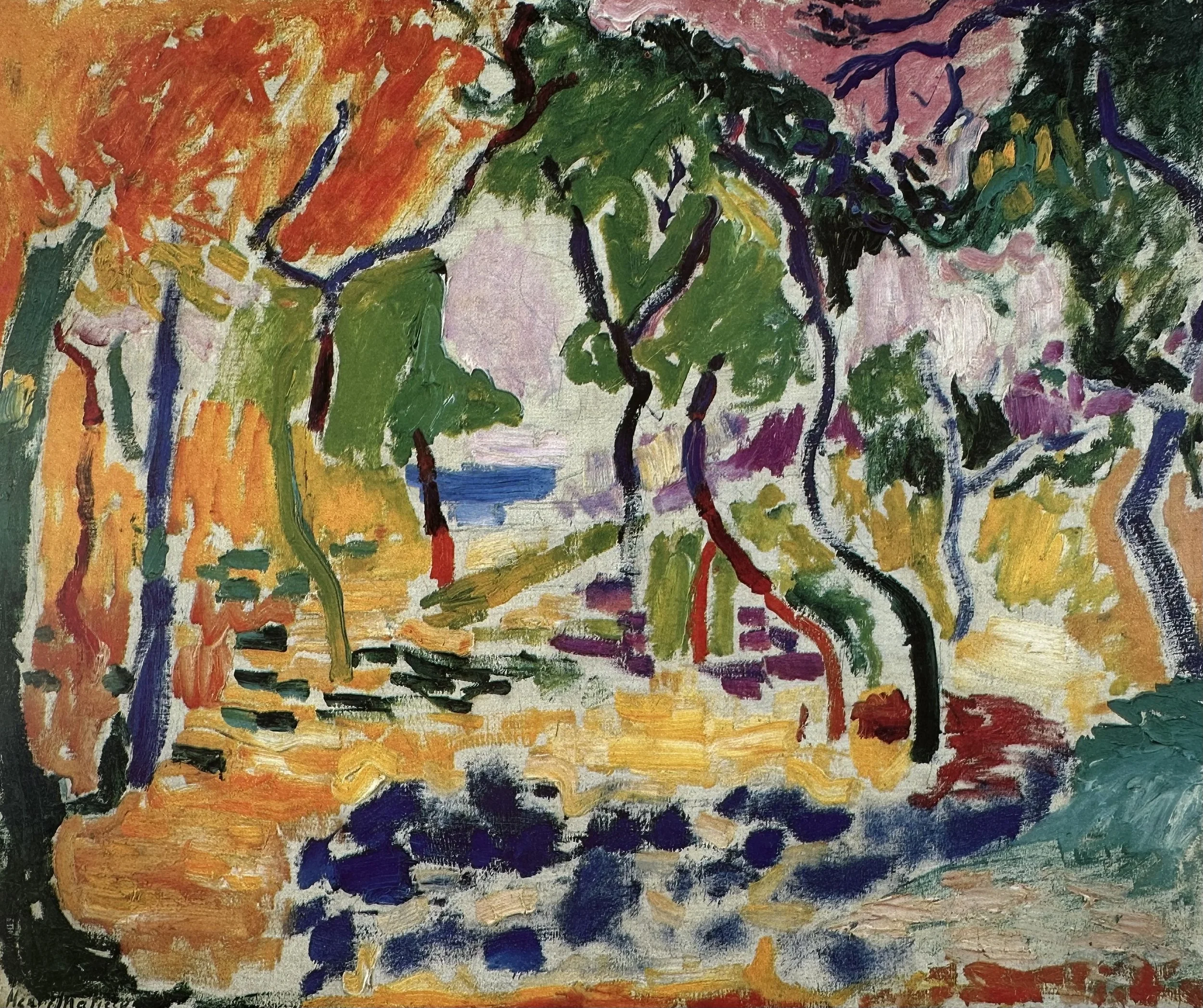
Collioure ▪ France
Where Matisse and Derain Changed the Art World Forever
Henri Matisse and André Derain painted together in the South of France in 1905 in the small and colorful town of Collioure. The resulting paintings radically changed the way artists use color. The photo here gives us some idea of the brilliant and inspiring “feast for the eyes” they must have experienced.
The video below, created by the Metropolitan Museum of Art, beautifully describes the relationship between Derain and Matisse. It’s hard to imagine the impact that these works had at the time because we are so used to seeing color used this way now, but try to imagine if this was the first time you had seen objects painted with expressive, bright, saturated colors instead of realistic and naturalistic colors.
Notice also, the vibrancy of the paintings in this video. Books and online sources do not truly capture the brilliance of the paint colors.

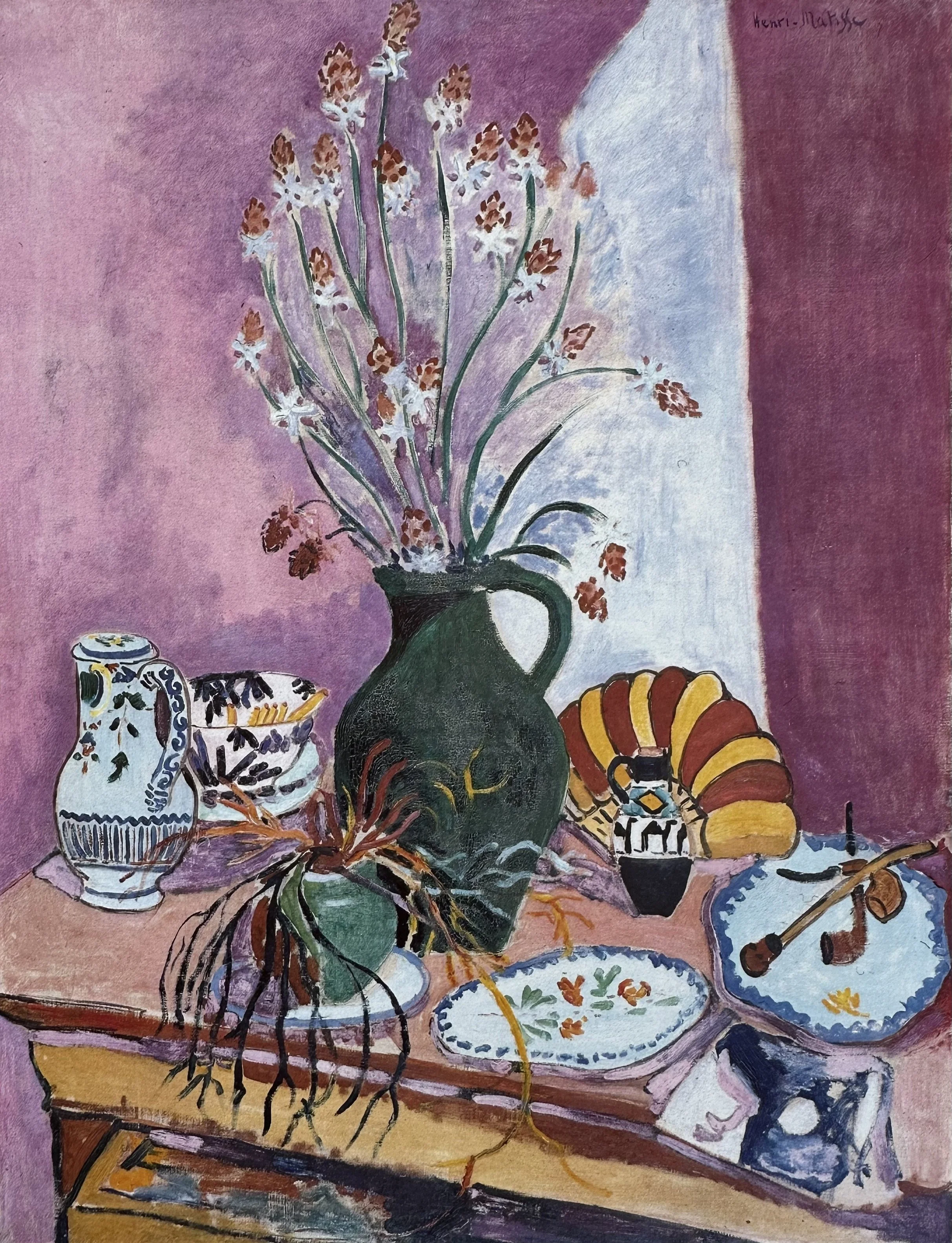
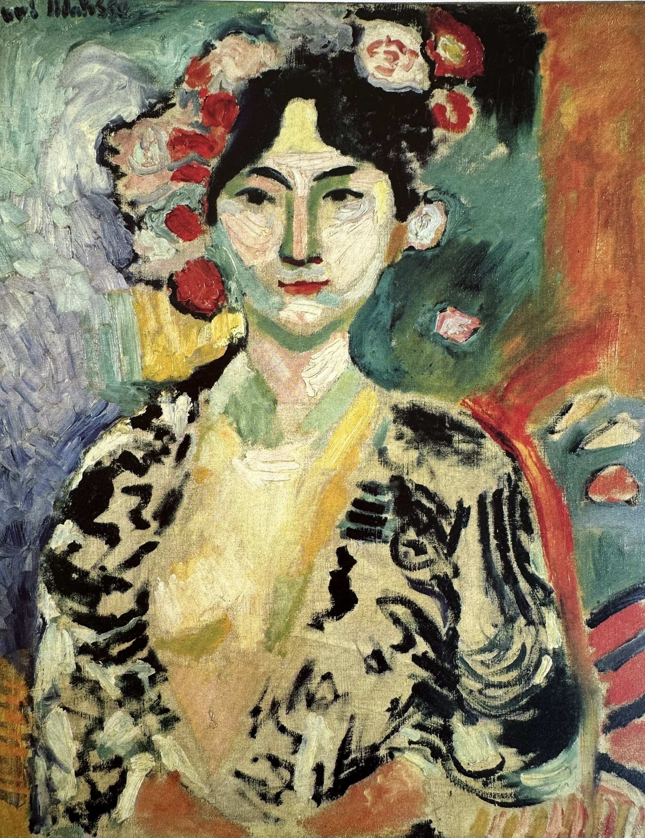
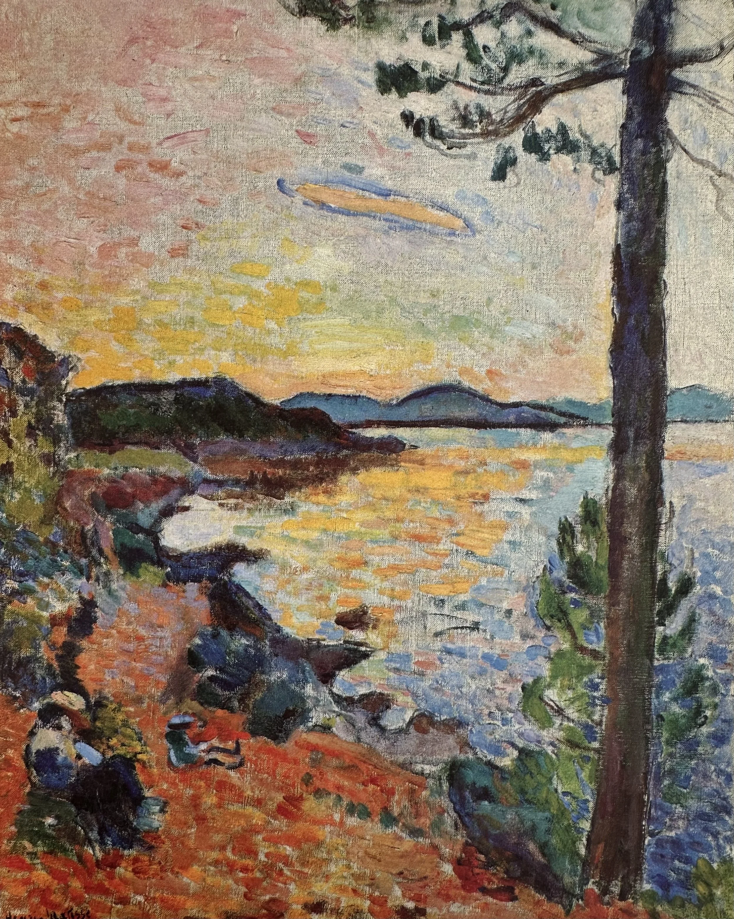
GALLERY
▫
GALLERY ▫
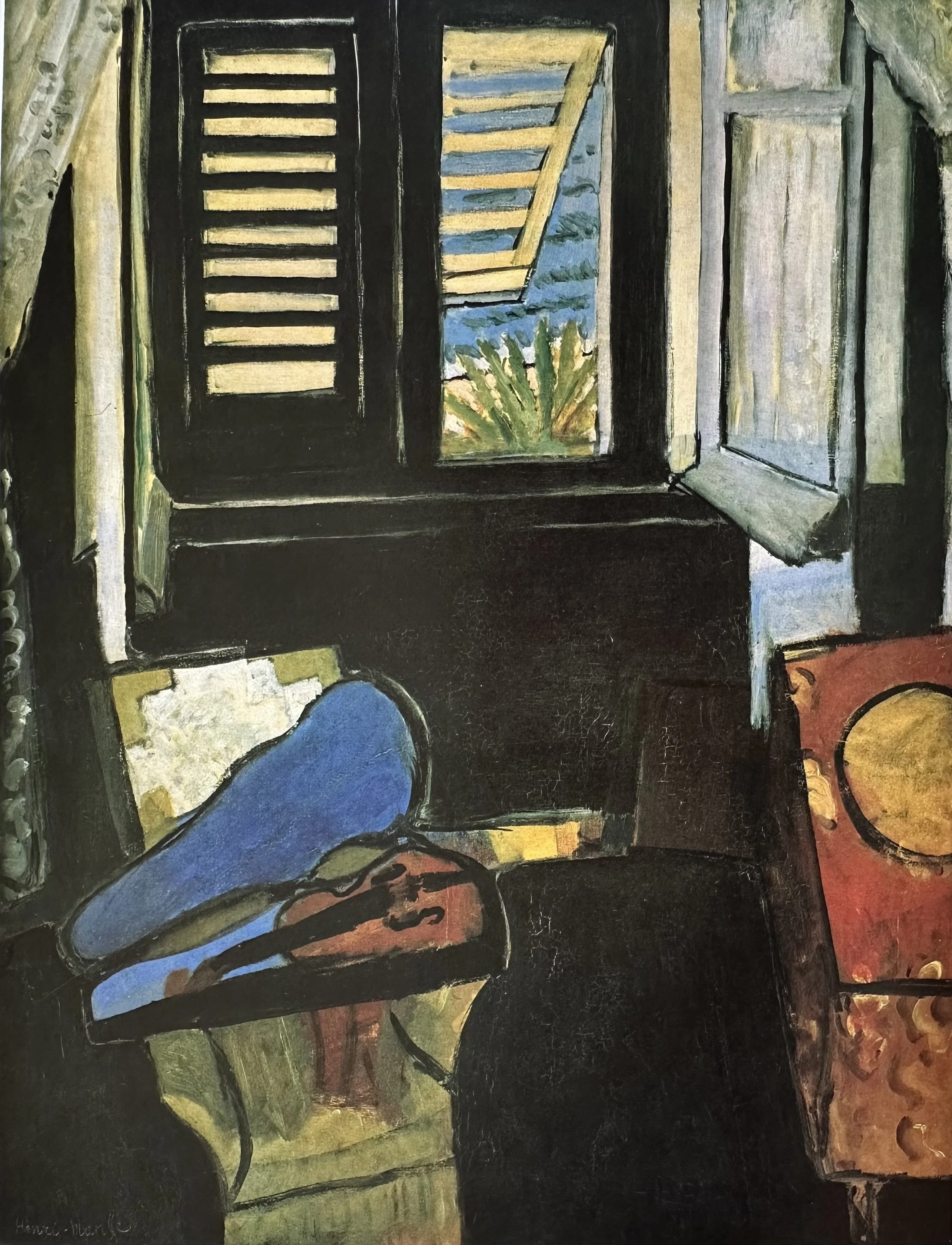
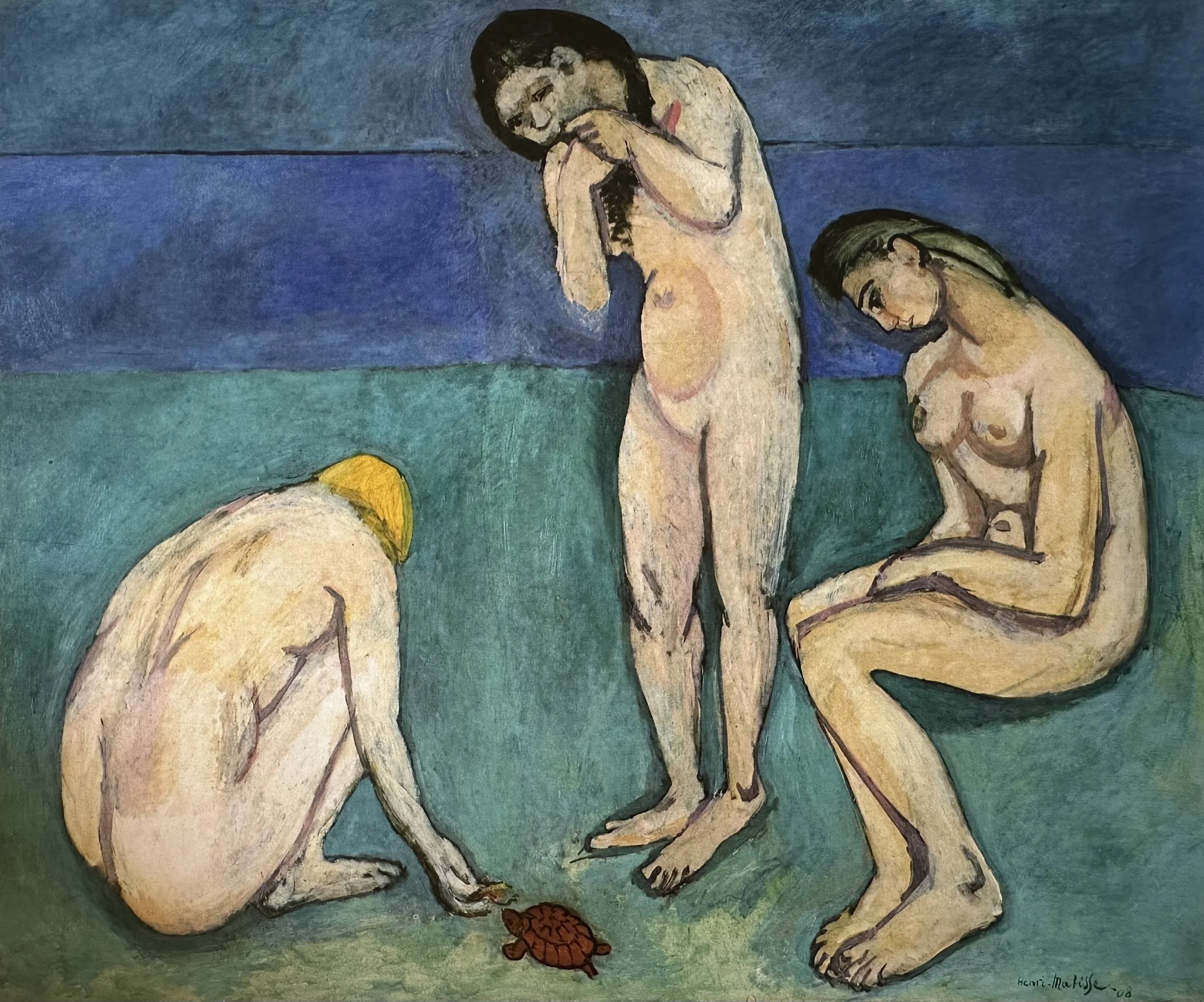
Matisse’s Fauvist Paintings
(1904–1907)
⇣ Click on any image to view larger ⇣
Master of Color
Before we can paint like Matisse, we need to understand his extraordinary command of color. Not necessarily rules to follow but principles he knew so deeply that he could break them with authority. First let’s review basic color terminology to make sure that we are all speaking the same color language before we further our color study.
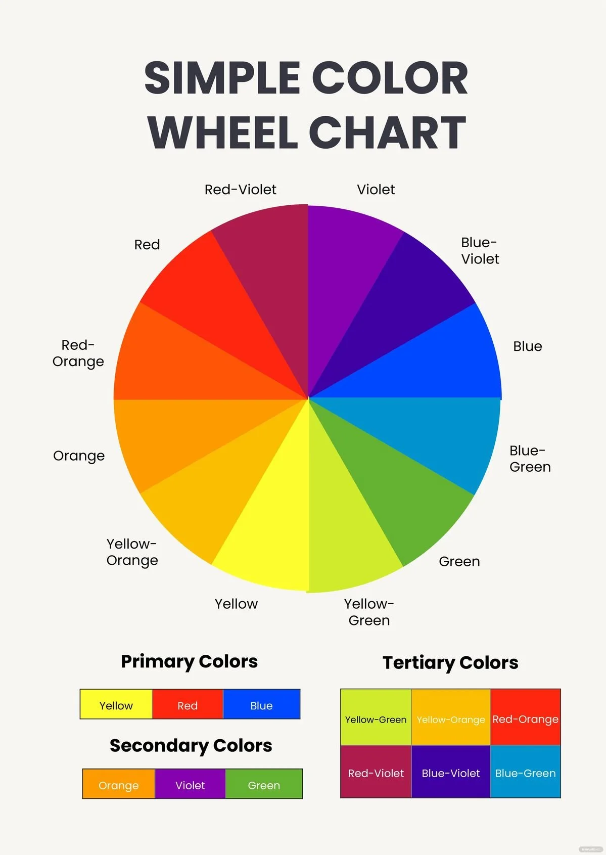
COLOR LANGUAGE
-
A color family such as Red, Blue, Yellow, Green, Violet, and Orange. We can break these down further into Yellow-Green, Red-Orange, etc. Every color belongs to a color family, thus, every color has a “hue.”
-
The brightness or INTENSITY of a color. We also sometimes use the word SATURATED. Cadmium Red Light (for instance) straight from the tube is an example of high-chroma, saturated color. A low chroma color is generally a more NEUTRAL color such as a grey or earth tone color.
-
Degree of lightness or darkness of a color. The color (hue) is not important in this definition, only how light or dark the color is relative to white and black. (Think of a black and white photo of your painting).
-
The true color of an object, as opposed to the way it may appear in certain lighting conditions, at a distance, or in contrast with other colors.
-
When two (or more) objects are near each other, the color of each may be reflected on the other. Imagine an orange next to a white pitcher. The side of the pitcher may take on (reflect) some of the orange color.
-
Every color is either WARM or COOL. This can be confusing to new painters in particular because color can be in a warm hue family but be cool relative to another color in their family. For example, Quinachridone Red is in the family of Red (warm) but it is a cool color relative to Cadmium Red Light.
-
Colors opposite each other on the color wheel.
-
Three to four colors next to each other on the color wheel. Another way to darken or lighten a color is to add an analogous color.
What Matisse Knew About Color
MATISSE’S SINGING PALETTE
The “singing palette” is a term used to describe the quality that results when colors in a painting seem to vibrate, resonate, or literally sing against each other rather than sitting inertly on the canvas.
Matisse described color less like a painter and more like a musician — talking about notes, chords, and harmony. The singing palette is essentially the visual equivalent of a chord: individual colors that, in combination, produce something greater than any of them alone.
The core idea comes from how certain color combinations create an optical and emotional intensity that no single color could produce alone. It's less about which specific colors you use, and more about the relationships between them.
What creates it:
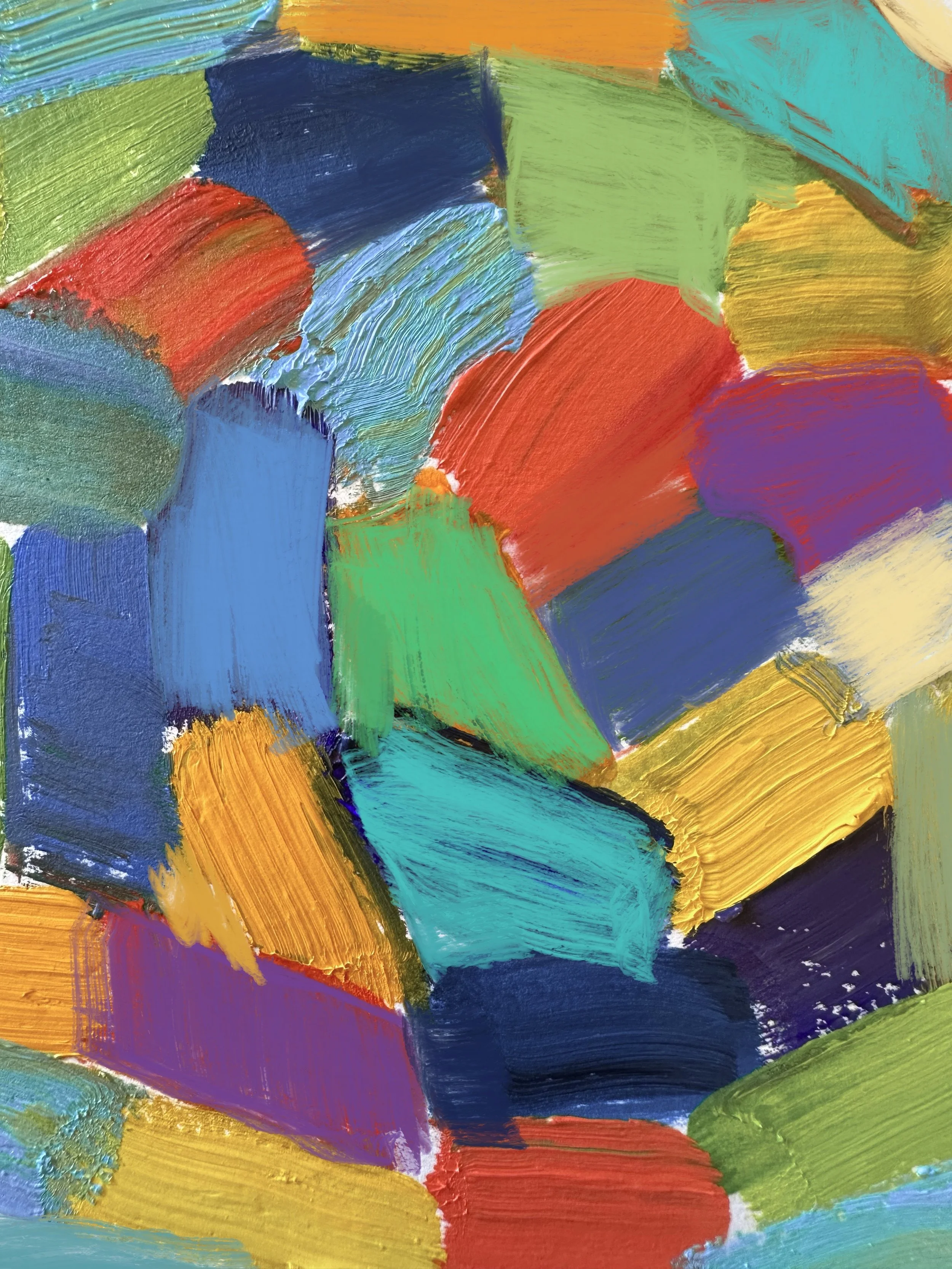
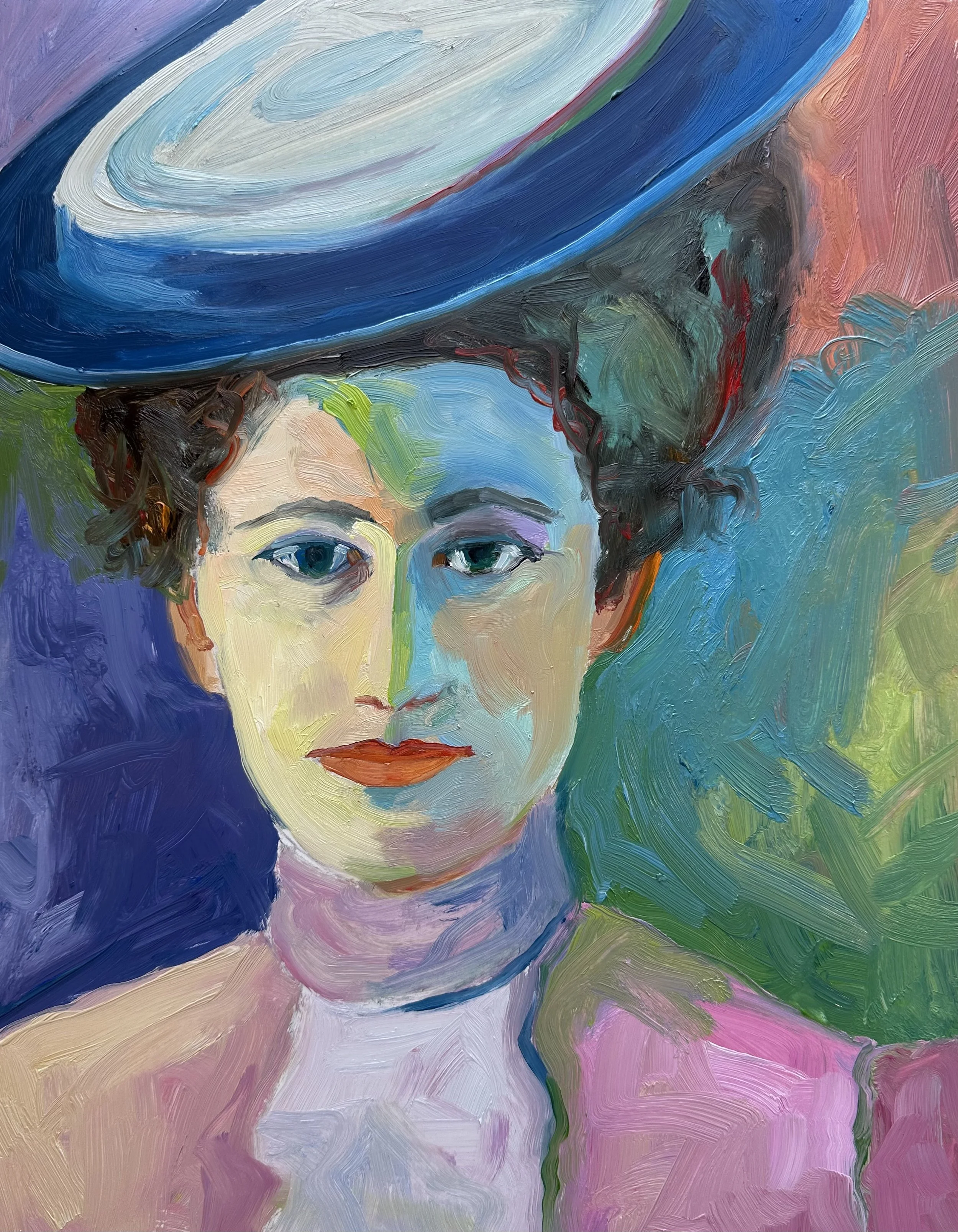
Matisse understood that complementary colors (those opposite each other on the color wheel) placed side by side at full saturation, intensify each other dramatically. Each color makes the other appear more vivid than it would look in isolation. A red placed next to a green doesn't just sit there, it vibrates.
But a singing palette isn't simply “use complementaries.” Matisse added crucial nuance:
Value is KEY. Firstly, Matisse’s “wild” Fauvist colors would often match the value of the original local color of the subject. Secondly, complementary colors of the same value vibrate more than colors of different values.
Proportion matters. A small note of orange against a large field of blue creates more electricity than equal amounts of each. He controlled the ratio carefully.
Temperature contrast adds to it. Warm colors (reds, oranges, yellows) placed against cool colors (blues, violets, cool greens) create a spatial tension. The warm colors appear to advance, and the cool to recede. This illusion adds to the vibrancy.
Saturation must be managed. If every color is at full intensity all at once, the result is noise, not music. Matisse would include a quieter, more neutral passages for contrast and to give the eye a place of rest.
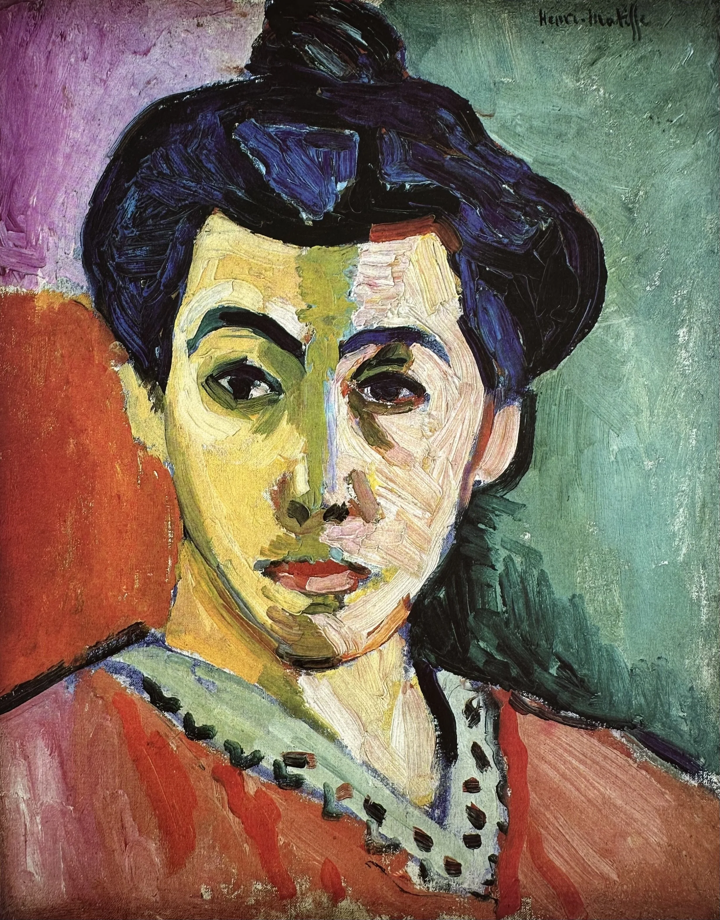
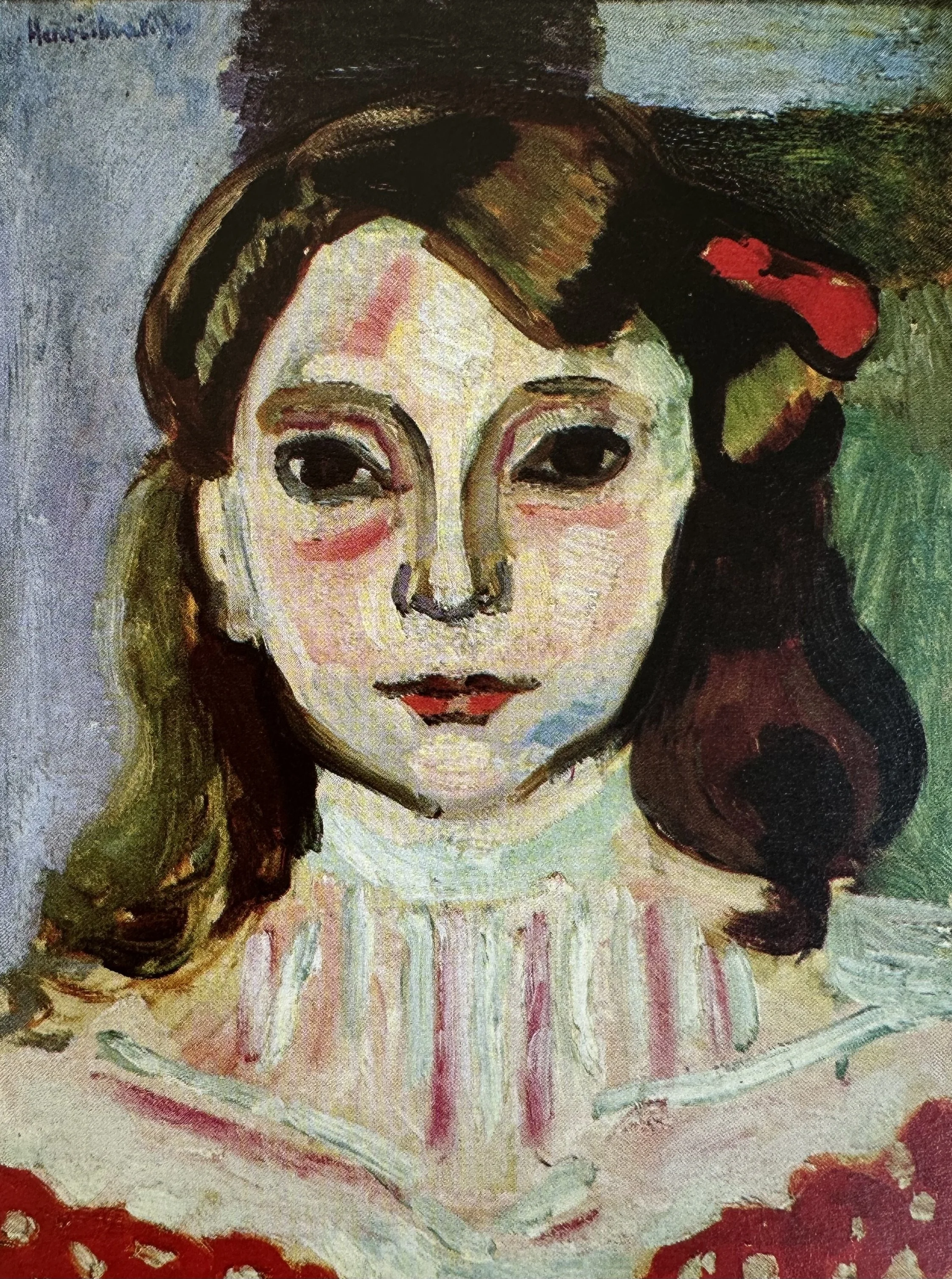
See if you can spot these concepts of a “SINGING PALETTE” in this painting, “The Woman with the Hat.”

Beyond The SINGING PALETTE
▫
Beyond The SINGING PALETTE ▫
ESSAY: “Notes of a Painter” by Henri Matisse
Matisse eventually moved past the use of the Post-Impressionist “pointalist” ideas. He, instead, focused on using color to express emotion as you can see from the quotations below. Very aware that one color will always affect another he would often re-work canvases dozens of times to get the color relationships and proportions to his liking. Here are some of his thoughts about color from an essay he wrote in 1908, “Notes of a Painter.”
“The chief function of color should be to serve expression as well as possible. I put down my tones without a preconceived plan.”
“My choice of colors does not rest on any scientific theory; it is based on observation, on sensitivity, on felt experiences… I simply try to put down colors which render my sensation.”
“In reality, I think that the very theory of complementary colors is not absolute.”
“If upon a white canvas I set down some sensations of blue, of green, of red, each new stroke diminishes the importance of the preceding ones…It is necessary that the various marks I use be balanced so that they do not destroy each other…A new combination of colors will succeed the first and render the totality of my representation. I am forced to transpose until finally my picture may seem completely changed when, after successive modifications, the red has succeeded the green as the dominant color.”
“Notes of a Painter” by Henri Matisse
CLICK ON THE PDF ICON TO READ / DOWNLOAD THE FULL ESSAY
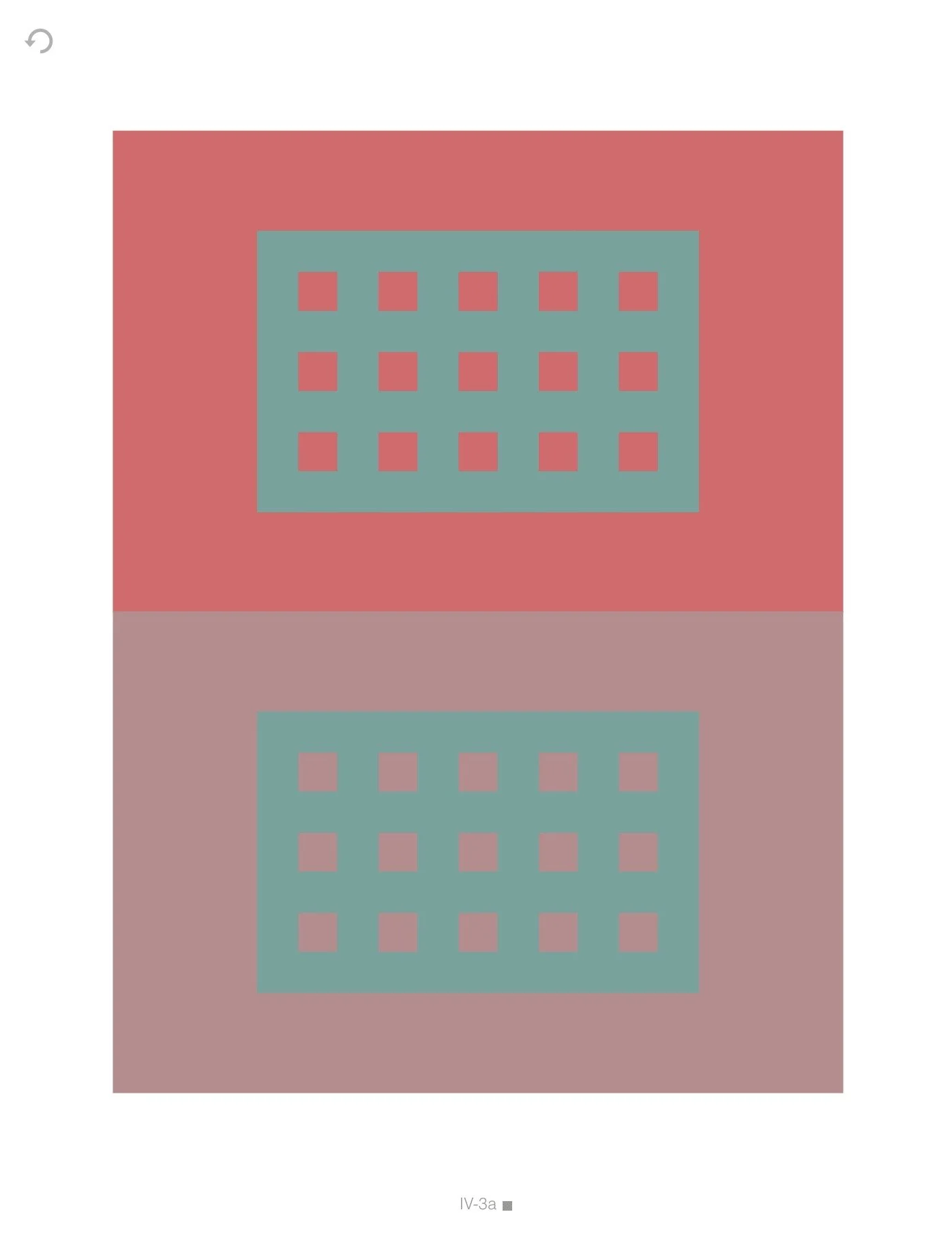
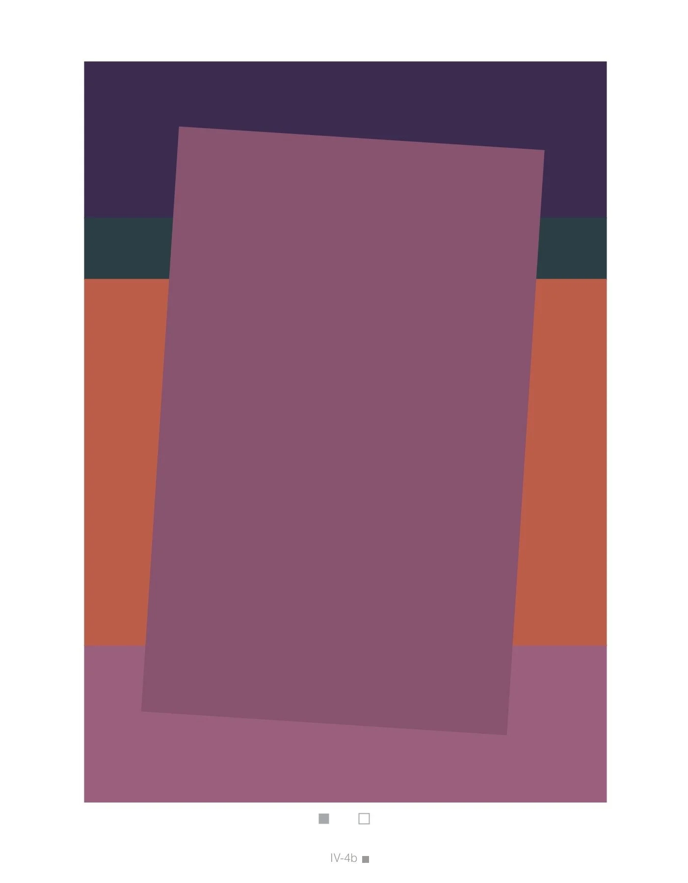
All color is relative. No color exists in isolation.
Every color is defined by its neighbors.
If you find color confusing, you are not alone. Watch this video to understand some reasons why and learn more about Color Relativity.
Video Password: Color
Video Length: 10:34 minutes

Project
Playing with Color Relativity
Play like a child and study color relativity at the same time!
Video Password: Play
Video Length: 5:10 minutes
NOTE: Feel free to select your own compositions or those of another artist for this project as well.


Project
Paint like a Fauve!
Let’s have some fun with color!
Video Password: Fauve
Video Length: 29:29 minutes
-
Be loose! There is no need to copy the photo exactly.
Be expressive with your color choices.
Consider using complementary colors to create that “singing palette.”
Be mindful of values. Think about approximating the values of your reference even though the color may be entirely different.
Be playful.
This project can also be done using a landscape as a reference.
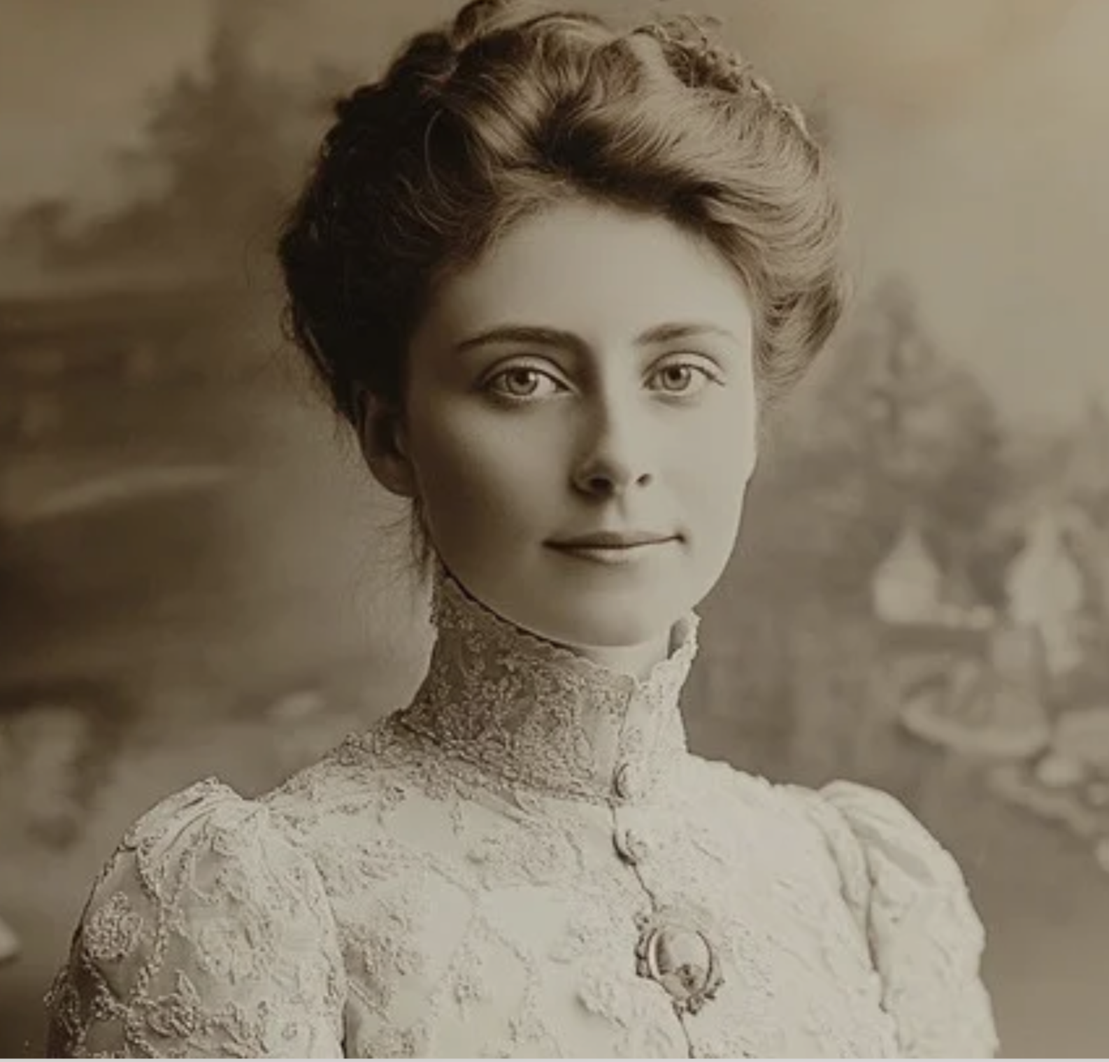
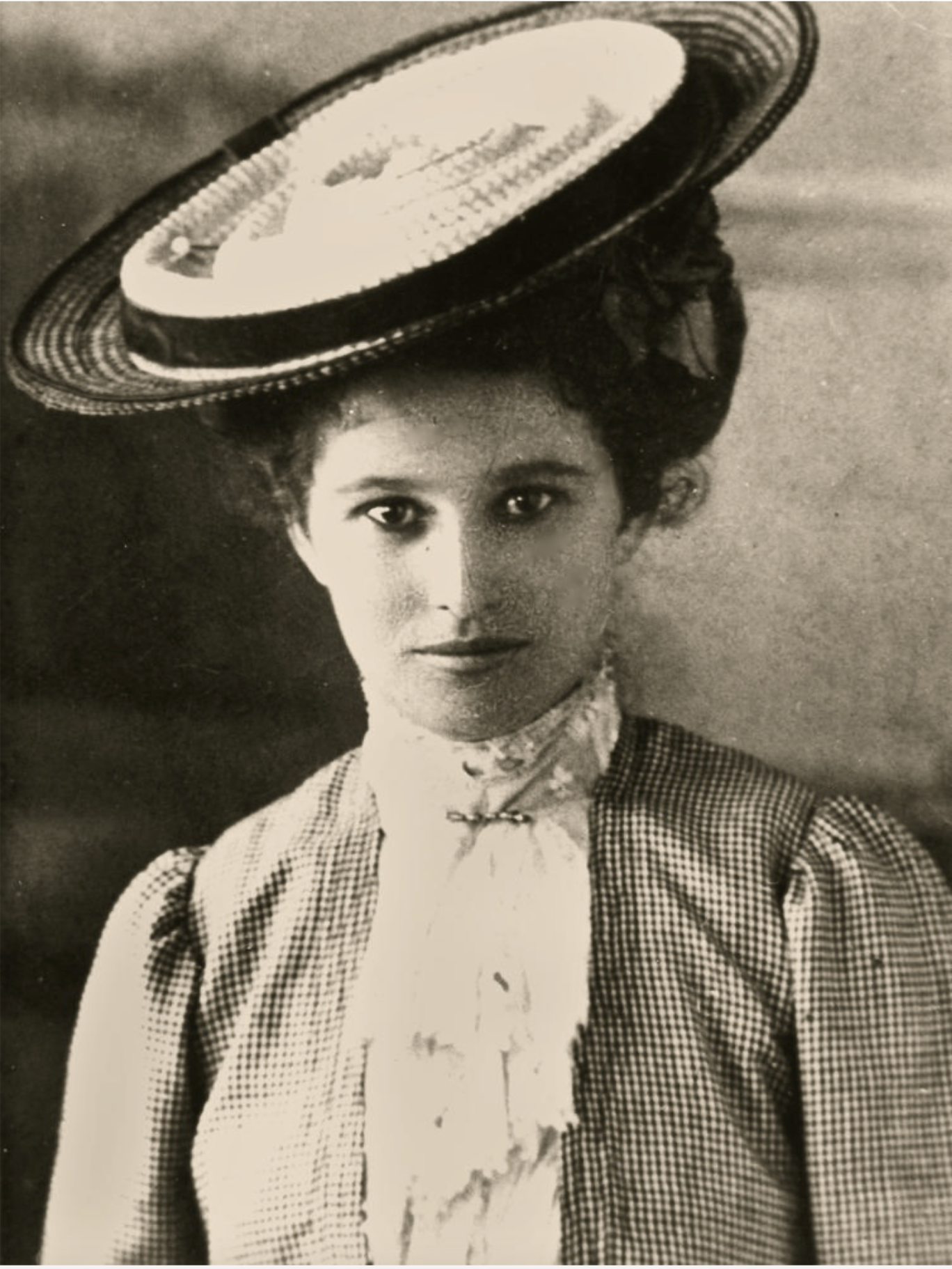
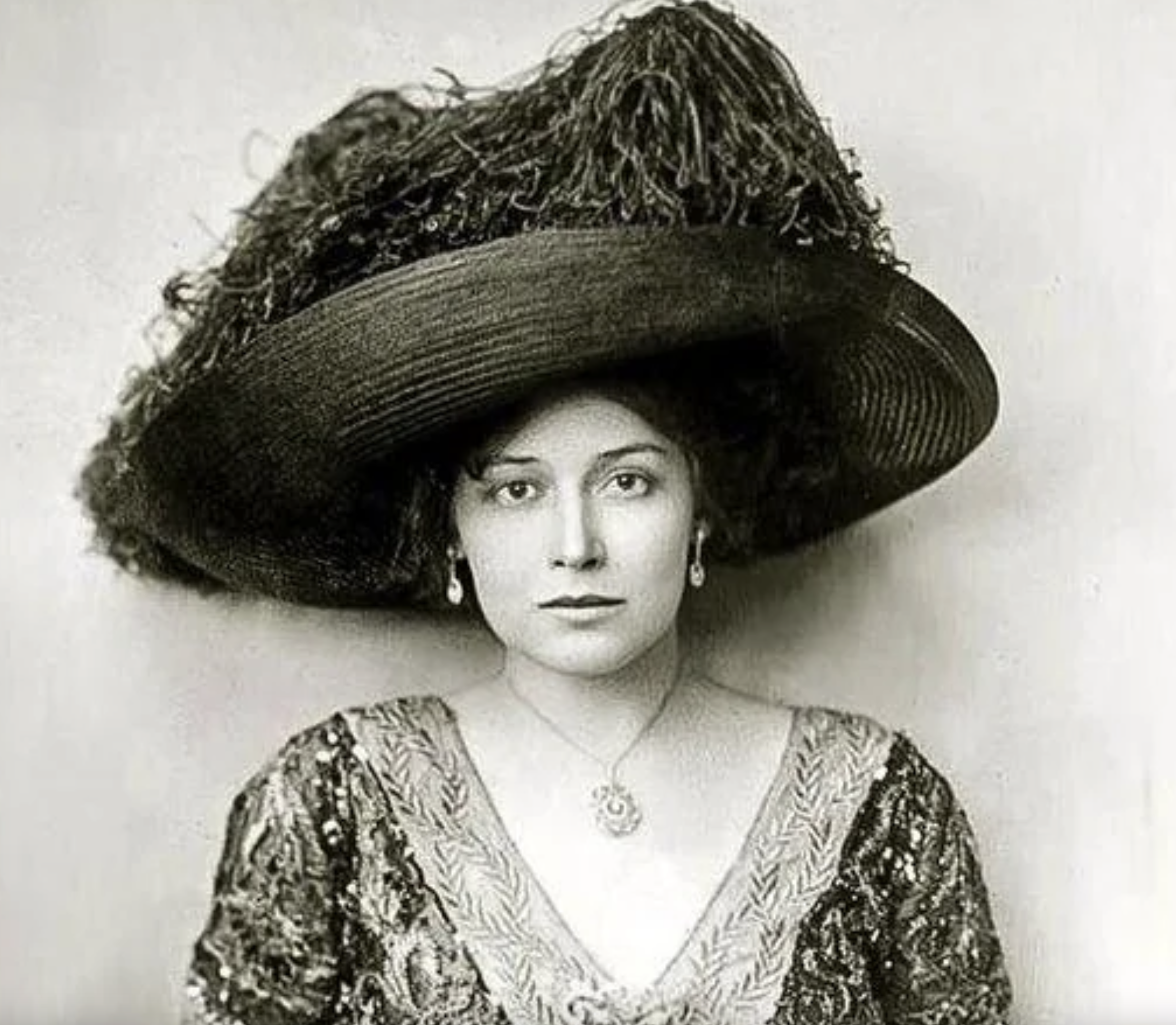
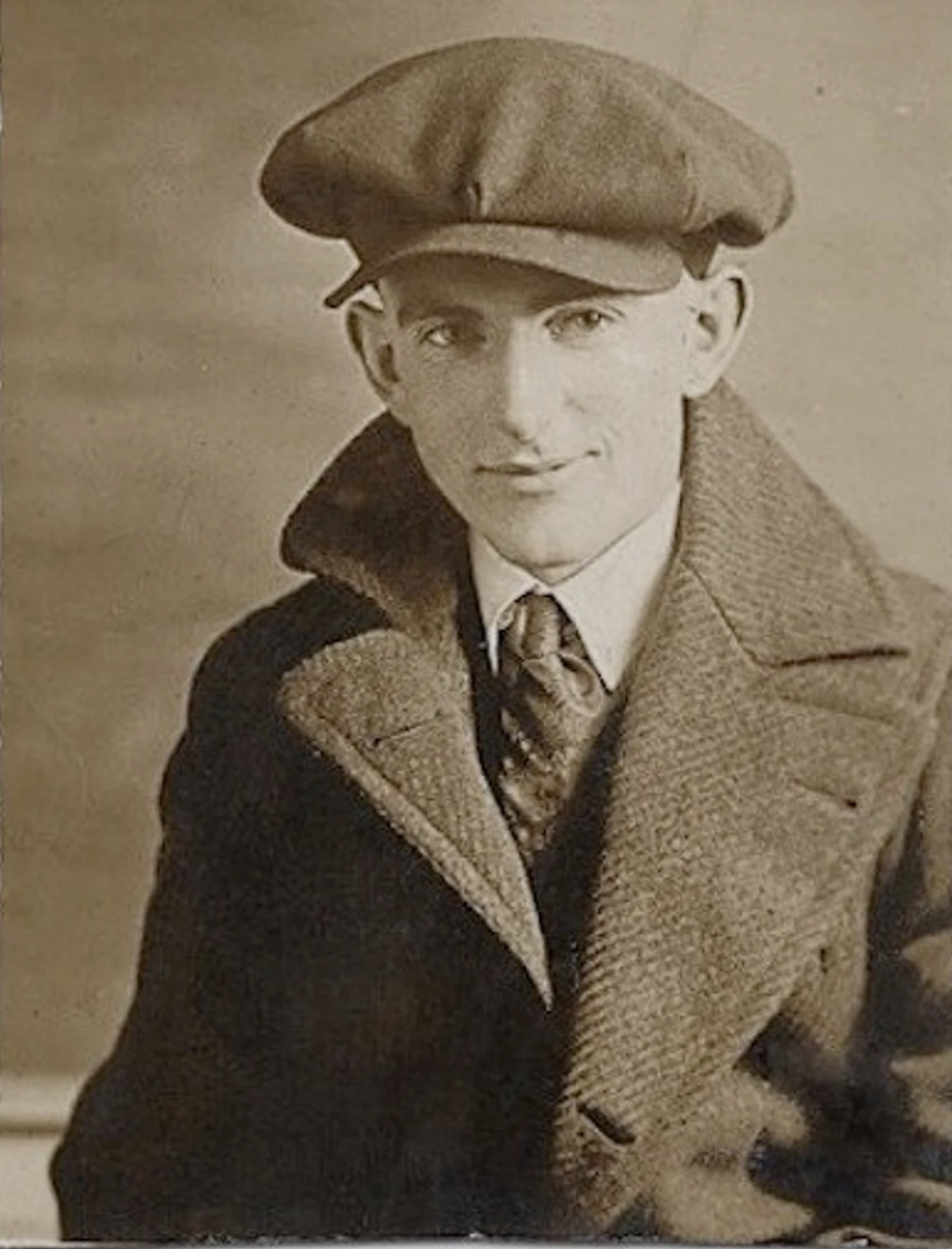
If you like the vintage look of the era of Matisse, simply search for “vintage photos of women",” or “vintage photos of women in hats.” etc. for more images. Below are examples of what you can find. Of course, feel free to use any of your own images that you might prefer.
REFERENCE PHOTO GALLERY
▫
REFERENCE PHOTO GALLERY ▫
⇣ Click on any image to view larger ⇣

▪ END OF LESSON ONE ▪
LESSON TWO
DRAWING, LINE and SIMPLIFICATION
Drawing and Line in Matisse’s Work
“One must always search for the desire of the line, where it wishes to enter or where to die away.”
Daily Drawing
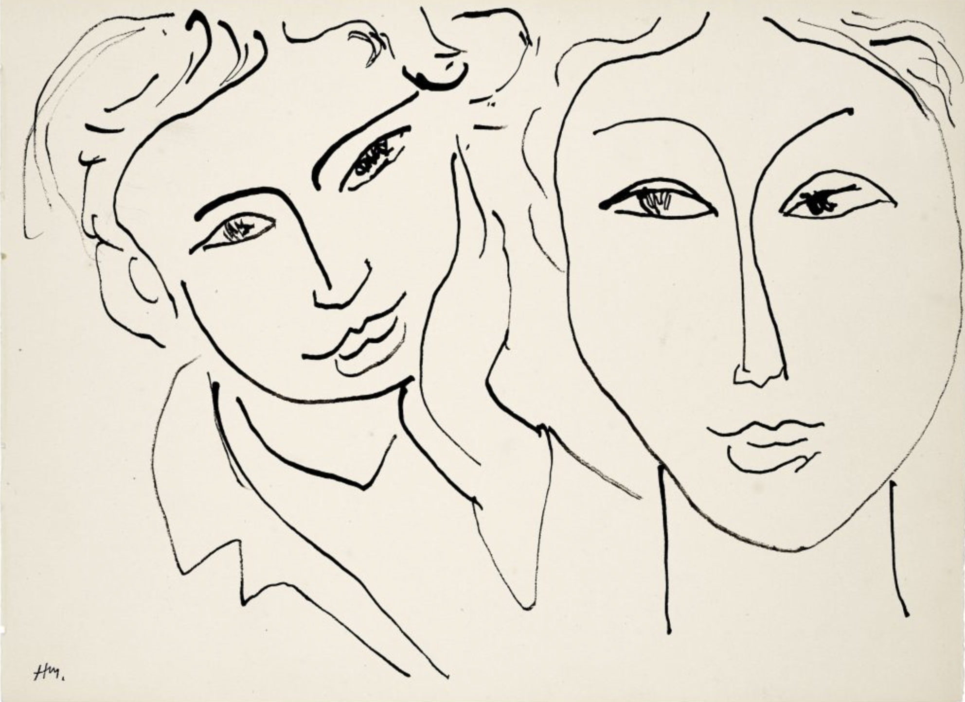
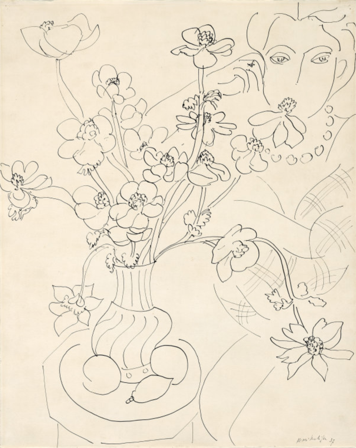
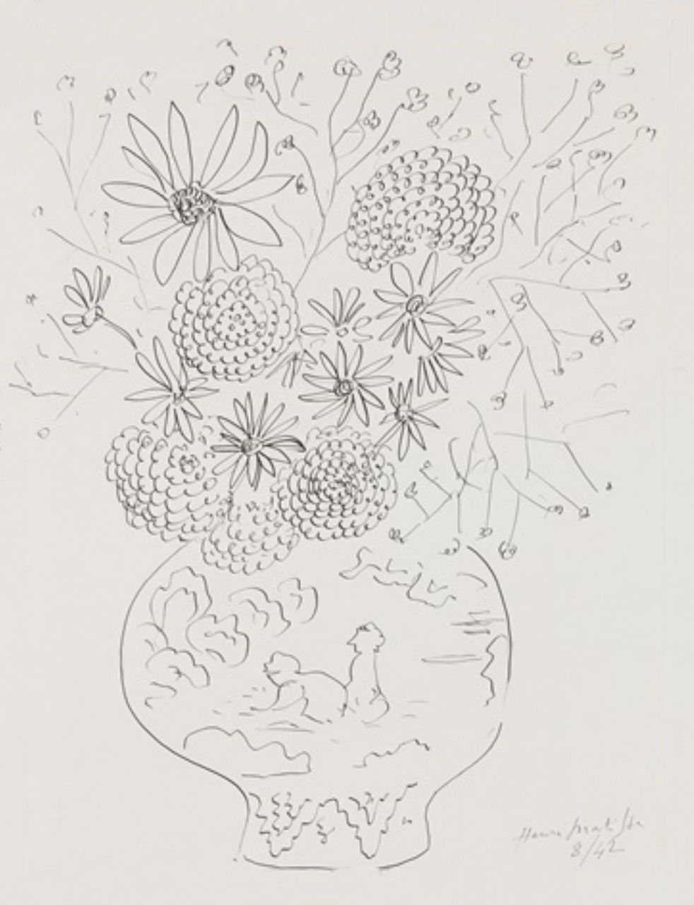
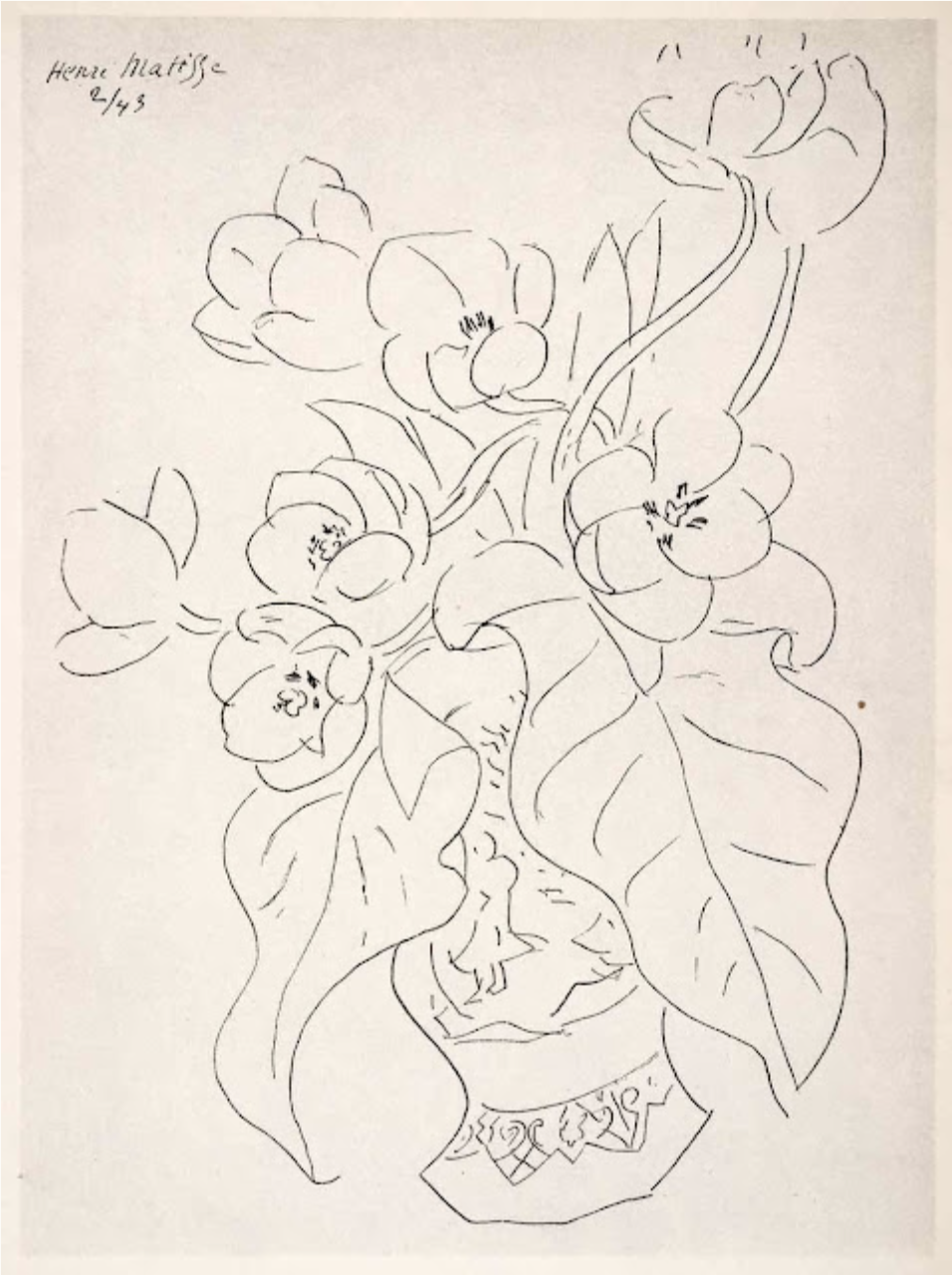
When we talk about Matisse, we have to include a lesson on line as it was essential to his work.
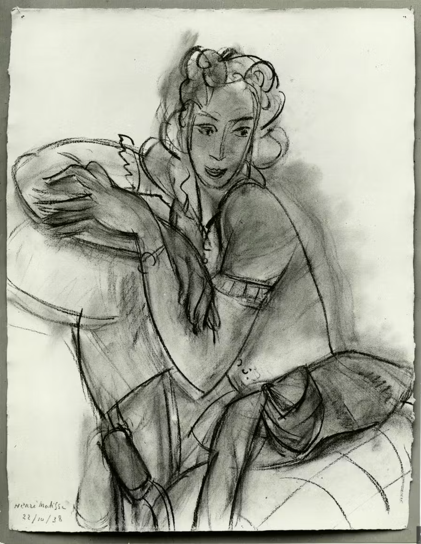
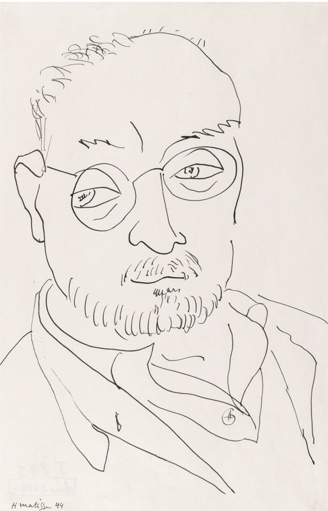
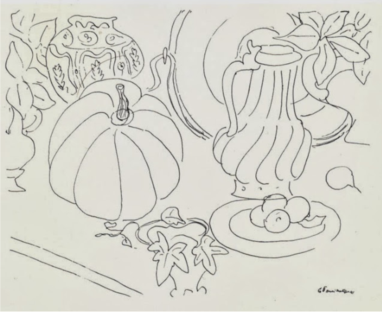
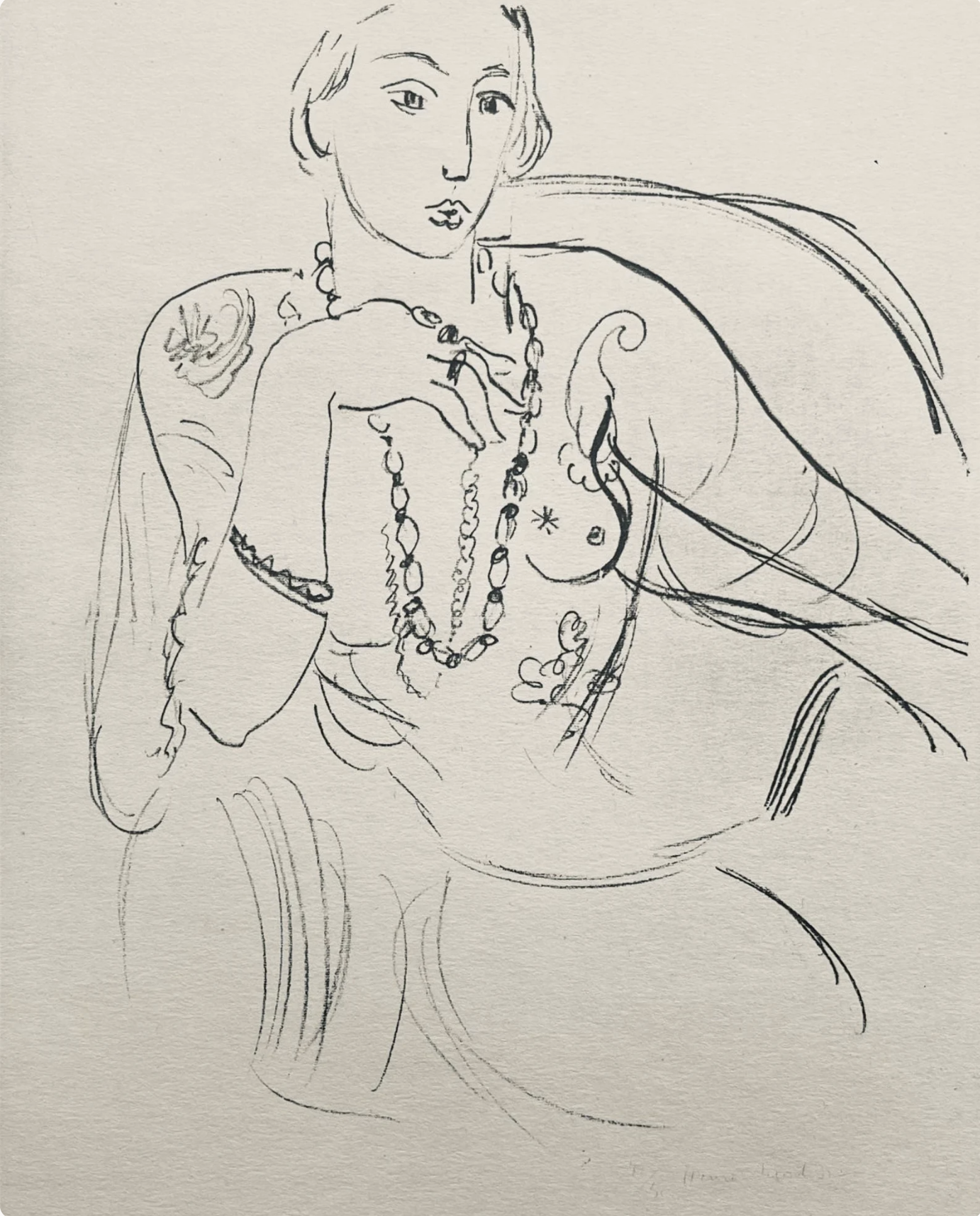
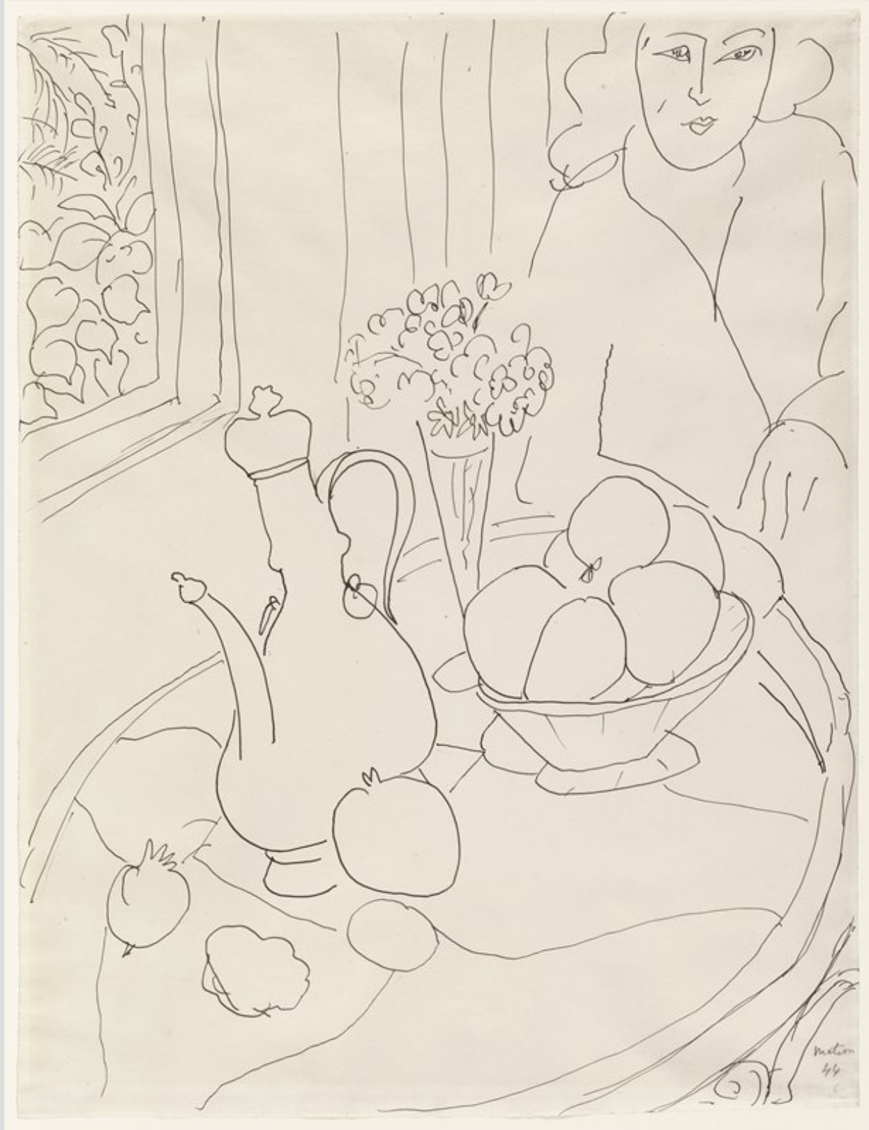
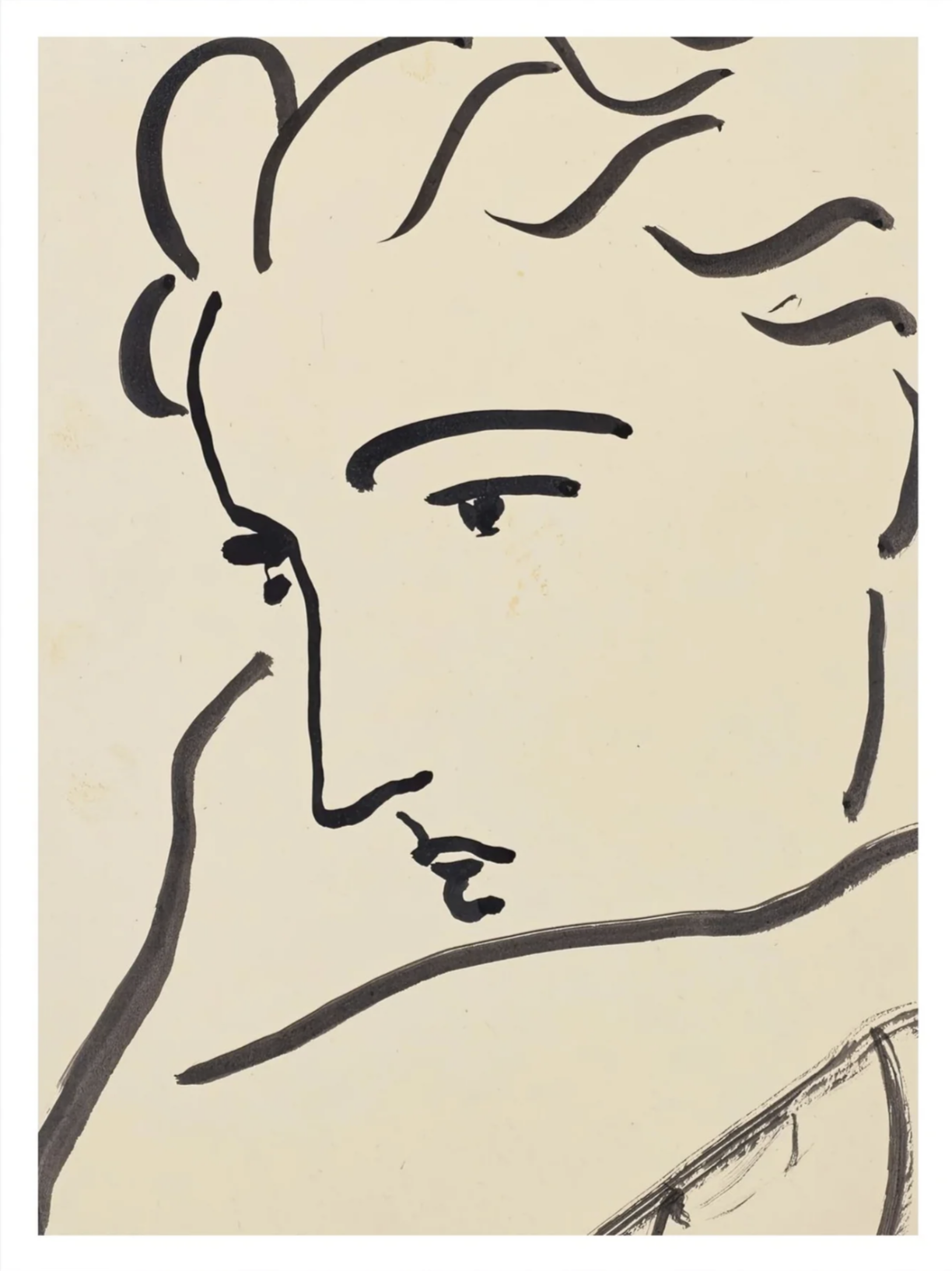
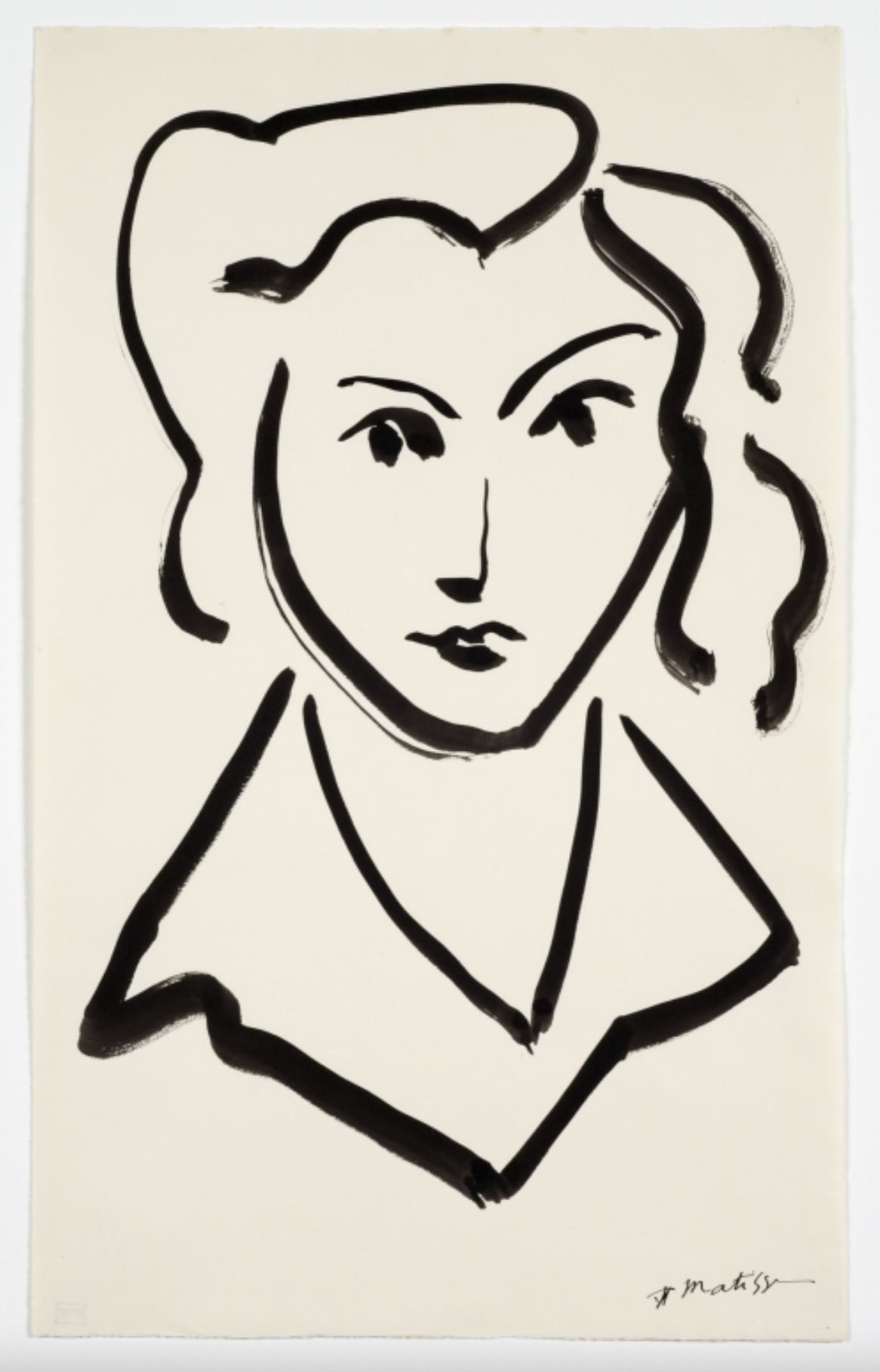
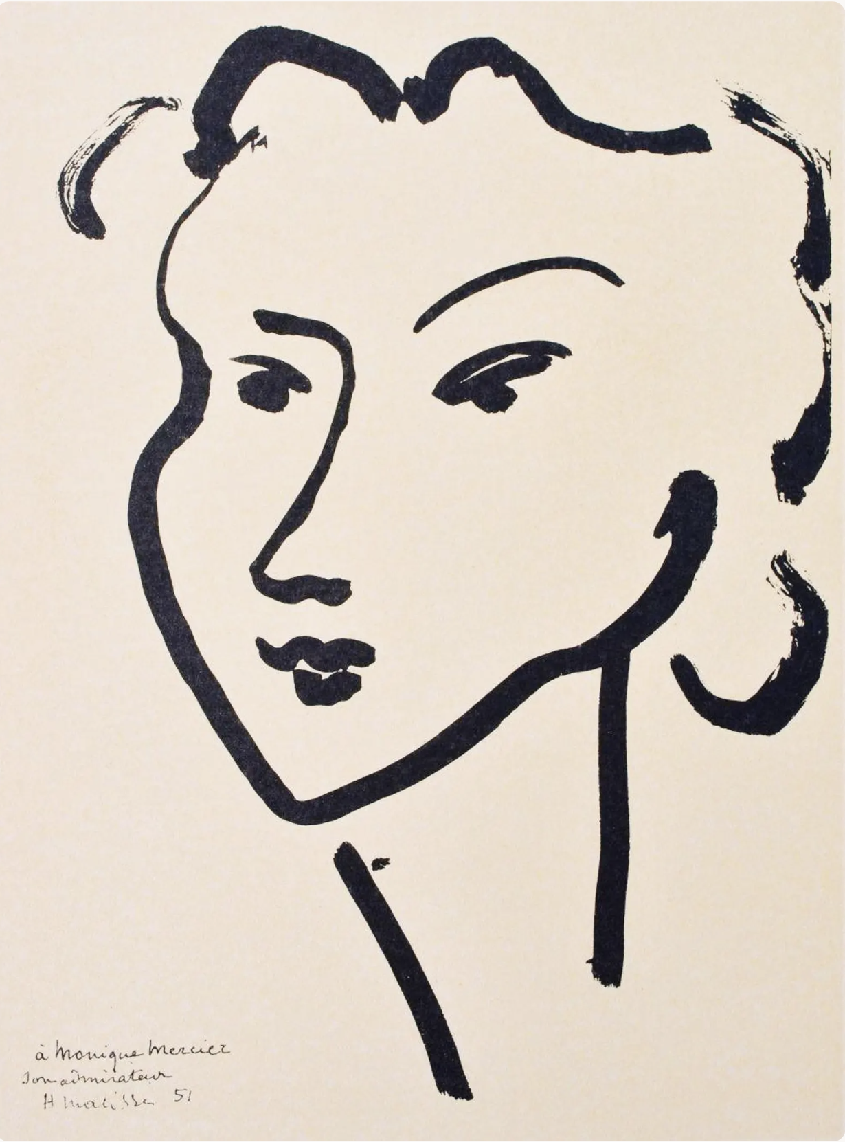
Matisse loved to draw and did so every day. He aimed for efficiency and how to describe something with the fewest and the most expressive lines. This can readily be seen in the gallery of images below.
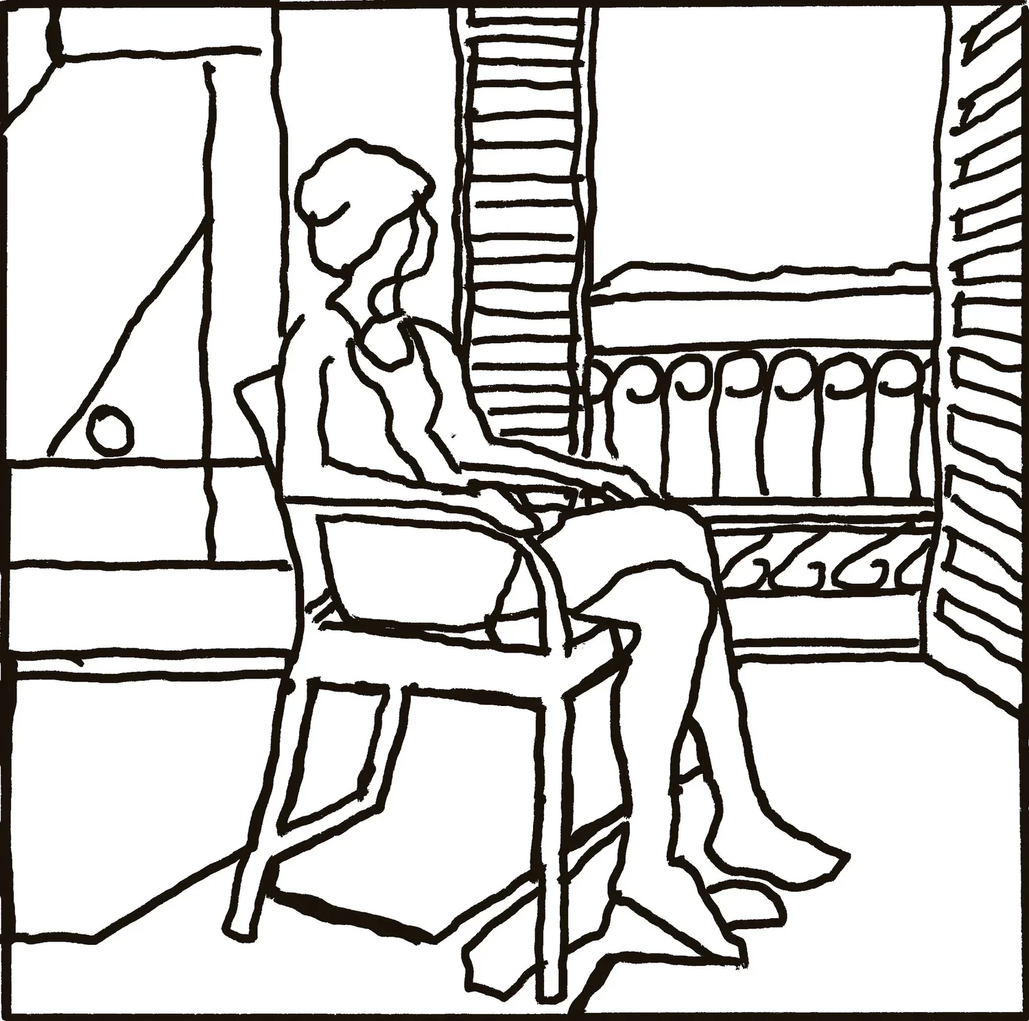
In the drawing on the right we see his process in finding the form and shape of the figure. Lines are drawn, rubbed out and drawn again until he was satisfied with the overall expression. He perfectly captures the woman’s lean into the pillow (sofa?) and shoulder turn as she glances backwards. Her hands are both resting and active. You can feel how she moved and adjusted into this pose.
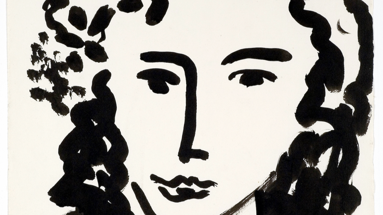
CONTOUR DRAWING GALLERY
▫
CONTOUR DRAWING GALLERY ▫
THINGS TO NOTICE
▪ The drawings are not “perfect,” yet they describe the essence of the subject. ▪
▪ There is an efficiency of line. Only essential lines were drawn. ▪
▪ Quality of Line: the images with heavier lines show a focus on the quality of the line. Thin, thick, narrow to wide, etc. ▪
⇣ Click on any image to view larger ⇣

Project
Contour Drawing
Let’s have some fun with playful contour drawings. No pressure to be perfect. It’s actually better if you are not perfect at all (and my drawing is very good proof of that)! Just express yourself and the object you are drawing with line.
The reference photos from Lesson One can also be used for this project.
Video Password: Line
Video Length: 16:44 minutes
-
Use a dark ink or paint (whether a pen or brush) so that you can see the line.
This project is not for a pencil. It is perfectly OK to make mistakes and be inaccurate. I used a fine line Sharpie, and Walnut Ink with a watercolor brush and a chopstick!
Painting from life is the best way to do this but using a photo is fine if that is your option.
Look at your source as much as possible while drawing.
Keep a playful mood.
It’s OK to add elements to create an interesting design/composition.
It’s OK to exaggerate.
Remember, Matisse threw away thousands of drawings. You are only seeing the ones he kept.
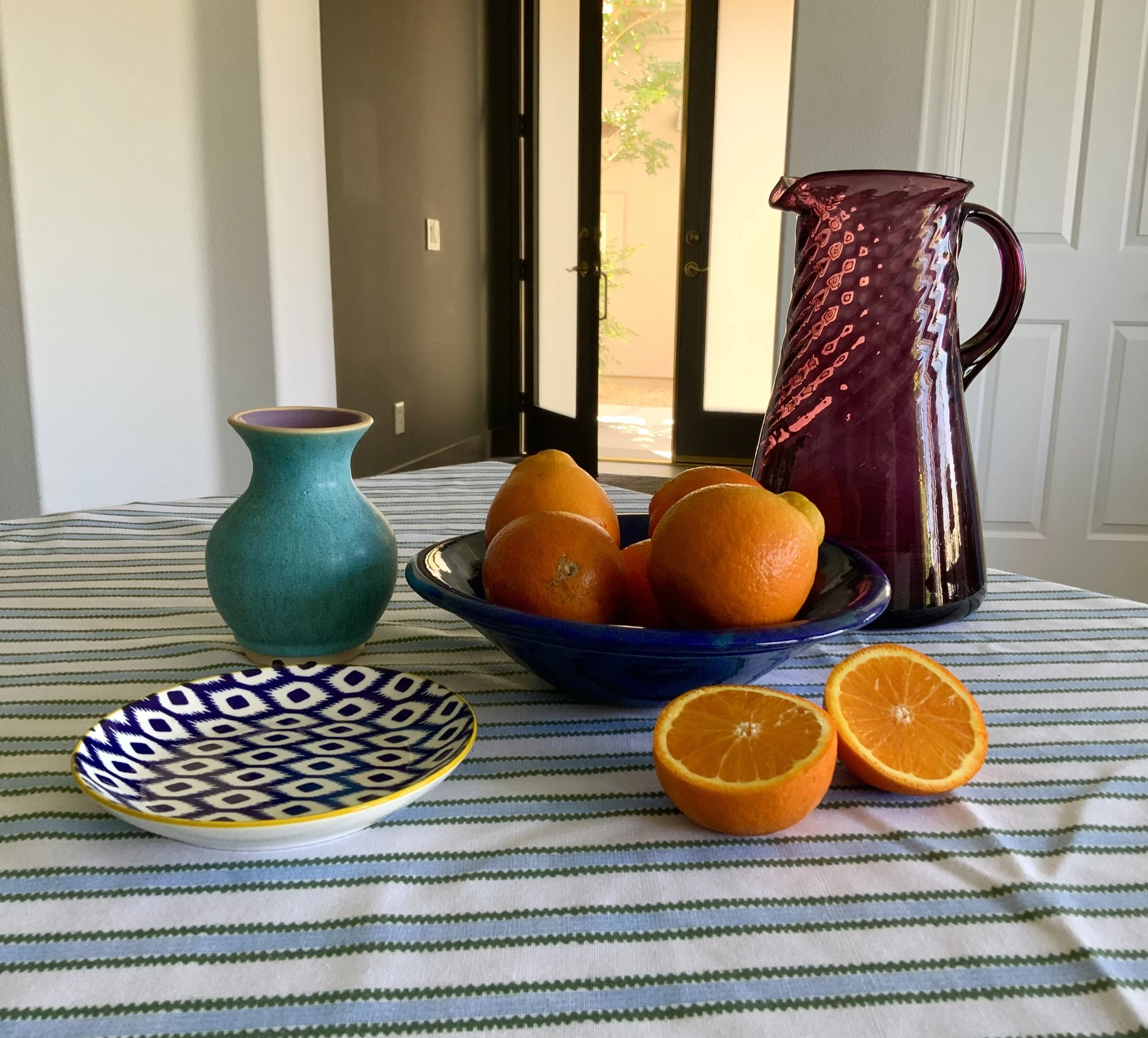
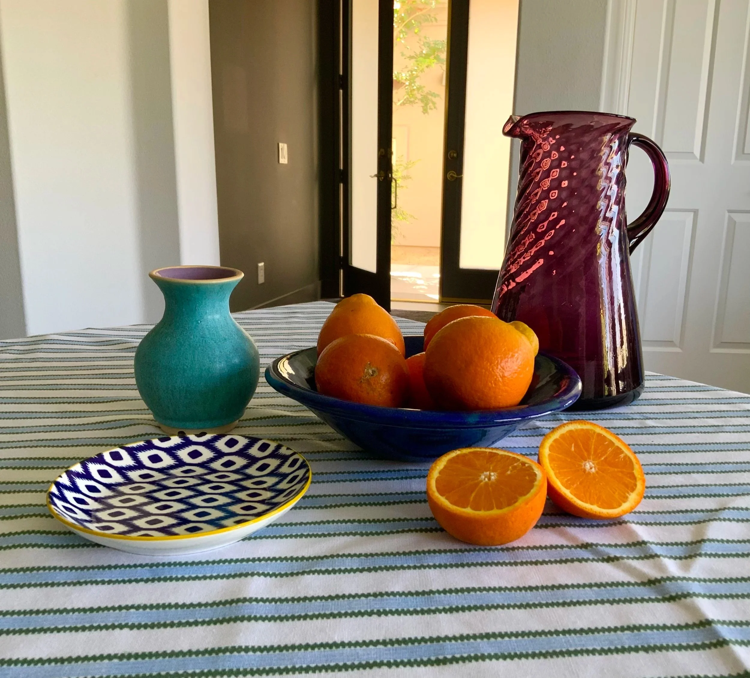
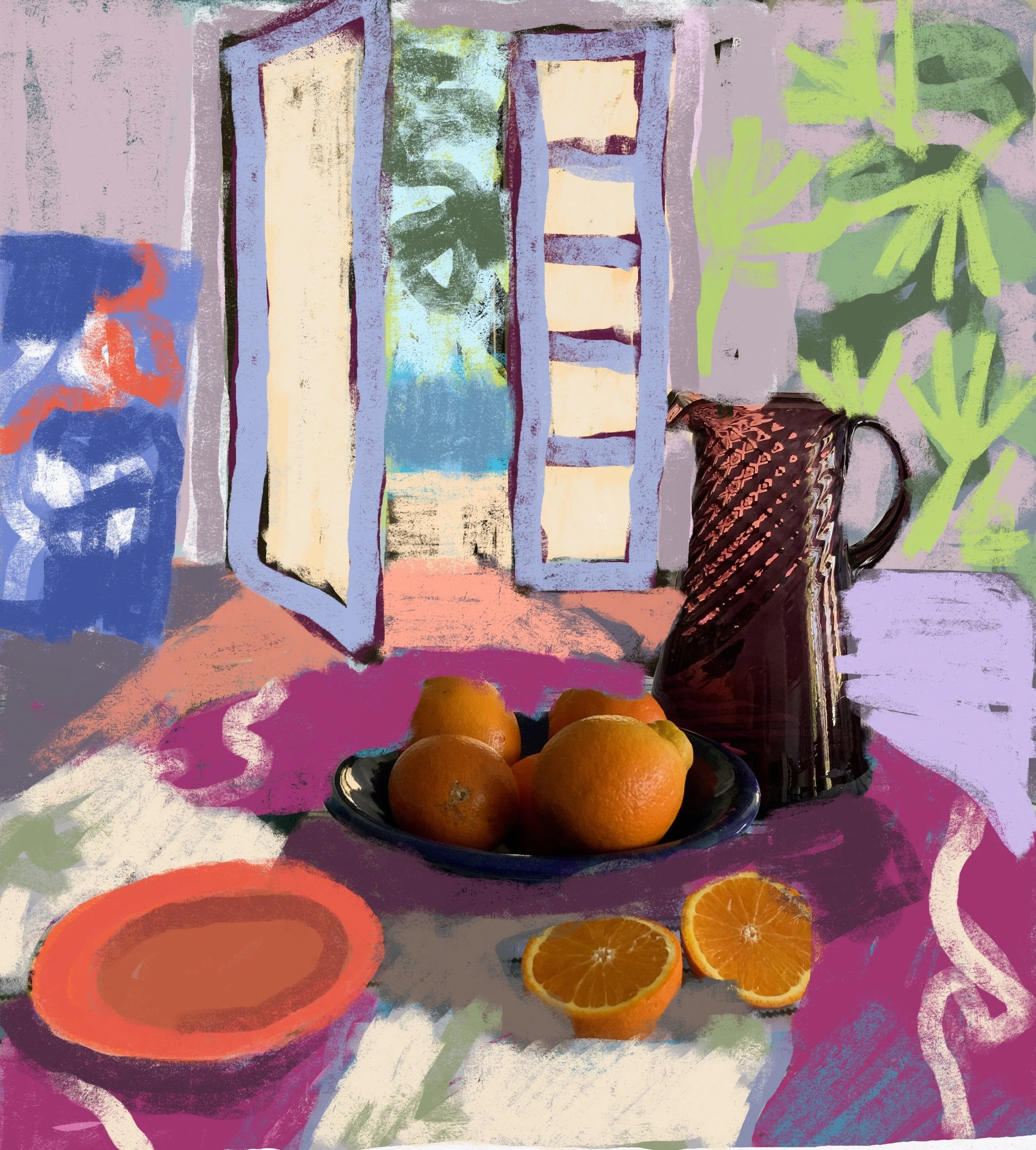
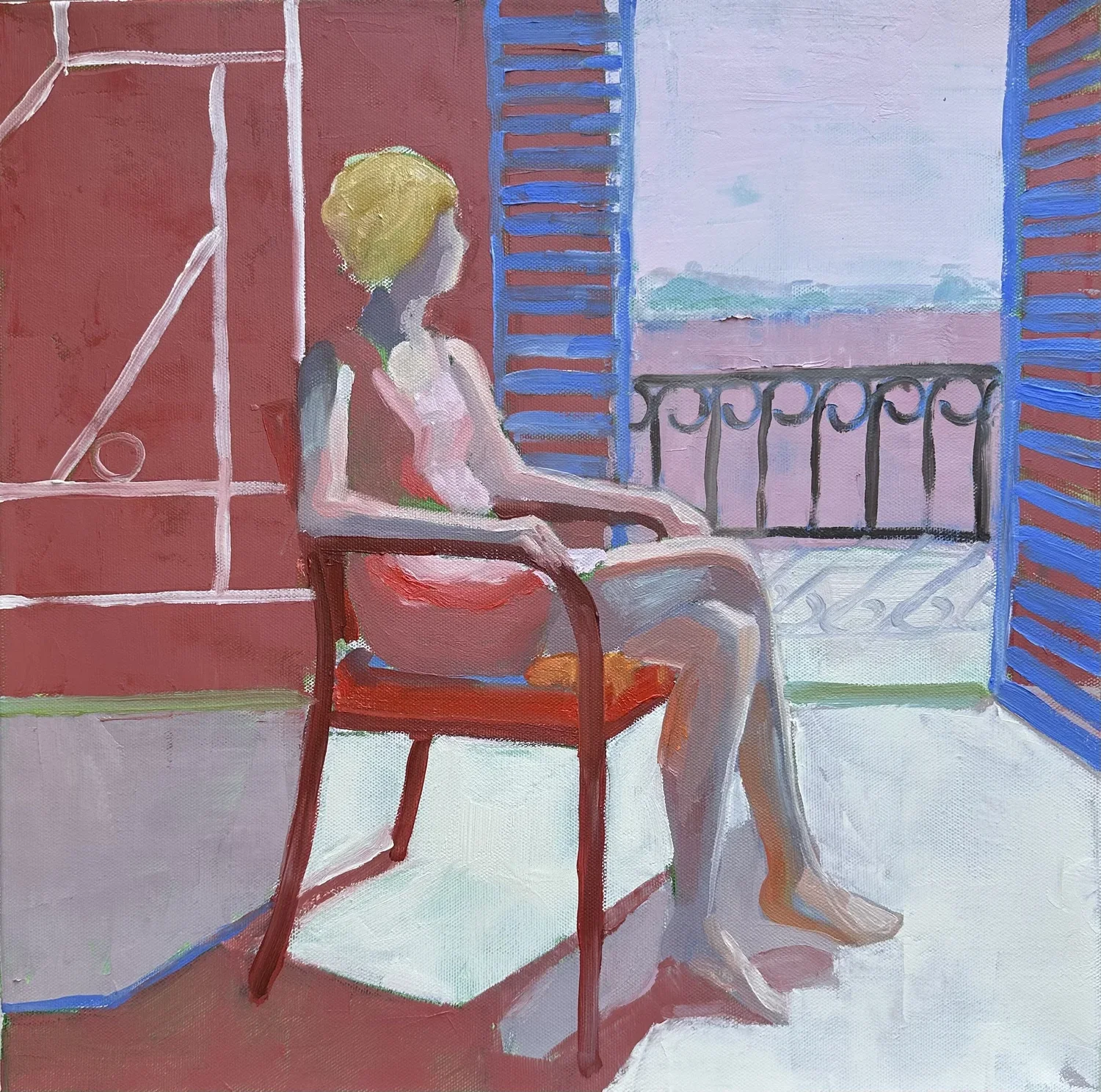
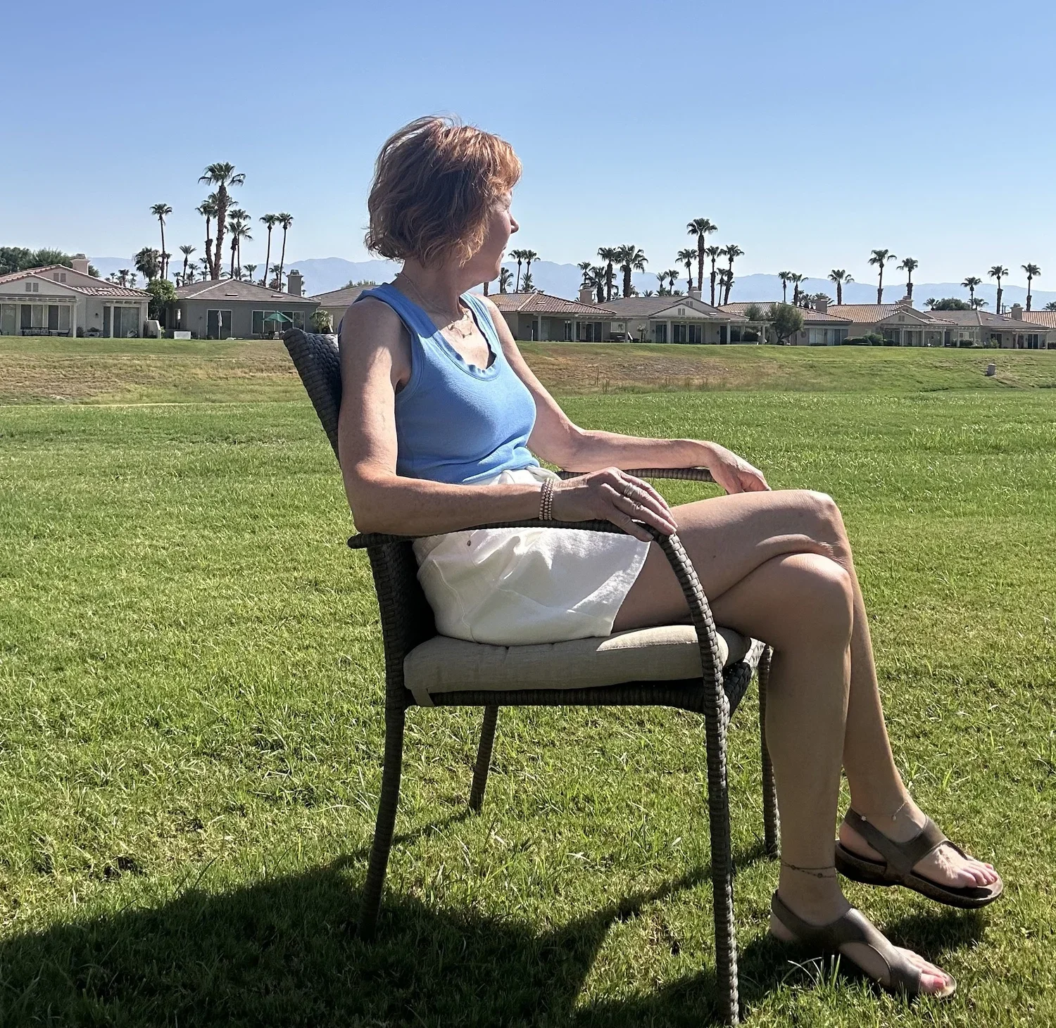
Here is the image I used for the first drawing. Feel free to use this or use one of your own. Even better work from observation of the real objects instead of a photo. ⇨
▪ END OF LESSON TWO ▪
LESSON THREE
INTERIOR WORLDS
The Influence of Persia and Morocco
“I do not literally paint that table, but the emotion it produces upon me.”
Two experiences in quick succession transformed Matisse's painting around 1911: an exhibition of Persian miniatures in Paris, whose intricate geometry and non-naturalistic color arrested him completely, and a journey to Morocco, where the blazing light and saturated hues were unlike anything he had encountered in France. Together, these encounters pushed his work toward a new flatness, an obsession with pattern, and a palette of startling, vivid intensity.
Video Password: Travel
Video Length: 15:55 minutes
The Red Studio
To understand more about Matisse’s life and creative process, it’s worth taking a moment to look at the history of this famous painting in two super informative videos created by The Museum of Modern Art.
A Painting Ahead of its Time
Was “The Red Studio” Always Red?
project
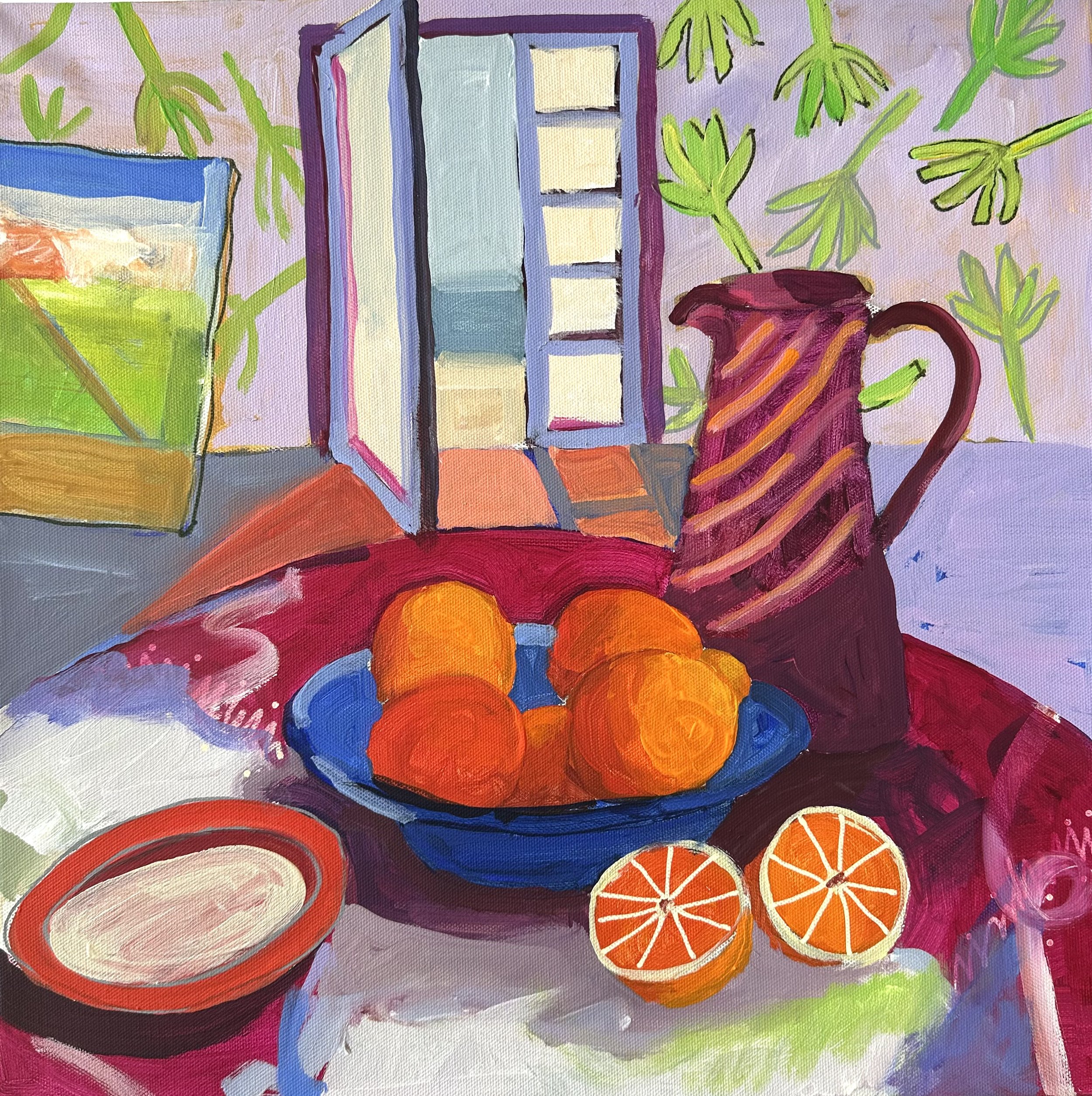
Interior Worlds
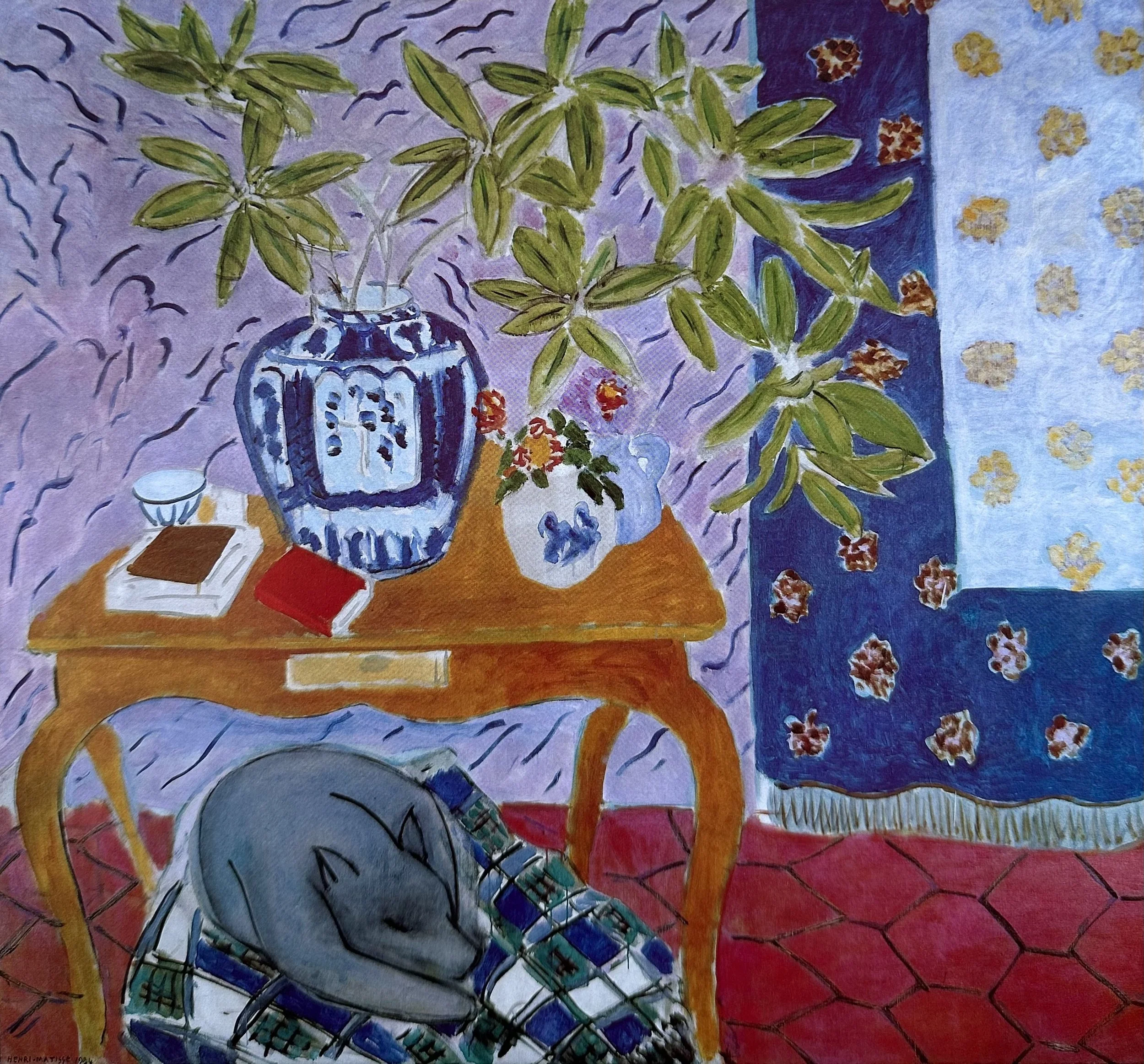
“Interior With Dog” — Henri Matisse
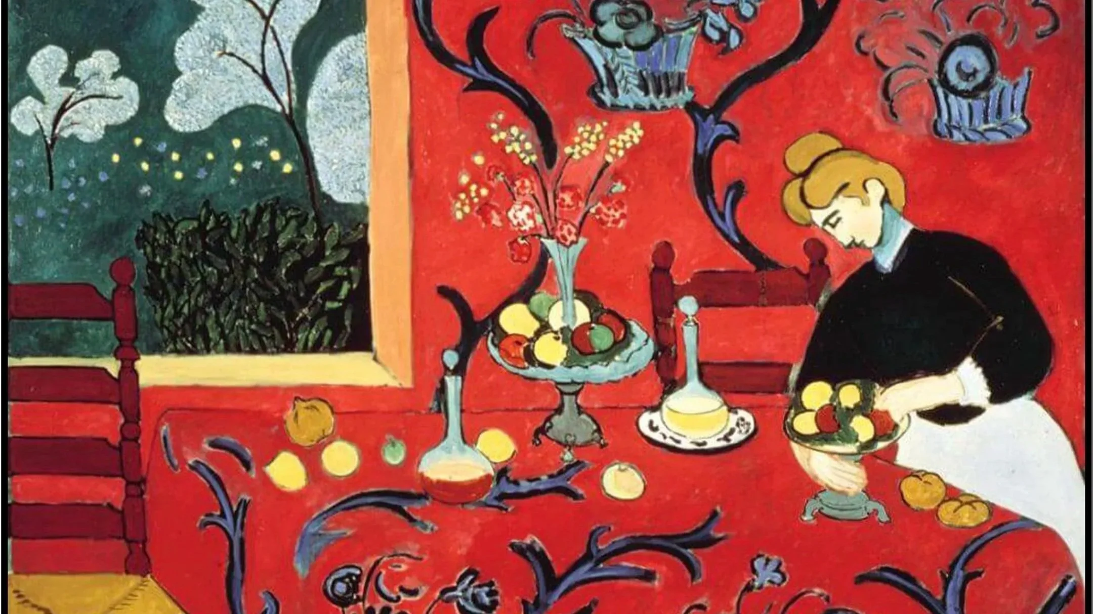
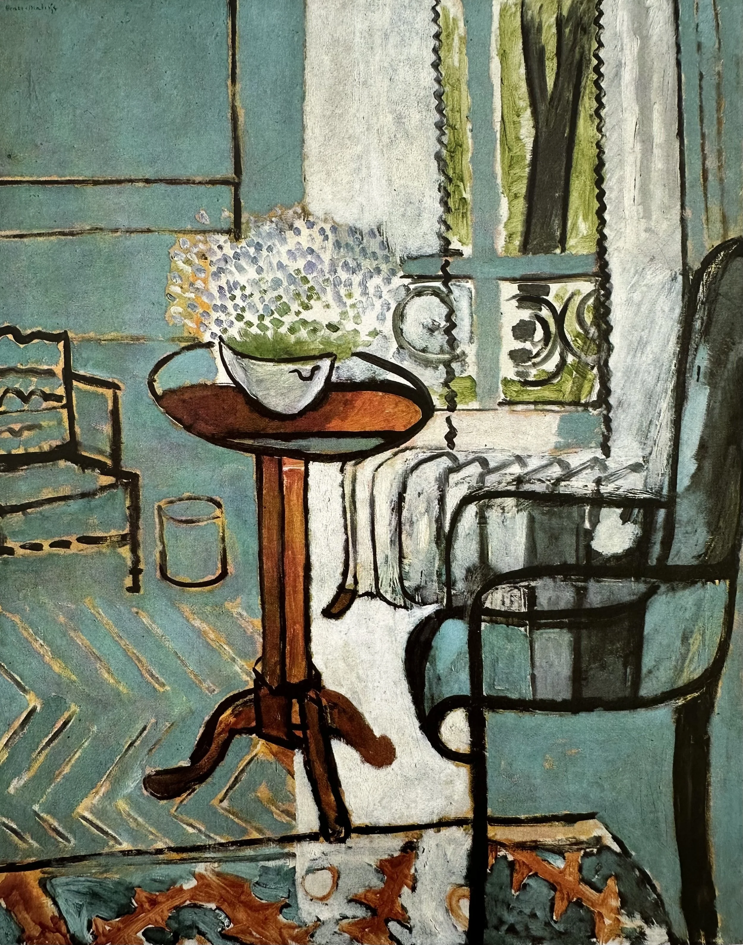
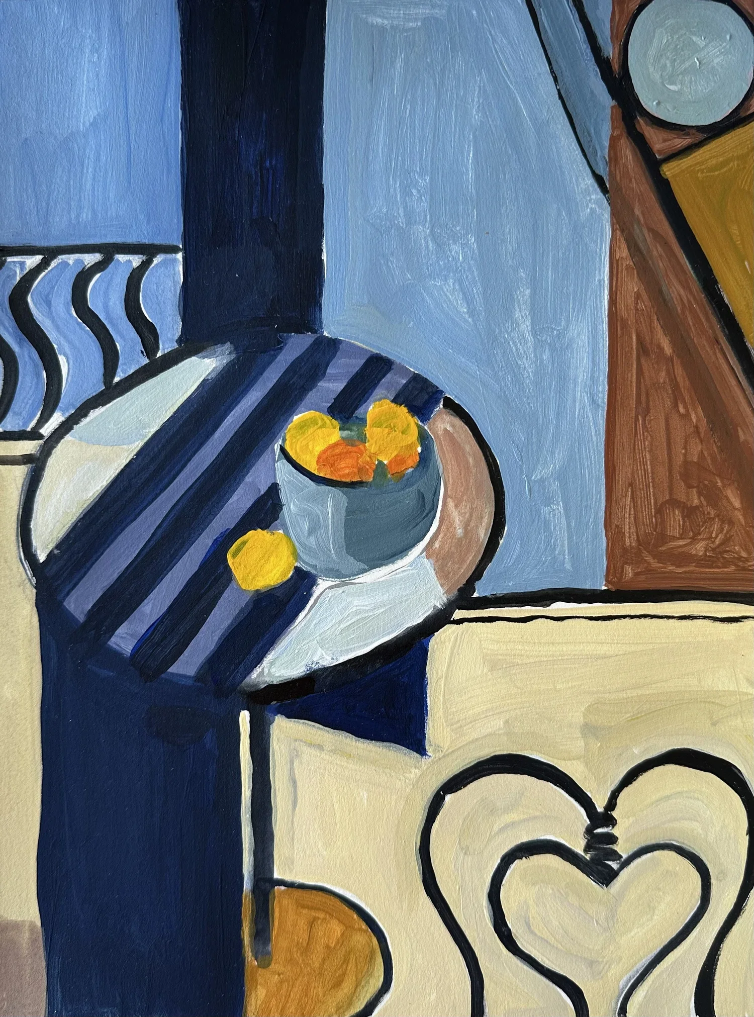
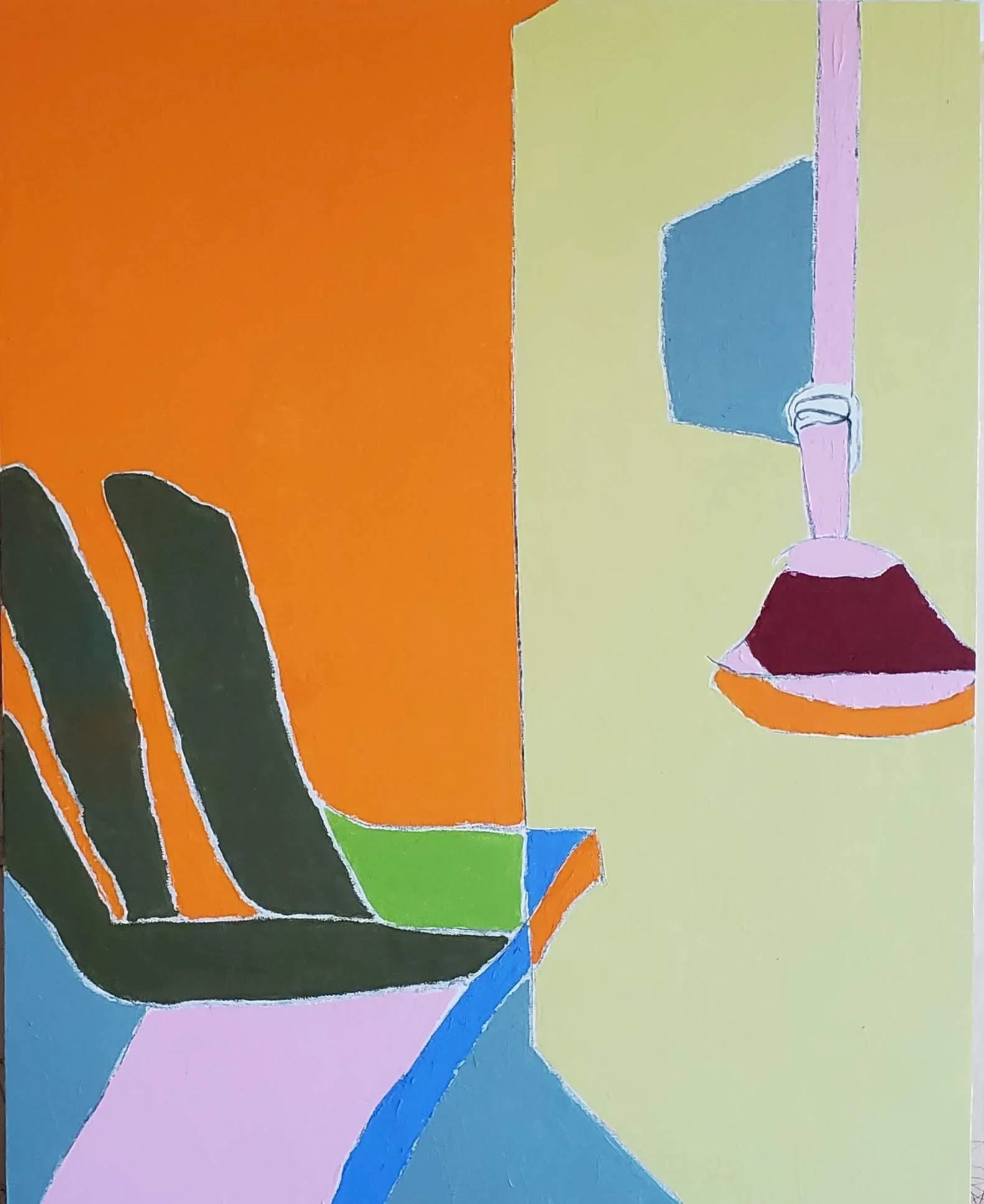
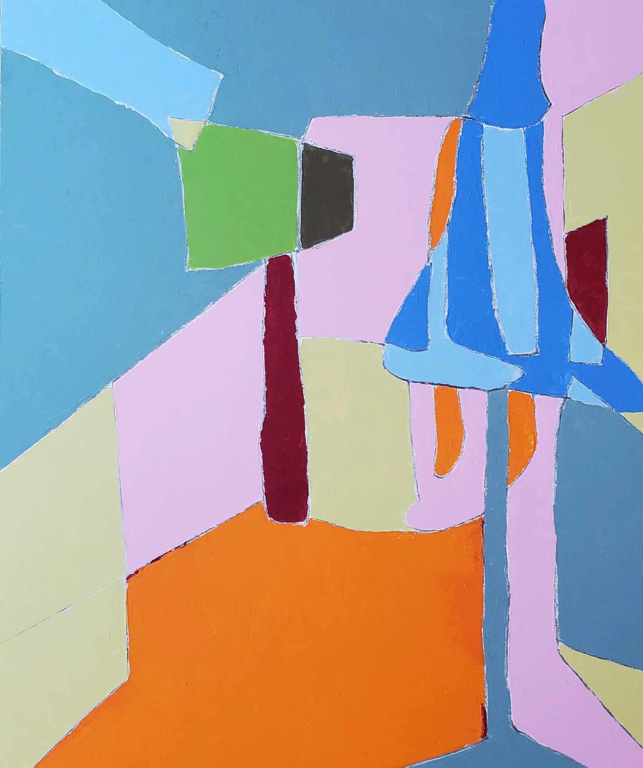
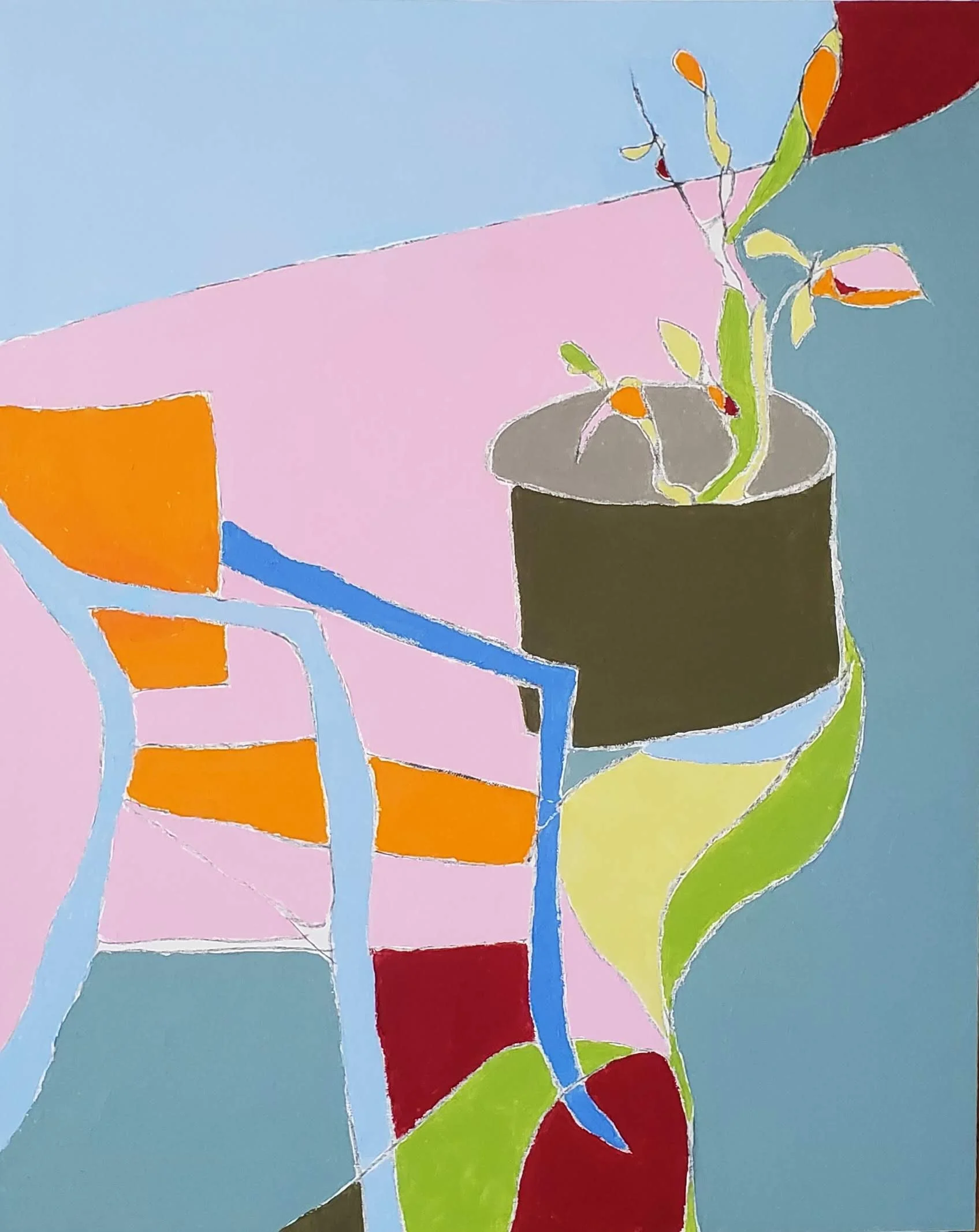
Matisse treated his interior paintings as a world he could arrange and rearrange, where floors, walls, fabrics, and objects merge into a unified decorative whole.
Again and again he returned to the same questions: how do pattern and color interact across a flat surface? How does a window or a vase become as visually alive as a human figure? Works like The Red Studio, Harmony in Red, and Interior at Nice each answer those questions differently, through a single blazing dominant color, through layered pattern on pattern, or through the luminous quiet of a sun-filled room.
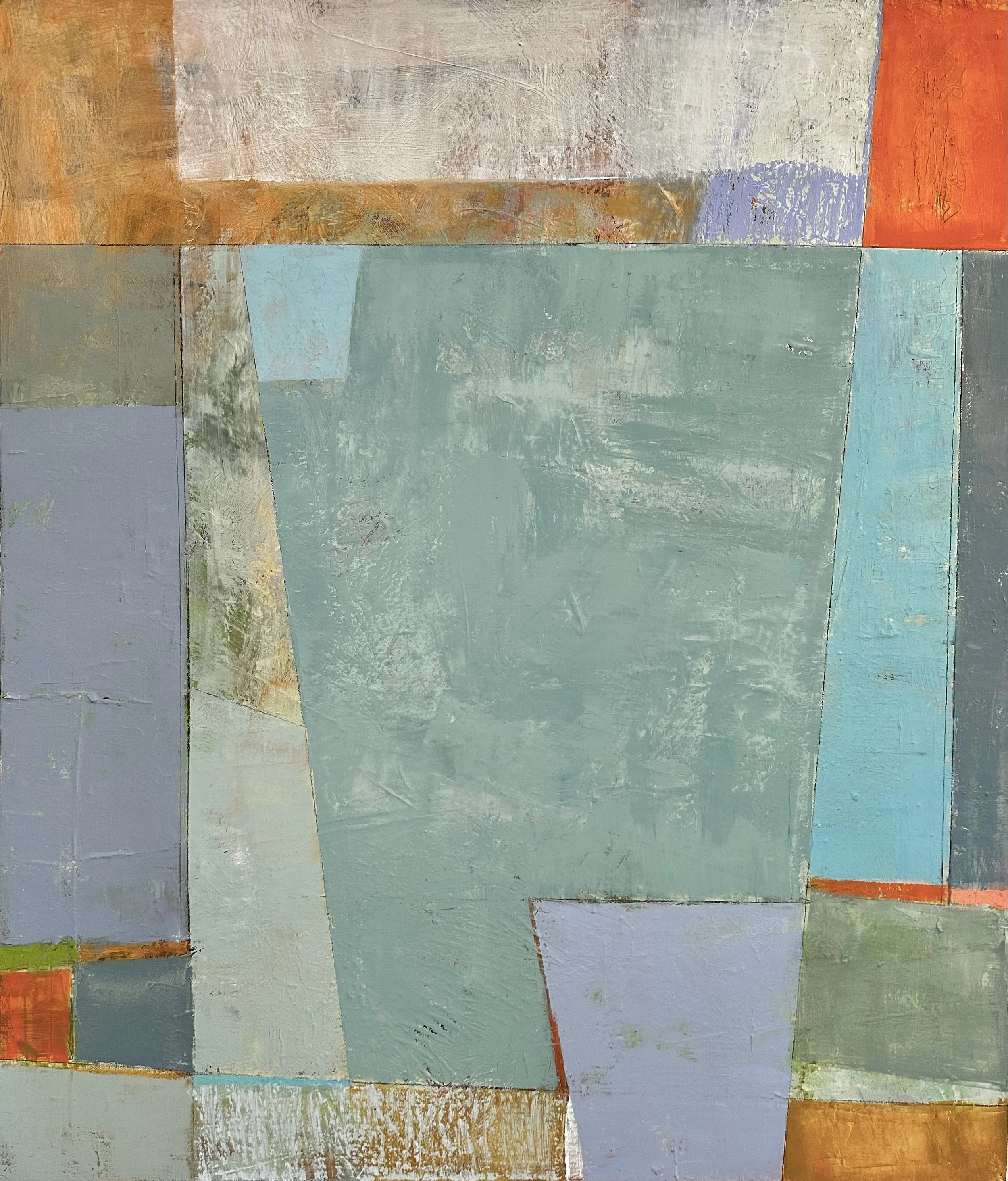
In this project, you'll paint your own interior, a corner, a window, a tabletop, using his approach as your guide. You might choose a bold dominant color and let it govern the entire composition. Consider treating wallpaper, flooring, and objects as equal pattern elements rather than separate items in space. Resist the pull toward shadow and depth; embrace the flat and the decorative.
Watch as I work through my own version in acrylics, making decisions out loud so you can see the thinking behind each choice.
INTERIOR PROJECT: Part One
Video Password: Interior
Video Length: 21:34 minutes
This video is divided into two parts for ease of downloading.
INTERIOR PROJECT: Part Two
Video Password: Still
Video Length: 19:22 minutes
-
Consider using bold colors.
All color is relative so you should be adjusting your colors as you paint.
Use the concept of patterned areas contrasting with flat areas.
Play with perspective. Let it be distorted. (Fun for those of you who struggle with drawing because it doesn’t matter too much here).
Be playful! Remember Matisse wanted his paintings to convey JOY!
OTHER NOTES:
I used the app Procreate to create some quick studies. Feel free to create some studies with a digital app or with sketches.
▪ END OF LESSON THREE ▪

LESSON FOUR
PICASSO and MATISSE
A Creative Rivalry and a Lifelong Dialogue
Picasso and Matisse had one of the most consequential friendships in art history, a relationship built on mutual admiration, intense rivalry, and genuine creative dialogue that spanned roughly half a century.

▫▫▫▫▫▫
Gertrude Stein’s Salon
They met around 1906, introduced through Gertrude Stein's Paris salon, at a moment when both were at pivotal points in their careers. From the start, they recognized each other as the only true peer either had. Picasso reportedly said that only he and Matisse were the painters who mattered, and by most accounts he meant it as a compliment as much as a competitive declaration.
▫▫▫▫▫▫

▫▫▫▫▫▫
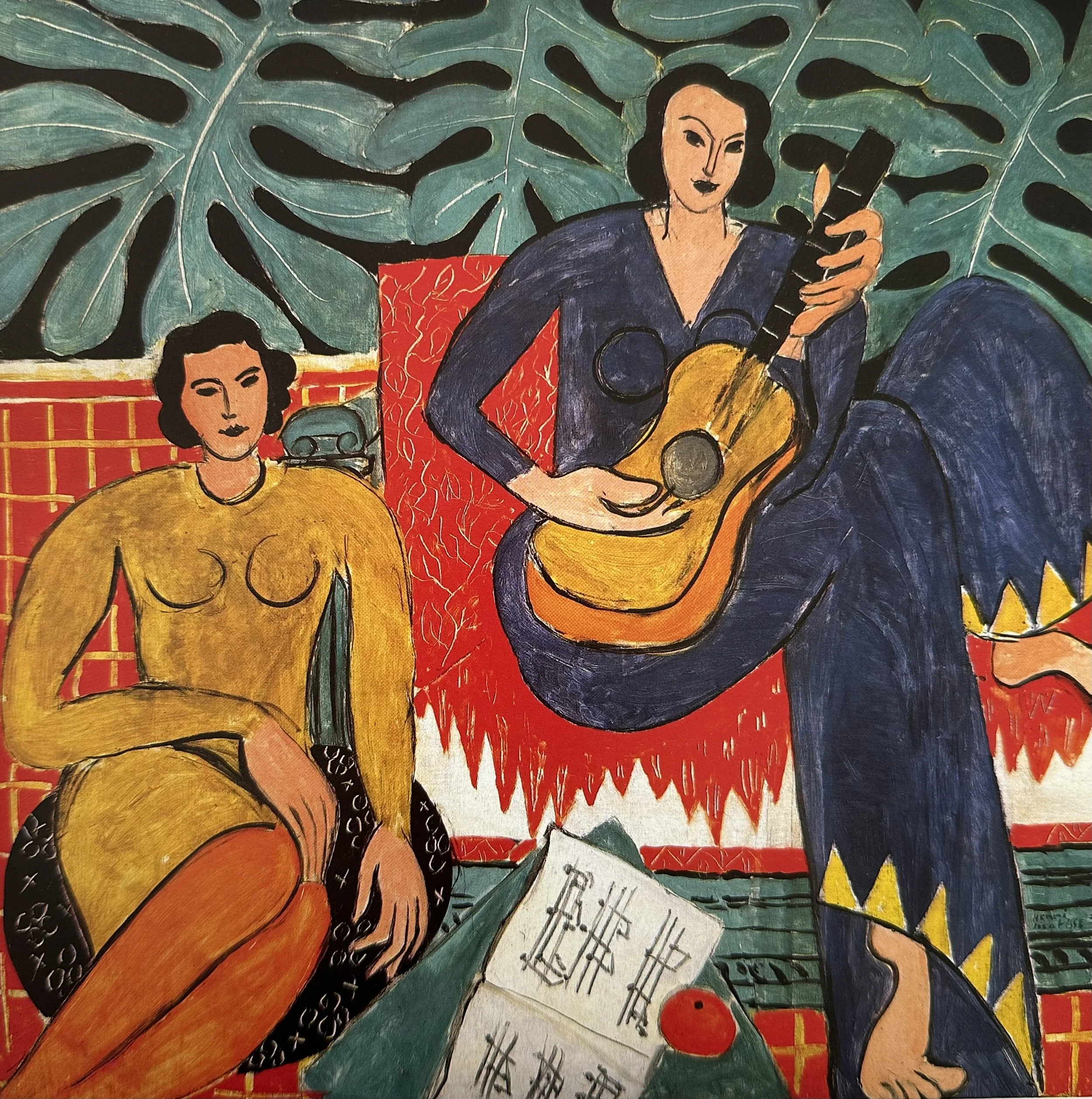
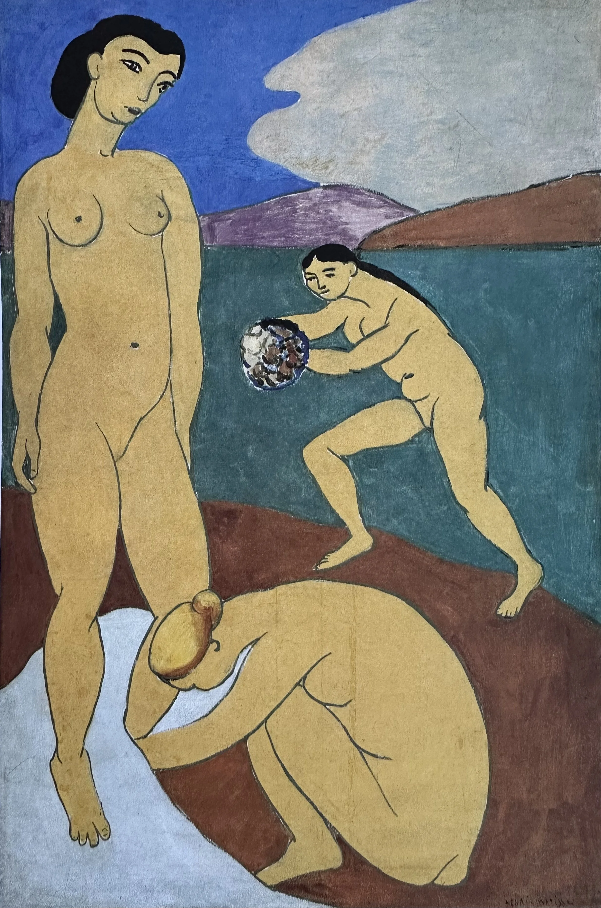
“Music” — by Matisse
There is no doubt that the mutual admiration and rivalry of these two artists inspired some of their greatest works. Matisse worked slowly, methodically, through color and decoration and sensual pleasure. Picasso worked in explosive bursts, through form, disruption, and psychological intensity. They looked at each other's work constantly and responded to it.
▫▫▫▫▫▫
▫▫▫▫▫▫
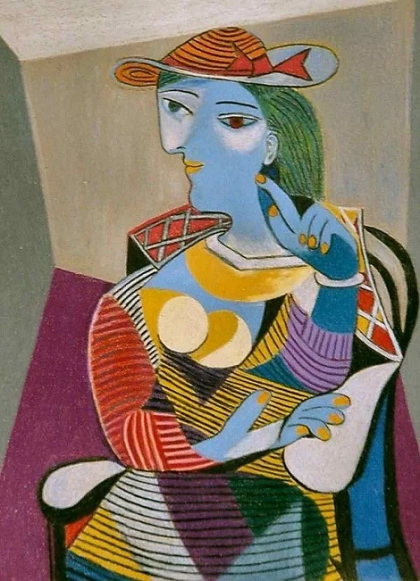
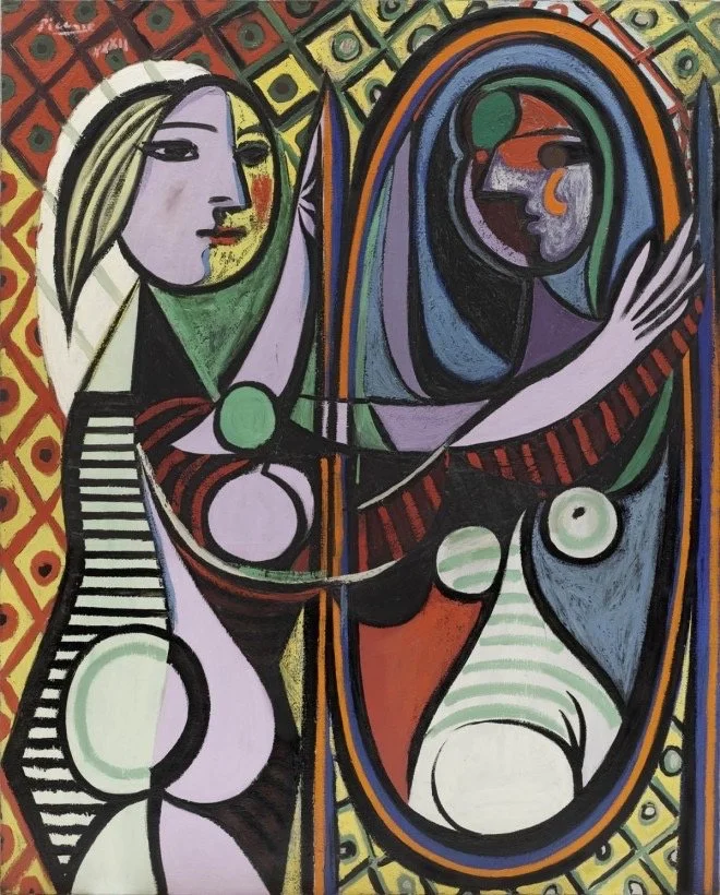
“Seated Woman” — by Picasso
When Matisse began flattening space and using bold pattern in his interiors, Picasso was watching. When Cubism fractured the picture plane, Matisse absorbed the challenge and found his own answer.
▫▫▫▫▫▫
▫▫▫▫▫▫
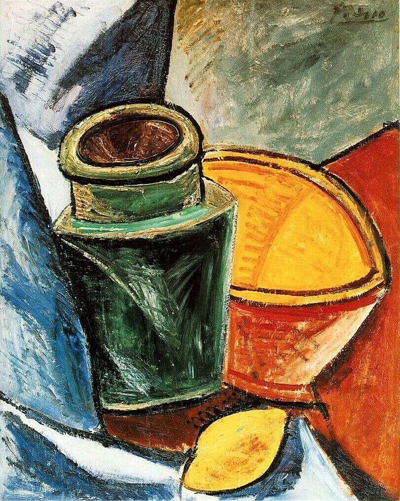
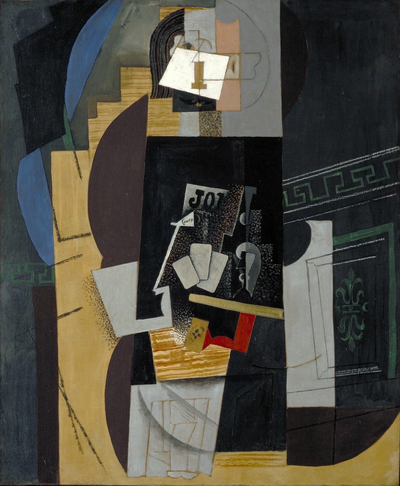
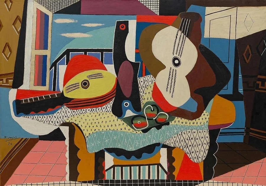
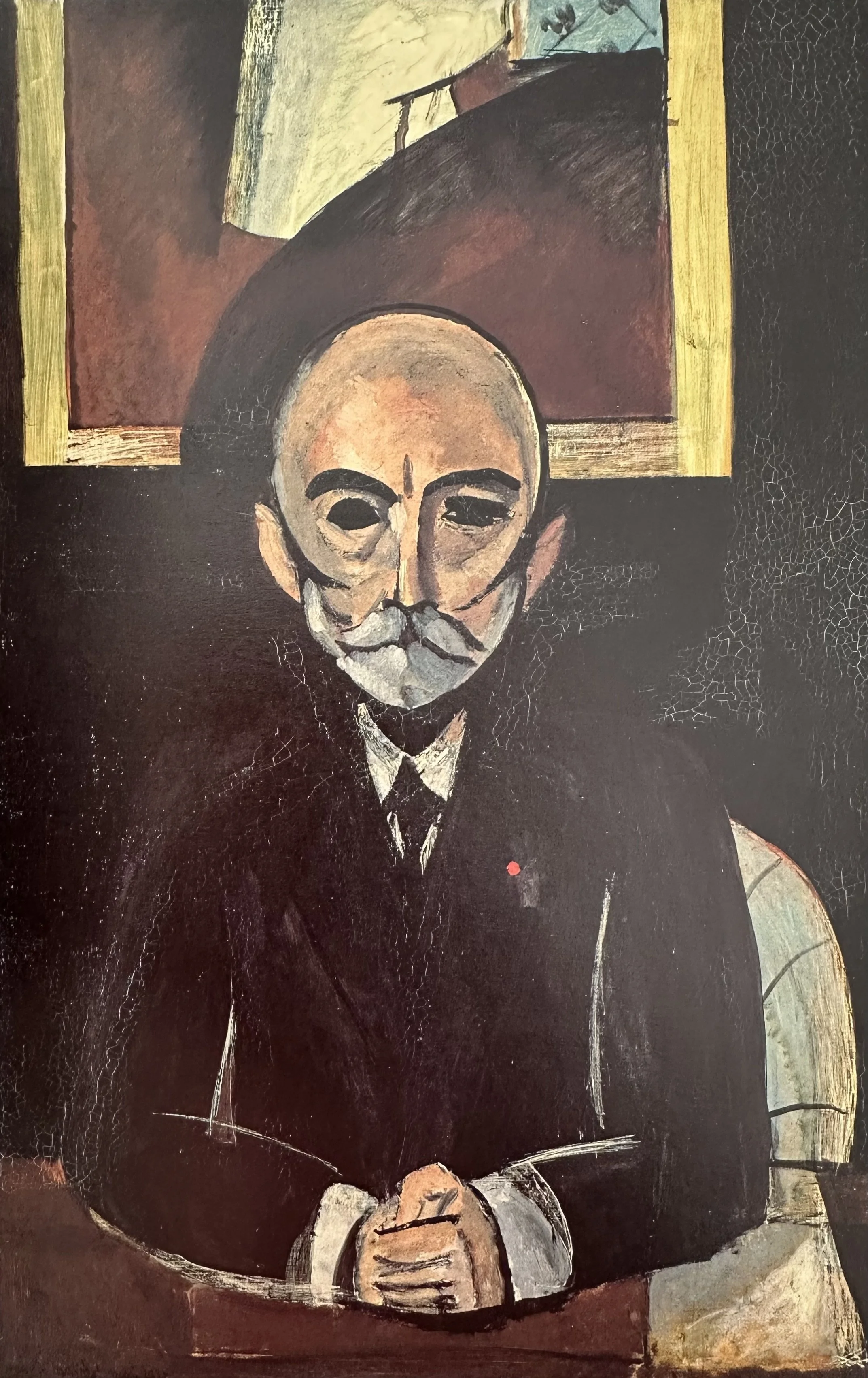
“Jug, Bowl and Lemon” — by Picasso
(chosen by Matisse)
They exchanged paintings and kept them. Matisse had Picassos on his wall; Picasso ended with 10 of Matisse’s works.
These two paintings are the first that they exchanged. Regarding these two, Gertrude Stein, ever the provocateur, said each had opted for the worst example of the other's new work, but in fact, learning was the driving motivation. Matisse, whose own still life of lemons had recently been criticized in the press, saw how Picasso was pushing the genre toward Cubism.
▫▫▫▫▫▫
For a deeper dive into this painting:
▫▫▫▫▫▫
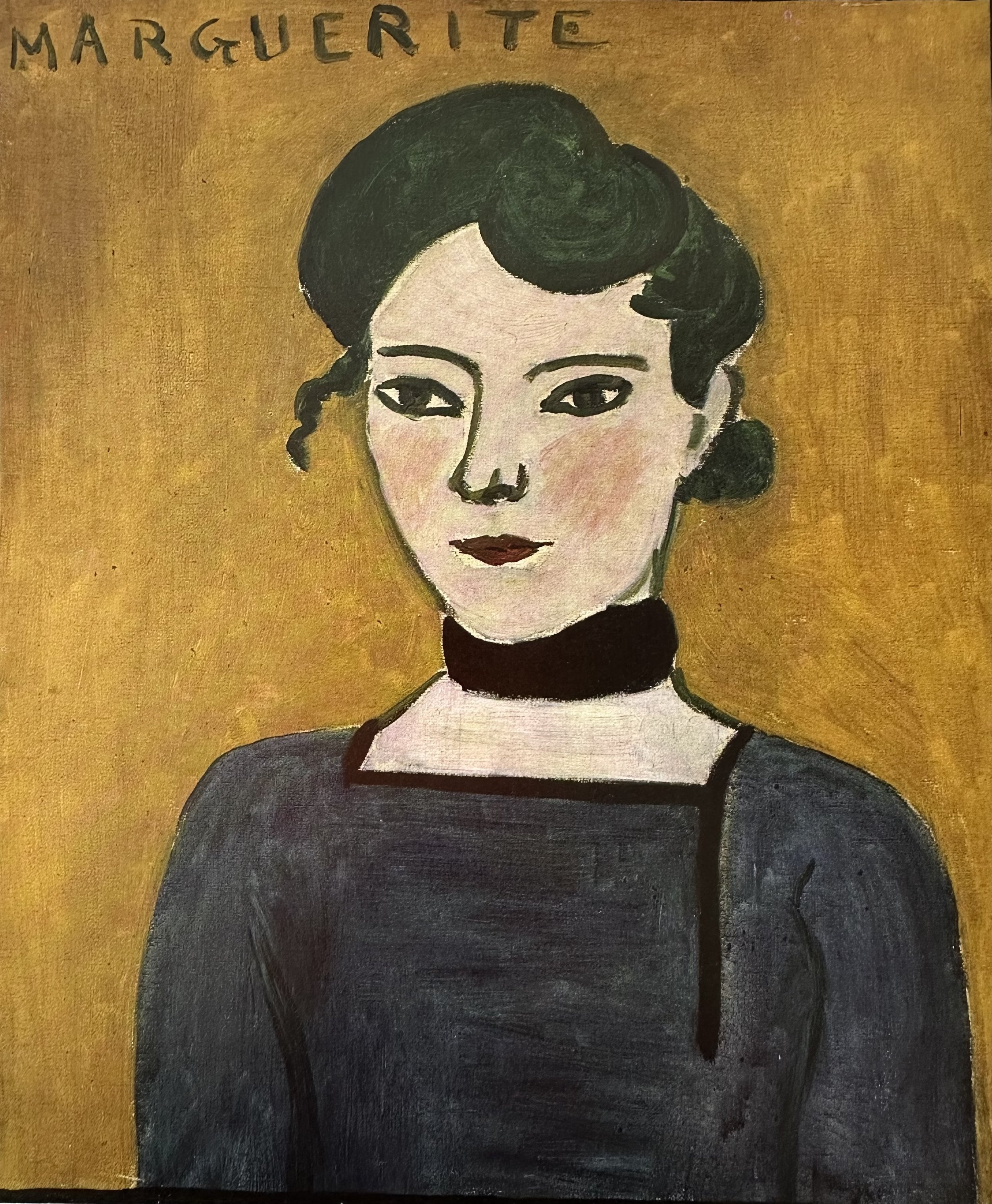
“Marguerite” — by Matisse
(chosen by Picasso)
Picasso chose Marguerite. This seemingly simple painting has deep historical references that few people would know. There are references to both Velazquez and Edouard Manet which Picasso would have seen and understood.
▫▫▫▫▫▫
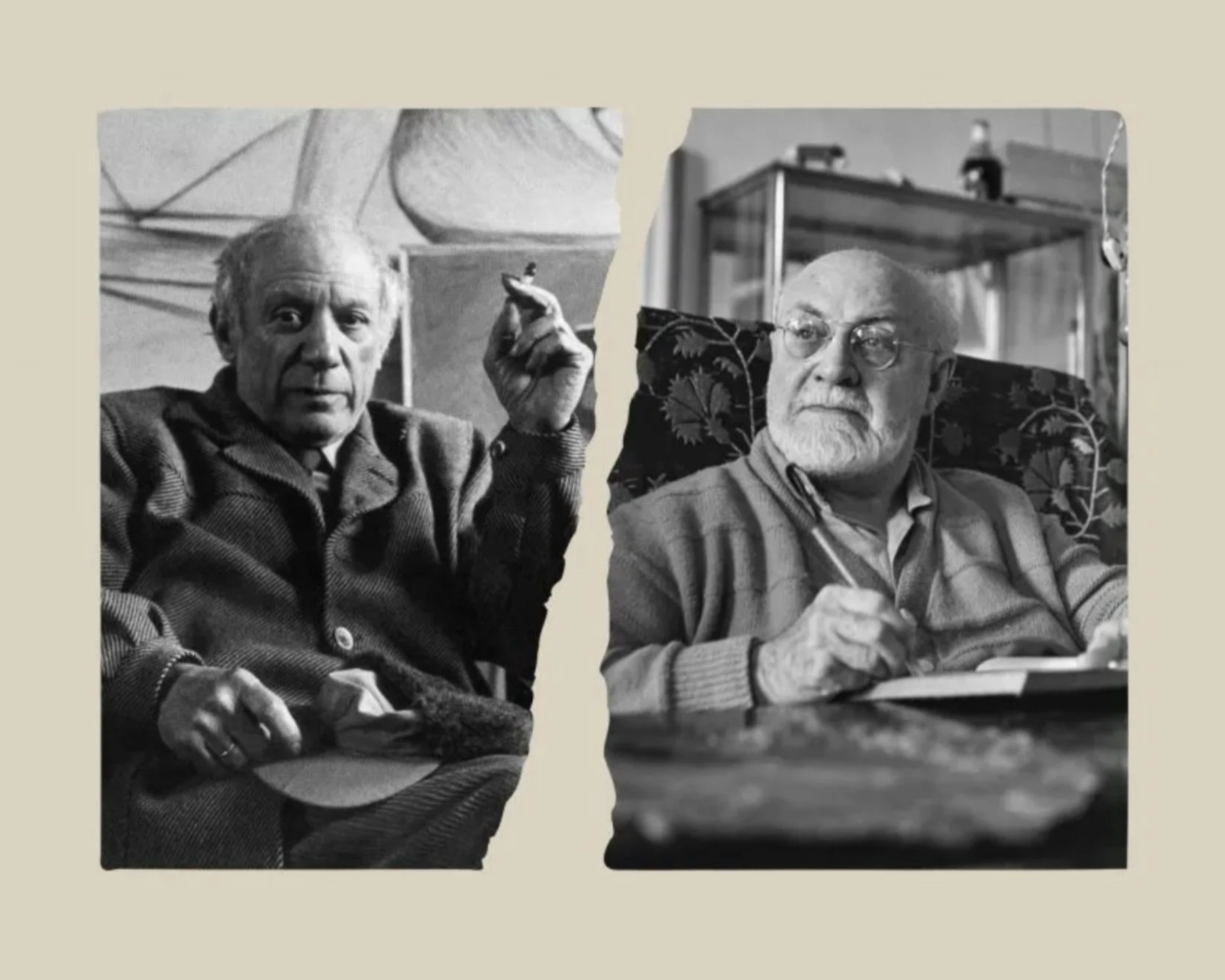
left: Pablo Picasso in his studio in Paris, c.1950. right: Henri Matisse in his living room in Vence, c.1948.
© Getty Images
▫▫▫▫▫▫
“Respect”
In their later years, when Matisse was largely bedridden and working on his cut-outs, Picasso would visit and they would talk for hours. By then the rivalry had mellowed into something closer to tenderness. Two old men who understood that no one else could quite grasp what the other had attempted. When Matisse died in 1954, Picasso is said to have wept and told friends that now he would have to carry on alone
▫▫▫▫▫▫
More History
For those of you who are intrigued by the history of these two legends, this is an interesting film. It is long (about an hour) and a bit clumsily translated, however it shows interesting footage and is quite informative.
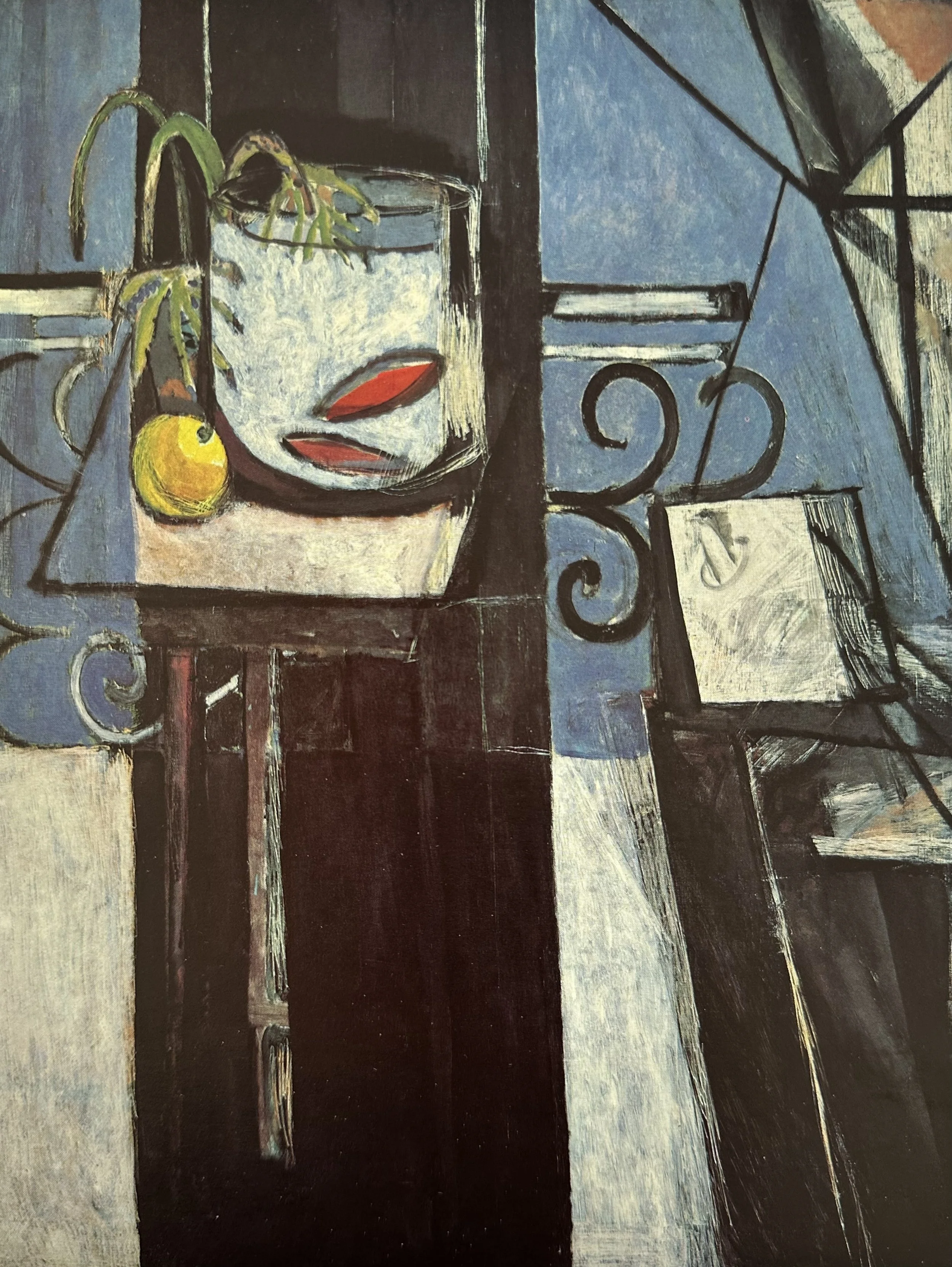
GALLERY
▫
GALLERY ▫
Picasso & Matisse
Can you spot the influences in each other’s work?
⇣ Click on any image to view larger ⇣

Project
Matisse with a Tablespoon of Picasso
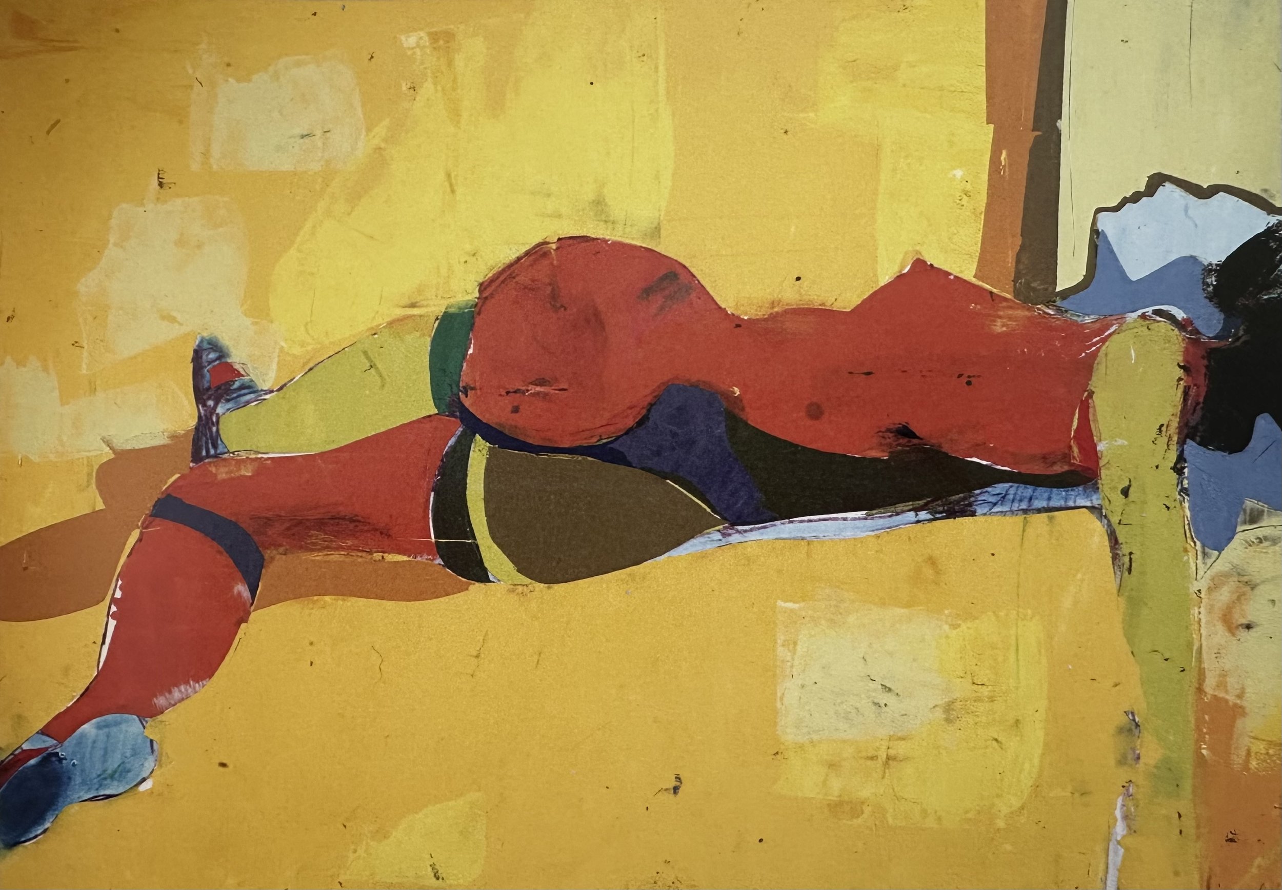
Matisse was clearly influenced by the Cubist movement although he never fully embraced it. Instead he developed his own viewpoint and style. He pushed further towards abstraction letting shapes become less object driven and more design or composition driven. He also continued to strive for simplification, editing out what was not needed.
In this project I take “Interior with Goldfish and Palette” as an inspirational jumping off point to create my own painting.
Video Password: Picasso
Video Length: 28:46 minutes
-
Let go of “realism” and lean towards simplifying shapes.
Think of Shape, Pattern and Line.
Look for ways to visualy connect your painting, such as with value, line and color.
Consider the Cubist concept of more than one view of the same object.
What are your emotions while painting this?

project
Everyday Objects can Tell a Story
Let’s look at how everyday objects can create some fun and playful paintings.
Video Password: Object
Video Length: 12:47 minutes
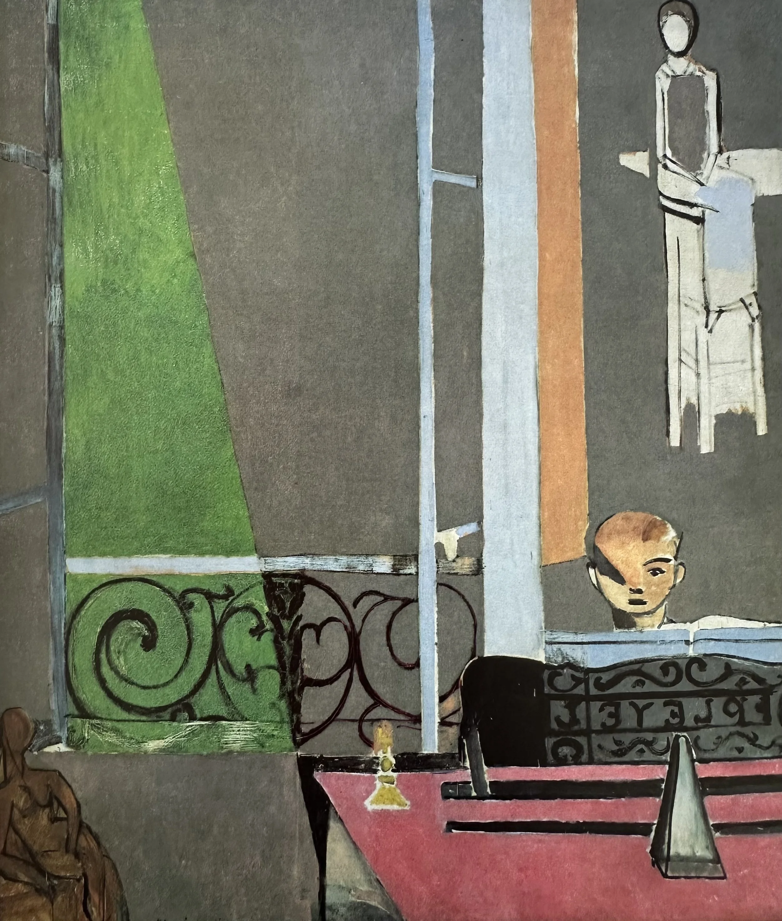
GALLERY
▫
GALLERY ▫
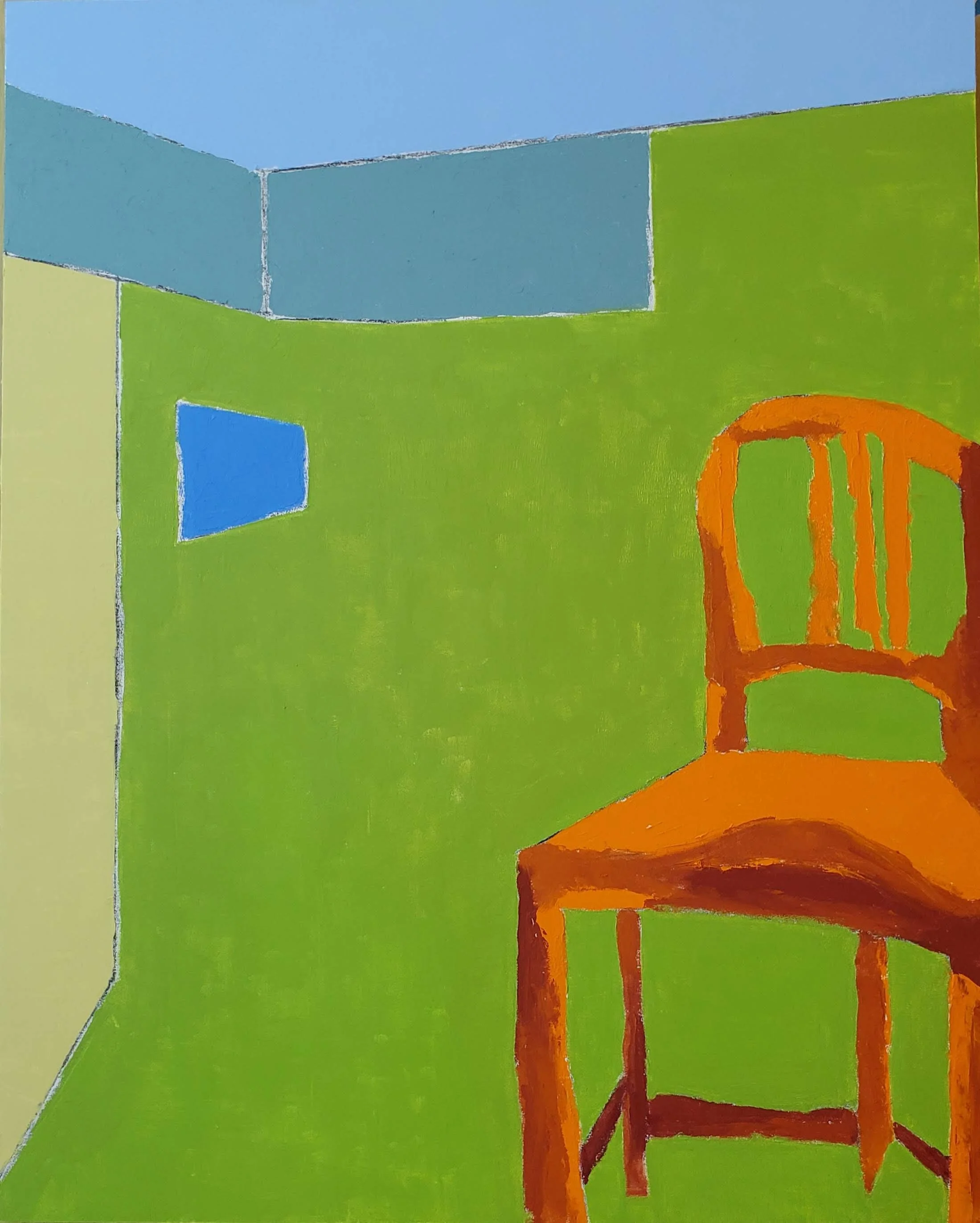
Diane Warner-Wang
⇣ Click on any image to view full painting ⇣
-
Use color boldly. Ignore color theory rules and see what happens when you break them.
Be aware of how the colors, shapes, lines, and values move your eyes around the painting.
Try to flatten the object with no or very little modeling (no shadows).
Look at what your painting needs as you work. Let go of directly copying the object.
Consider dividing negative spaces into flat color shapes.
Alternatively, consider painting your objects within a space that is made of a dominant color. (Such as Matisse’s “The Red Studio” or Diane’s “The Green Room with Orange Chair” above).
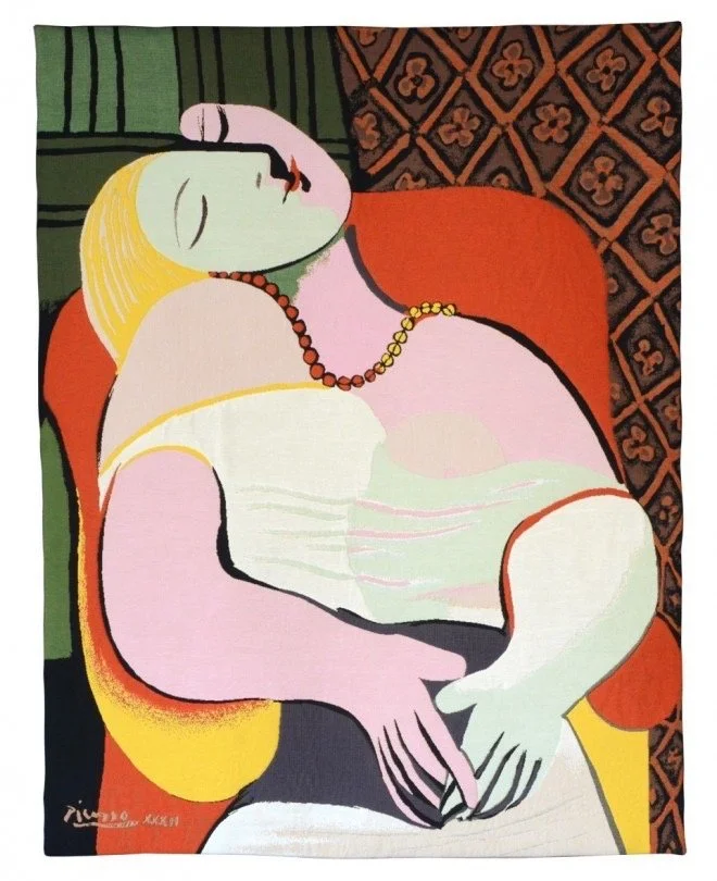
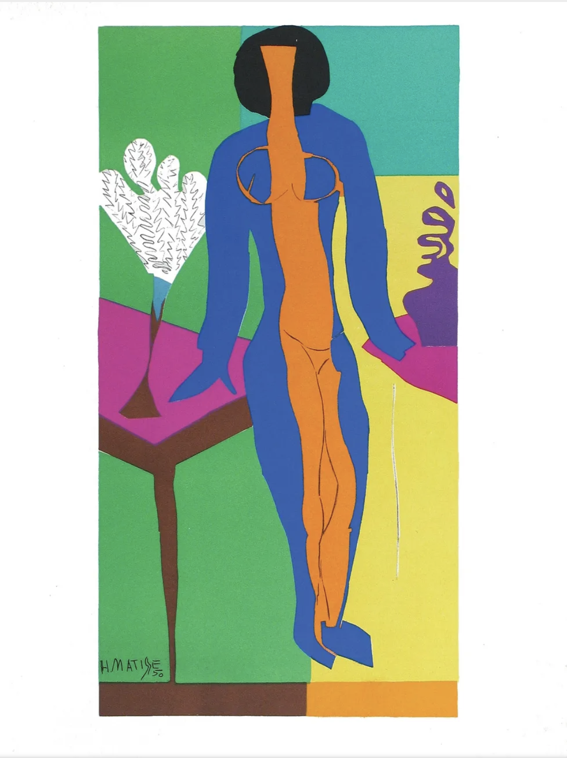
Matisse’s Mid-to-Later Years 1917-1954
1917–1930
Settles in Nice; moves towards luminous Odalisque paintings — sun-drenched interiors, rich textiles, and the model as part of a decorative whole.
1941
Diagnosed with cancer; a major abdominal operation leaves him largely bedridden. Far from suffering, he reinevents himself entirely.
1943–1954
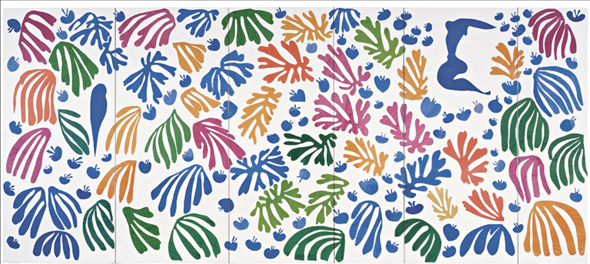
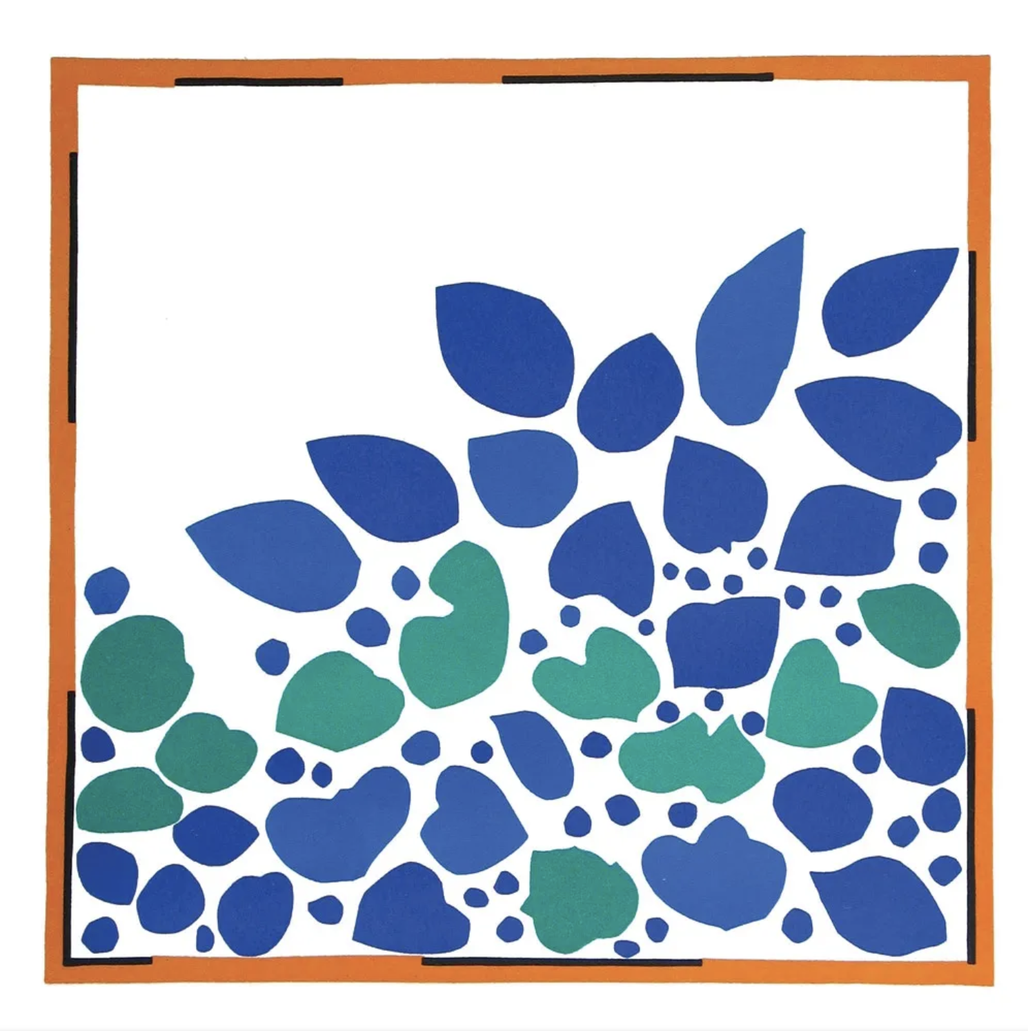
The Cut-Outs — his “second life”. Unable to stand at an easel. Matisse begins cutting shapes from vivid gouache-painted paper and arranging them with assistants. Works like “Jazz”, “The Swimming Pool”, and the monumental “La Gerbe” are among the most joyful and radical works of the century. He calls it “drawing with scissors.”
1947–1951
Designs and oversees every element of the Chapelle du Rosaire at Vence — windows, vestments, tiles — calling it his masterpiece.
1954
Dies at 84 in Nice. His legacy is immense: colour as emotion, decoration as profound art, and the cut-out as a revolutionary form that still reverberates through design, fashion, and contemporary art today.
▪ END OF LESSON FOUR ▪
LESSON FIVE
The FIGURE
Matisse’s Fascination with the Figure
“What interests me most is neither still life nor landscape, but the human figure. It is that which best permits me to express my almost religious awe towards life. I do not insist upon all the details of the face, on setting them down one-by-one with anatomical exactitude. If I have an Italian model who, at first appearance, suggests nothing but a purely animal existence, I nevertheless discover his essential qualities, I penetrate amid the lines of the face those which suggest the deep gravity which persists in every human being.”
Searching for the Essence
Matisse never treated the figure as an isolated anatomical subject. He thought of the human form as one element within a larger decorative whole, as much a shape, a color mass, or a rhythmic element as the patterned wallpaper or the vase beside it. The figure earned its place in the composition by contributing to the overall harmony, not by demanding special attention as a human presence. He wanted neither figure nor background to dominate; both should carry equal visual weight.
These concepts led him to think in terms of masses rather than anatomy. Where academic training taught artists to understand and render the body's structural logic, Matisse worked to dissolve that specificity, finding the essential silhouette, the weight, the gesture, and letting the rest go. His famous pen and ink nudes are extraordinary precisely because so little information produces such a vivid sense of a body.
His guiding principle, if there was one, was feeling over correctness, and nowhere is that more evident than in how he approached the figure: not as a problem to be solved technically, but as an emotional presence to be found.
Matisse and the Figure
Matisse would include the figure in intricate and complicated compositions as well as isolate it and reduce the figure to the essence of its form. Let’s look at how these ideas developed over the years.
Video Password: Figure
Video Length: 19:53 minutes
A Closer Look at Henri Matisse’s Bather
Join two top experts at The Museum of Modern Art (MoMA) for an in-depth look at this painting and Matisse’s process. Click on the link below to read the full article. It is well worth reading (or at least skimming) to fully understand his process.
“Despite the apparent simplicity of Matisse’s 1909 painting there’s more here than meets the eye.”
“(Matisse) always wanted painting to look effortless and to achieve these effects of apparent simplicity during this period. But in reality, you can see how he labored exhaustingly to achieve what he called an “art of balance.” What’s fascinating about this painting is that the process is very clear here. Even though he wanted this very apparent simplicity as the final product, you see the struggle.”
“Matisse is not painting an object, but the sensation of that object or that experience.”

Click on the MOMA logo to read the full article. NOTE: It will take you to the END of the article. Scroll up to the TOP when you get to the page to see the entire article.
Project
Painting the Figure
Under the Influence of Matisse
In this project I use a photograph as a source for my figure and light. For the rest of the painting I use my imagination to create the “environment” where the figure exists. My focus is on giving the figure and “background” equal importance.
PROJECT: Part One
Video Password: One
Video Length: 22:05 minutes
This video is divided into two parts for ease of downloading.
PROJECT: Part Two
Video Password: Two
Video Length: 20:10 minutes
-
Black, Van Dyke Brown, Ultramarine Blue, Cerulean Blue, Viridian, Transparent Red Oxide, Quinacridone Red, Cadmium Red Light, Cadmium Orange, Cadmium Yellow Medium, Cadmium Lemon, Titanium White, Titanium Buff, Gold Ochre, Gamblin’s Warm Grey, Cold Wax Medium
-
Try to give the figure and the background equal importance.
Expressing feeling is more important than acuracy.
Recognize the shapes in your work and how they relate to each other and to the picture plane.
Try using a unifying color.
Try using pattern. (I did not, but you can!)
Consider using line in your figure painting (like in the Bather).
Project
The Essence of the Figure
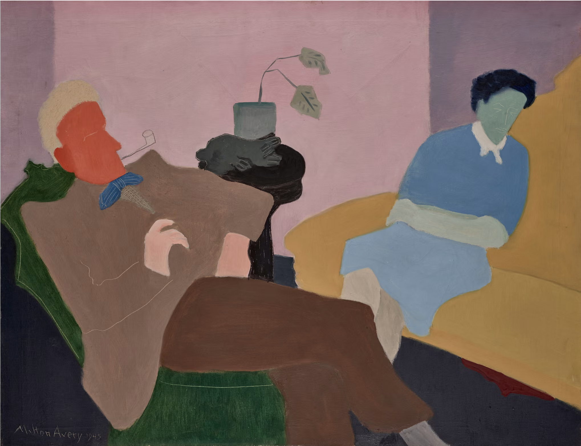
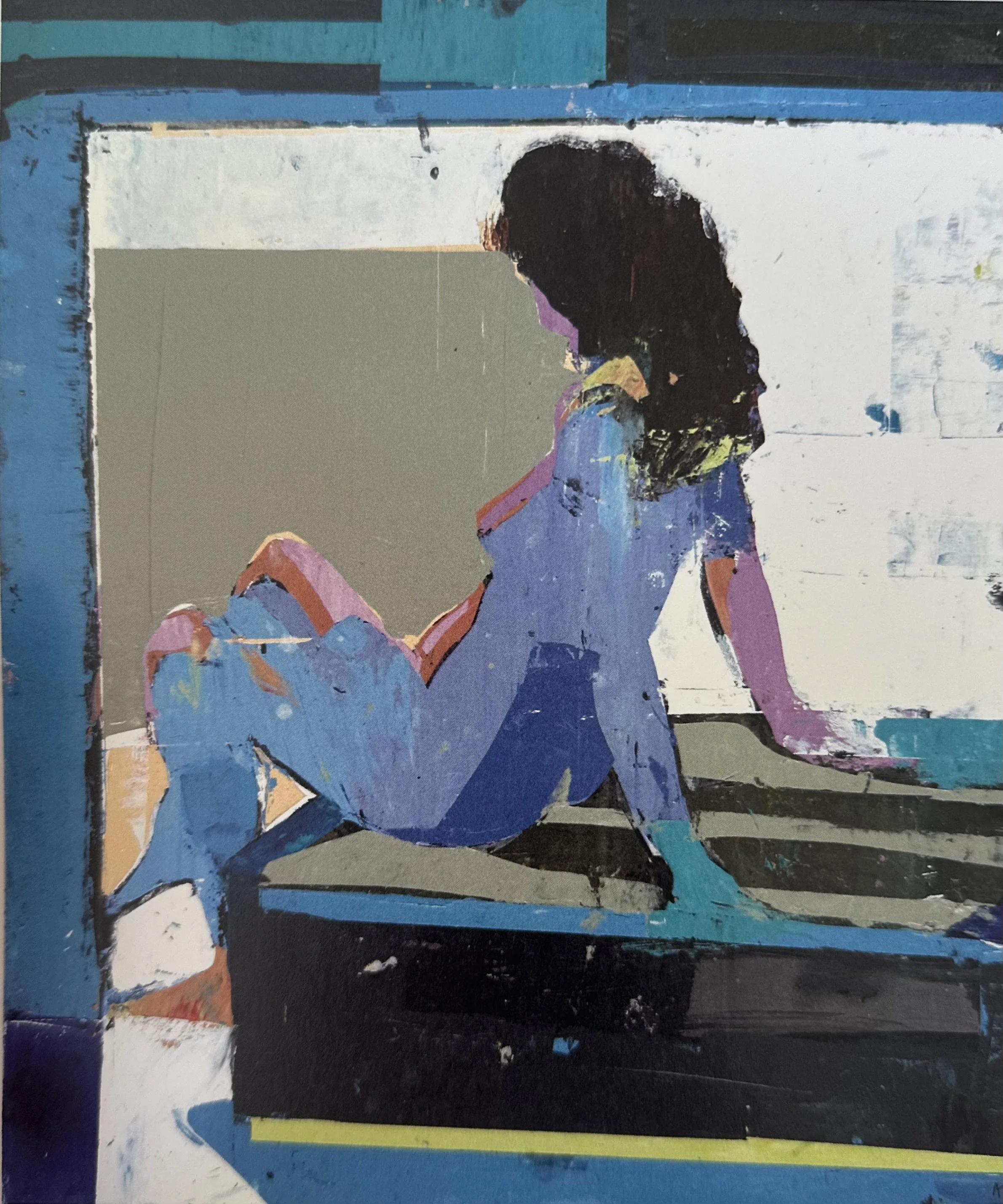
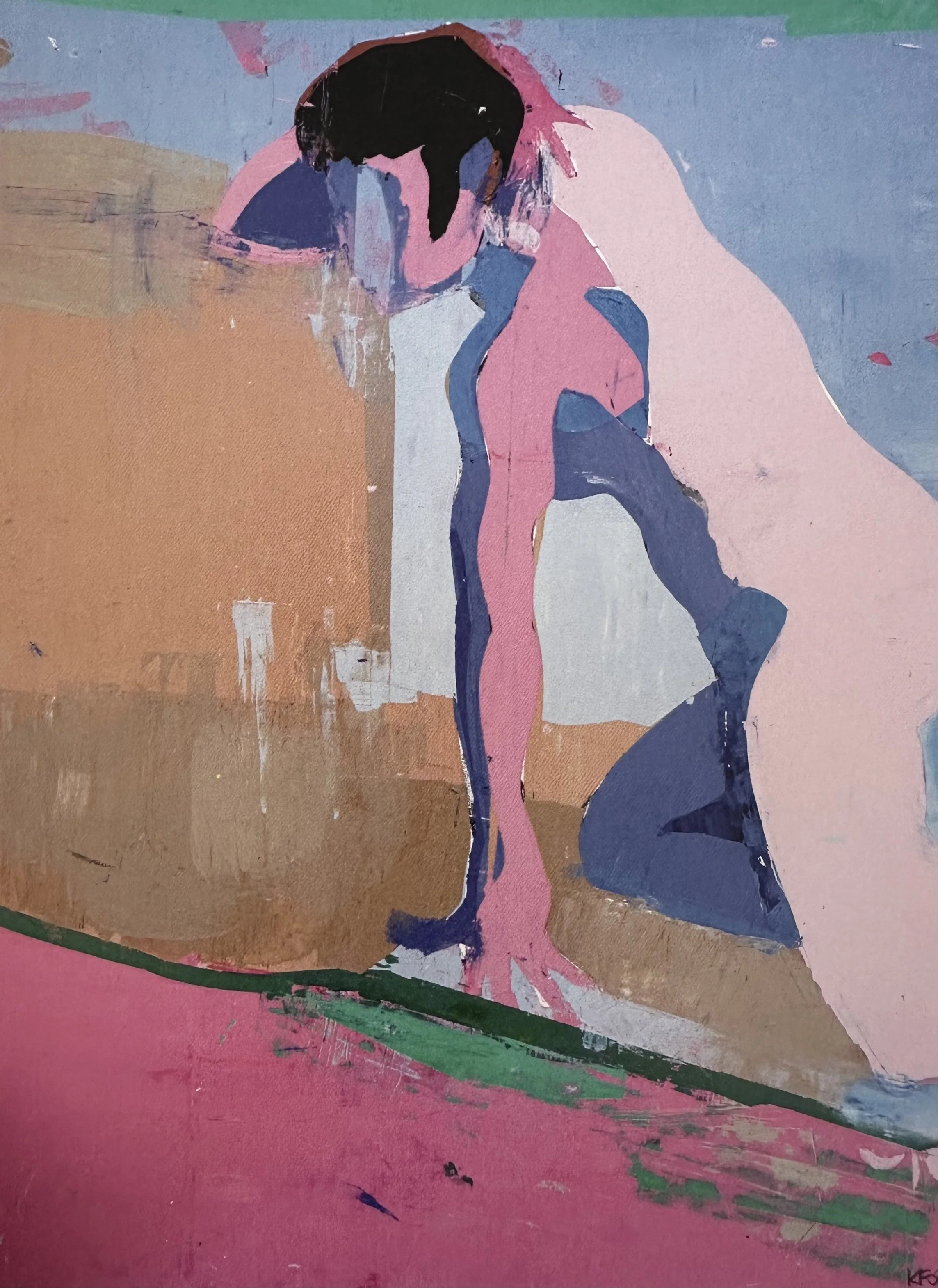
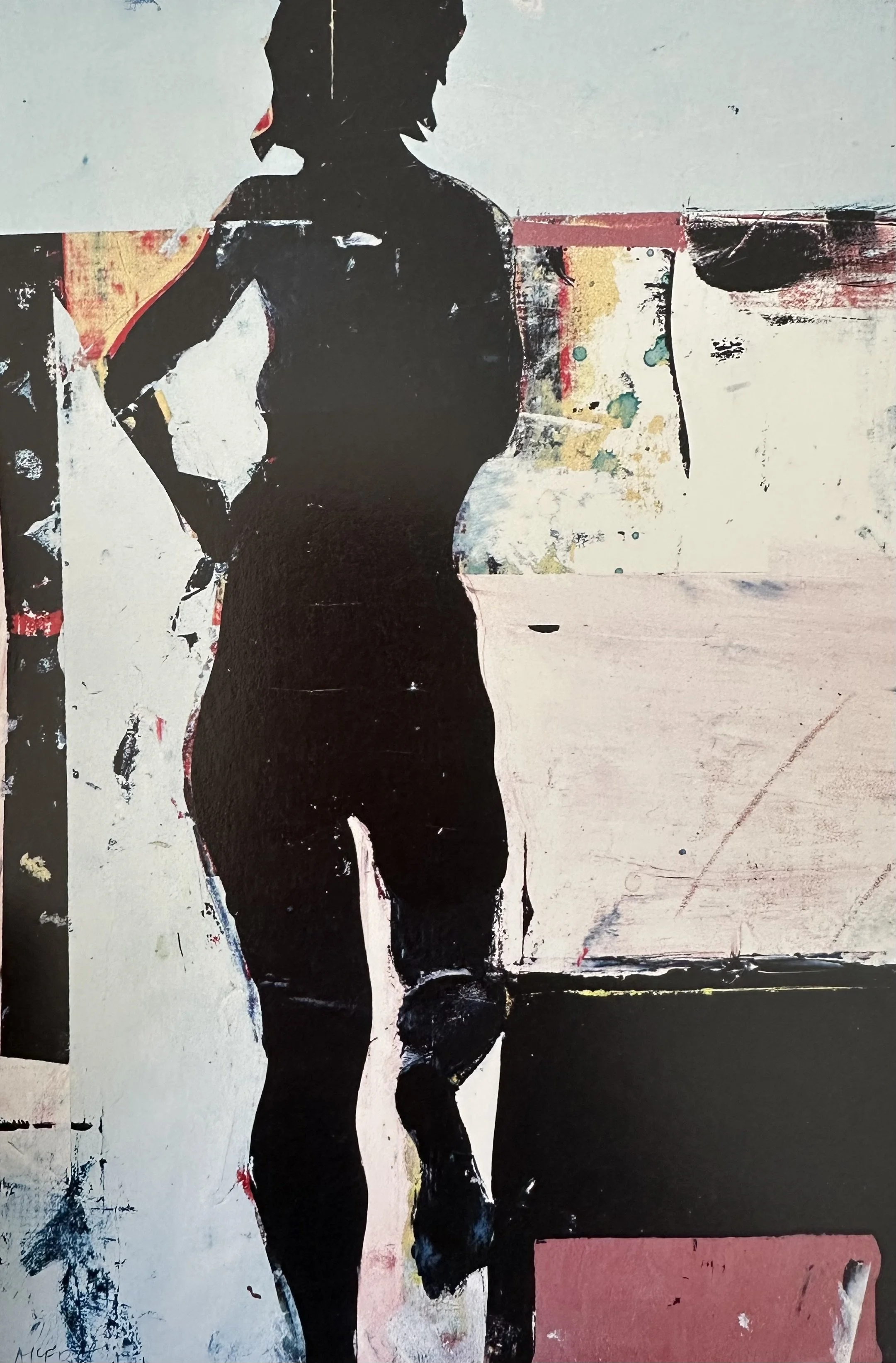
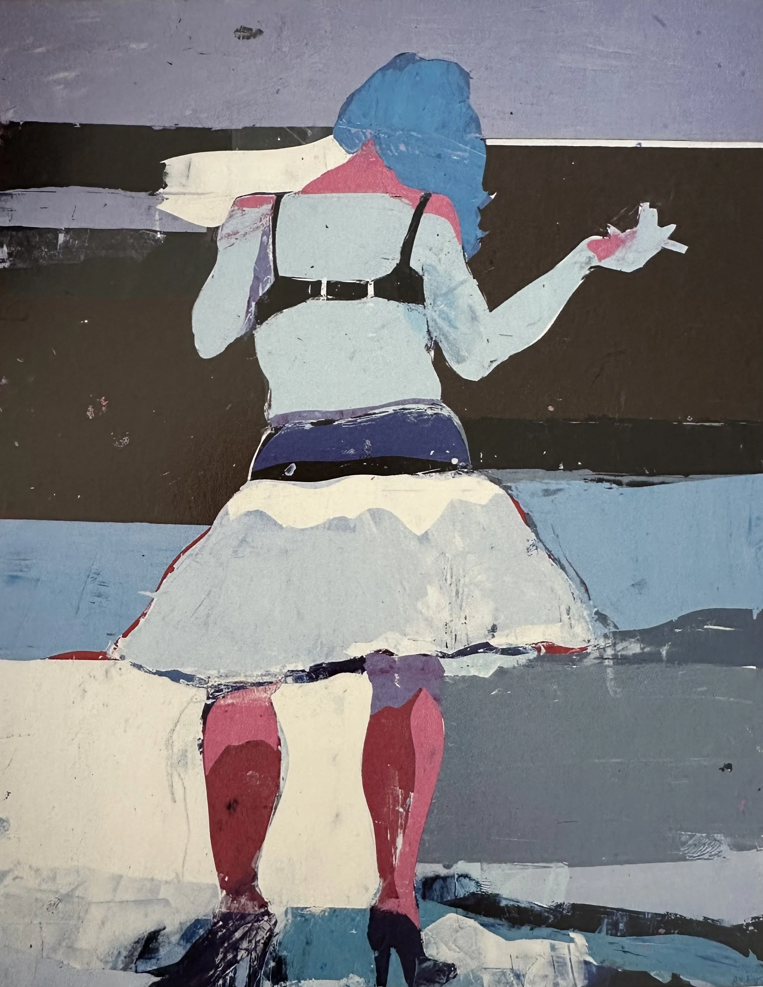
As we have seen, Matisse also reduced figures to their essence creating flat forms with little or no light and shadow or modeling. In this project create a flat figure or figures in a simple surrounding. Exaggerate limbs or parts of the body to be even more expressive. In the gallery below I also include paintings by Milton Avery, Joan Brown and Kim Frohsin, artists who have clearly been influenced by Matisse. Use this gallery to help inspire your project.
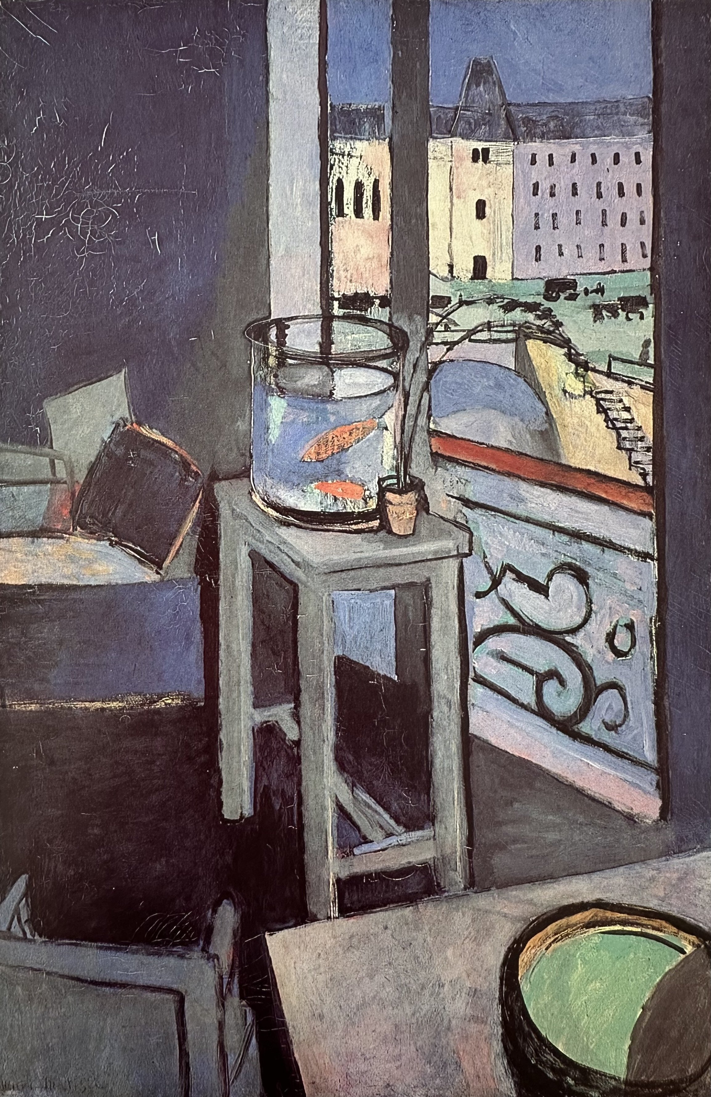
GALLERY
▫
GALLERY ▫
⇣ Click on any image to view larger ⇣


-
Try to keep the figure flat with no modeling.
Use the app “Notanizer” to help simplify values. See links below.
Consider exaggerating parts of the body.
Try to capture the essence of the figure or the pose.
It’s OK to keep the background simple.


▪ END OF LESSON FIVE ▪
LESSON SIX
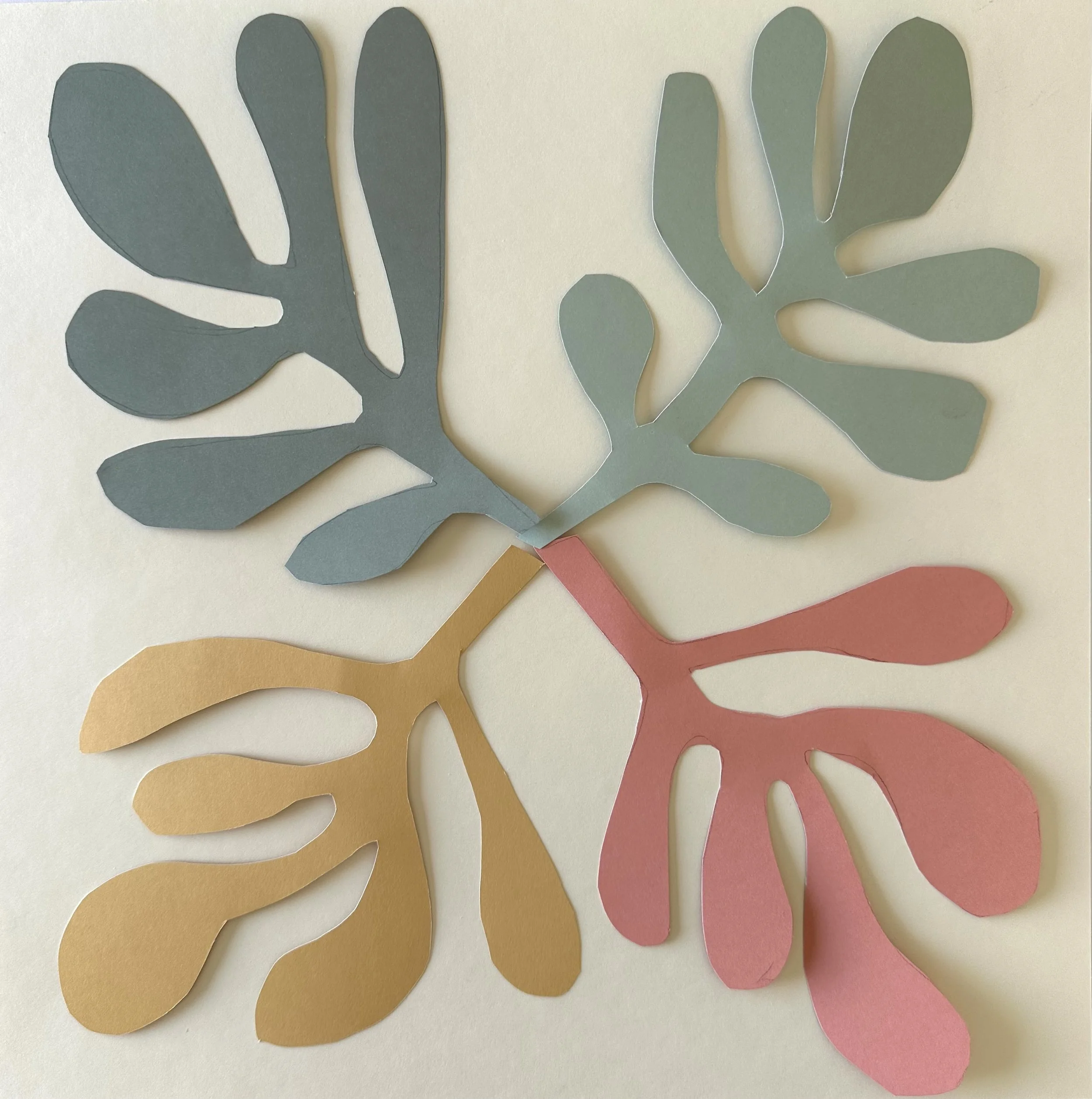
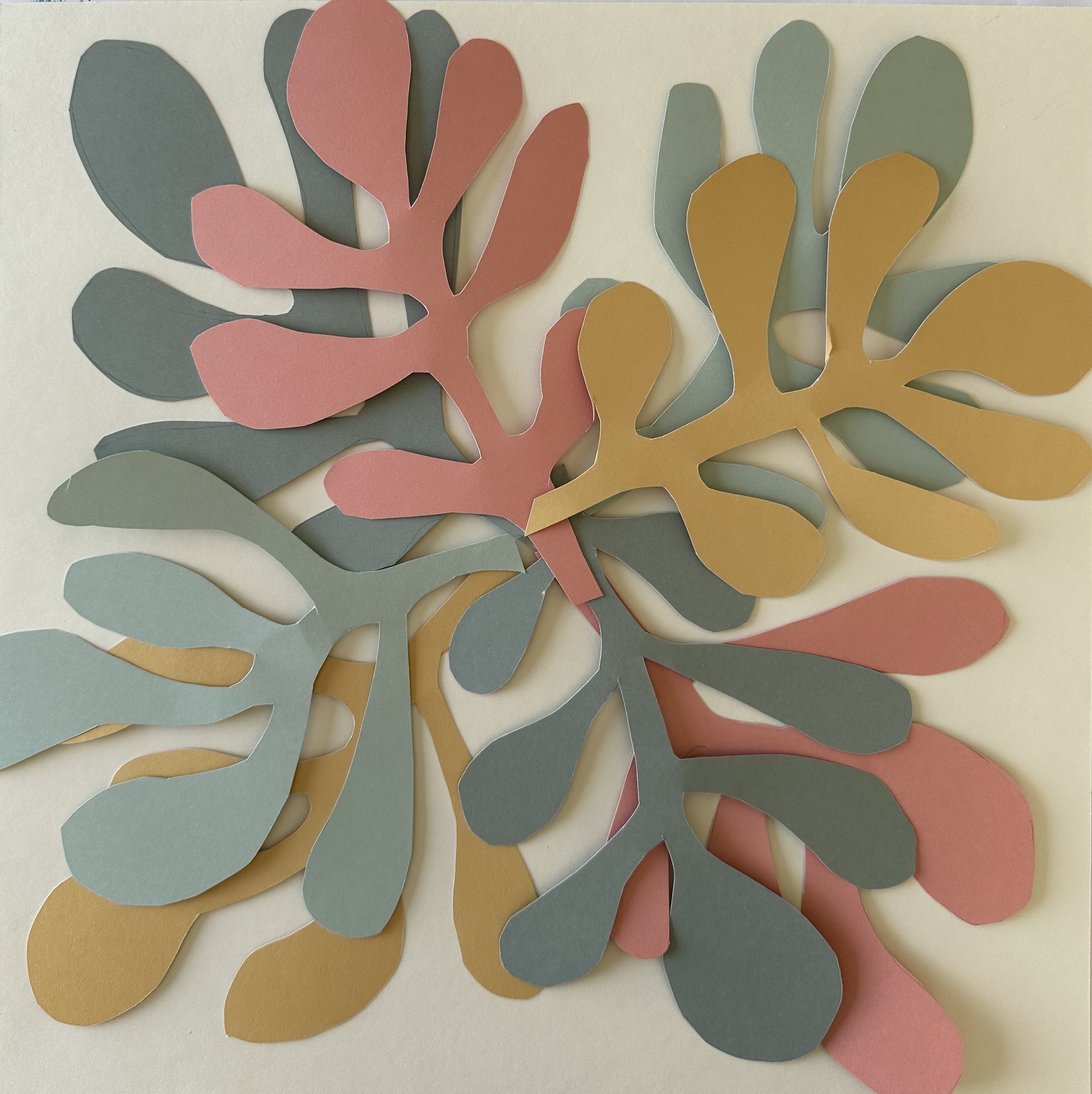
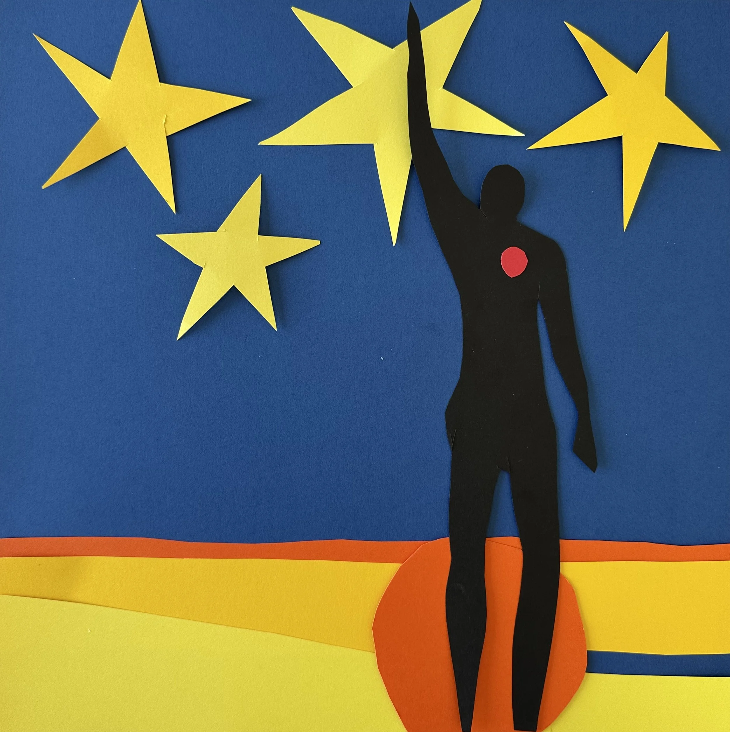
How Cut Paper Changed the World
The Cut-Outs: A Revolutionary Late Life
“Creativity takes courage.”
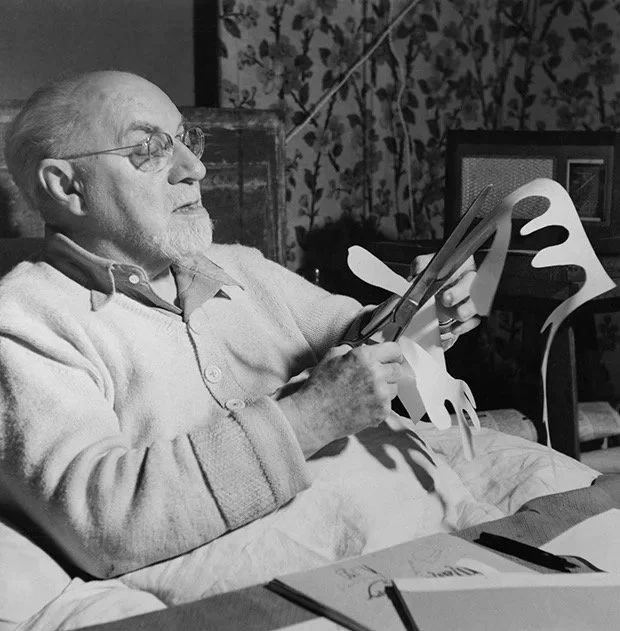
In 1941, Matisse underwent major abdominal surgery for cancer, leaving him largely bedridden and unable to stand at an easel for the rest of his life. Rather than ending his career, this forced confinement opened what he called his “second life.”
Working from a bed or wheelchair, Matisse began cutting shapes from sheets of paper that assistants had painted with vivid gouache, then directing their arrangement into compositions of extraordinary color and rhythm. He described this practice as “drawing with scissors,” a way of carving form directly from color rather than applying color to a pre-drawn line.
Far from a diminished late style, the cut-outs are now considered among the most radical and influential works of his career, anticipating the flat planes and graphic clarity that would shape design and abstraction for decades to come.
“JAZZ” by HENRI MATISSE
▫
“JAZZ” by HENRI MATISSE ▫
How a book of collage work became another major turning point in modern art.
⇣ Use the arrows on either side to scroll through the pages ⇣
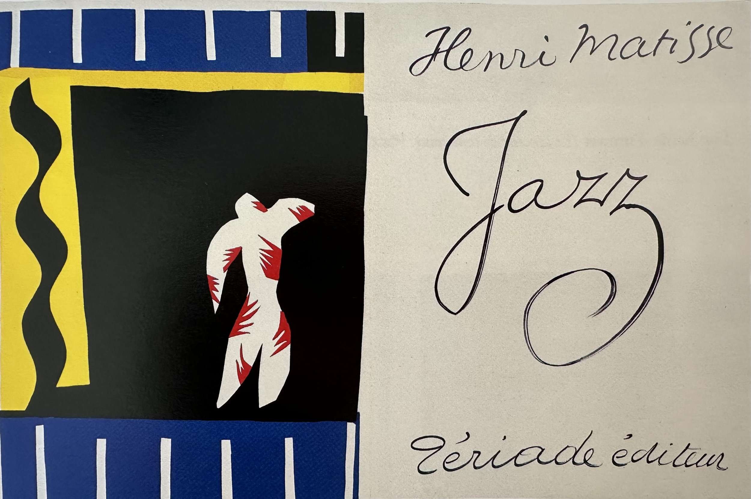
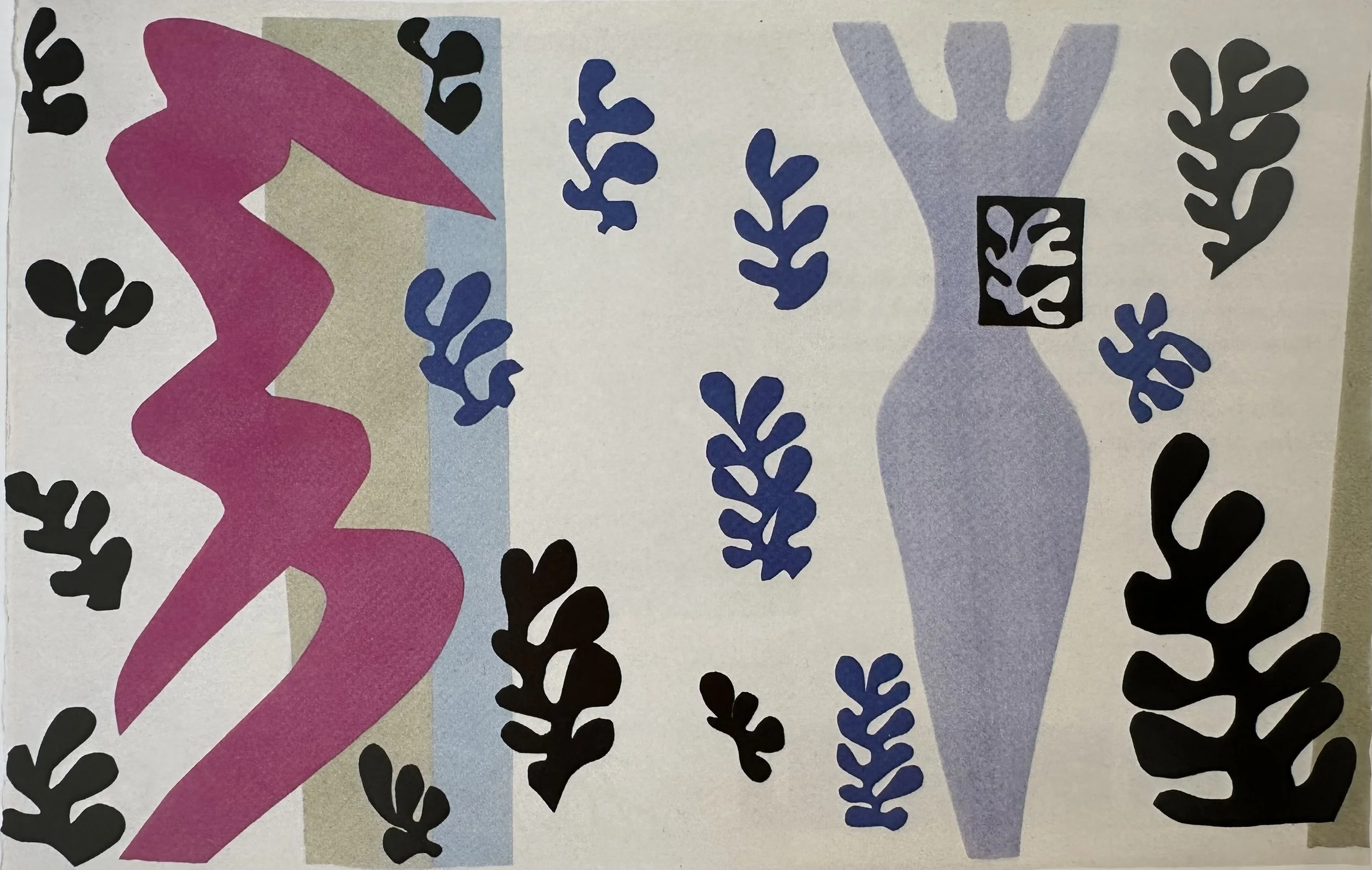
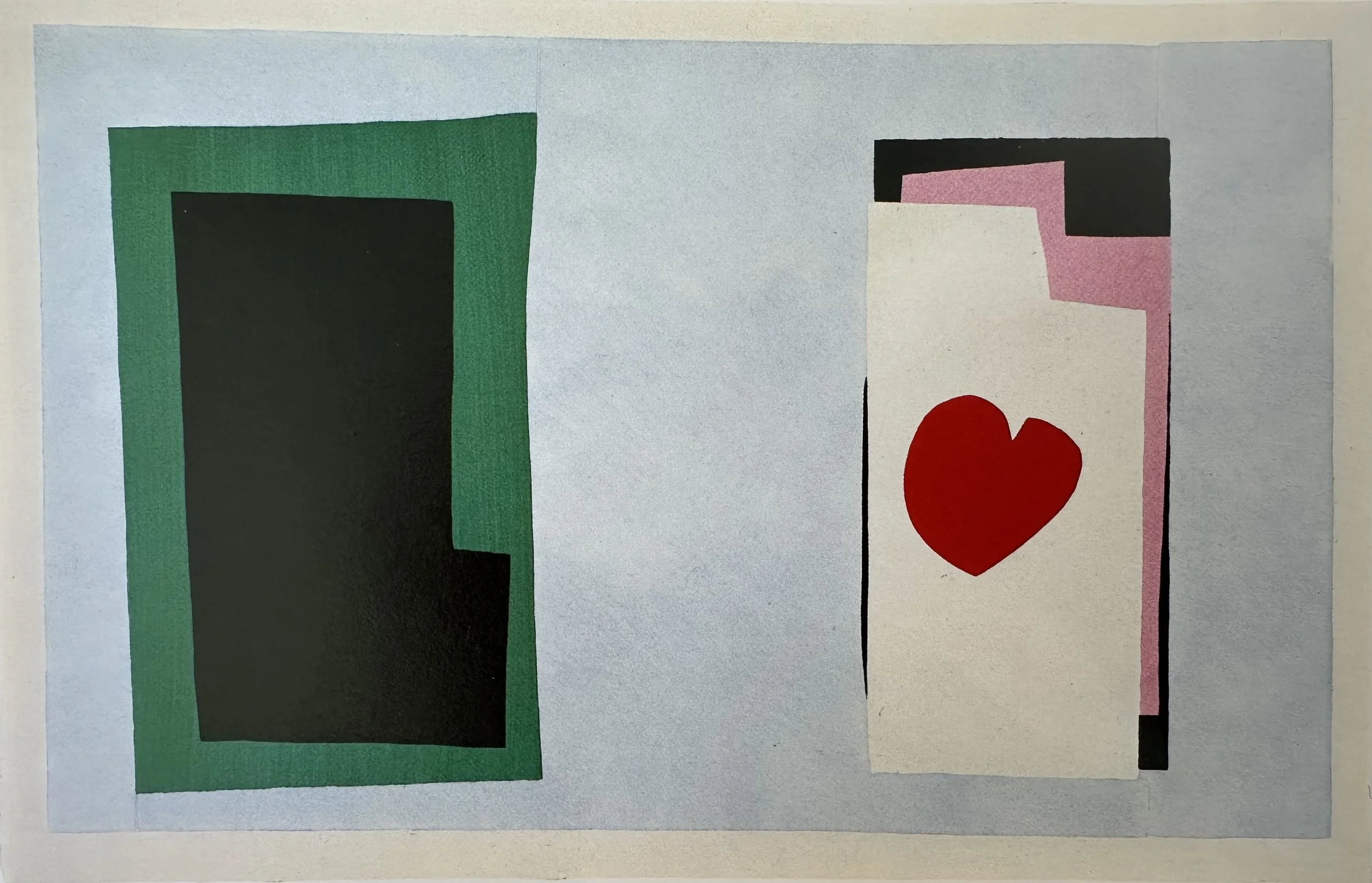
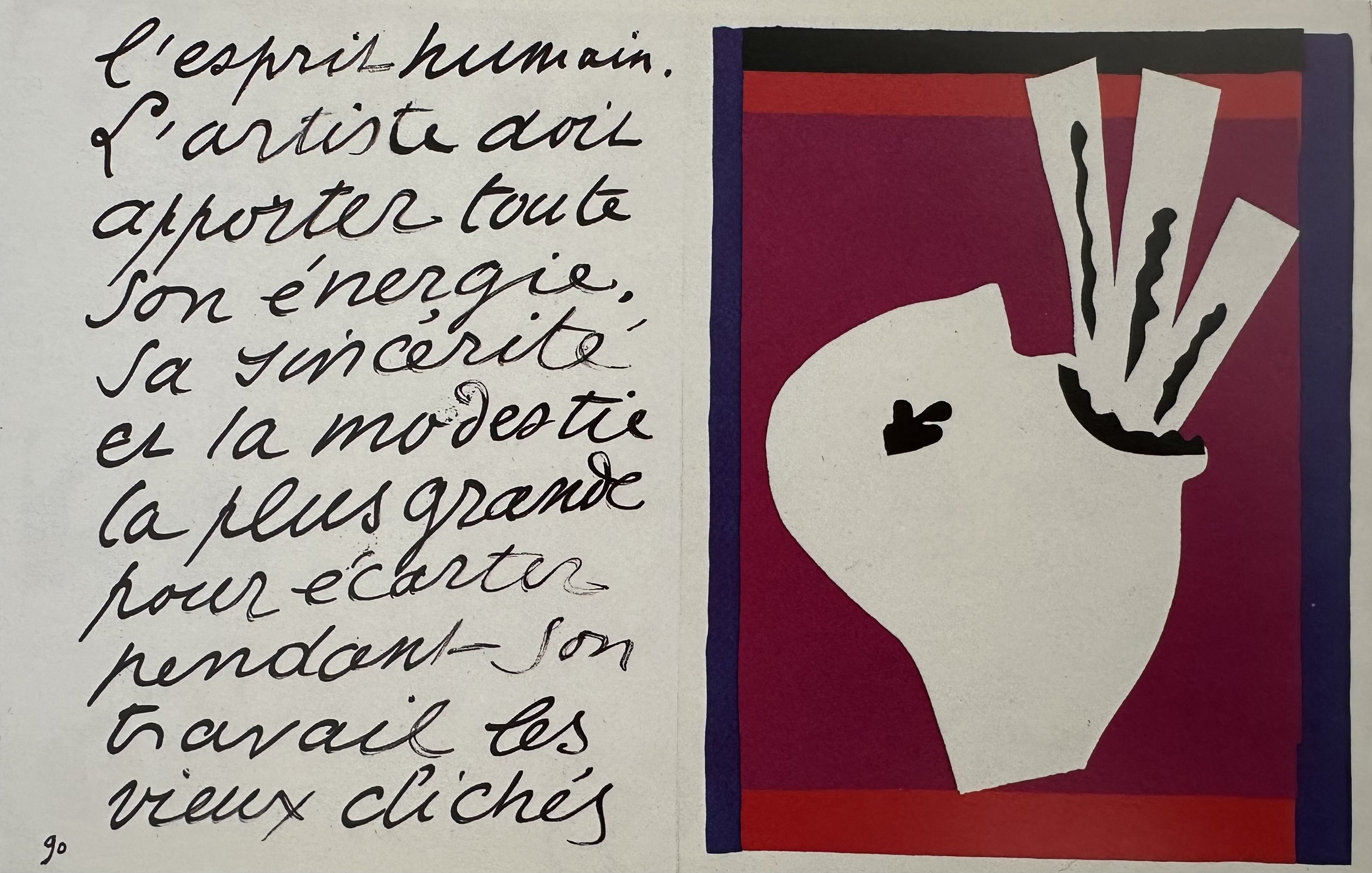
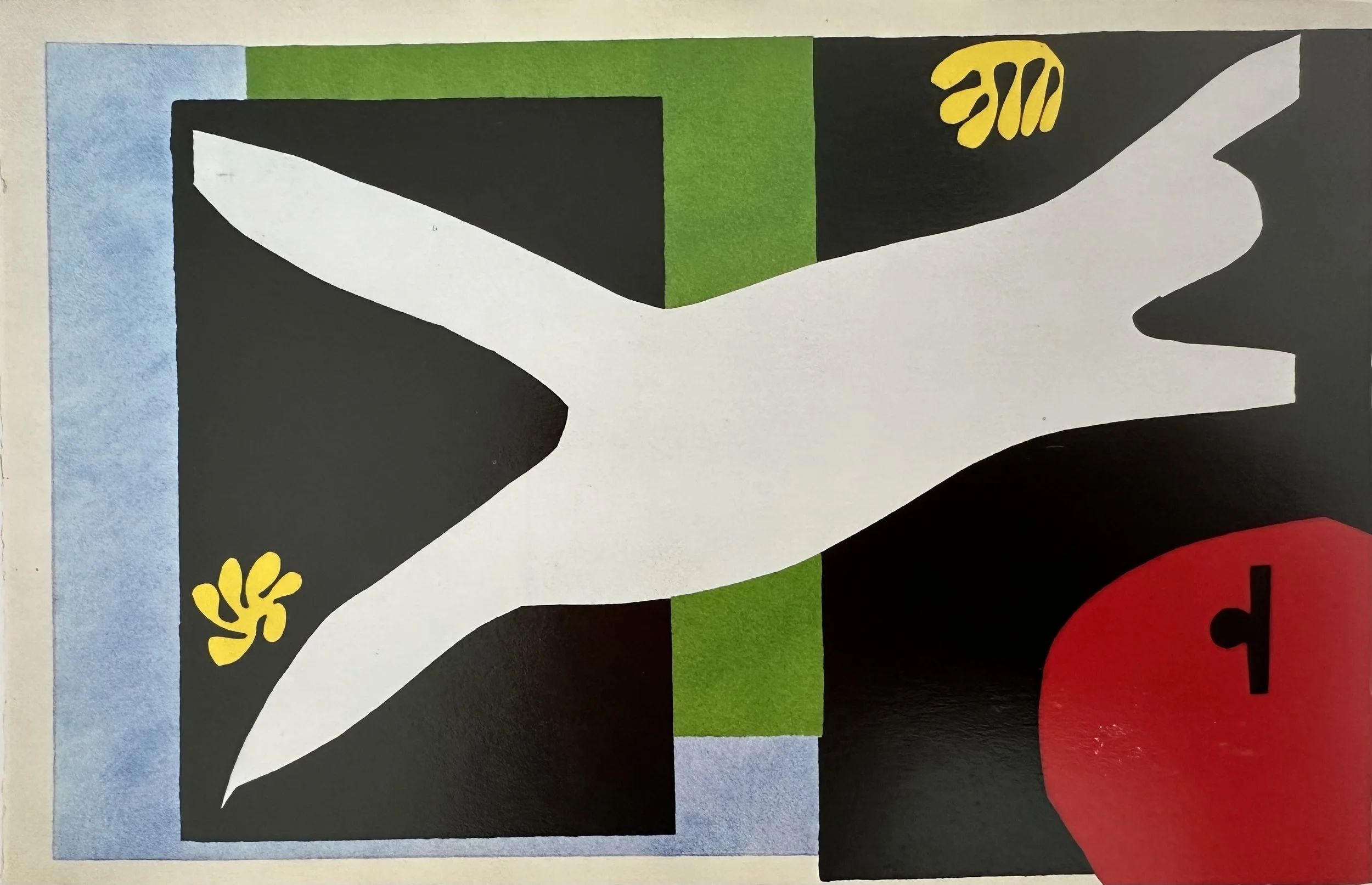
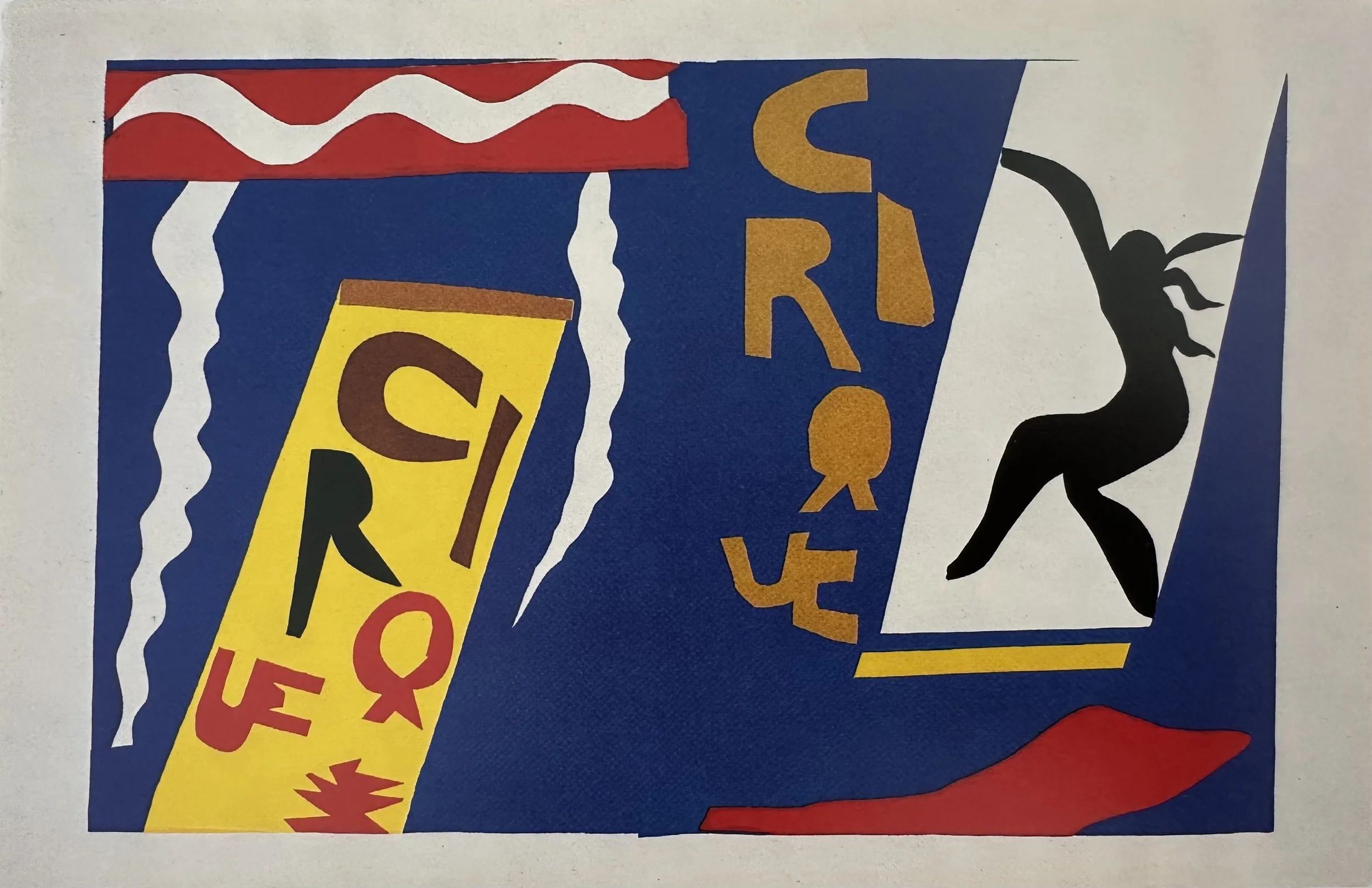
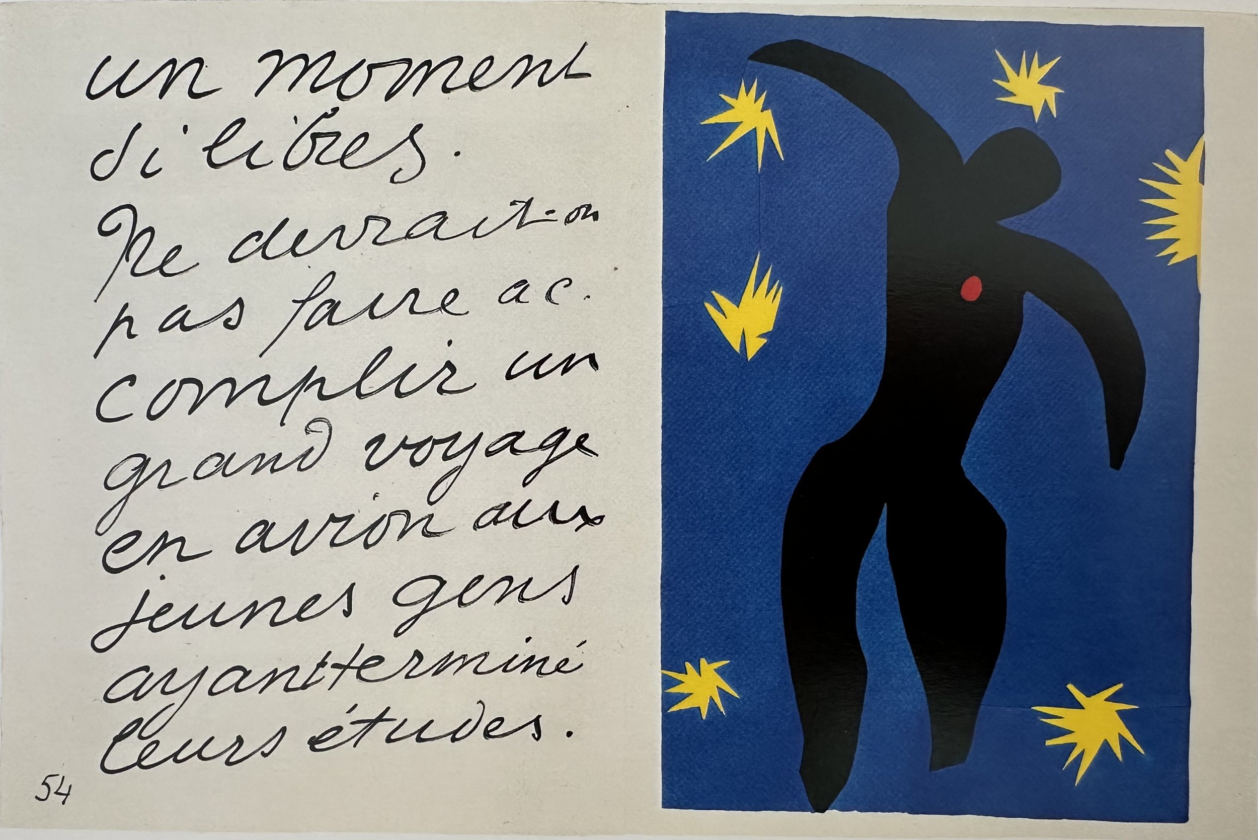
Created mostly in 1943, “Jazz” was published in 1947, and is Matisse’s first major collection of cut-outs.
A series of twenty hand-stencilled plates paired with pages of his own handwritten text, was produced while he was largely confined to bed following surgery. Matisse chose the title not to illustrate music but to evoke the spirit of improvisation as each plate feels spontaneous and alive, shaped by the direct, scissor-cut gesture he called "drawing with scissors." The colors are vibrant, saturated, flat fields such as red, blue, yellow, green, magenta and black.
Widely regarded as a turning point in modern art, “Jazz” demonstrated that collage could be as serious and resonant a medium as painting, and it remains one of the most joyful objects in the entire history of art.
Watch the video to see the work up close and learn more.
Video Length: 2:51 minutes
Drawing with Scissors
There are an extraordinary amount of resources, interesting articles and videos regarding the Cut Outs. The museums and curators can do a much better job explaining and illustrating this period of Matisse’s life than I. In this section you will find my curated selection of fun, insightful and important links and videos showcasing this later part of Matisse’s life.
Interactive Website
Click on the MoMA logo to visit a fun, interactive website that includes amazing photos of Matisse’s studios, his assistants, and his work.

VIDEO COLLECTION
▫
VIDEO COLLECTION ▫
Watch these excellent videos that explain in great detail, and with beautiful photography, the history and stories of the Cut-Outs.
The Tate Museum’s Exhibition
Video Length: 4:19 minutes
Matisse: A Cut Above the Rest
Video Length: 29:29 minutes
GALLERY
▫
MATISSE CUT OUTS
▫
GALLERY ▫ MATISSE CUT OUTS ▫
⇣ Click on any image to view larger ⇣


project
Drawing with Scissors
This project was surprisingly fun! I highly recommend it. I describe the process and approach in the video below.
Video Password: Paper
Video Length: 11:19 minutes
PROJECT EXAMPLES
▫
PROJECT EXAMPLES ▫
Feel free to print out the PDF below and use it for this project.
I do recommend that you also design and cut your own shapes too.
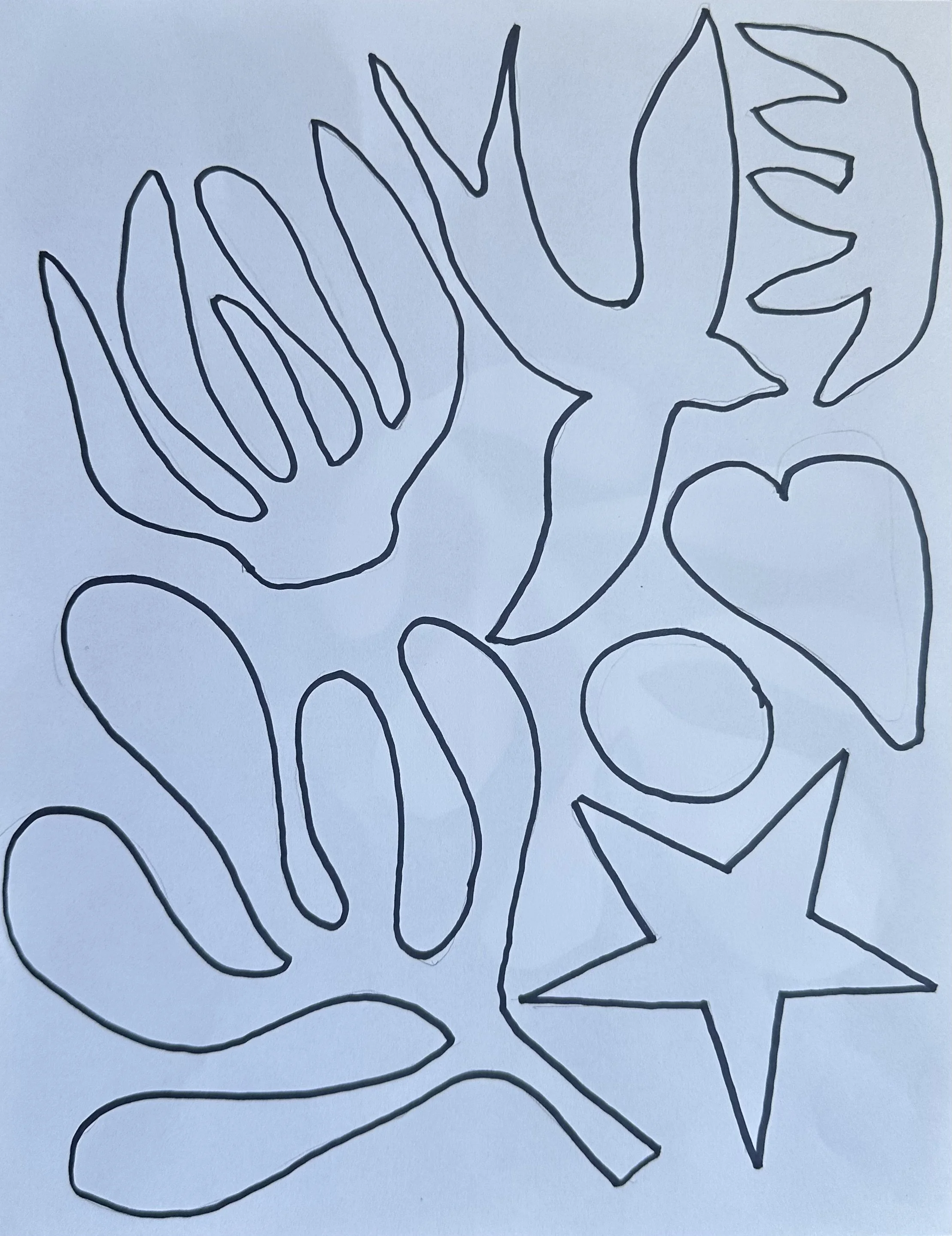
CUT OUT TEMPLATE
Matisse painted his papers with gouache. I used store bought colored paper. If you prefer to purchase your colored papers, click on the button below to go to the MATISSE COURSE PRODUCTS page to purchase.


▪ END OF LESSON SIX ▪
WRAP UP


These books are exceptional resources if you want to learn more about Matisse, and/or want to have more visual references in your studio for inspiration. Click on the button below to go to the MATISSE COURSE PRODUCTS page to purchase. (If you purchase through there I get a small fee to help buy paint—thank you!)