


LESSON FOUR
How To Begin An Oil Painting
Oil Painting Demo - Part One
In this demo I work on an acrylic toned canvas which had an unfinished acrylic painting underneath. This is what you see on the canvas when I begin the painting. I will often paint directly over old paintings and encourage you to do so as well. Just keep in mind the rules that I laid out in the Basics. Acrylic should be very thin and very dry. Oil paint should be dry to the touch as well, or you will be working “wet into wet.” Acrylics should never be painted over oils, so do not put a layer of acrylic paint over an old oil painting thinking you will start fresh. The acrylic will not adhere to the oil, and your painting's surface will crack and fall apart over time.
Please Note: Each video in this course has its own unique password.
VIDEO PASSWORD: Begin
VIDEO LENGTH: 22:28 minutes
In this first half of the full length OIL PAINTING DEMO I show the beginning steps of painting a still life. I use all of the concepts that we learned in The Basics Lesson. Additional take-aways from this lesson are:
I begin the sketch with Ultramarine Blue Oil Paint. I use this color for the following reasons: it is dark and readable; it does not interfere with my other colors later in the process; I like the dark line it can leave, and it is not hugely expensive. If you prefer to use charcoal that is OK too, but since I'm a painter, I have always used paint. It is best not to use graphite as that can end up interfering with your paint colors later on. Do NOT use staining colors like Phthalos, Alizarines or Dioxazines for your initial sketch!
When you first learn to paint with oils it can be difficult to keep your colors ‘clean’ because they do not dry immediately, and because you do not continually wash the brush the same way you do with water-based media. Keeping good control of your colors is a learning process and will take some practice to fully understand. One great way to help keep your colors clean, especially while you are learning, is to use a different brush for each color. This way you do not need to clean your brush when changing colors. At the very minimum you will want a brush for light values and another for dark values. Simply wiping your brush after several strokes can also help.
Do not paint the background across the entire canvas and underneath your subject matter unless you are planning to let it dry for several days. Oil painters paint each object individually and cut 'backgrounds' and foregrounds around the subject matter.
Stay away from white for most of the beginning of the painting process. White can easily muddy a painting and also create a 'chalky' look. Remember, it tends to be thicker as well, and we want to stay thin in the beginning. Try to hold off on white for as long as possible. Possible exceptions are the backgrounds and skies.
MATERIALS USED:
PAINT COLORS:
Titanium White
Lemon Yellow
Cadmium Yellow Medium Hue
Cadmium Yellow Deep Hue
Cadmium Orange Hue
Napthol Scarlet (Similar to Cad. Red Light)
Quinachridone Red (similar to Alizarin Crimson)
Sap Green (Winsor & Newton)
Viridian
Cerulean Blue Hue
Ultramarine Blue
Van Dyke Brown (a warm black)
*Gold Ochre (added to palette)
Medium : Gamblin Solvent Free Gel
OMS: Gamblin Gamsol
*The very large tube of Gold Ochre paint that I use here is from Classic Artist Oils. They are an excellent resource for paint if you live in the USA and specifically on the West Coast. Their ‘Squeeze’ Tubes are 4oz and their ‘Caulking’ Tubes (what I used) are 10oz. They also call this Yellow Ochre, but it is closer to Gold Ochre in most other brands.
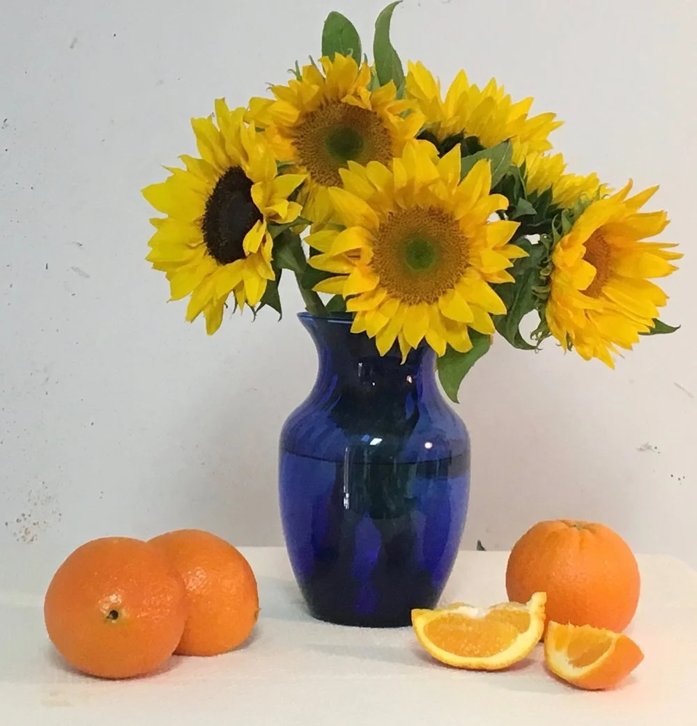
FEEL FREE TO USE THIS IMAGE FOR YOUR OWN PAINTING!