


COLOR
“The colors live a remarkable life of their own after they have been applied to the canvas.”

Mark Rothko
THE TOP ORANGE IS A HIGH CHROMA (BRIGHT) COLOR. THE BOTTOM RED IS A LOW CHROMA OR LOW INTENSITY (DULLER) COLOR.
There is so much to say about color that I have two eCourses devoted just to exploring it, and I still could do more! Often color is the first thing we respond to in a painting. Color creates a mood and can evoke emotions much the same way music affects us, often on a purely instinctual or ‘gut’ level.
I’m fairly certain that I don’t need to give you a definition of color, however I do want to clarify a few color terms so that we are all ‘talking the same language.’
HUE
Basically a color family: Red, Blue, Yellow, Green, Violet, and Orange. Every color is part of one of these color families. Thus, every color has a "hue."
CHROMA
The brightness or INTENSITY of a color. Cadmium Red Light (for instance) straight from the tube is an example of high-chroma color. In contrast, a grey-blue, for instance, would be a more neutral, “greyed-down,” or “duller” color.
TEMPERATURE
Whether a color is warm or cool. Warmer colors lean towards reds and yellows while cooler colors lean towards blues. For a good reference chart of which colors are warm and which are cool, see the GAMBLIN website link below. This is an oil paint chart, however there are many overlapping colors with water based mediums.
TRANSPARENT AND OPAQUE
Every paint color has a degree of transparency and opacity. These qualities are something to keep in mind when choosing and using color. Most paint tubes and charts will show a rating of Transparent, Semi-Transparent or Opaque.
COMPLEMENTARY COLORS
These are colors that are opposite each other on a color chart. This is important to know for many reasons, but most importantly, when you mix complementary colors you will get a neutral version, or gray of those colors, which will be much richer, generally, then a gray created with black and a color. Examples of complements include: red and green, blue and orange, yellow and purple.
CLICK ON LOGO TO VIEW CHART
Visit the GAMBLIN website for a REFERENCE CHART of which colors are warm and which are cool.
The Push And Pull Of Color
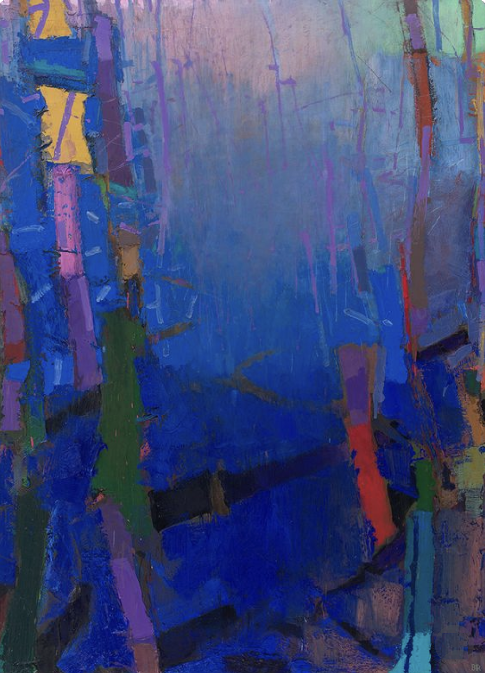
Brian Rutenberg
We looked at the push and pull of value, and now let’s look at it with color. These concepts are important to know so that you can use color with intention. The more you understand color theory, the more you will be able to control the outcome of your paintings. I’m all for intuitive and responsive work, but having a good foundation lets you run with your intuition without thinking about the ‘rules.’ Again, like knowing the alphabet and writing the essay…
Often when working with color artists like to manipulate the illusion of space creating a sense of depth in their work. Rutenberg’s work to the right is a perfect example of this quality. Even though this work has a landscape feel to it, artists working with pure abstraction use this technique as well.
GENERAL COLOR RULES:
Colors That Come FORWARD
WARM ▪ BRIGHT (HIGH CHROMA) ▪ DARK
Colors That RECEDE
COOL ▪ DULL (NEUTRAL OR GRAYED) ▪ LIGHT
I give you these ‘rules’ with the caveat that:
‘All Rules Can be Broken.’ I just want you to KNOW what rules you are breaking.
AND…on that note, one final thought from artist Helen Frankenthaler:
“There are no rules. That is how art is born, how breakthroughs happen. Go against the rules or ignore the rules. That is what invention is about.”
The Relativity Of Color
“When you really understand that each color is changed by a changed environment, you eventually find that you have learned about life as well as about color.”
HANS HOFMANN and JOSEF ALBERS
Hans Hofmann and Josef Albers each spent a lifetime studying color. They were both particularly interested in the relativity of color or, more simply put, how one color can affect another. In the following slide show, I show several images and talk about these two artist’s intentions.

Hans Hofmann
GERMAN-AMERICAN PAINTER AND THEORETICIAN
Born: March 21, 1880 - Weissenberg, Bavaria
Died: February 17, 1966 - New York City, NY
Movements and Styles: Abstract Expressionism

Josef Albers
AMERICAN PAINTER, POET, SCULPTOR, TEACHER, AND THEORETICIAN
Born: March 19 1888 - Bottrop, Germany
Died: March 25 1976 - New Haven, CT, USA
Movements and Styles: Bauhaus, Geometric Abstraction, Op Art
Please Note: Each video in this course has its own unique password.
VIDEO PASSWORD: Hofmann
VIDEO LENGTH: 3:53 minutes
COLOR PROJECT IDEAS:
Focus on creating the illusion of depth in an abstract painting with the use of color.
Create a “push pull” painting aka Hofmann and experiment with the interaction of colors, values and chroma.
Use a palette close in value AND intensity and emphasize complements (see “Good Vibrations”below). The result may be a mid-value painting, but you will be creating it intentionally. Feel free to add some darks and lights!
Try some rule breaking like making light colors come forward and dark colors recede.
Have a ton of fun with this Interaction of Color APP for iOS devices based on Josef Albers’ book.

Interaction of Color APP (Trial)
This app is available only on the App Store for iPad.
Good Vibrations Looking at the Chroma of Color

Try to match the Value AND Intensity of colors as one approach to create harmonious palettes that vibrate.
Why do some colors vibrate when placed next to each other? Well, I can’t tell you the science behind this, but I can tell you how to get these results. Complementary colors (refer to definitions) will often vibrate when placed next to each other. Complementary colors of the SAME VALUE will vibrate even more. Complementary colors with the SAME VALUE AND SAME INTENSITY (refer to definitions) will vibrate even more more!!
As you can see in this example, the orange stripes and blue background are really jumping, however all of the colors are creating a very harmonious palette. This is because they are all very close in both Value and Chroma (Intensity). You can create gorgeous color harmonies by actually keeping a tight/close range of values AND intensities. More ‘alphabet’ for your soup!
Inspirational images of paintings emphasizing COLORS
Throughout the classes I provide PINTEREST BOARDS for a specific relevant topic. Click on the logo to see the examples gathered.
Playing the Blues - Expression by Emphasizing ONE Color
In this Demo I, again, work with a limited palette concentrating this time on the color blue. My intention here is simply to create a painting with predominantly blue. I use several different blues (my palette is listed below), along with some warms to help create more neutral blues and cooler (more violet) blues. I am playing with Color, Value, Line and Shape (coming up next!). I work at varying each element to give the painting contrast and interest throughout. Setting up these kinds of limitations can focus your work and your decision making and often leads to greater creativity.
Please Note: Each video in this course has its own unique password.
VIDEO PASSWORD: Cobalt
VIDEO LENGTH: 20:58 minutes
Palette colors left to right:
VanDyke Brown, Transparent Red Oxide, Gold Ochre, Quinacridone Red, Cadmium Orange Hue, Titanium White, Titanium Buff, Ultramarine Blue, Cerulean Blue, Transparent Turquoise, Gamblin Gel Medium, Cold Wax


Two different examples of “Playing the Blues.” In both instances I was concentrating on varying the values, colors and intensities of the blues while adding in neutrals as well. These paintings are each 16” x 16".” Artists often produce a series of paintings working with the same concept/process. This practice can create surprises and lead to new ways of working and thinking about your work.
Remember Your Neutrals
Neutrals are colors too! Amazing, beautiful paintings can be created with neutrals alone. Remember neutrals help to set off brighter more saturated colors. Sometimes a painting that is created with all saturated (High Chroma) color is like having all dessert for dinner; a bit too concentrated on one set of taste buds. Neutrals can balance and give richness and even more depth to those brighter colors. In addition, neutrals themselves are some of the MOST beautiful colors!
Witness the the neutrals in the beautiful paintings of Rebecca Crowell below. Rebecca’s neutrals make the more saturated colors ‘sing.’ We will look further at Rebecca’s work when we get to the Element Texture.
Artist Focus
〰️
REBECCA CROWELL
〰️
Artist Focus 〰️ REBECCA CROWELL 〰️
Click on any image to view larger


Using Emotion and Surprise with Color
Many artists use these two concepts in their work. In this video we look at Mark Rothko and Barnett Newman both of whom were specifically concentrating on the emotional qualities of color. They wanted viewers to stand close to their large works to experience physical and emotional sensations. The viewers were/are to feel an existential sense of themselves within the universe while ‘enveloped’ in the expansive color of the paintings.
The next two artists we see are Helen Frankenthaler and Gerhard Richter. Both of these artists work very differently, but both are using surprise and unpredictability of color and paint in their process. Frankenthaler works with pours of paint and their unpredictable reactions with each other and the canvas itself, while Richter works with layers of paint which he then squeegees off to reveal the hidden history below.
Please Note: Each video in this course has its own unique password.
VIDEO PASSWORD: Surprise
VIDEO LENGTH: 5:43 minutes
MORE COLOR PROJECT IDEAS
Create a series of paintings based on an emotion, using color to focus your work.
Create a painting with mostly neutrals and just some pops (a pop?) of brighter colors.
Use a very large canvas and a very limited palette to elicit an emotional response with color.
Use oil paint (and cold wax as an option) to create several layers on a panel and scrape back like Richter to uncover the history. Repeat this layering and removing process. You can do this with acrylic too, but work fast
Try pouring paint with acrylics ala Frankenthaler and see what surprises you can get on your canvas or panel. Think of combining this technique with layering as well. (There are lots of how-to videos on acrylic pours on Youtube.
Pick a temperature like 90F or 32.2C and interpret it with a painting of color.
Artist Focus
〰️
BRIAN RUTENBERG
〰️
Artist Focus 〰️ BRIAN RUTENBERG 〰️
Click on any image to view larger


Brian Rutenberg’s work is an explosion of color. Landscape inspired, yet clearly abstract, his paintings pull you into his world of color, space and texture. When seen in person, you will immediately notice the three dimensionality of his thickly applied oil paint, which contributes to the sense of depth that otherwise is created purely with color. One can’t help but be mesmerized by his use of lush, saturated (high chroma) jewel tones along side rich neutrals that harmonize and unite the work. You will also notice a lot of rule breaking going on. Here is a master of Color at ease with ALL of the Elements.

Clear Seeing Place: Studio Visits
From the salt marshes and moss-draped live oaks of the South Carolina Lowcountry to the New York art world, Clear Seeing Place takes the reader behind the studio door to explore the making of a painter in intimate detail.
CLICK ON LOGO to listen to Brian talk about his work

CLICK ON LOGO to see more work on his website

CONCLUSION
COLOR
COLOR is often the first Element that we see or notice in a painting. We frequently respond emotionally to Color before we even perceive the subject matter of a painting. We can use Color to manipulate space as well as emotions, drawing people into our work. Focusing on Color alone can be a lifetime interest as well as a very fun limitation in abstraction!

Melina Cootsona