

lesson four

KNOWLEDGE TO INTUITION
Color Theory is the Grammar. Your Intuition Creates the Poetry.
“Color is the alphabet to your painting novel. Understanding color theory will lead you to work more intuitively just like learning to read and write will free your imagination to create your poem or novel. ”
The Symbolism of Colors
Let’s take a moment to look at the symbolism and emotional qualities of the primary and secondary colors. When working more intuitively with color, it is good to know how it might be interpreted. I have tried to include a wide range of styles, artists, and color variations to inspire you in the color gallery collections. I’ve also included links to short histories of each color for those of you who are interested in more detail. Click on any photo to see a the full image.
Learn More About Colors
〰️
Visit MY MODERN MET
〰️
Learn More About Colors 〰️ Visit MY MODERN MET 〰️

About the Color RED
RED
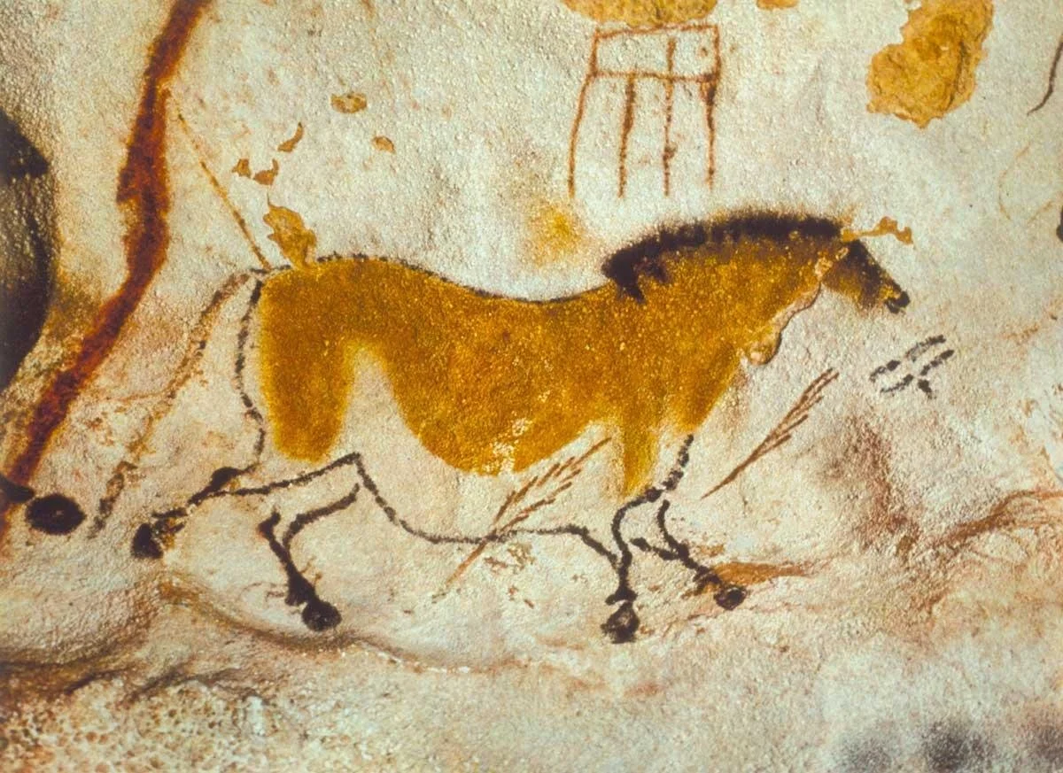
Red is one of the first colors used by man and can be seen in Paleolithic cave paintings. It’s emotional qualities are often thought of as passion, anger, vitality, love, danger, blood. It has also been used to represent wealth and has had several symbolic meanings in religious paintings.


About the Color BLUE
BLUE
Egyptians were the first people to create the color Blue in pigment. Blue has been associated with calm, serenity, infinity, spirituality, water, sky, cool or cold, sadness. When blue pigment was made from lapis lazuli, it was worth more than gold, thus it has also been used to represent wealth and has had religious connotations.


About the Color YELLOW
YELLOW
Yellow is also one of the oldest pigments in the form of Yellow Ochre. It has been found in cave paintings as well as Egyptian and Roman art. Yellow has quite a few emotional and historical connotations. Several of the positive ones are, sunshine, warmth, optimism, joy, energy, intellect. Conversely, Judas is often depicted wearing yellow as it also symbolizes cowardice and deceit.


About the Color YELLOW
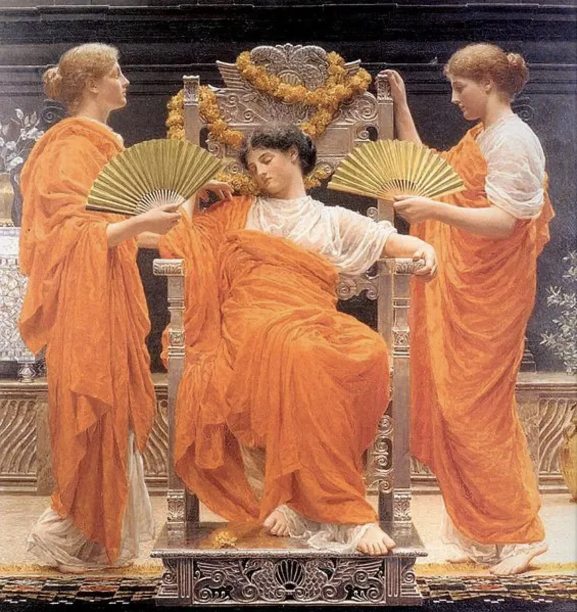
ORANGE
The color Orange is often associated with excitement, warmth, amusement, and energy. It can also signify danger or caution when used to catch our eye in potentially dangerous situations (think safety vests and inmate’s jumpsuits). It has religious connotations particularly in the East with Buddhism and Hinduism. It can also denote the Autumn and the changing of seasons.


About the Color GREEN
GREEN
Green is known for many symbolic qualities such as nature, growth, renewal (think Spring season), wealth, vitality, and youth. More negatively it can be associated with envy and illness, and when de-saturated and used in interiors it can create an eerie effect.


About the Color VIOLET/PURPLE
VIOLET/PURPLE
A Violet or Purple pigment dates back to prehistoric times and cave paintings. The Ancient Phoenicians later discovered a new method to make Violet by using thousands of sea snail shells which was an extremely expensive and difficult process. Thus, only the very wealthy or royalty could afford to wear any clothing with purple dye and they (along with the Catholic Church) were also the only ones who could afford to commission paintings with the pigment. Purple can symbolize wisdom, power, spirituality, luxury, wealth and nobility. It has also been said that it can both stimulate your imagination and create calmness. Violet can also invoke a sense of mystery.


Color Temperature
One of the last important concepts of color theory that we have not yet reviewed is Color Temperature. Every color has a temperature that is either warm or cool and most colors have a cool and warm version. Gamblin has a great chart that shows the temperature of each of their paints. These color temperatures will hold true for other mediums, such as acrylics and watercolors.
In this next short video we look at some warm and cool versions of our colors. I also demonstrate different ways to cool your colors down and/or warm them up.
▸ PASSWORD: WARM1
▸ VIDEO LENGTH: 9:45 minutes

color temperature
RULES!
〰️
RULES!
〰️
RULES!
〰️
RULES! 〰️ RULES! 〰️ RULES! 〰️
COOTSONA
Know the rules…and learn how to break them!
Learn these Color Theory Rules to create a sense of depth or space in your paintings.
Warm colors come forward and cool colors recede.
Bright, high chroma colors, come forward and more neutral, low chroma colors, recede.
Dark values come forward and light values recede in landscape painting and as a very generalized rule.
In portraiture, light values come forward and darker values recede.
Harder, “found,” edges come forward and softer, “lost,” edges recede. (Not color theory, but important to know.)
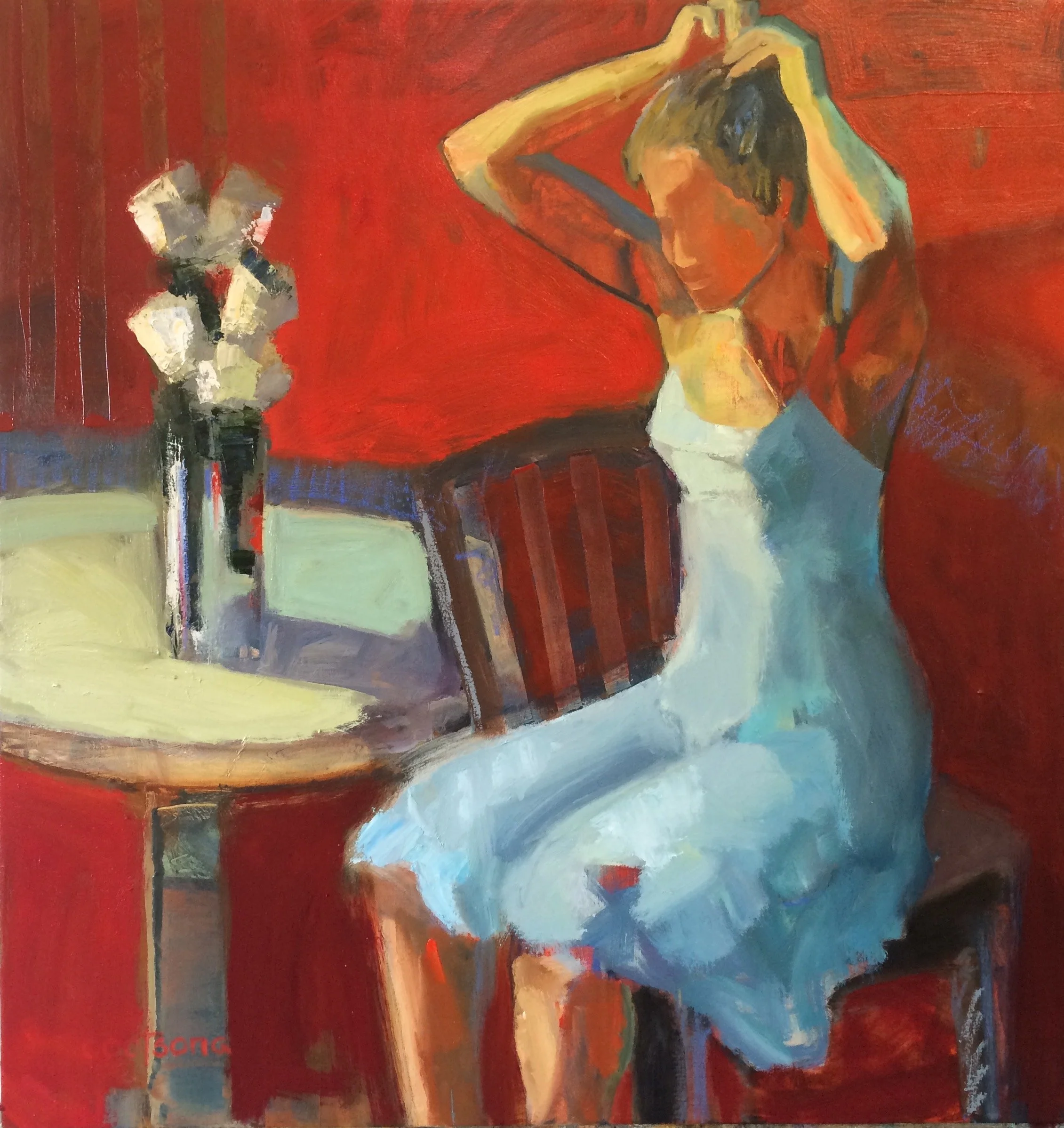
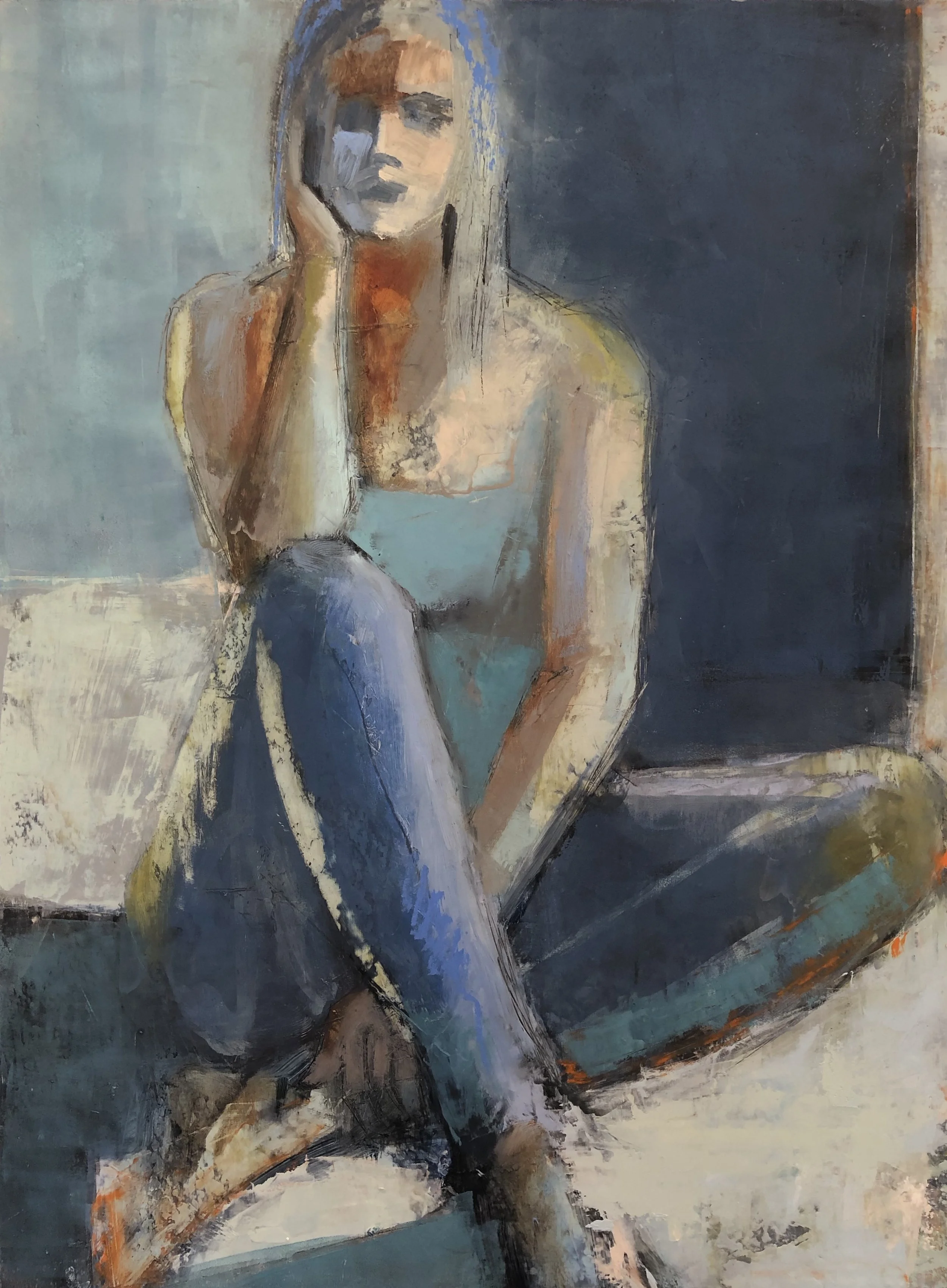
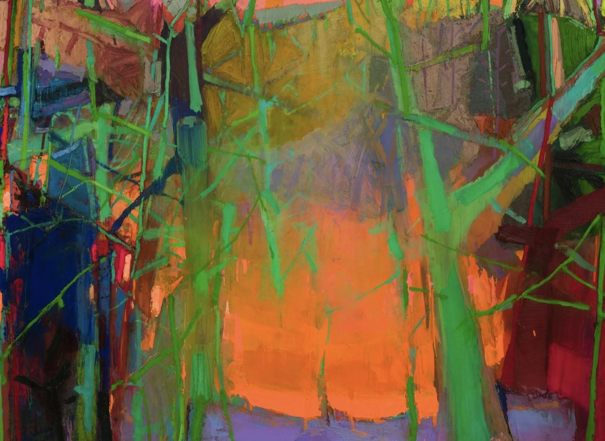
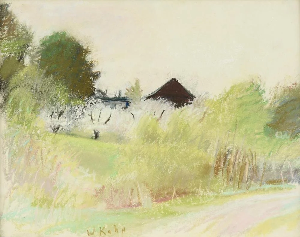
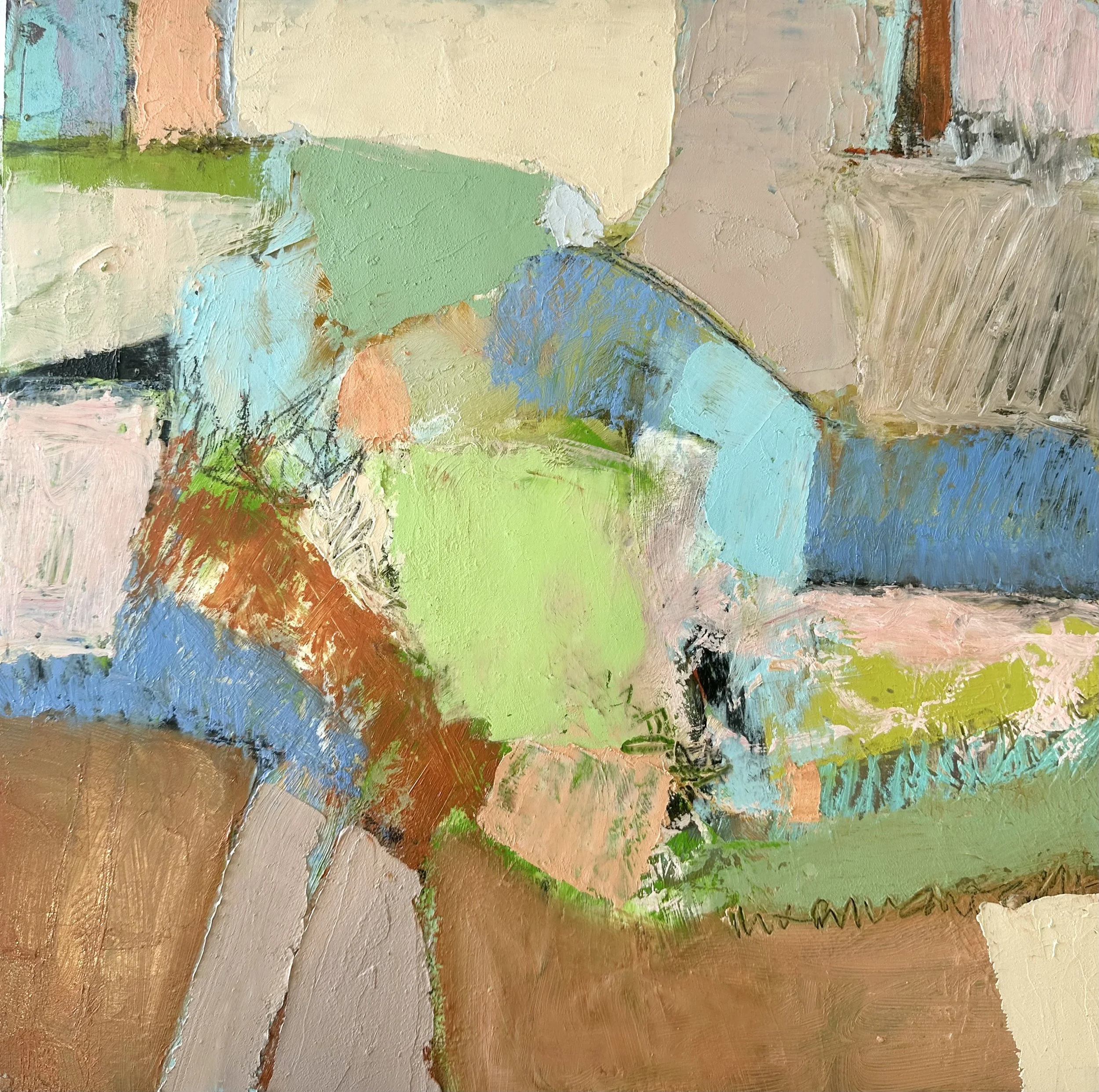
In this painting you can see how depth of space is created by several of these rules:
Brighter and warmer colors come forward.
Cooler and duller colors go back in space and create a sense of depth in the painting.
Rule Breaking
Now let’s watch a video of several inspiring paintings where lots of rules are broken and the paintings are not only very successful but a bit unexpected!
▸ PASSWORD: Picasso
▸ VIDEO LENGTH: 6:24 minutes
Project Ten: A SENSE OF PLACE
In the photos below, the artist, Richard Diebenkorn, has tried to capture the sense of the place where he was living at the time. He would work in series and these particular abstracts were done in Berkeley, California and Albuquerque, New Mexico. You can see the color differences immediately. Berkeley has more vegetation, is cooler, and is close to the San Francisco Bay. Albuquerque has more open space with the desert surrounding it as well as the colors of sand, clay and the feeling of heat.
Here is a link to an interesting article regarding Diebenkorn’s process with these abstract paintings.

Click on any image to view larger.


Desert Colors Demo
In this demo I create an abstract painting while focusing on the colors of the Coachella Valley where I live. These are desert colors that I see in the land, mountains, flora and sky. The intention of this project is to evoke a sense of how the place looks and feels like purely abstractly with color, shape, line, value and texture.
▸ PASSWORD: DESERT
▸ VIDEO LENGTH: 20:48 minutes
Your Turn:
Focus on a place that you know well. If you choose to do an abstract, feel free to use photo reference reminders for color, shapes, value and line. Try to create your feeling and interpretation of that place by really focusing on color.
If you prefer to chose subject matter that is realist, think about interpreting the image in colors that might be unexpected and represent your feelings about the place. Try to capture the “Sense of Place” more than visual accuracy. If you work from a photo, try printing it in black and white so that you can create your own color palette.
Things to Remember:
All of the color concepts that we have learned in this course: Limitations, Value, Chroma, Color Proportions, Triads, Temperature, etc.
The “Rules” listed above. Be aware of them and if you are intentionally breaking them.
Can you create a sense of depth in your painting? Or, conversely, would you prefer to keep it flat?
Are you being expressive with your colors and not just copying a photo?
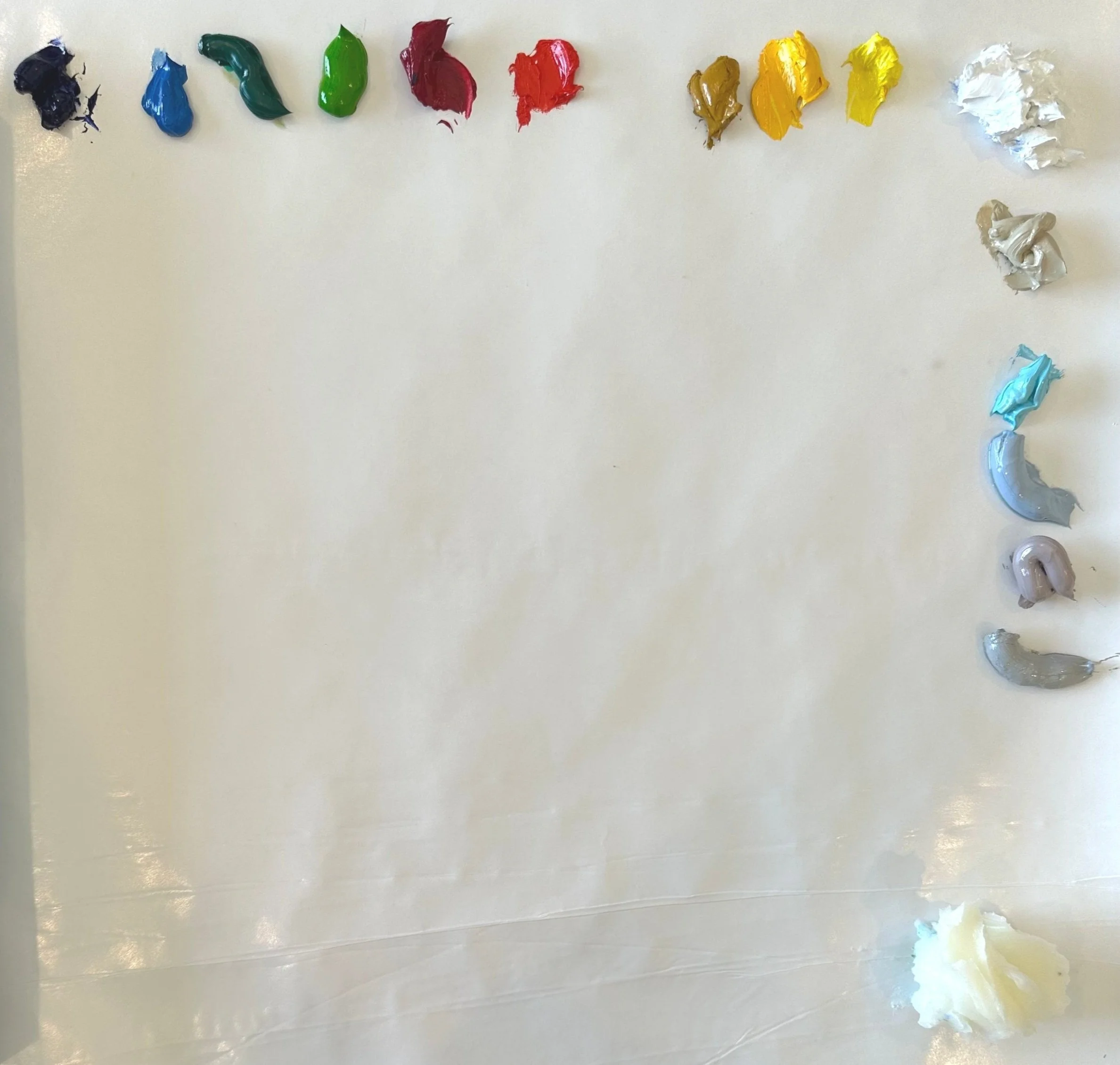
Desert Demo Colors
-
I know, I know, I used LOTS of colors! I knew the basic palette that I wanted in this painting and many of the colors are created by mixing so I needed several options. Also, when doing a demo, I like to have everything out to make things go as quickly as possible. You certainly don’t need this many colors out to create this project!
Colors used in demo (listed left to right):
Ultramarine Blue
Cerulean Blue
Viridian
Permanent Green Light
Quinacridone Red
Gold Ochre
Cad. Yellow Medium
Cad. Yellow Lemon
Titanium White
Titanium Buff
Radiant Turquoise
Portland Cool Grey
Portland Warm Grey
Neutral GreyCold Wax
Artist Focus
〰️
MICHAEL HEDGES
〰️
Artist Focus 〰️ MICHAEL HEDGES 〰️
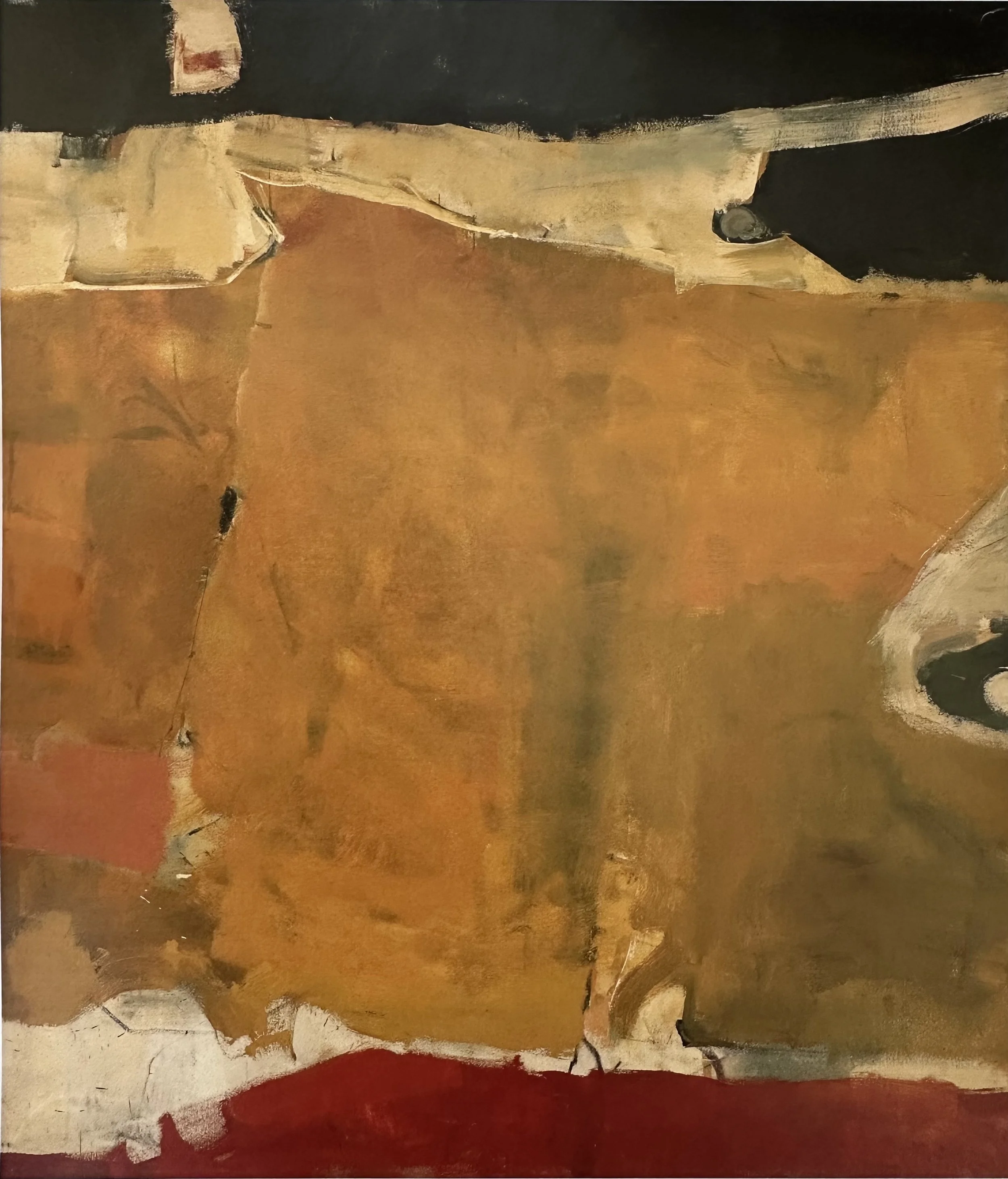
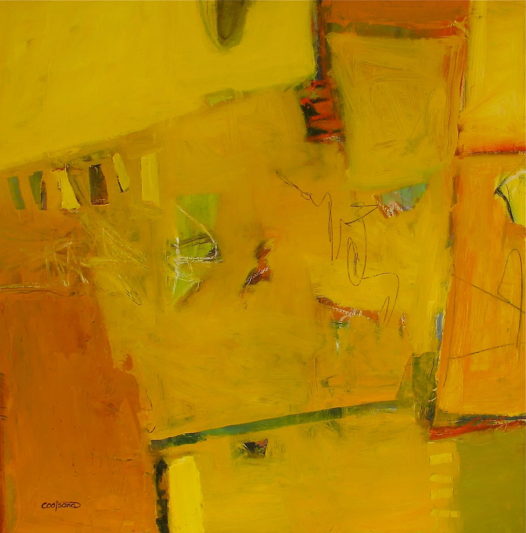
“My paintings are a synthesis of color, line, form, and texture. They begin as a problem of two or more color relationships to be explored through form. The form is loosely defined by a drawing that acts as a skeleton and exoskeleton both beneath and above the finished work. The application of the media to the painting surface is of utmost importance to me. The paint is applied with great bursts of energy, creating a surface, if I am successful, that is supercharged with texture and color. ”
I think this is the perfect place to include a contemporary artist who works with abstraction and a sense of place! Michael clearly has a joy of color and uses it masterfully. Look here at his color combinations and limitations. He works in series and explores dozens of color options within each limited palette. He also names these series very specifically which gives us that sense of place, for example, “Country Living” and “Lakeside.”
Click on any image to see larger.


To see more of MICHAEL HEDGES’ work visit sites below:


MICHAEL HEDGES
“Country Living”
Here you can see Hedges’ studio full of multiple paintings of the series, “Country Living.” Truly exploring a palette like this can lead to new discoveries and a solid knowledge of what your colors can do!
Project Eleven: PAINTING YOUR EMOTIONS
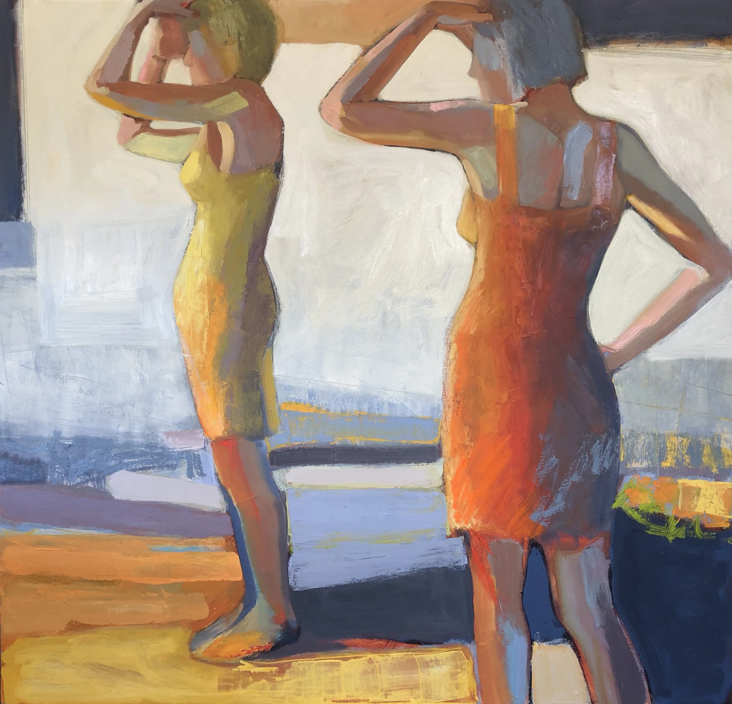
Being able to express emotional content in your work is the goal of many painters. This video shows a wide variety of artists who draw on their emotions to create their subject matter. The paintings range from highly realist to purely abstract, but the intention of the artists to convey, often very strong, emotional content is consistent throughout.
▸ PASSWORD: FRIDA
▸ VIDEO LENGTH: 25:00 minutes
Your Turn:
Create a painting that expresses one or more emotions that are personal to you. As you have seen, this can be a pure abstract or it can be realist and with narrative. It can be challenging to be vulnerable and truly express our feelings, but often when we do, we create our best work.
Things to Remember:
Use color expressively. Think about it’s impact and meaning.
Remember all of the elements of design (Value, Color, Shape, Line, Texture) and how you might manipulate them and/or use them to your advantage.
“Listen to” and watch your painting. If it begins to move in a direction that you didn’t expect consider following that direction.
Some thoughts I had while painting “Honey:”
Warmth, sweet, sticky, summer, honey colors, the feel of the gooey texture of honey, the transparency of honey, the taste of honey….
“HONEY”. M. COOTSONA
Why Aren’t My Colors Working?
The problems I see most often when I look at student’s work and how to fix them.
As a final video in this course, I show three paintings that have color “problems,” and I walk you through my thought process of how to harmonize and improve the paintings.
Here are several key problems that I often see in work from people who struggle with color:
The number one problem of most paintings that have color “issues” is too many colors. When unsure of what color to use students will often add a new color to a fairly developed painting instead of staying with a variation of a color already in the painting.
Another common problem is too much high chroma or inconsistent chroma, areas that are either too bright or too dull.
Not enough neutrals are used. The painting is full of too many colors and no neutrals for contrast.
Color temperature is off. For instance, shadows are too cool when a warmer shadow would feel more natural and rich.
Lack of reflected light on objects. Reflected light can tie your whole painting together and make it cohesive. Always look hard for reflected light.

“I truly hope that you enjoyed the course and now have a better understanding of color harmony. Thank you for your continued support of my courses and teachings. Keep on Painting!”
For even MORE ideas on color, refer to my Essential courses:
The two Essential E-Courses shown below deal specifically with color theory and usage, and may be a great way to further deepen your understanding of color, and its many qualities. Hope you find them useful for your creative journey.
~Melinda

