
lesson three

THE MAGICAL WORLD OF TRIADS
Creating harmonious, rich paintings with three colors.
It sounds so simple and basic, but working with variations of the primary colors Yellow, Red and Blue can not only limit your color choices but will give you guaranteed color harmony. Working with secondary colors and other Triads will also keep your colors harmonized. There are actually many primary color combinations and some that you may not have even thought of.
Let’s start by looking at a few here:
⇣ LOW CHROMA, LOW INTENSITY PALETTES ⇣

⇣ HIGH CHROMA, HIGH INTENSITY PALETTES ⇣
Your Turn:
Click on the icon below to download a blank chart of the color circle wheel above, to create your own color wheels.
Project Seven: FUN COLOR WHEEL PROJECT
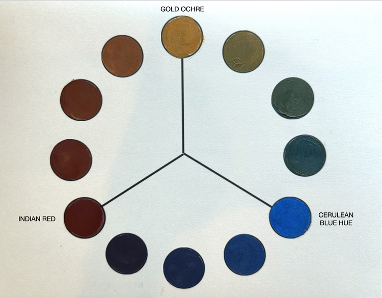
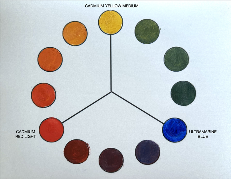
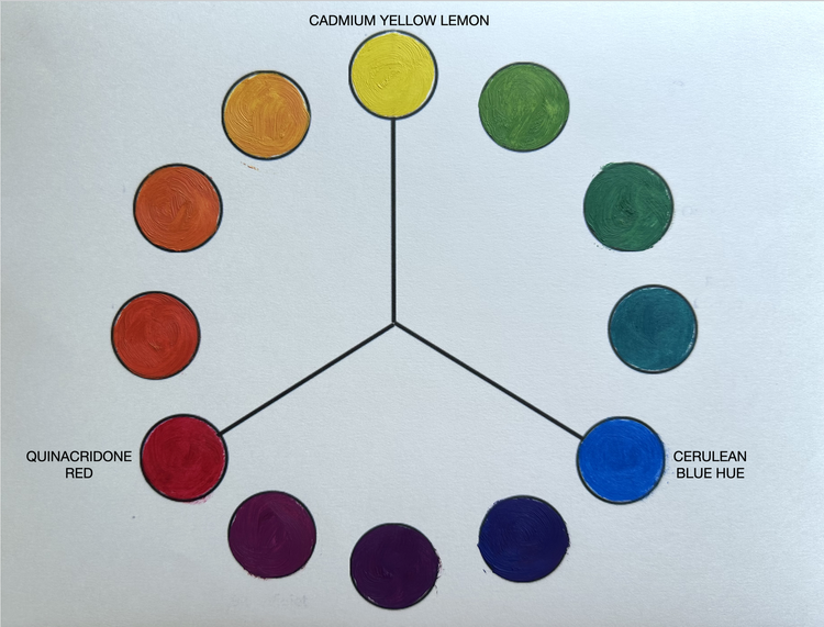
All of the secondary and tertiary colors on the wheels above were mixed from the three primaries. As you can see the palettes are all quite different and they all create lovely color harmonies. I’ve included a PDF of this wheel here so that you can print it out and make your own combinations. These are actually quite fun to paint, and can yield surprising results.
Another good combination is Gold Ochre, Cadmium Red Light and Black or Payne’s Grey. (This is the Zorn Palette which we will look at a bit more later.)
Remember, some of your earth tones can count as primaries, for example: Raw Sienna = Yellow, Payne’s Grey = Blue, Burnt Sienna = Red
Other ideas: you can substitute Black for Blue with different results.
I added white to a few of the very dark colors otherwise they are too dark to discern.
I did not have Hansa Yellow for the Modern Palette which would be more appropriate as it is more transparent than the Cadmium.
Notice if your color choices are opaque or transparent as that makes a difference in the brilliance of the colors.
Project Eight: PAINT WITH PRIMARY TRIADS
Watch me use two different triads plus black and white to create two different paintings with the same subject matter. In the first painting I use the Semi-Opaque Triad which creates a low chroma painting. In the second demo, I use the Traditional Triad which creates higher chroma results.
▸ PASSWORD: TRIADS2
▸ VIDEO LENGTH: 24:49 minutes


Your Turn:
Choose two of the primary triads above, or have fun creating one of your own using the paint colors in your studio. Feel free to use the same Richard Diebenkorn reference photo or any image of your own. Your subject matter does NOT need to be a portrait or figurative.
Things to Remember:
It’s great to choose a relatively easy image for this Project so that you can do it quickly and create at least two paintings. This way you will get an immediate sense of what these primary triad colors can do.
Remember, you can add black and white.
Notice if your colors are opaque or transparent.
Any Pthalo will tend to overpower the painting so use caution with Pthalos. (ie. Use small amounts of Pthalo.)
DID YOU KNOW?
〰️
DID YOU KNOW? 〰️
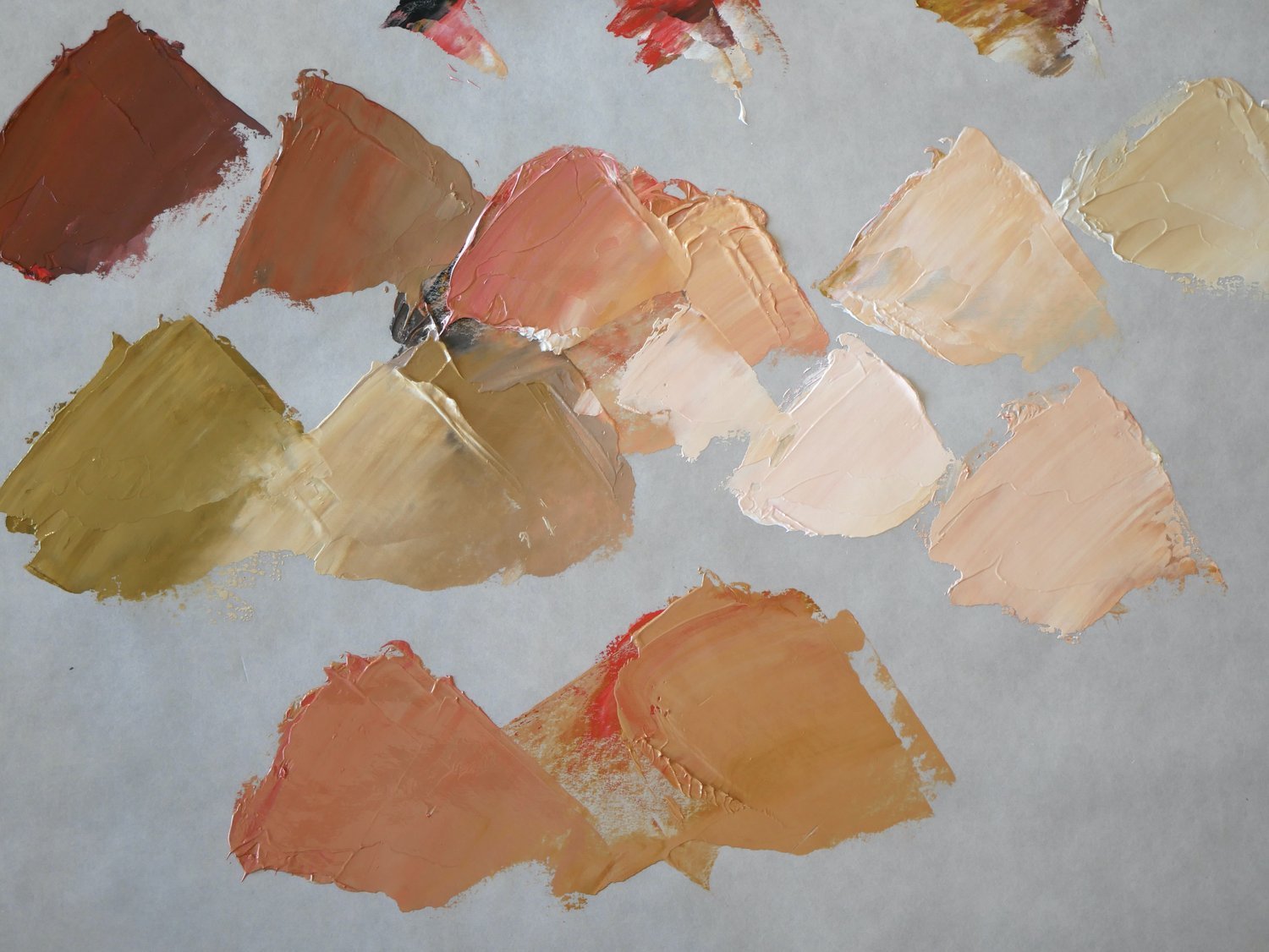
Triads Create the Best Skin Tones?
Let’s take a quick look at several palettes that mix together to create beautiful skin tones of any race.
▸ PASSWORD: SKIN
▸ VIDEO LENGTH: 10:29 minutes
⇣ These colors were mixed together on a neutral grey palette ⇣


WHAT’S THE STORY?
〰️
WHAT’S THE STORY? 〰️
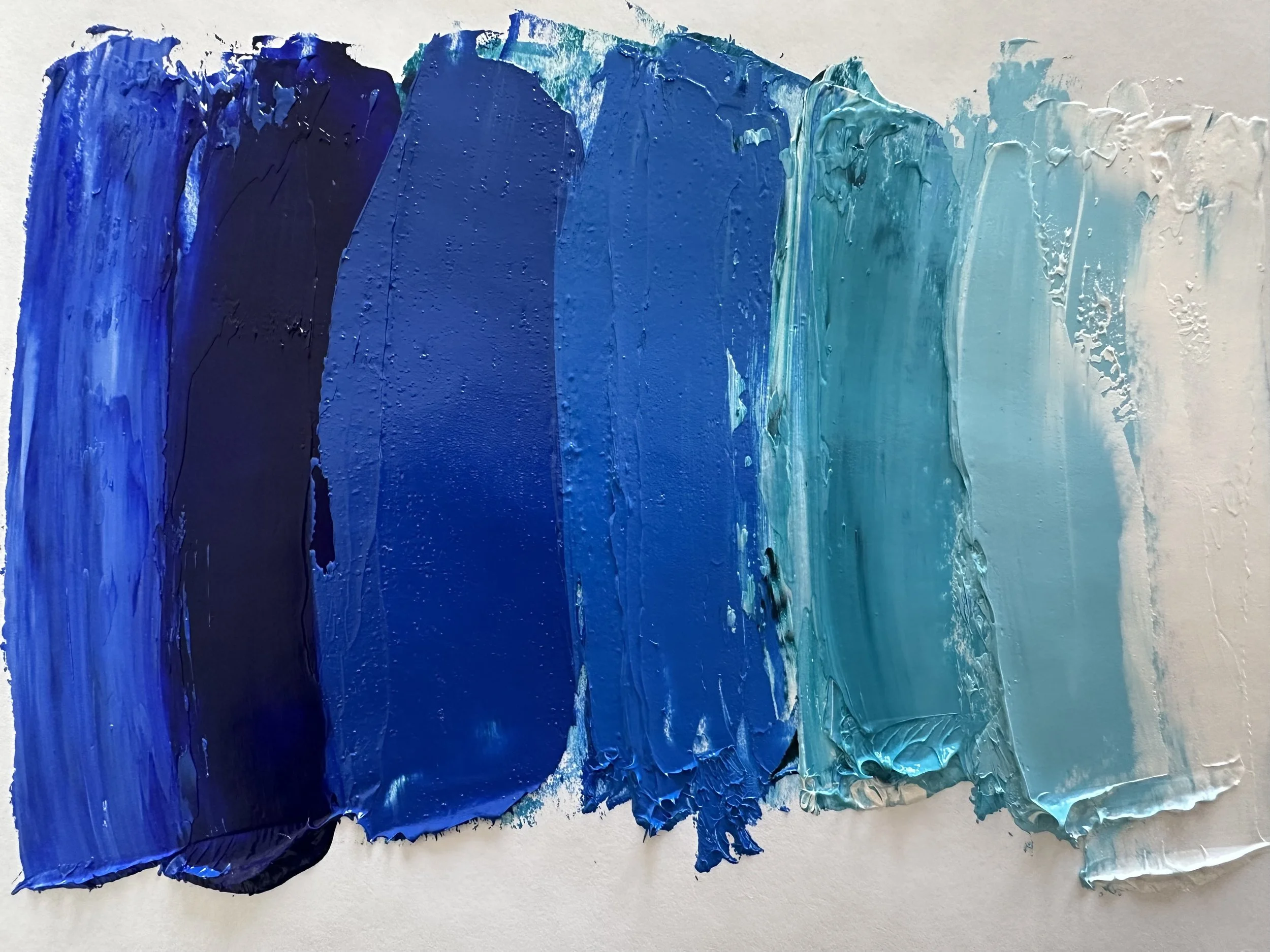
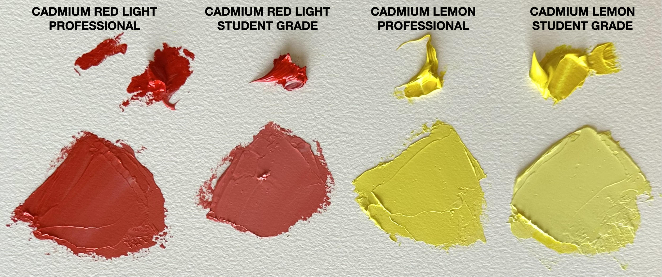
Student Grade vs. Professional Grade Oil Colors
⇣ Each color below has the same amount of white added. ⇣
You can see that the Professional pigments are stronger than the Student Grade pigments.
Just A Bit More on Chroma
Controlling chroma is how painters create that glow that you see in some paintings. This is done by placing high chroma colors next to neutral colors.
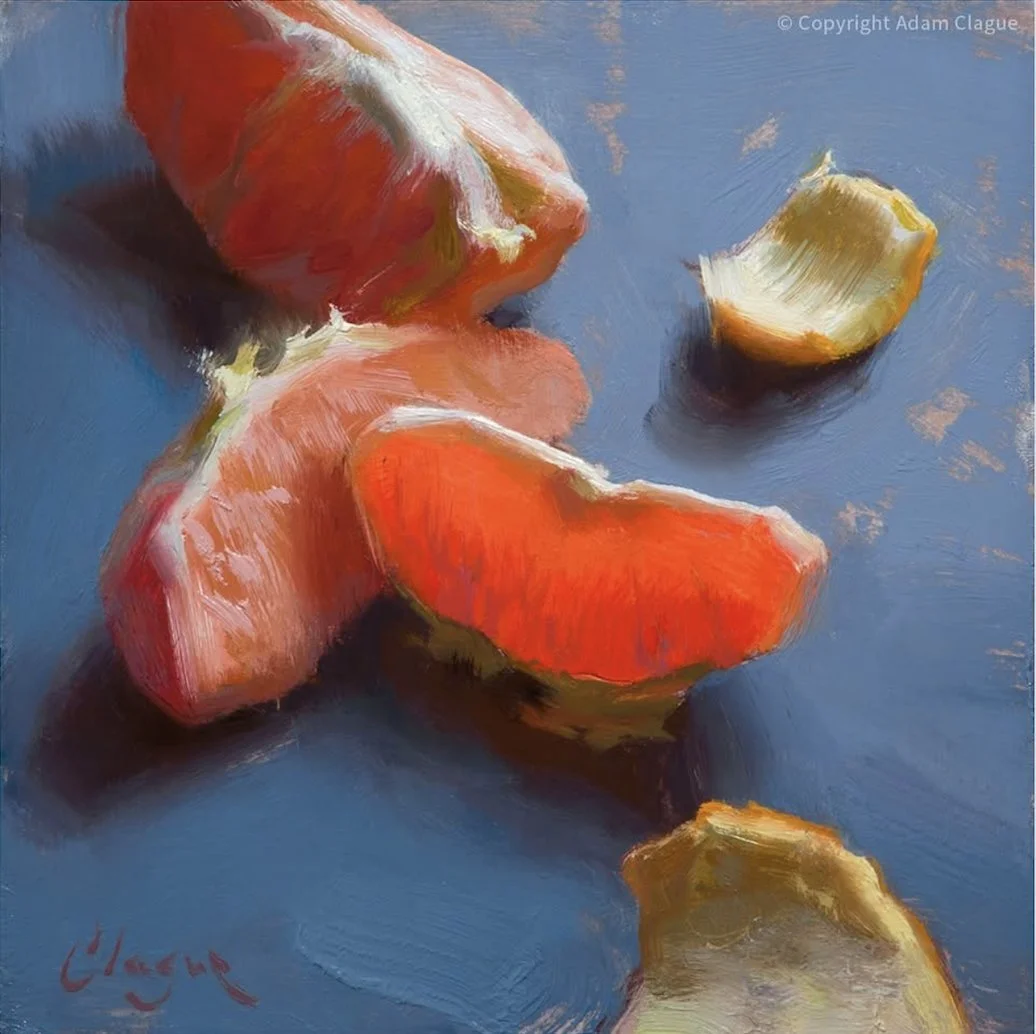
Refer to these two examples where CHROMA, VALUE and PAINT TRANSPARENCY were all used intentionally to create the feeling of light in the paintings. (Yes, that candle painting is a painting not a photo!) In the next demo, we will look at another type of triad and also concentrate a bit more on chroma.

Project Nine: A TRIAD USING SECONDARY COLORS & ANOTHER LOOK AT CHROMA
In this demo, I paint a still life of orange fruit. I’m not quite as masterful with the details that Adam Clague is above, but you can see the process. I use a triad of Orange, Green and Violet, but I use lots of colors to create this triad. I’m also very focused on Chroma and creating light and shadow on the subject matter.
▸ PASSWORD: ORANGE
▸ VIDEO LENGTH: 18:49 minutes
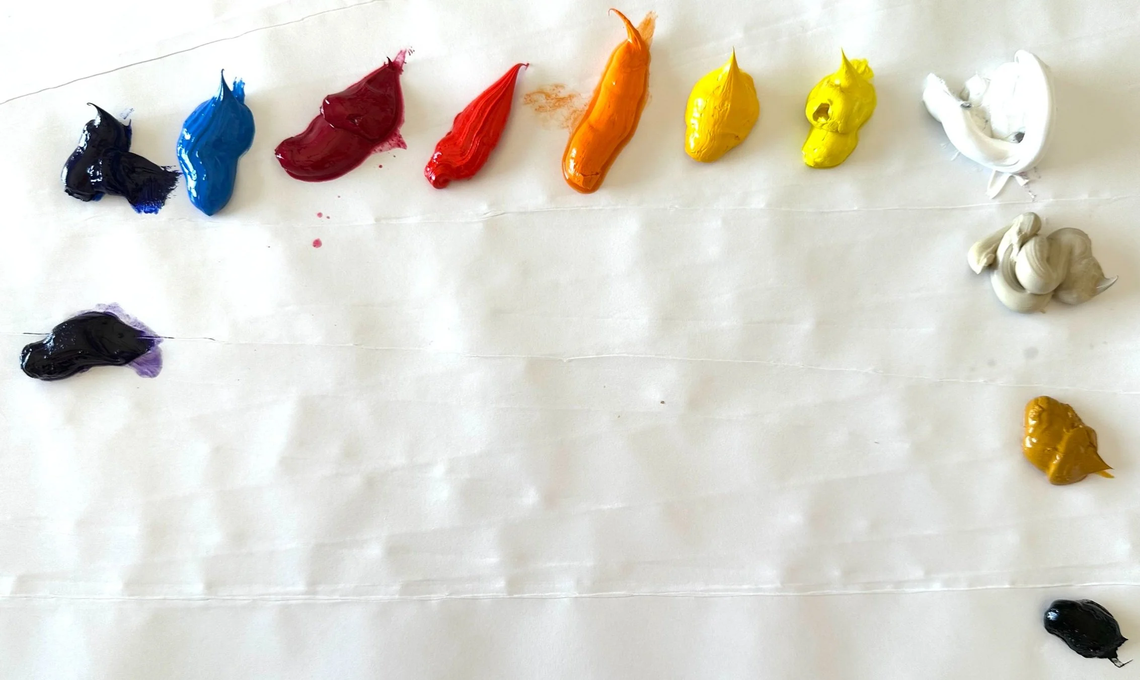
Demo Palette Colors
-
Colors listed below (left to right)
Ultramarine Violet
Ultramarine Blue
Cerulean Blue
Quinacridone Red
Cadmium Red Light
Cadmium Orange
Cadmium Yellow Medium
Cadmium Yellow Light
Titanium White
Titanium Buff
Gold Ochre
Carbon Black
Your Turn:
Create a painting choosing either a secondary triad or another triad of your choice. Look back at the color wheel in the introduction if you need a reminder on how to find your triads. Feel free to use my source image if it interests you.
If you are working with a high Chroma image pay attention to your brush and keep it relatively clean so that your bright colors stay “clean” and do not get contaminated.
To keep high Chroma colors bright, avoid adding white until absolutely necessary. Try using a lighter analogous color first, before you add white. White will cool and dull your colors.
Look for reflected colors.
Pay attention to your values.
Mix the colors in the triad to create beautiful neutrals.


“Both my printed image of this source photo and the actual orange were slightly more red-orange than this photo, thus my slant towards a more red-orange in the painting. If you are painting a still life, it is always best to paint it from life if at all possible.”
Artist Focus
〰️
EDMOND PRAYBE
Artist Focus 〰️ EDMOND PRAYBE
“I use the still life genre as a vehicle to pair intense direct observation with an underpinning of abstract structure, rhythm, shape and color. I am equally interested in translating the observable world into paint, developing carefully arranged divisions of surface geometry and exploring abstract color relationships.”
Praybe lives in Maryland and shows his work at the galleries listed below. He is a great draftsman (he knows how to draw!) but he also has a brilliant and sublime color sense. In this gallery of images, notice how he is incorporating everything we are learning about color harmony in different paintings: limited palettes, closely related values, triads, monochromatic palettes, complementary palettes, etc. He also very consciously manipulates Chroma by placing his brighter colors where he wants to “draw our eye.” There is a lot to be learned by studying his work!
Look at Praybe’s work and see if you can find the color theories that you have been learning about!
Click on any image to see larger.


⇣ To see more of EDMOND PRAYBE’S work, visit the sites below. ⇣
